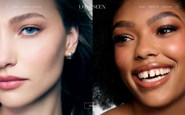
Preview image. Unlock full-res
Minimalist Editorial Canvas
Color palette
Primary text, interactive elements (links, buttons) text and borders, outline for ghost buttons. Its near-black depth offers strong contrast and a premium feel
Primary page and hero background
Neutral surface background for cards and image containers
Secondary background color for subtle section breaks and footer area
Typography
- Weights
- 400, 500
- Sizes
- 10px, 12px, 13px, 14px, 16px, 18px
- Line height
- 0.92, 1, 1.2, 1.43, 1.54, 1.63, 1.67, 2.06, 2.2, 2.31, 2.5
- Letter spacing
- 0.0220em, 0.0250em, 0.0280em, 0.0330em, 0.0370em, 0.0490em, 0.0500em, 0.0580em, 0.0710em
- Fallback
- system-ui
Primary typeface for all text content including headings, body, navigation, and interactive elements. Its wide range of letter-spacing values enables fine typographic control, emphasizing an airy, premium feel.
- Weights
- 400
- Sizes
- 13px
- Line height
- 1.2
- Letter spacing
- normal
- Fallback
- Arial, sans-serif
Fallback font for small functional text, buttons, and icons where high legibility is paramount.
Spacing & shape
Components
Transparent background, Midnight Ink (#00091b) text, 1px Midnight Ink (#00091b) border on all sides. No border radius. Padding: 12px vertical, 12px horizontal for smaller instances; 30px vertical, 30px horizontal for larger, more prominent actions.
Midnight Ink (#00091b) text, BeausiteWeb font at various sizes, usually 12-14px. No explicit background or border. Generous letter-spacing. Inherits page background.
Transparent background, Midnight Ink (#00091b) text. Features a 1px Midnight Ink (#00091b) border on all sides. No border radius. Left padding: 21px for content. Text color can be #00091b.
Features a light border in Midnight Ink (#00091b) with generous internal padding. Text is Midnight Ink (#00091b), likely with increased letter spacing. Appears on Blush Sand (#f2e2e0) background.
No explicit border or shadow, relies on surrounding negative space. Background is Porcelain (#faf6f5). Appears as a simple square block containing imagery, tightly cropped without additional padding.
Guidelines
- Use Alabaster (#f2eded) as the default background for all primary page content sections.
- Apply Midnight Ink (#00091b) for all primary body text, headlines, and interactive elements to maintain high contrast and sophistication.
- Ensure all buttons and input fields feature sharp, 0px border radii.
- Implement consistent 1px borders in Midnight Ink (#00091b) for ghost buttons and input fields to define interactive areas subtly.
- Utilize the BeausiteWeb font family across all typographic elements, leveraging its varied letter-spacing for an airy, elegant presentation.
- Introduce Blush Sand (#f2e2e0) as a background color to delineate distinct content sections or footers with a soft visual break.
- Maintain a spacious density; prioritize ample whitespace, with element gaps around 15px and vertical section gaps at 70px.
- Avoid applying any border-radius greater than 0px to interactive components like buttons or input fields.
- Do not use strong shadows (elevation) on any UI elements; rely on subtle background color shifts or hairline borders for visual separation.
- Refrain from using highly saturated or bright colors beyond the core brand palette; color should be spare and functional.
- Do not use generic system fonts for prominent display text or navigation; BeausiteWeb is critical to the brand's aesthetic.
- Avoid decorative gradients; stick to solid colors for backgrounds and component fills.
- Do not clutter layouts; maintain a disciplined spaciousness and minimal component density.
- Do not use distinct filled buttons for primary actions; prefer the ghost button style with Midnight Ink borders and text.
About this system
ShowHide
Loveseen's visual style evokes a minimalist fashion-editorial aesthetic. It presents content on a clean, light canvas, leveraging subtle neutral tones for background variation and borders. Typography is sophisticated and generous with letter spacing, creating an airy feel. Components are understated, featuring hairline borders and an absence of strong shadows, emphasizing content over chrome. The overall impression is one of effortless elegance and product-focused presentation.
The page primarily utilizes a full-bleed layout for hero sections, transitioning to a contained, centered model for body content. The hero typically features large, dynamic imagery often split or overlaid with minimal text and ghost buttons. Sections are defined by varying background colors (Alabaster, Blush Sand), creating a subtle visual rhythm without hard dividers. Content is arranged in flexible patterns, including centered stacks for calls to action and multi-column grids for featuring images or testimonials. Navigation is a persistent, minimal top bar with left-aligned brand logo and right-aligned links.
This site features high-key, product-focused photography and lifestyle imagery, often tightly cropped to focus on the face or eyes. Images are full-bleed or presented as isolated, square, unmasked elements on clean backgrounds. The photography is vibrant and high-contrast, showcasing product usage directly rather than conceptual scenes. Icons are minimal, utilizing outlined styles with light stroke weights and predominantly Midnight Ink (#00091b) color. Imagery serves both decorative atmosphere in hero sections and explanatory/social proof roles within content blocks.
Reminiscent of Glossier, Away Travel, Everlane, Aesop.
# Loveseen — Style Reference
> Minimalist Editorial Canvas

**Theme:** light

**Site:** https://loveseen.com

Loveseen's visual style evokes a minimalist fashion-editorial aesthetic. It presents content on a clean, light canvas, leveraging subtle neutral tones for background variation and borders. Typography is sophisticated and generous with letter spacing, creating an airy feel. Components are understated, featuring hairline borders and an absence of strong shadows, emphasizing content over chrome. The overall impression is one of effortless elegance and product-focused presentation.

## Tokens — Colors

| Name | Value | Token | Role |
|------|------|------|------|
| Midnight Ink | `#00091b` | `--color-midnight-ink` | Primary text, interactive elements (links, buttons) text and borders, outline for ghost buttons. Its near-black depth offers strong contrast and a premium feel |
| Alabaster | `#f2eded` | `--color-alabaster` | Primary page and hero background |
| Porcelain | `#faf6f5` | `--color-porcelain` | Neutral surface background for cards and image containers |
| Blush Sand | `#f2e2e0` | `--color-blush-sand` | Secondary background color for subtle section breaks and footer area |

## Tokens — Typography

### BeausiteWeb
- **Substitute:** system-ui
- **Weights:** 400, 500
- **Sizes:** 10px, 12px, 13px, 14px, 16px, 18px
- **Line height:** 0.92, 1, 1.2, 1.43, 1.54, 1.63, 1.67, 2.06, 2.2, 2.31, 2.5
- **Letter spacing:** 0.0220em, 0.0250em, 0.0280em, 0.0330em, 0.0370em, 0.0490em, 0.0500em, 0.0580em, 0.0710em
- **Role:** Primary typeface for all text content including headings, body, navigation, and interactive elements. Its wide range of letter-spacing values enables fine typographic control, emphasizing an airy, premium feel.

### Arial
- **Substitute:** Arial, sans-serif
- **Weights:** 400
- **Sizes:** 13px
- **Line height:** 1.2
- **Letter spacing:** normal
- **Role:** Fallback font for small functional text, buttons, and icons where high legibility is paramount.

## Tokens — Type Scale

Major Second (1.125) from 13px base.

| Role | Size | Line height | Letter spacing |
|------|------|------|------|
| caption | 10px | 1.63 | — |
| body-sm | 12px | 1.63 | — |
| body | 13px | 1.63 | — |
| body-lg | 14px | 1.63 | — |
| heading-sm | 16px | 1.63 | — |
| heading | 18px | 1.63 | — |

## Tokens — Spacing

- **Section gap:** 70px
- **Card padding:** 12px
- **Element gap:** 15px

## Tokens — Radius

- **Default:** 0px

## Layout

The page primarily utilizes a full-bleed layout for hero sections, transitioning to a contained, centered model for body content. The hero typically features large, dynamic imagery often split or overlaid with minimal text and ghost buttons. Sections are defined by varying background colors (Alabaster, Blush Sand), creating a subtle visual rhythm without hard dividers. Content is arranged in flexible patterns, including centered stacks for calls to action and multi-column grids for featuring images or testimonials. Navigation is a persistent, minimal top bar with left-aligned brand logo and right-aligned links.

## Imagery

This site features high-key, product-focused photography and lifestyle imagery, often tightly cropped to focus on the face or eyes. Images are full-bleed or presented as isolated, square, unmasked elements on clean backgrounds. The photography is vibrant and high-contrast, showcasing product usage directly rather than conceptual scenes. Icons are minimal, utilizing outlined styles with light stroke weights and predominantly Midnight Ink (#00091b) color. Imagery serves both decorative atmosphere in hero sections and explanatory/social proof roles within content blocks.

## Components

### Ghost Button
*Primary interactive element for calls to action.*

Transparent background, Midnight Ink (#00091b) text, 1px Midnight Ink (#00091b) border on all sides. No border radius. Padding: 12px vertical, 12px horizontal for smaller instances; 30px vertical, 30px horizontal for larger, more prominent actions.

### Navigation Link
*Top-level navigation and secondary links.*

Midnight Ink (#00091b) text, BeausiteWeb font at various sizes, usually 12-14px. No explicit background or border. Generous letter-spacing. Inherits page background.

### Input Field
*Text input areas.*

Transparent background, Midnight Ink (#00091b) text. Features a 1px Midnight Ink (#00091b) border on all sides. No border radius. Left padding: 21px for content. Text color can be #00091b.

### Follow CTA Block
*Social media call to action.*

Features a light border in Midnight Ink (#00091b) with generous internal padding. Text is Midnight Ink (#00091b), likely with increased letter spacing. Appears on Blush Sand (#f2e2e0) background.

### Product Image Card
*Displaying product images or user-generated content.*

No explicit border or shadow, relies on surrounding negative space. Background is Porcelain (#faf6f5). Appears as a simple square block containing imagery, tightly cropped without additional padding.

## Guidelines

### Do

- Use Alabaster (#f2eded) as the default background for all primary page content sections.
- Apply Midnight Ink (#00091b) for all primary body text, headlines, and interactive elements to maintain high contrast and sophistication.
- Ensure all buttons and input fields feature sharp, 0px border radii.
- Implement consistent 1px borders in Midnight Ink (#00091b) for ghost buttons and input fields to define interactive areas subtly.
- Utilize the BeausiteWeb font family across all typographic elements, leveraging its varied letter-spacing for an airy, elegant presentation.
- Introduce Blush Sand (#f2e2e0) as a background color to delineate distinct content sections or footers with a soft visual break.
- Maintain a spacious density; prioritize ample whitespace, with element gaps around 15px and vertical section gaps at 70px.

### Don't

- Avoid applying any border-radius greater than 0px to interactive components like buttons or input fields.
- Do not use strong shadows (elevation) on any UI elements; rely on subtle background color shifts or hairline borders for visual separation.
- Refrain from using highly saturated or bright colors beyond the core brand palette; color should be spare and functional.
- Do not use generic system fonts for prominent display text or navigation; BeausiteWeb is critical to the brand's aesthetic.
- Avoid decorative gradients; stick to solid colors for backgrounds and component fills.
- Do not clutter layouts; maintain a disciplined spaciousness and minimal component density.
- Do not use distinct filled buttons for primary actions; prefer the ghost button style with Midnight Ink borders and text.

## Agent Prompt Guide

Quick Color Reference:
text: #00091b
background: #f2eded
border: #00091b
accent: no distinct accent color
primary action: #00091b (outlined action border)

Example Component Prompts:
1. Create a Hero Section with a full-bleed image. Overlay 'LoveSeen' in BeausiteWeb, size 18px, weight 500, letter-spacing 0.37px, color #00091b. Below it, a Ghost Button: 'OH HI' in BeausiteWeb, size 13px, weight 400, letter-spacing 0.5px, color #00091b, with a 1px #00091b border, 30px vertical and 30px horizontal padding, 0px radius.
2. Design a Testimonial Grid section: Set its background to Porcelain (#faf6f5). Each grid item should be a Product Image Card: a square image contained within. No explicit padding or border on the cards themselves, letting the Porcelain background provide visual separation.
3. Create an Outlined Primary Action: Transparent background, #00091b border and text, 9999px radius, compact pill padding. Use it for the main CTA instead of a filled button.
More like this









Keep what you find
A free account saves references to boards and can send you a weekly email of picks based on what you save.
To see every result, go Pro.