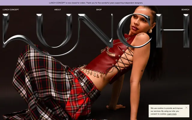
Preview image. Unlock full-res
gallery meets fashion editorial
Color palette
Primary text, borders, active states, outlines for ghost elements
Navigation text, secondary UI elements that need to be subtle against cooler backgrounds
Background for specific sections, footer background — a deliberate soft, muted main canvas color
Typography
- Weights
- 400, 700
- Sizes
- 12px, 16px, 24px, 32px
- Line height
- 1, 1.8
- Letter spacing
- -0.005em at 32px, -0.007em at 24px, -0.01em at 16px, -0.013em at 12px
- Fallback
- Inter
All body text, navigation, links, and product details. Its compact nature reinforces the brand's contemporary edge.
- Weights
- 700
- Sizes
- 72px
- Line height
- 1.8
- Letter spacing
- 0.002em
- Fallback
- OCR A Extended
Distinctive display headlines, likely for hero sections or key editorial content. Its monospace, almost industrial feel provides a sharp contrast to the product photography.
Spacing & shape
Components
Uses Good Sans, weight 400, 16px, Carbon Black text. Hover states are Carbon Black text with an underline, no background change. Primary navigation links are Pale Parchment on the muted section background.
Completely borderless and shadowless, with 0px radius. Product title and price in Carbon Black Good Sans. '(Sold Out)' text is in red, Good Sans, 12px. Background is transparent, relying on the page's main surface color. No explicit padding detected, images are full-bleed to the edges of the card.
Background is Digital Lavender. Text is Good Sans, 16px, Carbon Black. Padding is 10px.
Appears as an overlay, likely with a light background and Carbon Black text. Includes a close button. Text is Good Sans 12px.
Text is Good Sans, 16px, Carbon Black. No background fill, appears as a text link with a subtle bottom border or hover effect indicating interactivity. Often paired with 'FIND OUT MORE'.
Guidelines
- Use Carbon Black (#000000) for all primary body text and most UI borders to maintain strong typographic contrast.
- Apply Digital Lavender (#B8AAD0) as a background for any full-width informational banners or footers.
- Render all product cards without any borders, shadows, or rounded corners (0px radius) to emphasize product photography as the sole visual element.
- Utilize Good Sans at weight 400 for all navigation links and product descriptions.
- Implement letter-spacing adjusted for font size, using a tighter track for larger headings (e.g., -0.005em at 32px Good Sans).
- Prioritize generous vertical spacing around content sections (60px) to allow visual elements to breathe.
- Display 'Sold Out' text in a distinct red (#ff0000) for immediate visual feedback on product availability.
- Avoid using drop shadows or complex gradients on UI elements; elevation is not communicated through shadow.
- Do not introduce additional bright accent colors; the palette is intentionally restrained to prioritize product visuals.
- Refrain from applying rounded corners to buttons, cards, or other containers; maintain a sharp, angular aesthetic (0px radius).
- Do not deviate from Good Sans for general UI text; consistency in this bespoke typeface is key to brand identity.
- Avoid dense, information-heavy blocks of text; opt for precise, spaced-out content.
- Do not use highly saturated colors for backgrounds; stick to the muted neutral palette.
- Never use automatic browser link styling; explicitly set link colors and hover states to Carbon Black.
About this system
ShowHide
LUNCH cultivates an avant-garde boutique aesthetic, with a cool, muted palette anchored by deep black text and an unusual purple background. Typography is compact and precise, using a bespoke sans-serif for most content and a distinct display font for striking headings. The layout emphasizes strong visual content on neutral surfaces, with minimal UI elements that feel almost like sparse museum displays, allowing the product imagery to dominate.
The page structure is full-bleed with an implicit, flexible max-width for textual content within sections, centered on the screen. The hero section is a full-width, full-height striking image often overlaid with large, stylized typography. Content sections alternate between visually dominant product grids and brief textual descriptions. Vertical rhythm is established through consistent 60px gaps between major sections. The main navigation is a minimal, centered horizontal bar at the top, which appears to become a sticky header on scroll. Product grids are typically 4-column, displaying products without explicit card boundaries, relying on image boundaries and minimal text for separation.
The site uses a mix of high-fashion editorial photography for hero sections and clean, studio-lit product photography against light, neutral backgrounds for product listings. Photography is often full-bleed or large-scale, with minimal UI elements overlapping. Editorial images often feature models in dynamic poses, emphasizing clothing movement and texture. Product images are typically tight crops, showcasing detail over context. Iconography is minimal, likely outlined and monochromatic.
Reminiscent of SSENSE, Farfetch, Kith, The Line.
# LUNCH — Style Reference
> gallery meets fashion editorial

**Theme:** light

**Site:** https://lunchconcept.com

LUNCH cultivates an avant-garde boutique aesthetic, with a cool, muted palette anchored by deep black text and an unusual purple background. Typography is compact and precise, using a bespoke sans-serif for most content and a distinct display font for striking headings. The layout emphasizes strong visual content on neutral surfaces, with minimal UI elements that feel almost like sparse museum displays, allowing the product imagery to dominate.

## Tokens — Colors

| Name | Value | Token | Role |
|------|------|------|------|
| Carbon Black | `#000000` | `--color-carbon-black` | Primary text, borders, active states, outlines for ghost elements |
| Pale Parchment | `#FCFAF1` | `--color-pale-parchment` | Navigation text, secondary UI elements that need to be subtle against cooler backgrounds |
| Digital Lavender | `#B8AAD0` | `--color-digital-lavender` | Background for specific sections, footer background — a deliberate soft, muted main canvas color |

## Tokens — Typography

### Good Sans
- **Substitute:** Inter
- **Weights:** 400, 700
- **Sizes:** 12px, 16px, 24px, 32px
- **Line height:** 1, 1.8
- **Letter spacing:** -0.005em at 32px, -0.007em at 24px, -0.01em at 16px, -0.013em at 12px
- **Role:** All body text, navigation, links, and product details. Its compact nature reinforces the brand's contemporary edge.

### Redaction
- **Substitute:** OCR A Extended
- **Weights:** 700
- **Sizes:** 72px
- **Line height:** 1.8
- **Letter spacing:** 0.002em
- **Role:** Distinctive display headlines, likely for hero sections or key editorial content. Its monospace, almost industrial feel provides a sharp contrast to the product photography.

## Tokens — Type Scale

| Role | Size | Line height | Letter spacing |
|------|------|------|------|
| caption | 12px | 1 | -0.013em |
| body | 16px | 1 | -0.01em |
| subheading | 24px | 1 | -0.007em |
| heading | 32px | 1 | -0.005em |
| display | 72px | 1.8 | 0.002em |

## Tokens — Spacing

- **Section gap:** 60px
- **Card padding:** 0px
- **Element gap:** 20px

## Tokens — Radius

- **Cards:** 0px
- **badges:** 0px

## Layout

The page structure is full-bleed with an implicit, flexible max-width for textual content within sections, centered on the screen. The hero section is a full-width, full-height striking image often overlaid with large, stylized typography. Content sections alternate between visually dominant product grids and brief textual descriptions. Vertical rhythm is established through consistent 60px gaps between major sections. The main navigation is a minimal, centered horizontal bar at the top, which appears to become a sticky header on scroll. Product grids are typically 4-column, displaying products without explicit card boundaries, relying on image boundaries and minimal text for separation.

## Imagery

The site uses a mix of high-fashion editorial photography for hero sections and clean, studio-lit product photography against light, neutral backgrounds for product listings. Photography is often full-bleed or large-scale, with minimal UI elements overlapping. Editorial images often feature models in dynamic poses, emphasizing clothing movement and texture. Product images are typically tight crops, showcasing detail over context. Iconography is minimal, likely outlined and monochromatic.

## Components

### Navigation Link
*Primary navigation items and in-content links*

Uses Good Sans, weight 400, 16px, Carbon Black text. Hover states are Carbon Black text with an underline, no background change. Primary navigation links are Pale Parchment on the muted section background.

### Product Card
*Displaying product items in grids*

Completely borderless and shadowless, with 0px radius. Product title and price in Carbon Black Good Sans. '(Sold Out)' text is in red, Good Sans, 12px. Background is transparent, relying on the page's main surface color. No explicit padding detected, images are full-bleed to the edges of the card.

### Footer Announcement Bar
*Global informational messages, typically at the top or bottom of the page.*

Background is Digital Lavender. Text is Good Sans, 16px, Carbon Black. Padding is 10px.

### Cookie Consent Banner
*Legal compliance notice*

Appears as an overlay, likely with a light background and Carbon Black text. Includes a close button. Text is Good Sans 12px.

### Ghost Button/Link
*Secondary calls to action or informational links*

Text is Good Sans, 16px, Carbon Black. No background fill, appears as a text link with a subtle bottom border or hover effect indicating interactivity. Often paired with 'FIND OUT MORE'.

## Guidelines

### Do

- Use Carbon Black (#000000) for all primary body text and most UI borders to maintain strong typographic contrast.
- Apply Digital Lavender (#B8AAD0) as a background for any full-width informational banners or footers.
- Render all product cards without any borders, shadows, or rounded corners (0px radius) to emphasize product photography as the sole visual element.
- Utilize Good Sans at weight 400 for all navigation links and product descriptions.
- Implement letter-spacing adjusted for font size, using a tighter track for larger headings (e.g., -0.005em at 32px Good Sans).
- Prioritize generous vertical spacing around content sections (60px) to allow visual elements to breathe.
- Display 'Sold Out' text in a distinct red (#ff0000) for immediate visual feedback on product availability.

### Don't

- Avoid using drop shadows or complex gradients on UI elements; elevation is not communicated through shadow.
- Do not introduce additional bright accent colors; the palette is intentionally restrained to prioritize product visuals.
- Refrain from applying rounded corners to buttons, cards, or other containers; maintain a sharp, angular aesthetic (0px radius).
- Do not deviate from Good Sans for general UI text; consistency in this bespoke typeface is key to brand identity.
- Avoid dense, information-heavy blocks of text; opt for precise, spaced-out content.
- Do not use highly saturated colors for backgrounds; stick to the muted neutral palette.
- Never use automatic browser link styling; explicitly set link colors and hover states to Carbon Black.

## Agent Prompt Guide

Quick Color Reference:
text: #000000
background: #B8AAD0
border: #000000
accent: no distinct accent color
primary action: no distinct CTA color

Example Component Prompts:
1. Create a product listing card grid: each card has a transparent background, 0px radius, 0px padding. Image fills card. Text is Good Sans 16px #000000 for product name, Good Sans 12px #000000 for price, and Good Sans 12px #ff0000 for '(Sold Out)'.
2. Design a top navigation bar: Pale Parchment (#FCFAF1) text on a light background. Good Sans 16px, weight 400. Text for 'LUNCH CONCEPT' is also Pale Parchment, as identified in primary navigation.
3. Implement a page footer section: Digital Lavender (#B8AAD0) background. All text (e.g., 'LUNCH CONCEPT is now closed for orders...') is Good Sans 16px, Carbon Black (#000000). Apply 60px vertical padding above and below.
More like this









Keep what you find
A free account saves references to boards and can send you a weekly email of picks based on what you save.
To see every result, go Pro.