Preview image. Unlock full-res
Serene teal workspace
Color palette
Primary action buttons, interactive elements, brand highlights
Subtle accent backgrounds, secondary brand highlights, active state indicators
Interactive link backgrounds, subtle decorative fills
Conic gradient start for decorative elements
Accent backgrounds for decorative panels
Accent backgrounds for decorative panels
Primary text, heading text, critical UI elements, dark brand accents
Subtle borders, dividers, subtle inactive element states
Page backgrounds, primary card surfaces, default UI areas
Secondary card backgrounds, subtle alert backgrounds
Muted text, secondary borders, less emphasized elements
Typography
- Weights
- 400, 500
- Sizes
- 12px, 13px, 14px, 15px, 16px, 18px, 20px, 22px, 26px
- Line height
- 1.22, 1.25, 1.5
- Letter spacing
- normal
- Fallback
- Inter
Primary body text, labels, navigation items, and most UI text. The custom font `mint` at weights 400 and 500 maintains a clean, digital aesthetic for readability across various sizes.
- Weights
- 400
- Sizes
- 22px, 46px, 60px
- Line height
- 1.05, 1.15, 1.2
- Letter spacing
- normal
- Fallback
- Outfit
Display headlines and subheadings. The unique `grenette` font provides a distinct, modern character for larger text, establishing brand presence without being overly bold.
Spacing & shape
Components
Solid 'Zenith Teal' (#006e75) background, 'Midnight Pine' (#061d29) text, 8px border-radius, padding 16px vertical, 24px horizontal. Text is `mint` font, typically weight 500.
Transparent background, 'Midnight Pine' (#061d29) text, 'Arctic Mist' (#e5e7eb) border, 8px border-radius, padding 16px vertical, 24px horizontal. Text is `mint` font, typically weight 500.
Transparent background, 'Midnight Pine' (#061d29) text, 0px border-radius, 0px vertical padding, 12px horizontal padding. On hover, background uses 'Zenith Teal' (#006e75) with 'Pale Mint' (#b9ffe8) text. Text is `mint` font, typically weight 400.
'Canvas White' (#ffffff) background, 24px border-radius, no shadow, 0px padding by default (content drives interior spacing).
'Pale Amber' (#fffded) background, 24px border-radius, no shadow, 0px padding by default.
'Midnight Pine' (#061d29) text, transparent background, with 'Artic Mist' (#e5e7eb) border on focus/hover. Uses `mint` font, 8px radius for containers.
Guidelines
- Use 'Midnight Pine' (#061d29) for all primary text and headings.
- Apply 'Zenith Teal' (#006e75) for primary call-to-action buttons, ensuring it's always interactable.
- Maintain a 24px border-radius for all content cards, softening surfaces.
- Employ 'Arctic Mist' (#e5e7eb) for subtle UI dividers, borders, and inactive states.
- Prioritize the `mint` font for all body text, navigation, and functional UI elements.
- Use a base unit of 8px for vertical and horizontal element gaps to maintain comfortable density.
- Structure page sections with a 'Midnight Pine' heading using `grenette` font, followed by `mint` body text.
- Avoid using highly saturated colors for large background areas; reserve them for accents or interactive elements.
- Do not introduce heavy shadows or deep elevation; components should feel lightweight and integrated.
- Refrain from using generic system fonts when `mint` or `grenette` are available.
- Do not deviate from the 8px or 24px border-radii for buttons and cards respectively.
- Do not overcrowd sections; maintain the comfortable density with 24px section gaps.
- Never use 'Pale Mint' (#b9ffe8) for text against light backgrounds; its contrast is insufficient.
- Avoid arbitrary gradients; only use the defined conic gradients for decorative elements, not functional UI.
About this system
ShowHide
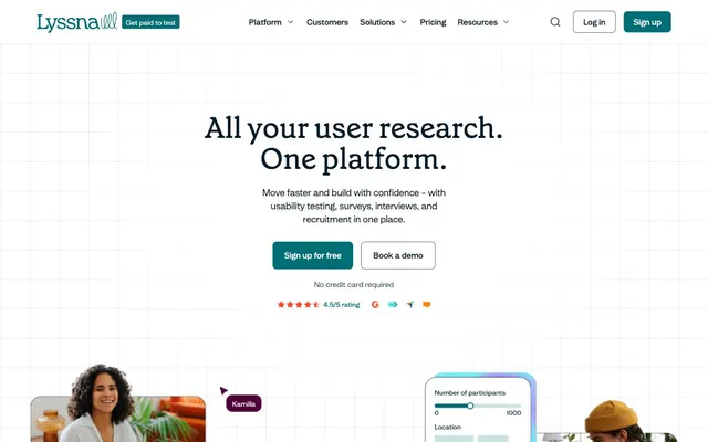
Lyssna cultivates a calm, focused workspace aesthetic with soft, muted background colors and a distinctive rich teal. Typography is functional and modern, balancing a custom sans-serif for body text with a unique display font for headlines. Components are lightweight with subtle rounding, emphasizing content rather than heavy borders or deep shadows. The overall feel is one of approachable professionalism, with color used sparingly to guide interaction.
The page primarily uses a max-width contained layout, centered on 'Canvas White' background, with full-width sections for brand logos (implicitly max-width due to content). The hero section features a centered headline and subtext, followed by two primary ghost and filled action buttons. Below the fold, sections alternate between centered stacks of content and common text-left/image-right (or vice-versa) arrangements, utilizing a default card grid for features. Vertical rhythm is maintained by consistent 24px section gaps, with content organized for comfortable readability and scannability. The navigation is a fixed top bar with standard links and two distinct button actions.
The visual language combines abstract, gradient-filled graphics with clear product screenshots and professional, often unposed, photography. Imagery serves both decorative and explanatory roles. Abstract background gradients (like the Rose Sunset conic gradient) provide atmosphere, while tight product screenshots showcase the UI clearly, often with a subtle white border. Photography features diverse individuals in work settings, maintaining a candid, authentic feel rather than highly stylized lifestyle shots. Icons are filled, monocolor, and have a consistent stroke weight, used sparingly for functionality and subtle decoration. Imagery density is moderate, carefully balanced with text to avoid overwhelming the user.
Reminiscent of Usability Hub, Maze, Hotjar.
# Lyssna — Style Reference
> Serene teal workspace

**Theme:** light

**Site:** https://www.lyssna.com

Lyssna cultivates a calm, focused workspace aesthetic with soft, muted background colors and a distinctive rich teal. Typography is functional and modern, balancing a custom sans-serif for body text with a unique display font for headlines. Components are lightweight with subtle rounding, emphasizing content rather than heavy borders or deep shadows. The overall feel is one of approachable professionalism, with color used sparingly to guide interaction.

## Tokens — Colors

| Name | Value | Token | Role |
|------|------|------|------|
| Zenith Teal | `#006e75` | `--color-zenith-teal` | Primary action buttons, interactive elements, brand highlights |
| Pale Mint | `#b9ffe8` | `--color-pale-mint` | Subtle accent backgrounds, secondary brand highlights, active state indicators |
| Ocean Glimmer | `#0b978e` | `--color-ocean-glimmer` | Interactive link backgrounds, subtle decorative fills |
| Rose Sunset | `#ffb0a4` | `--color-rose-sunset` | Conic gradient start for decorative elements |
| Warm Berry | `#4d0037` | `--color-warm-berry` | Accent backgrounds for decorative panels |
| Soft Magenta | `#ffc3e6` | `--color-soft-magenta` | Accent backgrounds for decorative panels |
| Midnight Pine | `#061d29` | `--color-midnight-pine` | Primary text, heading text, critical UI elements, dark brand accents |
| Arctic Mist | `#e5e7eb` | `--color-arctic-mist` | Subtle borders, dividers, subtle inactive element states |
| Canvas White | `#ffffff` | `--color-canvas-white` | Page backgrounds, primary card surfaces, default UI areas |
| Pale Amber | `#fffded` | `--color-pale-amber` | Secondary card backgrounds, subtle alert backgrounds |
| Soft Stone | `#425d6d` | `--color-soft-stone` | Muted text, secondary borders, less emphasized elements |

## Tokens — Typography

### mint
- **Substitute:** Inter
- **Weights:** 400, 500
- **Sizes:** 12px, 13px, 14px, 15px, 16px, 18px, 20px, 22px, 26px
- **Line height:** 1.22, 1.25, 1.5
- **Letter spacing:** normal
- **Role:** Primary body text, labels, navigation items, and most UI text. The custom font `mint` at weights 400 and 500 maintains a clean, digital aesthetic for readability across various sizes.

### grenette
- **Substitute:** Outfit
- **Weights:** 400
- **Sizes:** 22px, 46px, 60px
- **Line height:** 1.05, 1.15, 1.2
- **Letter spacing:** normal
- **Role:** Display headlines and subheadings. The unique `grenette` font provides a distinct, modern character for larger text, establishing brand presence without being overly bold.

## Tokens — Type Scale

Major Third (1.25) from 14px base.

| Role | Size | Line height | Letter spacing |
|------|------|------|------|
| caption | 12px | 1.5 | — |
| body | 14px | 1.5 | — |
| body-lg | 16px | 1.5 | — |
| subheading | 18px | 1.25 | — |
| heading-sm | 22px | 1.2 | — |
| heading | 26px | 1.22 | — |
| heading-lg | 46px | 1.15 | — |
| display | 60px | 1.05 | — |

## Tokens — Spacing

- **Section gap:** 24px
- **Card padding:** 24px
- **Element gap:** 8px

## Tokens — Radius

- **Buttons:** 8px
- **Cards:** 24px
- **elements:** 12px

## Layout

The page primarily uses a max-width contained layout, centered on 'Canvas White' background, with full-width sections for brand logos (implicitly max-width due to content). The hero section features a centered headline and subtext, followed by two primary ghost and filled action buttons. Below the fold, sections alternate between centered stacks of content and common text-left/image-right (or vice-versa) arrangements, utilizing a default card grid for features. Vertical rhythm is maintained by consistent 24px section gaps, with content organized for comfortable readability and scannability. The navigation is a fixed top bar with standard links and two distinct button actions.

## Imagery

The visual language combines abstract, gradient-filled graphics with clear product screenshots and professional, often unposed, photography. Imagery serves both decorative and explanatory roles. Abstract background gradients (like the Rose Sunset conic gradient) provide atmosphere, while tight product screenshots showcase the UI clearly, often with a subtle white border. Photography features diverse individuals in work settings, maintaining a candid, authentic feel rather than highly stylized lifestyle shots. Icons are filled, monocolor, and have a consistent stroke weight, used sparingly for functionality and subtle decoration. Imagery density is moderate, carefully balanced with text to avoid overwhelming the user.

## Components

### Primary Filled Button
*Call-to-action button for initiating key actions.*

Solid 'Zenith Teal' (#006e75) background, 'Midnight Pine' (#061d29) text, 8px border-radius, padding 16px vertical, 24px horizontal. Text is `mint` font, typically weight 500.

### Ghost Outline Button
*Secondary action button, blends into content.*

Transparent background, 'Midnight Pine' (#061d29) text, 'Arctic Mist' (#e5e7eb) border, 8px border-radius, padding 16px vertical, 24px horizontal. Text is `mint` font, typically weight 500.

### Navigation Link Button
*Navigation items in the header or active states.*

Transparent background, 'Midnight Pine' (#061d29) text, 0px border-radius, 0px vertical padding, 12px horizontal padding. On hover, background uses 'Zenith Teal' (#006e75) with 'Pale Mint' (#b9ffe8) text. Text is `mint` font, typically weight 400.

### Default Card
*Content containers on white backgrounds.*

'Canvas White' (#ffffff) background, 24px border-radius, no shadow, 0px padding by default (content drives interior spacing).

### Accent Card - Pale Amber
*Decorative or highlighted content containers.*

'Pale Amber' (#fffded) background, 24px border-radius, no shadow, 0px padding by default.

### Muted Action Link
*Secondary action or informational links without button styling.*

'Midnight Pine' (#061d29) text, transparent background, with 'Artic Mist' (#e5e7eb) border on focus/hover. Uses `mint` font, 8px radius for containers.

## Guidelines

### Do

- Use 'Midnight Pine' (#061d29) for all primary text and headings.
- Apply 'Zenith Teal' (#006e75) for primary call-to-action buttons, ensuring it's always interactable.
- Maintain a 24px border-radius for all content cards, softening surfaces.
- Employ 'Arctic Mist' (#e5e7eb) for subtle UI dividers, borders, and inactive states.
- Prioritize the `mint` font for all body text, navigation, and functional UI elements.
- Use a base unit of 8px for vertical and horizontal element gaps to maintain comfortable density.
- Structure page sections with a 'Midnight Pine' heading using `grenette` font, followed by `mint` body text.

### Don't

- Avoid using highly saturated colors for large background areas; reserve them for accents or interactive elements.
- Do not introduce heavy shadows or deep elevation; components should feel lightweight and integrated.
- Refrain from using generic system fonts when `mint` or `grenette` are available.
- Do not deviate from the 8px or 24px border-radii for buttons and cards respectively.
- Do not overcrowd sections; maintain the comfortable density with 24px section gaps.
- Never use 'Pale Mint' (#b9ffe8) for text against light backgrounds; its contrast is insufficient.
- Avoid arbitrary gradients; only use the defined conic gradients for decorative elements, not functional UI.

## Agent Prompt Guide

Quick Color Reference:
text: #061d29
background: #ffffff
border: #e5e7eb
accent: #b9ffe8
primary action: #006e75 (filled action)

Example Component Prompts:
1. Create a Primary Action Button: #006e75 background, #ffffff text, 9999px radius, compact pill padding. Use this filled treatment for the main CTA.
2. Create a feature card: 'Pale Amber' (#fffded) background, 24px border-radius, `mint` font for body text set to size 14px, weight 400, 'Midnight Pine' (#061d29). Include an `mint` font heading size 22px, weight 500 'Midnight Pine' (#061d29). Ensure ample 24px padding inside the card.
3. Create a navigation bar: 'Canvas White' (#ffffff) background. Left aligned logo (placeholder). Right aligned 'Navigation Link Button' for 'Platform', 'Customers', 'Solutions', 'Pricing', 'Resources'. End with 'Midnight Pine' (#061d29) 'Ghost Outline Button' for 'Log In' and 'Zenith Teal' (#006e75) 'Primary Filled Button' for 'Sign up'.
More like this









Keep what you find
A free account saves references to boards and can send you a weekly email of picks based on what you save.
To see every result, go Pro.