Preview image. Unlock full-res
Teal-accented architectural blueprint on pristine parchment.
Color palette
Teal action color for filled buttons, selected navigation states, and focused conversion moments
Outlined button borders, active navigation link borders
Secondary action buttons, subtle brand accents — a complementary, slightly softer active state
Tertiary action buttons, particularly on darker backgrounds or for specialized features
Outlined button borders for secondary actions or tags, decorative accents. A soft counterpoint to the dominant teal
Decorative background fills for visual sections or emphasis
Outline button borders for informational tags or categories
Primary page background — a soft, cool neutral that feels expansive
Card backgrounds, elevated UI elements, text on dark backgrounds
Primary text, core iconography, borders for ghost buttons and outlines
Primary headings on light backgrounds, strong emphasis text
Subtle surface differentiation for cards or sections, button backgrounds
Light border for outline buttons, subtle text accents
Typography
- Weights
- 400, 500, 700
- Sizes
- 12px, 13px, 14px, 16px, 18px, 19px, 20px, 22px, 24px
- Line height
- 1, 1.27, 1.33, 1.38, 1.4, 1.43, 1.44, 1.46, 1.5, 1.53, 1.56, 1.71, 2
- Letter spacing
- -0.0100em, -0.0090em, 0.0430em
- Fallback
- Montserrat, Lato
Primary UI text, body copy, navigation, buttons, and form labels. Its geometric yet friendly presence ensures clarity across functional elements. Note the slight negative letter-spacing on larger sizes at -0.01em for improved visual density.
- Weights
- 400, 500
- Sizes
- 30px, 44px, 50px, 64px
- Line height
- 1.16, 1.2, 1.32, 1.33
- Fallback
- Merriweather, Playfair Display
Primary headings. This serif font provides a distinct, authoritative voice for main titles and section headers, contrasting with the sans-serif body text for clear hierarchy.
- Weights
- 700
- Sizes
- 30px, 36px, 50px
- Line height
- 1.17, 1.2, 1.33
- Fallback
- Merriweather Italic, Playfair Display Italic
Emphatic headings and callouts, leveraging its italic style for visual flair within larger headings.
- Weights
- 400, 500, 600
- Sizes
- 13px, 14px, 15px, 17px, 20px
- Line height
- 1.3, 1.57, 1.69, 2.24, 2.76
- Letter spacing
- 0.0380em, 0.0590em
- Fallback
- Roboto Mono, Space Mono
Used for code snippets, data displays, and instances requiring a technical or structured feel, providing clear legibility for numerical or code-like information.
Spacing & shape
Components
Background: Oceanic Teal (#1c5d5f). Text: Polar White (#ffffff). Border radius: 48px. Padding: 14px vertical, 22px horizontal. This button signals key interactions.
Background: Emerald Green (#156152). Text: Polar White (#ffffff). Border radius: 48px. Padding: 14px vertical, 22px horizontal. Provides a slightly different emphasis than the primary teal.
Background: rgba(0,0,0,0) (transparent). Text: Inkwell Black (#000000). Border: 1px solid Inkwell Black (#000000). Border radius: 88px. Padding: 12px vertical, 20px-30px horizontal. This button offers a lightweight interaction.
Background: rgba(0,0,0,0). Text: Inkwell Black (#000000). Border: 1px solid Sky Blue (#a2cbcd). Border radius: 100px. Padding: 3.2px vertical, 16px horizontal. Clearly defines interactive categories.
Background: rgba(0,0,0,0). Text: Inkwell Black (#000000). Border: 1px solid Berry Blush (#d6aec1). Border radius: 100px. Padding: 3.2px vertical, 16px horizontal. Offers a distinct visual for different tag groups.
Default state: Inkwell Black (#000000), Sofia Pro weight 400. Hover/active state: Inkwell Black (#000000) with a 1px border-bottom of Deep Teal (#0e4749). Padding: 12px vertical, 10px horizontal. Creates a clear, interactive top-level navigation.
Background: Cloud Frost (#e4f0f1). Text: Inkwell Black (#000000). Padding sufficient to hold content. Often includes a distinct icon and link. Example: the 'AI-Assisted, Human Led' banner.
Guidelines
- Prioritize Canvas Ice (#f2f8f7) for primary page backgrounds to maintain an open and airy feel.
- Use Oceanic Teal (#1c5d5f) for all primary calls-to-action, ensuring visual prominence and consistency.
- Apply rounded corners generously: 48px for most buttons and 88px for larger interactive areas or cards for a friendly, organic aesthetic.
- Employ `p22-mackinac-pro` (serif) for all main headings (H1-H3) and `sofia-pro` (sans-serif) for body text and UI elements to establish clear typographic hierarchy.
- Maintain generous vertical spacing between sections, aiming for a minimum of 88px to prevent visual clutter and provide comfortable reading breaks.
- Avoid deviating from the defined primary (Oceanic Teal) and secondary (Emerald Green) button colors for main actions; do not introduce new saturated hues.
- Do not use sharp corners; the system's aesthetic relies on significant radius values for all interactive and card-like components.
- Refrain from using `IBM Plex Mono` for general body text or headings; reserve it strictly for data, code, or technical information.
- Do not use dark backgrounds for entire page sections unless leveraging an accent color from the `accent` group, maintaining the light theme's dominance.
- Avoid over-emphasizing every link or interactive element with a border; ghost buttons with Inkwell Black outlines or subtle Deep Teal underlinings are preferred for secondary actions.
About this system
ShowHide
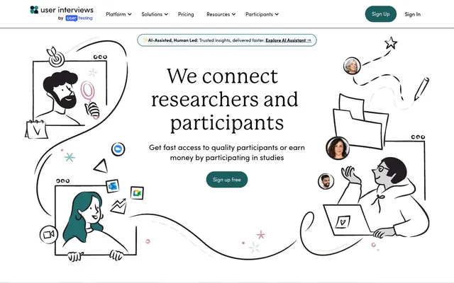
User Interviews employs a crisp, clear, and confident interface, building on a foundation of clean neutrals and a distinctive teal accent. Layouts are spacious, prioritizing readability and direct interaction. Typography balances approachability with clarity, while a preference for rounded, organic shapes softens the overall structure, creating a friendly yet authoritative digital workspace. Interactive elements are clearly defined through color and shape, maintaining a focus on user flow.
The page primarily follows a max-width contained layout, likely around 1200px, centering content for readability. The hero section is a full-width experience, featuring a prominent, centered headline over a playful background illustration. Subsequent sections alternate between light backgrounds (Canvas Ice) and occasionally subtle shifts (Cloud Frost). Content is often arranged in 2-column text + image layouts, or centered stacks for stronger statements. Feature sets are presented in multi-column card grids. Vertical rhythm is established through consistent section gaps (around 88px), creating distinct content blocks. The navigation is a sticky top bar with a clear brand logo on the left and prominent 'Sign Up' and 'Sign In' buttons on the right.
The site uses a clean, line-art illustration style, predominantly monochromatic (Inkwell Black strokes) with subtle color accents like Oceanic Teal or Emerald Green fills. The illustrations are organic and whimsical, depicting diverse individuals interacting with technology or in research settings, often contained within soft, rounded shapes or appearing as playful background elements. Photography is minimal, typically headshots of individuals within testimonial or team contexts. Icons are outlined, simple, and functional, maintaining a light stroke weight. Imagery primarily serves to enhance the brand's friendly and accessible atmosphere, explaining concepts through visual narrative and adding personality without overwhelming the UI.
Reminiscent of Typeform, Airtable, Coda, Figma.
# User Interviews — Style Reference
> Teal-accented architectural blueprint on pristine parchment.

**Theme:** light

**Site:** https://www.userinterviews.com

User Interviews employs a crisp, clear, and confident interface, building on a foundation of clean neutrals and a distinctive teal accent. Layouts are spacious, prioritizing readability and direct interaction. Typography balances approachability with clarity, while a preference for rounded, organic shapes softens the overall structure, creating a friendly yet authoritative digital workspace. Interactive elements are clearly defined through color and shape, maintaining a focus on user flow.

## Tokens — Colors

| Name | Value | Token | Role |
|------|------|------|------|
| Oceanic Teal | `#1c5d5f` | `--color-oceanic-teal` | Teal action color for filled buttons, selected navigation states, and focused conversion moments |
| Deep Teal | `#0e4749` | `--color-deep-teal` | Outlined button borders, active navigation link borders |
| Emerald Green | `#156152` | `--color-emerald-green` | Secondary action buttons, subtle brand accents — a complementary, slightly softer active state |
| Deep Sapphire | `#16325a` | `--color-deep-sapphire` | Tertiary action buttons, particularly on darker backgrounds or for specialized features |
| Berry Blush | `#d6aec1` | `--color-berry-blush` | Outlined button borders for secondary actions or tags, decorative accents. A soft counterpoint to the dominant teal |
| Deep Berry | `#662344` | `--color-deep-berry` | Decorative background fills for visual sections or emphasis |
| Sky Blue | `#a2cbcd` | `--color-sky-blue` | Outline button borders for informational tags or categories |
| Canvas Ice | `#f2f8f7` | `--color-canvas-ice` | Primary page background — a soft, cool neutral that feels expansive |
| Polar White | `#ffffff` | `--color-polar-white` | Card backgrounds, elevated UI elements, text on dark backgrounds |
| Inkwell Black | `#000000` | `--color-inkwell-black` | Primary text, core iconography, borders for ghost buttons and outlines |
| Slate Gray | `#283338` | `--color-slate-gray` | Primary headings on light backgrounds, strong emphasis text |
| Cloud Frost | `#e4f0f1` | `--color-cloud-frost` | Subtle surface differentiation for cards or sections, button backgrounds |
| Misty Teal | `#cae1e2` | `--color-misty-teal` | Light border for outline buttons, subtle text accents |

## Tokens — Typography

### sofia-pro
- **Substitute:** Montserrat, Lato
- **Weights:** 400, 500, 700
- **Sizes:** 12px, 13px, 14px, 16px, 18px, 19px, 20px, 22px, 24px
- **Line height:** 1, 1.27, 1.33, 1.38, 1.4, 1.43, 1.44, 1.46, 1.5, 1.53, 1.56, 1.71, 2
- **Letter spacing:** -0.0100em, -0.0090em, 0.0430em
- **Role:** Primary UI text, body copy, navigation, buttons, and form labels. Its geometric yet friendly presence ensures clarity across functional elements. Note the slight negative letter-spacing on larger sizes at -0.01em for improved visual density.

### p22-mackinac-pro
- **Substitute:** Merriweather, Playfair Display
- **Weights:** 400, 500
- **Sizes:** 30px, 44px, 50px, 64px
- **Line height:** 1.16, 1.2, 1.32, 1.33
- **Role:** Primary headings. This serif font provides a distinct, authoritative voice for main titles and section headers, contrasting with the sans-serif body text for clear hierarchy.

### P 22 Mackinac italic
- **Substitute:** Merriweather Italic, Playfair Display Italic
- **Weights:** 700
- **Sizes:** 30px, 36px, 50px
- **Line height:** 1.17, 1.2, 1.33
- **Role:** Emphatic headings and callouts, leveraging its italic style for visual flair within larger headings.

### IBM Plex Mono
- **Substitute:** Roboto Mono, Space Mono
- **Weights:** 400, 500, 600
- **Sizes:** 13px, 14px, 15px, 17px, 20px
- **Line height:** 1.3, 1.57, 1.69, 2.24, 2.76
- **Letter spacing:** 0.0380em, 0.0590em
- **Role:** Used for code snippets, data displays, and instances requiring a technical or structured feel, providing clear legibility for numerical or code-like information.

## Tokens — Type Scale

Augmented Fourth (1.414) from 14px base.

| Role | Size | Line height | Letter spacing |
|------|------|------|------|
| caption | 12px | 1.5 | 0.516px |
| body | 14px | 1.57 | -0.126px |
| heading-sm | 18px | 1.44 | -0.18px |
| heading | 24px | 1.33 | -0.24px |
| heading-lg | 44px | 1.2 | -0.44px |
| display | 64px | 1.16 | -0.64px |

## Tokens — Spacing

- **Section gap:** 88px
- **Card padding:** 16px
- **Element gap:** 8px

## Tokens — Radius

- **Buttons:** 48px
- **forms:** 88px
- **largeElements:** 88px
- **pills:** 1000px
- **tags:** 100px

## Layout

The page primarily follows a max-width contained layout, likely around 1200px, centering content for readability. The hero section is a full-width experience, featuring a prominent, centered headline over a playful background illustration. Subsequent sections alternate between light backgrounds (Canvas Ice) and occasionally subtle shifts (Cloud Frost). Content is often arranged in 2-column text + image layouts, or centered stacks for stronger statements. Feature sets are presented in multi-column card grids. Vertical rhythm is established through consistent section gaps (around 88px), creating distinct content blocks. The navigation is a sticky top bar with a clear brand logo on the left and prominent 'Sign Up' and 'Sign In' buttons on the right.

## Imagery

The site uses a clean, line-art illustration style, predominantly monochromatic (Inkwell Black strokes) with subtle color accents like Oceanic Teal or Emerald Green fills. The illustrations are organic and whimsical, depicting diverse individuals interacting with technology or in research settings, often contained within soft, rounded shapes or appearing as playful background elements. Photography is minimal, typically headshots of individuals within testimonial or team contexts. Icons are outlined, simple, and functional, maintaining a light stroke weight. Imagery primarily serves to enhance the brand's friendly and accessible atmosphere, explaining concepts through visual narrative and adding personality without overwhelming the UI.

## Components

### Primary Filled Button - Oceanic Teal
*Main call-to-action.*

Background: Oceanic Teal (#1c5d5f). Text: Polar White (#ffffff). Border radius: 48px. Padding: 14px vertical, 22px horizontal. This button signals key interactions.

### Secondary Filled Button - Emerald Green
*Alternative call-to-action, active state for related actions.*

Background: Emerald Green (#156152). Text: Polar White (#ffffff). Border radius: 48px. Padding: 14px vertical, 22px horizontal. Provides a slightly different emphasis than the primary teal.

### Ghost Button - Inkwell Black
*Subtle calls to action or navigation links.*

Background: rgba(0,0,0,0) (transparent). Text: Inkwell Black (#000000). Border: 1px solid Inkwell Black (#000000). Border radius: 88px. Padding: 12px vertical, 20px-30px horizontal. This button offers a lightweight interaction.

### Outlined Tag Button - Sky Blue
*Filter tags or categorization buttons.*

Background: rgba(0,0,0,0). Text: Inkwell Black (#000000). Border: 1px solid Sky Blue (#a2cbcd). Border radius: 100px. Padding: 3.2px vertical, 16px horizontal. Clearly defines interactive categories.

### Outlined Tag Button - Berry Blush
*Alternative tag style, secondary filter options.*

Background: rgba(0,0,0,0). Text: Inkwell Black (#000000). Border: 1px solid Berry Blush (#d6aec1). Border radius: 100px. Padding: 3.2px vertical, 16px horizontal. Offers a distinct visual for different tag groups.

### Navigation Link
*Primary navigation items within the header.*

Default state: Inkwell Black (#000000), Sofia Pro weight 400. Hover/active state: Inkwell Black (#000000) with a 1px border-bottom of Deep Teal (#0e4749). Padding: 12px vertical, 10px horizontal. Creates a clear, interactive top-level navigation.

### Info Banner
*Prominent informational messages or announcements.*

Background: Cloud Frost (#e4f0f1). Text: Inkwell Black (#000000). Padding sufficient to hold content. Often includes a distinct icon and link. Example: the 'AI-Assisted, Human Led' banner.

## Guidelines

### Do

- Prioritize Canvas Ice (#f2f8f7) for primary page backgrounds to maintain an open and airy feel.
- Use Oceanic Teal (#1c5d5f) for all primary calls-to-action, ensuring visual prominence and consistency.
- Apply rounded corners generously: 48px for most buttons and 88px for larger interactive areas or cards for a friendly, organic aesthetic.
- Employ `p22-mackinac-pro` (serif) for all main headings (H1-H3) and `sofia-pro` (sans-serif) for body text and UI elements to establish clear typographic hierarchy.
- Maintain generous vertical spacing between sections, aiming for a minimum of 88px to prevent visual clutter and provide comfortable reading breaks.

### Don't

- Avoid deviating from the defined primary (Oceanic Teal) and secondary (Emerald Green) button colors for main actions; do not introduce new saturated hues.
- Do not use sharp corners; the system's aesthetic relies on significant radius values for all interactive and card-like components.
- Refrain from using `IBM Plex Mono` for general body text or headings; reserve it strictly for data, code, or technical information.
- Do not use dark backgrounds for entire page sections unless leveraging an accent color from the `accent` group, maintaining the light theme's dominance.
- Avoid over-emphasizing every link or interactive element with a border; ghost buttons with Inkwell Black outlines or subtle Deep Teal underlinings are preferred for secondary actions.

## Agent Prompt Guide

**Quick Color Reference**
text: #000000
background: #f2f8f7
border: #000000
accent: #1c5d5f
primary action: #1c5d5f (filled action)

**3-5 Example Component Prompts**
1. Create a Primary Action Button: #1c5d5f background, #ffffff text, 9999px radius, compact pill padding. Use this filled treatment for the main CTA.
2. Create a secondary content card: Polar White (#ffffff) background, 88px corner radius. Headline 'Find qualified participants, fast' using p22-mackinac-pro weight 400 at 30px, Inkwell Black (#000000). Body text in sofia-pro weight 400 at 16px, Inkwell Black (#000000). Include a Secondary Filled Button - Emerald Green with text 'Explore Recruit'.
4. Create a filter/tag component: Outlined Tag Button - Sky Blue with text 'user research'. Padding 3.2px vertical, 16px horizontal.
5. Design an info banner: Cloud Frost (#e4f0f1) background. Text 'AI-Assisted, Human Led: Trusted insights, delivered faster.' in sofia-pro weight 400 at 14px, Inkwell Black (#000000).
More like this









Keep what you find
A free account saves references to boards and can send you a weekly email of picks based on what you save.
To see every result, go Pro.