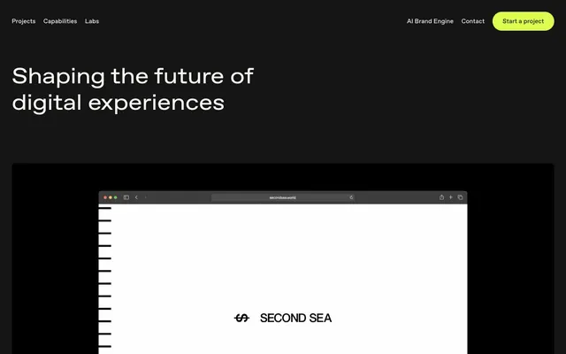
Preview image. Unlock full-res
Neon on Obsidian: Precision text and vivid accents against a deep, dark canvas.
Color palette
Primary brand accent and interactive element highlight – used for CTA backgrounds, active button text, and decorative borders. Its vividness creates immediate focal points
A secondary accent used sparingly for decorative elements or specific visual cues, providing an alternative bright highlight
Primary background for pages and cards, maintaining a stark, high-contrast base
Secondary surface background for nested cards and input fields, adding a subtle layer distinction
Primary text color and significant border elements, providing crisp readability against dark backgrounds
Muted text for helper links and secondary information, offering a softer hierarchy
Dark borders and separators for elevated surfaces and inverted UI.
Typography
- Weights
- 400
- Sizes
- 40px, 56px
- Line height
- 1.2
- Letter spacing
- -0.02
Favorit extended — detected in extracted data but not described by AI
- Weights
- 400
- Sizes
- 11px, 12px, 13px, 16px, 24px
- Line height
- 1, 1.2, 1.3, 1.35, 1.4, 1.42, 1.5
- Letter spacing
- -0.0200em for display sizes (40px, 56px), normal for smaller text
- Fallback
- system-ui, sans-serif
The sole typeface, 'Favorit', serves all textual content. Its consistent use in weight 400 across various sizes, combined with its distinct letter-spacing for headings (sizes 40px, 56px), establishes a cohesive yet dynamic typographic voice. The 'ss04' feature implies a specific stylistic set for unique character forms, contributing to its signature look.
Spacing & shape
Components
Filled with Switchblade Green (#dcff4f), text in Onyx Graphite (#151515) at Favorit weight 400. Features a 50px border-radius, creating a distinct pill shape. Padding is 14px vertical, 32px horizontal.
Background is Midnight Ink (#000000) with a subtle 8px border-radius. No explicit padding inside, content is implicitly spaced.
Background in Onyx Graphite (#151515), with an 8px border-radius, maintaining strong contrast against the page background. No explicit padding.
Background Onyx Graphite (#151515), text Floral Veil (#faf9f4). Has a 2px Floral Veil (#faf9f4) border and a 16px border-radius. Padding of 26px vertical, 24px horizontal.
Text in Floral Veil (#faf9f4) with no background or border, presenting minimal visual weight. Underline hover effect is often present but not captured in static state. Padding 11px vertical.
Text in Soft Silver (#bdbdbd) or Warm Gray (#666666), with no specific background or borders. Used for 'Read more' or policy links, often with an associated border in the same color.
Guidelines
- Always use Midnight Ink (#000000) as the base background for pages and main content blocks.
- Highlight primary actions with Switchblade Green (#dcff4f) for backgrounds, ensuring text uses a dark neutral like Onyx Graphite (#151515) for contrast.
- Apply Favorit at weight 400 for all typography, adjusting letter-spacing to -0.020em only for display headings (40px, 56px).
- Utilize 50px border-radius for all interactive buttons to create a consistent pill shape, and 8px for cards.
- Maintain a clear functional hierarchy using Floral Veil (#faf9f4) for primary text, Soft Silver (#bdbdbd) for secondary text, and Warm Gray (#666666) for tertiary text.
- Separate major sections with a consistent `sectionGap` of 81px to create a spacious rhythm.
- Use Onyx Graphite (#151515) for nested surfaces or input fields to provide subtle depth against the main Midnight Ink (#000000) background.
- Avoid introducing additional chromatic colors beyond Switchblade Green (#dcff4f) and Emerald Spark (#51d287) to preserve the stark brand identity.
- Do not vary font weights beyond 400 for Favorit; all typographic emphasis should be achieved through size and letter-spacing.
- Do not use subtle shadows for elevation; rely on background color changes or strong borders if elevation is required.
- Avoid applying tight padding on cards; maintain comfortable internal spacing with a minimum of 16px to 24px where content is present.
- Never use full-width sections without some horizontal padding; content should always feel contained even in full-bleed patterns.
- Do not use generic system fonts; always specify 'Favorit' or its defined substitute to maintain brand consistency.
- Avoid centered text blocks for large amounts of body copy; prefer left-aligned text for readability in the dark theme.
About this system
ShowHide
Madebyon uses a high-contrast dark aesthetic where deep black surfaces meet vivid neon green accents. Typography is compact and precise, maintaining readability against dark backgrounds with a single sans-serif typeface that subtly shifts its tracking for emphasis. Components are defined by sharp corners and generous padding, creating a distinct, confident presence, with interactive elements highlighted by a 'switched-on' luminous green. The overall impression is one of modern, refined competence.
The page model is primarily full-bleed with content contained within implied horizontal margins, giving a sense of expansive space. The hero section is full-bleed, dark, featuring a large, centered headline against the dark background. Section rhythm is consistent, separated by the significant `sectionGap` of 81px, with visual breaks often marked by full-width dark sections alternating with slightly deeper dark surfaces. Content often alternates between large centered text blocks and two-column layouts featuring text on one side and a product image or abstract visual on the other. A card grid is used for testimonials, presenting information in neat, uniform blocks. Navigation is a fixed top bar, minimal and unobtrusive, featuring ghost links and a single primary action button.
The visual language relies heavily on clean product screenshots and abstract or conceptual graphics. Photography tends toward product-focused shots or highly stylized, sometimes desaturated, close-ups with tight crops to eliminate distracting backgrounds. Illustrations are minimal, often geometric or abstract, used primarily for decorative flair rather than information conveyance. Icons are outlined, simple, and monochromatic, aligning with the UI's clean aesthetic. Imagery is sparse, serving primarily to add decorative atmosphere or demonstrate product context, making the site feel text-dominant.
Reminiscent of Stripe, Linear, Figma, Vercel.
# Madebyon — Style Reference
> Neon on Obsidian: Precision text and vivid accents against a deep, dark canvas.

**Theme:** dark

**Site:** https://www.madebyon.com

Madebyon uses a high-contrast dark aesthetic where deep black surfaces meet vivid neon green accents. Typography is compact and precise, maintaining readability against dark backgrounds with a single sans-serif typeface that subtly shifts its tracking for emphasis. Components are defined by sharp corners and generous padding, creating a distinct, confident presence, with interactive elements highlighted by a 'switched-on' luminous green. The overall impression is one of modern, refined competence.

## Tokens — Colors

| Name | Value | Token | Role |
|------|------|------|------|
| Switchblade Green | `#dcff4f` | `--color-switchblade-green` | Primary brand accent and interactive element highlight – used for CTA backgrounds, active button text, and decorative borders. Its vividness creates immediate focal points |
| Emerald Spark | `#51d287` | `--color-emerald-spark` | A secondary accent used sparingly for decorative elements or specific visual cues, providing an alternative bright highlight |
| Midnight Ink | `#000000` | `--color-midnight-ink` | Primary background for pages and cards, maintaining a stark, high-contrast base |
| Onyx Graphite | `#151515` | `--color-onyx-graphite` | Secondary surface background for nested cards and input fields, adding a subtle layer distinction |
| Floral Veil | `#faf9f4` | `--color-floral-veil` | Primary text color and significant border elements, providing crisp readability against dark backgrounds |
| Soft Silver | `#bdbdbd` | `--color-soft-silver` | Muted text for helper links and secondary information, offering a softer hierarchy |
| Warm Gray | `#666666` | `--color-warm-gray` | Dark borders and separators for elevated surfaces and inverted UI. |

## Tokens — Typography

### Favorit extended
- **Weights:** 400
- **Sizes:** 40px, 56px
- **Line height:** 1.2
- **Letter spacing:** -0.02
- **Role:** Favorit extended — detected in extracted data but not described by AI

### Favorit
- **Substitute:** system-ui, sans-serif
- **Weights:** 400
- **Sizes:** 11px, 12px, 13px, 16px, 24px
- **Line height:** 1, 1.2, 1.3, 1.35, 1.4, 1.42, 1.5
- **Letter spacing:** -0.0200em for display sizes (40px, 56px), normal for smaller text
- **Role:** The sole typeface, 'Favorit', serves all textual content. Its consistent use in weight 400 across various sizes, combined with its distinct letter-spacing for headings (sizes 40px, 56px), establishes a cohesive yet dynamic typographic voice. The 'ss04' feature implies a specific stylistic set for unique character forms, contributing to its signature look.

## Tokens — Type Scale

Minor Third (1.2) from 13px base.

| Role | Size | Line height | Letter spacing |
|------|------|------|------|
| caption | 11px | 1.35 | — |
| body-sm | 12px | 1.35 | — |
| body | 13px | 1.35 | — |
| body-lg | 16px | 1.35 | — |
| heading-sm | 24px | 1.3 | — |

## Tokens — Spacing

- **Section gap:** 81px
- **Card padding:** 16px
- **Element gap:** 16px

## Tokens — Radius

- **Buttons:** 50px
- **Inputs:** 16px
- **Cards:** 8px
- **bodyElements:** 24px
- **navItems:** 50px
- **tags:** 999px

## Layout

The page model is primarily full-bleed with content contained within implied horizontal margins, giving a sense of expansive space. The hero section is full-bleed, dark, featuring a large, centered headline against the dark background. Section rhythm is consistent, separated by the significant `sectionGap` of 81px, with visual breaks often marked by full-width dark sections alternating with slightly deeper dark surfaces. Content often alternates between large centered text blocks and two-column layouts featuring text on one side and a product image or abstract visual on the other. A card grid is used for testimonials, presenting information in neat, uniform blocks. Navigation is a fixed top bar, minimal and unobtrusive, featuring ghost links and a single primary action button.

## Imagery

The visual language relies heavily on clean product screenshots and abstract or conceptual graphics. Photography tends toward product-focused shots or highly stylized, sometimes desaturated, close-ups with tight crops to eliminate distracting backgrounds. Illustrations are minimal, often geometric or abstract, used primarily for decorative flair rather than information conveyance. Icons are outlined, simple, and monochromatic, aligning with the UI's clean aesthetic. Imagery is sparse, serving primarily to add decorative atmosphere or demonstrate product context, making the site feel text-dominant.

## Components

### Primary Action Button
*Call-to-action button, signaling key interactive elements.*

Filled with Switchblade Green (#dcff4f), text in Onyx Graphite (#151515) at Favorit weight 400. Features a 50px border-radius, creating a distinct pill shape. Padding is 14px vertical, 32px horizontal.

### Testimonial Card
*Container for client testimonials.*

Background is Midnight Ink (#000000) with a subtle 8px border-radius. No explicit padding inside, content is implicitly spaced.

### Nested Card
*Secondary content container within primary black cards.*

Background in Onyx Graphite (#151515), with an 8px border-radius, maintaining strong contrast against the page background. No explicit padding.

### Input Field
*Form input elements for user data entry.*

Background Onyx Graphite (#151515), text Floral Veil (#faf9f4). Has a 2px Floral Veil (#faf9f4) border and a 16px border-radius. Padding of 26px vertical, 24px horizontal.

### Ghost Navigation Link
*Main navigation links in the header.*

Text in Floral Veil (#faf9f4) with no background or border, presenting minimal visual weight. Underline hover effect is often present but not captured in static state. Padding 11px vertical.

### Text Link - Muted
*Secondary or informational links, often found in footers.*

Text in Soft Silver (#bdbdbd) or Warm Gray (#666666), with no specific background or borders. Used for 'Read more' or policy links, often with an associated border in the same color.

## Guidelines

### Do

- Always use Midnight Ink (#000000) as the base background for pages and main content blocks.
- Highlight primary actions with Switchblade Green (#dcff4f) for backgrounds, ensuring text uses a dark neutral like Onyx Graphite (#151515) for contrast.
- Apply Favorit at weight 400 for all typography, adjusting letter-spacing to -0.020em only for display headings (40px, 56px).
- Utilize 50px border-radius for all interactive buttons to create a consistent pill shape, and 8px for cards.
- Maintain a clear functional hierarchy using Floral Veil (#faf9f4) for primary text, Soft Silver (#bdbdbd) for secondary text, and Warm Gray (#666666) for tertiary text.
- Separate major sections with a consistent `sectionGap` of 81px to create a spacious rhythm.
- Use Onyx Graphite (#151515) for nested surfaces or input fields to provide subtle depth against the main Midnight Ink (#000000) background.

### Don't

- Avoid introducing additional chromatic colors beyond Switchblade Green (#dcff4f) and Emerald Spark (#51d287) to preserve the stark brand identity.
- Do not vary font weights beyond 400 for Favorit; all typographic emphasis should be achieved through size and letter-spacing.
- Do not use subtle shadows for elevation; rely on background color changes or strong borders if elevation is required.
- Avoid applying tight padding on cards; maintain comfortable internal spacing with a minimum of 16px to 24px where content is present.
- Never use full-width sections without some horizontal padding; content should always feel contained even in full-bleed patterns.
- Do not use generic system fonts; always specify 'Favorit' or its defined substitute to maintain brand consistency.
- Avoid centered text blocks for large amounts of body copy; prefer left-aligned text for readability in the dark theme.

## Agent Prompt Guide

**Quick Color Reference**
text: #faf9f4
background: #000000
border: #bdbdbd
accent: #dcff4f
primary action: #dcff4f (filled action)

**3-5 Example Component Prompts**
1. Create a hero section: Midnight Ink (#000000) background. Headline 'Shaping the future' at Favorit 56px weight 400, #faf9f4, letter-spacing -0.020em. Subtext 'Building high-impact digital experiences' at Favorit 24px weight 400, #faf9f4.
2. Design a primary action button: Switchblade Green (#dcff4f) background, text 'Start a project' in Onyx Graphite (#151515) at Favorit 16px weight 400. Use 50px border-radius and 14px vertical, 32px horizontal padding.
3. Build a testimonial card: Midnight Ink (#000000) background, 8px border-radius. Text 'Loved their approach' in Floral Veil (#faf9f4) at Favorit 16px weight 400. Muted attribution 'John Doe, CEO' in Soft Silver (#bdbdbd) at Favorit 13px weight 400.
4. Create an input field: Onyx Graphite (#151515) background, 16px border-radius. Border is 1px solid Floral Veil (#faf9f4). Placeholder text 'Your email' in Soft Silver (#bdbdbd) at Favorit 16px weight 400. Padding 26px vertical, 24px horizontal.
5. Assemble a navigation link: Text 'Capabilities' in Floral Veil (#faf9f4) at Favorit 16px weight 400. No background or border. Use 11px vertical padding.
More like this








Keep what you find
A free account saves references to boards and can send you a weekly email of picks based on what you save.
To see every result, go Pro.