Preview image. Unlock full-res
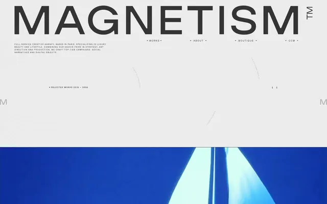
High-fashion editorial canvas
Color palette
Primary text, deep surface undertones, high-contrast accents against lighter background
Page background, foundational dark areas
Primary text on dark backgrounds, active navigation elements, hairline borders
Muted text, secondary navigation items, subtle background distinctions
Decorative strokes, subtle UI lines, alternative muted text color
Hover states for light text elements, subtle background variations
Helper text, tertiary navigation links
Typography
- Weights
- 300, 400, 500
- Sizes
- 8px, 10px, 11px, 14px, 16px, 20px
- Line height
- 1, 1.5, 2, 2.5
- Letter spacing
- -0.04em at 20px, 0.1em at 14px, 0.22em at 10px
- Fallback
- Montserrat
Primary typeface for all text content including headlines, body, navigation, and captions. Its slightly extended letterforms with varied tracking contribute to a refined, spacious feel.
- Weights
- 400
- Sizes
- 24px
- Line height
- 1.5
- Letter spacing
- normal
- Fallback
- Inter
Used for specific body text sections, providing a contrasting legibility against the primary typeface. Its slightly wider, more geometric form adds a subtle shift in tone.
Spacing & shape
Components
Text link in Silver Mist (#e5e7eb) with 7px right and 9px left padding. On hover, text becomes Graphite (#343434). Inactive links are Muted Gray (#aaaaaa).
Text in Silver Mist (#e5e7eb) with 32px padding, often accompanied by hairline borders (#e5e7eb).
Completely borderless and shadowless, with 0px radius. Relies on its visual content (images) and surrounding negative space for definition. Text in Silver Mist (#e5e7eb).
1px solid line in Silver Mist (#e5e7eb), providing subtle structural definition against dark backgrounds.
Text in Muted Gray (#aaaaaa) with 12px right and 14px left padding, no underline by default.
Guidelines
- Prioritize Silver Mist (#e5e7eb) for all primary text on dark backgrounds to maintain high contrast and the signature aesthetic.
- Use TT Hoves Pro Trial with varied letter spacing (e.g., 0.1000em for smaller text, normal for headlines) to establish a distinct typographic rhythm.
- Define UI elements through hairline borders (1px solid #e5e7eb) rather than heavy fills or shadows.
- Maintain a spacious content-empty border around page elements, allowing visuals to breathe.
- Employ the 0px border-radius system-wide for a sharp, angular component aesthetic.
- Ensure large, impactful imagery dominates sections, often full-bleed, with minimal surrounding UI elements.
- Avoid using box-shadows or elevation effects; the design relies on flat surfaces and borders for depth.
- Do not deviate from the achromatic color palette; saturated or bright colors are reserved for content imagery only.
- Do not introduce rounded corners on any UI elements; all corners should be sharp 0px radius.
- Refrain from using heavy fills for buttons or interactive elements; prefer ghosted or outlined styles.
- Avoid dense UIs; prioritize ample negative space and large content blocks over compact information displays.
About this system
ShowHide
Magnetism presents a stark, high-contrast aesthetic reminiscent of an editorial spread. Its theme is dark with light gray typography and hairline borders, creating a sophisticated tension. The layout is structured yet fluid, with large, impactful imagery anchoring blocks of stark typography. Components are minimal, often ghosted or outlined, allowing content and photography to dominate the visual field.
The page uses a full-bleed model, with content stretching to the viewport edges, but internal content is implicitly centered, giving the impression of a wide, unconstrained canvas. The hero is a full-bleed image with centered, large-format typography overlaying it. Section rhythm is driven by alternating large image blocks, often with left-aligned or centered text overlays. Content arrangement is primarily a single column for large hero sections, transitioning to two columns for work showcases where image and text exist side-by-side. The density is spacious, ensuring significant breathing room around visual and typographic elements. Navigation is a minimal sticky header with text links.
The site heavily relies on high-quality, full-bleed photography and art-directed product shots. These images are the primary visual content, often occupying significant screen real estate. The treatment is often full-bleed with sharp, raw edges, integrating directly into the layout without frames or masks. Photography ranges from vibrant, richly colored lifestyle and product shots to more subdued, artistic compositions, occasionally featuring strong blues. It serves primarily as product showcase and mood-setting atmosphere, creating a visually rich and distinctive brand identity.
Reminiscent of Acme Co., FutureDeluxe, Build in Amsterdam, Sagmeister & Walsh, Bureau for Visual Affairs.
# Magnetism — Style Reference
> High-fashion editorial canvas

**Theme:** dark

**Site:** https://www.magnetism.fr/en

Magnetism presents a stark, high-contrast aesthetic reminiscent of an editorial spread. Its theme is dark with light gray typography and hairline borders, creating a sophisticated tension. The layout is structured yet fluid, with large, impactful imagery anchoring blocks of stark typography. Components are minimal, often ghosted or outlined, allowing content and photography to dominate the visual field.

## Tokens — Colors

| Name | Value | Token | Role |
|------|------|------|------|
| Rich Black | `#222222` | `--color-rich-black` | Primary text, deep surface undertones, high-contrast accents against lighter background |
| Night Canvas | `#000000` | `--color-night-canvas` | Page background, foundational dark areas |
| Silver Mist | `#e5e7eb` | `--color-silver-mist` | Primary text on dark backgrounds, active navigation elements, hairline borders |
| Graphite | `#343434` | `--color-graphite` | Muted text, secondary navigation items, subtle background distinctions |
| Cool Steel | `#dbdbdb` | `--color-cool-steel` | Decorative strokes, subtle UI lines, alternative muted text color |
| Pale Ash | `#cccccc` | `--color-pale-ash` | Hover states for light text elements, subtle background variations |
| Muted Gray | `#aaaaaa` | `--color-muted-gray` | Helper text, tertiary navigation links |

## Tokens — Typography

### TT Hoves Pro Trial
- **Substitute:** Montserrat
- **Weights:** 300, 400, 500
- **Sizes:** 8px, 10px, 11px, 14px, 16px, 20px
- **Line height:** 1, 1.5, 2, 2.5
- **Letter spacing:** -0.04em at 20px, 0.1em at 14px, 0.22em at 10px
- **Role:** Primary typeface for all text content including headlines, body, navigation, and captions. Its slightly extended letterforms with varied tracking contribute to a refined, spacious feel.

### NeueMontreal
- **Substitute:** Inter
- **Weights:** 400
- **Sizes:** 24px
- **Line height:** 1.5
- **Letter spacing:** normal
- **Role:** Used for specific body text sections, providing a contrasting legibility against the primary typeface. Its slightly wider, more geometric form adds a subtle shift in tone.

## Tokens — Type Scale

Minor Third (1.2) from 14px base.

| Role | Size | Line height | Letter spacing |
|------|------|------|------|
| caption | 10px | 2 | — |
| body-sm | 11px | 2 | — |
| body | 14px | 2 | — |
| body-lg | 16px | 2 | — |
| heading-sm | 20px | 2 | — |

## Tokens — Spacing

- **Section gap:** 32px
- **Card padding:** 0px
- **Element gap:** 12px

## Tokens — Radius

- **Default:** 0px

## Layout

The page uses a full-bleed model, with content stretching to the viewport edges, but internal content is implicitly centered, giving the impression of a wide, unconstrained canvas. The hero is a full-bleed image with centered, large-format typography overlaying it. Section rhythm is driven by alternating large image blocks, often with left-aligned or centered text overlays. Content arrangement is primarily a single column for large hero sections, transitioning to two columns for work showcases where image and text exist side-by-side. The density is spacious, ensuring significant breathing room around visual and typographic elements. Navigation is a minimal sticky header with text links.

## Imagery

The site heavily relies on high-quality, full-bleed photography and art-directed product shots. These images are the primary visual content, often occupying significant screen real estate. The treatment is often full-bleed with sharp, raw edges, integrating directly into the layout without frames or masks. Photography ranges from vibrant, richly colored lifestyle and product shots to more subdued, artistic compositions, occasionally featuring strong blues. It serves primarily as product showcase and mood-setting atmosphere, creating a visually rich and distinctive brand identity.

## Components

### Navigation Link
*Primary navigation element*

Text link in Silver Mist (#e5e7eb) with 7px right and 9px left padding. On hover, text becomes Graphite (#343434). Inactive links are Muted Gray (#aaaaaa).

### Works Section Header
*Section title and interactive link*

Text in Silver Mist (#e5e7eb) with 32px padding, often accompanied by hairline borders (#e5e7eb).

### Project Card
*Showcase individual projects or campaigns*

Completely borderless and shadowless, with 0px radius. Relies on its visual content (images) and surrounding negative space for definition. Text in Silver Mist (#e5e7eb).

### Hairline Divider
*Visual separator for content blocks*

1px solid line in Silver Mist (#e5e7eb), providing subtle structural definition against dark backgrounds.

### Muted Text Link
*Secondary and footer navigation links*

Text in Muted Gray (#aaaaaa) with 12px right and 14px left padding, no underline by default.

## Guidelines

### Do

- Prioritize Silver Mist (#e5e7eb) for all primary text on dark backgrounds to maintain high contrast and the signature aesthetic.
- Use TT Hoves Pro Trial with varied letter spacing (e.g., 0.1000em for smaller text, normal for headlines) to establish a distinct typographic rhythm.
- Define UI elements through hairline borders (1px solid #e5e7eb) rather than heavy fills or shadows.
- Maintain a spacious content-empty border around page elements, allowing visuals to breathe.
- Employ the 0px border-radius system-wide for a sharp, angular component aesthetic.
- Ensure large, impactful imagery dominates sections, often full-bleed, with minimal surrounding UI elements.

### Don't

- Avoid using box-shadows or elevation effects; the design relies on flat surfaces and borders for depth.
- Do not deviate from the achromatic color palette; saturated or bright colors are reserved for content imagery only.
- Do not introduce rounded corners on any UI elements; all corners should be sharp 0px radius.
- Refrain from using heavy fills for buttons or interactive elements; prefer ghosted or outlined styles.
- Avoid dense UIs; prioritize ample negative space and large content blocks over compact information displays.

## Agent Prompt Guide

Quick Color Reference:
text: #e5e7eb
background: #000000
border: #e5e7eb
accent: none observed
primary action: no distinct CTA color

Example Component Prompts:
1. Create a primary navigation link: text 'Works' in Silver Mist (#e5e7eb) using TT Hoves Pro Trial, weight 400, size 14px, 7px right padding, 9px left padding. On hover, text color changes to Graphite (#343434).
2. Create a section divider: a 1px solid line in Silver Mist (#e5e7eb).
3. Create a footer link: text 'Contact us' in Muted Gray (#aaaaaa) using TT Hoves Pro Trial, weight 400, size 11px, 12px right padding, 14px left padding.
More like this









Keep what you find
A free account saves references to boards and can send you a weekly email of picks based on what you save.
To see every result, go Pro.