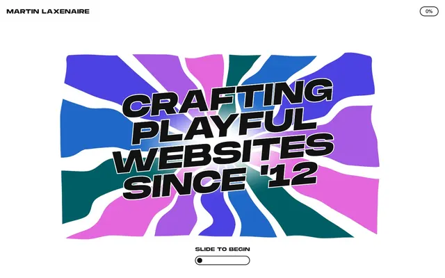
Preview image. Unlock full-res
Vibrant canvas, bold typography
Color palette
Decorative background fills for sections and visual accents, forming a vibrant base layer
Decorative background fill within hero graphic
Decorative background fill within hero graphic
Decorative background fill within hero graphic
Page backgrounds, elevated surface backgrounds, primary button fills
Dark borders and separators for elevated surfaces and inverted UI. Do not promote it to the primary CTA color
Typography
- Weights
- 400, 700
- Sizes
- 18px, 21px, 63px, 94px, 105px, 167px, 419px
- Line height
- 0.75, 0.85, 1.2
- Fallback
- Bebas Neue
Dominant display and heading font. Its ultra-bold weight and tight line height create a striking, impactful visual statement for key messages and branding. Used for navigation and large interactive elements like '0% complete'.
- Weights
- 400
- Sizes
- 16px, 21px, 26px
- Line height
- 0.85, 1.2
- Fallback
- Bebas Neue
Secondary heading and link typeface, providing visual continuity with the UltraBold variant while offering slightly more readability for mid-sized text.
- Weights
- 400
- Sizes
- 16px, 17px, 19px, 21px, 31px
- Line height
- 1.2
- Fallback
- Inter
Primary body and descriptive text. Its straightforward, sans-serif design ensures readability and provides a neutral counterpoint to the more expressive display fonts.
Spacing & shape
Components
Uses 'MonumentExtended UltraBold' at 18px, Ink Black text color. No explicit padding or background, relying on surrounding layout for spacing. No border, with 0px radius.
Transparent background, Ink Black text (rgb(18, 18, 18)), and a 1px Ink Black border (rgb(18, 18, 18)). No specific padding, 0px radius. Font is 'Swiss' at varying sizes. Used for the progress indicator '0%' in the header.
Canvas White (rgb(255, 255, 255)) background with Ink Black text (rgb(18, 18, 18)) and border (rgb(18, 18, 18)). Has a rounded 'pill' shape with a radius of 16.22px or 20.93px. Padding: ~4px-5px vertical, ~8px-10px horizontal. Font is 'Swiss' or 'MonumentExtended UltraBold'.
Transparent background (rgba(0, 0, 0, 0)) with Ink Black text (rgb(18, 18, 18)) and a 1px Ink Black border (rgb(18, 18, 18)). Features a 'pill' radius of 20.93px. No specific padding, relying on underlying content for sizing. Font is 'Swiss'.
Consists of a small, horizontally elongated pill shape with a transparent background and an Ink Black text border. Contains a small internal pill acting as the progress indicator. Radius is 20.93px. Text 'SLIDE TO BEGIN' is 'Swiss' at 16px.
Guidelines
- Prioritize Canvas White (#ffffff) as the dominant background, with Ink Black (#121212) for all text and UI outlines.
- Use MonumentExtended UltraBold for all primary headings and impactful statements at sizes 63px and above, ensuring tight line heights (0.75-0.85) for visual density.
- Employ the rounded pill shape with 16.22px or 20.93px radius for all interactive buttons and active states.
- Introduce Candy Pink (#f9d9f7) as a background fill for content sections to create visual rhythm and a playful atmosphere, ensuring Ink Black text maintains AAA contrast.
- Maintain comfortable density with an `elementGap` of 21px and a `sectionGap` of 42px for consistent vertical spacing.
- Apply Ink Black (#121212) as a 1px border for all interactive elements and surfaces that require definition against the Canvas White background.
- Use 'Swiss' at 16-21px for all body copy and descriptive text, prioritizing readability.
- Avoid using multiple chromatic colors in active UI elements; reserve vibrant colors mainly for decorative backgrounds or illustrations.
- Do not deviate from the specified MonumentExtended weights and line heights for headings; their distinct visual impact relies on these precise values.
- Do not use subtle variations of gray for additional neutrals; stick to Canvas White and Ink Black for core UI elements.
- Avoid using drop shadows for elevation; rely on solid borders and background color changes for surface distinction.
- Do not introduce square or minimally rounded corners (e.g., 4px radius) for interactive components; maintain the distinct pill-like radius (16.22px or 20.93px).
- Do not use generic system fonts for body text; always substitute with 'Swiss' or its designated replacement 'Inter'.
- Avoid large negative letter spacing outside of the defined typography scale; maintain normal letter spacing for most text.
About this system
ShowHide
This design system presents a playful yet structured aesthetic with high-contrast monochrome text layered over vibrant, organic color fields. It prioritizes bold typography and dynamic background elements, creating an engaging user experience without heavy-handed decoration. The system balances sharp, interactive elements with a distinct underlying fluidity for visual interest, using an 'experience point' metaphor to drive user engagement. Surfaces are bright and clean, allowing the expressive typography and occasional bursts of color to define the visual identity.
The page employs a max-width layout of 1440px, with content centered. The hero section is full-bleed, featuring a large, dynamically illustrated background against which a central, angled headline sits. Sections alternate between Canvas White and Candy Pink backgrounds, creating a clear vertical rhythm. Content often stacks vertically or uses alternating text and graphic layout in two columns. The main navigation is a minimal, top-left brand identifier with a progress indicator in the top-right. The overall density is comfortable, ensuring sufficient negative space around elements.
The site uses a highly stylized, abstract illustration language for its hero section, characterized by organic, wavy shapes filled with vibrant, contrasting colors (Electric Purple, Playful Blue, Teal Wave, Candy Pink). This creates a dynamic, high-energy backdrop for bold, impactful typography. Imagery is primarily decorative and atmospheric, visually reinforcing the 'playful' aspect of the brand. There is no visible photography or stock imagery, focusing instead on bespoke graphic elements. Icons, such as '0% complete', are simple outlined or filled monochrome, adhering to the Ink Black theme.
Reminiscent of Awwwards-winning portfolio sites, Active Theory, Garden Eight.
# Martin Laxenaire — Style Reference
> Vibrant canvas, bold typography

**Theme:** light

**Site:** https://www.martin-laxenaire.fr

This design system presents a playful yet structured aesthetic with high-contrast monochrome text layered over vibrant, organic color fields. It prioritizes bold typography and dynamic background elements, creating an engaging user experience without heavy-handed decoration. The system balances sharp, interactive elements with a distinct underlying fluidity for visual interest, using an 'experience point' metaphor to drive user engagement. Surfaces are bright and clean, allowing the expressive typography and occasional bursts of color to define the visual identity.

## Tokens — Colors

| Name | Value | Token | Role |
|------|------|------|------|
| Candy Pink | `#f9d9f7` | `--color-candy-pink` | Decorative background fills for sections and visual accents, forming a vibrant base layer |
| Playful Blue | `#3430ee` | `--color-playful-blue` | Decorative background fill within hero graphic |
| Electric Purple | `#8000ff` | `--color-electric-purple` | Decorative background fill within hero graphic |
| Teal Wave | `#008170` | `--color-teal-wave` | Decorative background fill within hero graphic |
| Canvas White | `#ffffff` | `--color-canvas-white` | Page backgrounds, elevated surface backgrounds, primary button fills |
| Ink Black | `#121212` | `--color-ink-black` | Dark borders and separators for elevated surfaces and inverted UI. Do not promote it to the primary CTA color |

## Tokens — Typography

### MonumentExtended UltraBold
- **Substitute:** Bebas Neue
- **Weights:** 400, 700
- **Sizes:** 18px, 21px, 63px, 94px, 105px, 167px, 419px
- **Line height:** 0.75, 0.85, 1.2
- **Role:** Dominant display and heading font. Its ultra-bold weight and tight line height create a striking, impactful visual statement for key messages and branding. Used for navigation and large interactive elements like '0% complete'.

### MonumentExtended Regular
- **Substitute:** Bebas Neue
- **Weights:** 400
- **Sizes:** 16px, 21px, 26px
- **Line height:** 0.85, 1.2
- **Role:** Secondary heading and link typeface, providing visual continuity with the UltraBold variant while offering slightly more readability for mid-sized text.

### Swiss
- **Substitute:** Inter
- **Weights:** 400
- **Sizes:** 16px, 17px, 19px, 21px, 31px
- **Line height:** 1.2
- **Role:** Primary body and descriptive text. Its straightforward, sans-serif design ensures readability and provides a neutral counterpoint to the more expressive display fonts.

## Tokens — Type Scale

| Role | Size | Line height | Letter spacing |
|------|------|------|------|
| caption | 16px | 1.2 | — |
| body | 19px | 1.2 | — |
| body-lg | 21px | 1.2 | — |
| subheading | 31px | 1.2 | — |
| heading | 63px | 0.85 | — |
| heading-lg | 94px | 0.85 | — |
| display | 105px | 0.75 | — |

## Tokens — Spacing

- **Max width:** 1440px
- **Section gap:** 42px
- **Card padding:** 19px
- **Element gap:** 21px

## Tokens — Radius

- **Default:** 20.93px
- **Buttons:** 16.22px, 20.93px
- **elements:** 20.93px

## Layout

The page employs a max-width layout of 1440px, with content centered. The hero section is full-bleed, featuring a large, dynamically illustrated background against which a central, angled headline sits. Sections alternate between Canvas White and Candy Pink backgrounds, creating a clear vertical rhythm. Content often stacks vertically or uses alternating text and graphic layout in two columns. The main navigation is a minimal, top-left brand identifier with a progress indicator in the top-right. The overall density is comfortable, ensuring sufficient negative space around elements.

## Imagery

The site uses a highly stylized, abstract illustration language for its hero section, characterized by organic, wavy shapes filled with vibrant, contrasting colors (Electric Purple, Playful Blue, Teal Wave, Candy Pink). This creates a dynamic, high-energy backdrop for bold, impactful typography. Imagery is primarily decorative and atmospheric, visually reinforcing the 'playful' aspect of the brand. There is no visible photography or stock imagery, focusing instead on bespoke graphic elements. Icons, such as '0% complete', are simple outlined or filled monochrome, adhering to the Ink Black theme.

## Components

### Header Navigation Link
*Text-based navigation link in the header.*

Uses 'MonumentExtended UltraBold' at 18px, Ink Black text color. No explicit padding or background, relying on surrounding layout for spacing. No border, with 0px radius.

### Ghost Button
*Minimal interactive button, often for secondary actions or decorative information displays.*

Transparent background, Ink Black text (rgb(18, 18, 18)), and a 1px Ink Black border (rgb(18, 18, 18)). No specific padding, 0px radius. Font is 'Swiss' at varying sizes. Used for the progress indicator '0%' in the header.

### Pill Button (Filled)
*Primary Call-to-action button or interactive element.*

Canvas White (rgb(255, 255, 255)) background with Ink Black text (rgb(18, 18, 18)) and border (rgb(18, 18, 18)). Has a rounded 'pill' shape with a radius of 16.22px or 20.93px. Padding: ~4px-5px vertical, ~8px-10px horizontal. Font is 'Swiss' or 'MonumentExtended UltraBold'.

### Pill Button (Ghost)
*Secondary action or interactive label with a distinct rounded shape.*

Transparent background (rgba(0, 0, 0, 0)) with Ink Black text (rgb(18, 18, 18)) and a 1px Ink Black border (rgb(18, 18, 18)). Features a 'pill' radius of 20.93px. No specific padding, relying on underlying content for sizing. Font is 'Swiss'.

### Progress Meter (Horizontal)
*Interactive element indicating progress or state.*

Consists of a small, horizontally elongated pill shape with a transparent background and an Ink Black text border. Contains a small internal pill acting as the progress indicator. Radius is 20.93px. Text 'SLIDE TO BEGIN' is 'Swiss' at 16px.

## Guidelines

### Do

- Prioritize Canvas White (#ffffff) as the dominant background, with Ink Black (#121212) for all text and UI outlines.
- Use MonumentExtended UltraBold for all primary headings and impactful statements at sizes 63px and above, ensuring tight line heights (0.75-0.85) for visual density.
- Employ the rounded pill shape with 16.22px or 20.93px radius for all interactive buttons and active states.
- Introduce Candy Pink (#f9d9f7) as a background fill for content sections to create visual rhythm and a playful atmosphere, ensuring Ink Black text maintains AAA contrast.
- Maintain comfortable density with an `elementGap` of 21px and a `sectionGap` of 42px for consistent vertical spacing.
- Apply Ink Black (#121212) as a 1px border for all interactive elements and surfaces that require definition against the Canvas White background.
- Use 'Swiss' at 16-21px for all body copy and descriptive text, prioritizing readability.

### Don't

- Avoid using multiple chromatic colors in active UI elements; reserve vibrant colors mainly for decorative backgrounds or illustrations.
- Do not deviate from the specified MonumentExtended weights and line heights for headings; their distinct visual impact relies on these precise values.
- Do not use subtle variations of gray for additional neutrals; stick to Canvas White and Ink Black for core UI elements.
- Avoid using drop shadows for elevation; rely on solid borders and background color changes for surface distinction.
- Do not introduce square or minimally rounded corners (e.g., 4px radius) for interactive components; maintain the distinct pill-like radius (16.22px or 20.93px).
- Do not use generic system fonts for body text; always substitute with 'Swiss' or its designated replacement 'Inter'.
- Avoid large negative letter spacing outside of the defined typography scale; maintain normal letter spacing for most text.

## Agent Prompt Guide

**Quick Color Reference**
text: #121212
background: #ffffff
border: #121212
accent: #f9d9f7
primary action: no distinct CTA color

**3-5 Example Component Prompts**
1. Create a Header Navigation Link: Text "Martin Laxenaire" using MonumentExtended UltraBold, 18px, Ink Black text (#121212). Positioning should be top-left.
2. Create a Ghost Button: Text "0% complete", Swiss, 16px, Ink Black text (#121212), transparent background (rgba(0, 0, 0, 0)), 1px Ink Black border (#121212), 0px radius.
3. Create a Pill Button (Filled): Text "Unlock everything", Swiss, 17px, Ink Black text (#121212), Canvas White background (#ffffff), 1px Ink Black border (#121212), 16.22px border-radius, 4px vertical padding, 8px horizontal padding.
4. Create a Section Heading: Text "Features" using MonumentExtended UltraBold, 63px, Ink Black text (#121212), line-height 0.85, margin-bottom 9px.
More like this









Keep what you find
A free account saves references to boards and can send you a weekly email of picks based on what you save.
To see every result, go Pro.