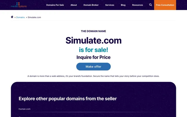
Preview image. Unlock full-res
Deep Violet Canvas
Color palette
Primary surface background, card fills, primary button background, core text color — establishes a dark, rich foundation
Navigation links, interactive elements, highlights — provides a clear, vivid accent for clickable items
Decorative accents for headlines and subtext, subtle borders — adds a secondary, muted blue tone
Call-to-action button background, secondary interactive states — a distinct blue for emphasized actions
Alternative link and icon color — a slightly darker, more subdued blue often used for less prominent links
Orange wash for highlight backgrounds, decorative bands, and soft emphasis behind content. Do not promote it to the primary CTA color
Page background, text color against dark surfaces, input fields, subtle borders — the primary contrasting neutral
Divider lines, subtle list borders — a very light, almost invisible gray for structure
Muted text, secondary link text, less prominent borders — a mid-tone gray for informational text
Supporting neutral for secondary UI, dividers, and muted labels. Do not promote it to the primary CTA color
Typography
- Weights
- 400, 600, 700
- Sizes
- 14px, 16px, 20px, 22px, 36px, 48px, 68px
- Line height
- 1, 1.15, 1.2, 1.28, 1.56, 1.63, 1.75, 1.78, 2.19
- Letter spacing
- -0.0300em, 0.0290em, 0.0540em
- Fallback
- system-ui, sans-serif
Primary typeface for all UI elements, headings, and body text. Its clear and modern aesthetic supports direct communication.
Spacing & shape
Elevation
Components
Background: #2b6cb0 (Action Blue), text: Polar White, border-radius: 50px, padding: 10px 72px.
Background: transparent, text: Polar White, border-color: Polar White, border-radius: 5px, padding: 0px.
Background: #160042 (Midnight Indigo), text: Polar White, border-color: Polar White, border-radius: 50px, padding: 10px 40px.
Background: #160042 (Midnight Indigo), border-radius: 50px, box-shadow: none, padding: 60px.
Background: Polar White, text: Midnight Indigo, border-top-color: Midnight Indigo, border-radius: 0px, padding: 0px 15px.
Guidelines
- Use Midnight Indigo (#160042) for large background surfaces and card fills to establish the primary darkened canvas.
- Apply 50px border-radius to all independent card and button components for a consistent soft, rounded aesthetic.
- Prioritize Inter at 400, 600, and 700 weights for all text, ensuring clear distinction between body, subheadings, and headlines.
- Utilize Sky Link (#0073e5) for primary navigational links and interactive elements to clearly delineate clickable areas.
- Maintain a comfortable density with 15px element gaps for most internal component spacing.
- Employ the Amber CTA (#e86d1f) for the main call-to-action buttons to ensure maximum prominence and urgency.
- Use Polar White (#fbfcfe) for text and secondary backgrounds within dark containers to provide strong contrast.
- Avoid using flat, angular borders; instead, default to rounded corners or sharp edges on inputs where functional.
- Do not introduce additional bold, saturated colors beyond the established blue, indigo, and orange palette.
- Refrain from using lightweight fonts for critical information or headlines; maintain a minimum weight of 400 for body text.
- Do not overcrowd content; utilize the comfortable 60px card padding and 30px section gaps to provide ample breathing room.
- Avoid generic gray tones for interactive elements; use the Sky Link blue or Amber CTA orange for all primary interactions.
- Do not use transparent backgrounds for cards or primary buttons; content containers should always have a solid fill.
- Escew complex drop shadows; use the subtle rgba(0, 0, 0, 0.2) 0px 3px 1px -2px shadow for minimal depth where needed.
About this system
ShowHide
MediaOptions embraces a commanding, yet approachable digital presence. Deep blue-violet surfaces create a sophisticated backdrop, punctuated by a vibrant orange for call-to-actions and a sky blue for links, providing clear points of interaction. Typography is direct and legible, maintaining professionalism with a focused range of weights. Components feature generous rounded corners for a soft touch against the structured layout, creating a visual balance between authority and user-friendliness.
The page maintains a contained layout with a maximum width of 1320px, usually centered. The hero section features a dominant centered headline over a dark, full-width background. Content sections beneath follow a structured rhythm, often alternating between a light page canvas and the dark Midnight Indigo card surfaces. Elements are frequently stacked vertically, with the potential for grid-based arrangements for features. Navigation is a persistent top bar, with elements neatly spaced.
This site predominantly uses UI elements rather than illustrative or photographic imagery. Icons are minimal, either outline or solid, and monochromatic, taking on the surrounding text color or a distinct accent hue like Accent Blue. When present, product-type images are presented cleanly within the UI without elaborate masking or effects. The visual system is text-dominant, with imagery taking a supportive, functional role rather than a decorative one.
Reminiscent of Brandfetch, Stripe, Framer, Linear.
# MediaOptions — Style Reference
> Deep Violet Canvas

**Theme:** light

**Site:** https://simulate.com

MediaOptions embraces a commanding, yet approachable digital presence. Deep blue-violet surfaces create a sophisticated backdrop, punctuated by a vibrant orange for call-to-actions and a sky blue for links, providing clear points of interaction. Typography is direct and legible, maintaining professionalism with a focused range of weights. Components feature generous rounded corners for a soft touch against the structured layout, creating a visual balance between authority and user-friendliness.

## Tokens — Colors

| Name | Value | Token | Role |
|------|------|------|------|
| Midnight Indigo | `#160042` | `--color-midnight-indigo` | Primary surface background, card fills, primary button background, core text color — establishes a dark, rich foundation |
| Sky Link | `#0073e5` | `--color-sky-link` | Navigation links, interactive elements, highlights — provides a clear, vivid accent for clickable items |
| Ocean Glimmer | `#008da8` | `--color-ocean-glimmer` | Decorative accents for headlines and subtext, subtle borders — adds a secondary, muted blue tone |
| Action Blue | `#2b6cb0` | `--color-action-blue` | Call-to-action button background, secondary interactive states — a distinct blue for emphasized actions |
| Accent Blue | `#0071bc` | `--color-accent-blue` | Alternative link and icon color — a slightly darker, more subdued blue often used for less prominent links |
| Amber CTA | `#e86d1f` | `--color-amber-cta` | Orange wash for highlight backgrounds, decorative bands, and soft emphasis behind content. Do not promote it to the primary CTA color |
| Polar White | `#fbfcfe` | `--color-polar-white` | Page background, text color against dark surfaces, input fields, subtle borders — the primary contrasting neutral |
| Ghost Gray | `#eeeeee` | `--color-ghost-gray` | Divider lines, subtle list borders — a very light, almost invisible gray for structure |
| Iron Gray | `#8e8f94` | `--color-iron-gray` | Muted text, secondary link text, less prominent borders — a mid-tone gray for informational text |
| Shadow Tint | `#cccccc` | `--color-shadow-tint` | Supporting neutral for secondary UI, dividers, and muted labels. Do not promote it to the primary CTA color |

## Tokens — Typography

### Inter
- **Substitute:** system-ui, sans-serif
- **Weights:** 400, 600, 700
- **Sizes:** 14px, 16px, 20px, 22px, 36px, 48px, 68px
- **Line height:** 1, 1.15, 1.2, 1.28, 1.56, 1.63, 1.75, 1.78, 2.19
- **Letter spacing:** -0.0300em, 0.0290em, 0.0540em
- **Role:** Primary typeface for all UI elements, headings, and body text. Its clear and modern aesthetic supports direct communication.

## Tokens — Type Scale

Perfect Fourth (1.333) from 20px base.

| Role | Size | Line height | Letter spacing |
|------|------|------|------|
| caption | 14px | 1.75 | 0.054em |
| body-sm | 16px | 1.78 | 0.029em |
| body | 20px | 1.56 | — |
| subheading | 22px | 1.28 | — |
| heading | 36px | 1.2 | — |
| heading-lg | 48px | 1.15 | -0.03em |
| display | 68px | 1 | -0.03em |

## Tokens — Spacing

- **Max width:** 1320px
- **Section gap:** 30px
- **Card padding:** 60px
- **Element gap:** 15px

## Tokens — Radius

- **Buttons:** 50px
- **Inputs:** 0px
- **Cards:** 50px

## Tokens — Elevation

- **Button:** `rgba(0, 0, 0, 0.2) 0px 3px 1px -2px, rgba(0, 0, 0, 0.14) 0px 2px 2px 0px, rgba(0, 0, 0, 0.12) 0px 1px 5px 0px`
- **Link:** `rgba(0, 0, 0, 0.2) 0px 3px 1px -2px, rgba(0, 0, 0, 0.14) 0px 2px 2px 0px, rgba(0, 0, 0, 0.12) 0px 1px 5px 0px`

## Layout

The page maintains a contained layout with a maximum width of 1320px, usually centered. The hero section features a dominant centered headline over a dark, full-width background. Content sections beneath follow a structured rhythm, often alternating between a light page canvas and the dark Midnight Indigo card surfaces. Elements are frequently stacked vertically, with the potential for grid-based arrangements for features. Navigation is a persistent top bar, with elements neatly spaced.

## Imagery

This site predominantly uses UI elements rather than illustrative or photographic imagery. Icons are minimal, either outline or solid, and monochromatic, taking on the surrounding text color or a distinct accent hue like Accent Blue. When present, product-type images are presented cleanly within the UI without elaborate masking or effects. The visual system is text-dominant, with imagery taking a supportive, functional role rather than a decorative one.

## Components

### Primary Filled Button
*Main call-to-action button*

Background: #2b6cb0 (Action Blue), text: Polar White, border-radius: 50px, padding: 10px 72px.

### Navigation Button
*Secondary action or ghost button in navigation*

Background: transparent, text: Polar White, border-color: Polar White, border-radius: 5px, padding: 0px.

### Dark Filled Button
*Alternative filled button for specific dark contexts*

Background: #160042 (Midnight Indigo), text: Polar White, border-color: Polar White, border-radius: 50px, padding: 10px 40px.

### Primary Card
*Content container for main sections*

Background: #160042 (Midnight Indigo), border-radius: 50px, box-shadow: none, padding: 60px.

### Text Input (Dark Context)
*Input field for forms within dark sections*

Background: Polar White, text: Midnight Indigo, border-top-color: Midnight Indigo, border-radius: 0px, padding: 0px 15px.

## Guidelines

### Do

- Use Midnight Indigo (#160042) for large background surfaces and card fills to establish the primary darkened canvas.
- Apply 50px border-radius to all independent card and button components for a consistent soft, rounded aesthetic.
- Prioritize Inter at 400, 600, and 700 weights for all text, ensuring clear distinction between body, subheadings, and headlines.
- Utilize Sky Link (#0073e5) for primary navigational links and interactive elements to clearly delineate clickable areas.
- Maintain a comfortable density with 15px element gaps for most internal component spacing.
- Employ the Amber CTA (#e86d1f) for the main call-to-action buttons to ensure maximum prominence and urgency.
- Use Polar White (#fbfcfe) for text and secondary backgrounds within dark containers to provide strong contrast.

### Don't

- Avoid using flat, angular borders; instead, default to rounded corners or sharp edges on inputs where functional.
- Do not introduce additional bold, saturated colors beyond the established blue, indigo, and orange palette.
- Refrain from using lightweight fonts for critical information or headlines; maintain a minimum weight of 400 for body text.
- Do not overcrowd content; utilize the comfortable 60px card padding and 30px section gaps to provide ample breathing room.
- Avoid generic gray tones for interactive elements; use the Sky Link blue or Amber CTA orange for all primary interactions.
- Do not use transparent backgrounds for cards or primary buttons; content containers should always have a solid fill.
- Escew complex drop shadows; use the subtle rgba(0, 0, 0, 0.2) 0px 3px 1px -2px shadow for minimal depth where needed.

## Agent Prompt Guide

### Quick Color Reference
text: #160042
background: #fbfcfe
border: #eeeeee
accent: #0073e5
primary action: #2b6cb0 (filled action)

### 3-5 Example Component Prompts
1. Create a Primary Action Button: #2b6cb0 background, #fbfcfe text, 9999px radius, compact pill padding. Use this filled treatment for the main CTA.
2. Create a Feature Card: Midnight Indigo (#160042) background, 50px border-radius, 60px padding. Inside, a heading 'Explore popular domains' at 36px Inter weight 600 Polar White (#fbfcfe), and body text 'Human.com' at 20px Inter weight 400 Polar White (#fbfcfe).
3. Create a Newsletter Signup Block: Page Canvas (#fbfcfe) background. Headline 'The #1 Domain Sales Newsletter' at 36px Inter weight 700 Midnight Indigo (#160042). Below, an input field with Polar White (#fbfcfe) background, Midnight Indigo (#160042) text color, Midnight Indigo (#160042) border, 0px border-radius, 0px 15px padding, followed by a Dark Filled Button 'Sign Up' with Midnight Indigo (#160042) background, Polar White (#fbfcfe) text, 50px border-radius, and 10px 40px padding.
More like this









Keep what you find
A free account saves references to boards and can send you a weekly email of picks based on what you save.
To see every result, go Pro.