Preview image. Unlock full-res
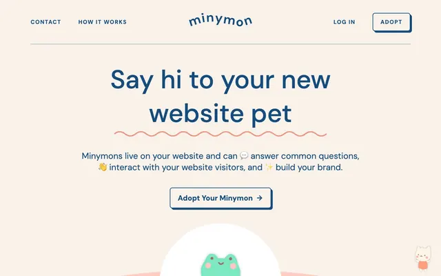
Playful pastel storybook
Color palette
Hairline borders, dividers, input outlines, and card edges on light surfaces. Do not promote it to the primary CTA color
Strong headings, accent lines, input text and outlines, key brand elements. Also serves as an informational color
Key interaction accents, outlined action color, illustrative elements—provides a playful contrast
Background for specific card content or illustrative sections, adding a warm, soft touch
Background for default or less prominent buttons
Teal wash for highlight backgrounds, decorative bands, and soft emphasis behind content. Do not promote it to the primary CTA color
Primary page background, setting a warm, inviting tone
Card backgrounds, elevated interface elements, content containers
Main body text, paragraph content, prominent headings
Muted text, helper text, secondary descriptions
Subtle dividers, input field outlines, hairline separators
Typography
- Weights
- 400
- Sizes
- 16px
- Line height
- 1.2
- Letter spacing
- normal
- Fallback
- serif
Used sparingly for specific content or decorative text, providing a classic counterpoint to the primary sans-serif.
- Weights
- 400, 500, 700
- Sizes
- 13px, 14px, 16px, 18px, 20px, 24px, 28px, 36px, 84px
- Line height
- 1.2, 1.31
- Letter spacing
- 0.111em
- Fallback
- system-ui
Primary typeface for most UI elements, headings, body text, and interactive components. Its rounded, friendly forms support the playful brand identity while maintaining legibility across diverse sizes. The consistent letter-spacing across sizes gives it a compact and intentional feel.
- Weights
- 400
- Sizes
- 13px
- Line height
- 1.2
Arial — detected in extracted data but not described by AI
Spacing & shape
Elevation
Components
Text: DM Sans medium, Minymon Orange #f16849. Border: 1px solid Minymon Orange #f16849. Background: Canvas Tan #f9f2ea. Padding: 16px vertical, 24px horizontal. Radius: 8px. This component highlights key actions with a vibrant border against a neutral background.
Text: Text Primary #474747. Background: Button Teal Light #dbf0f0. Border: 1px solid Text Primary #474747. Padding: 12px vertical, 16px horizontal. Radius: 24px. The border uses the primary text color, making it subtle but present, supporting the soft aesthetic.
Text: Black #000000. No background, no border. Used for discrete interactions, maintaining a light interface footprint.
Background: Surface White #ffffff. Padding: 28px vertical, 34px horizontal. Radius: 24px. Shadow: rgba(0, 0, 0, 0.12) 0px 0px 20px 0px. This card uses a strong radius and a subtle shadow to make content pop from the Canvas Tan background.
Background: Surface White #ffffff. Padding: 12px vertical, 16px horizontal. Radius: 24px. No shadow. Used for related content blocks not requiring strong visual separation.
Background: Surface White #ffffff. Radius: 50%. No padding or shadow. Specifically for containing circular graphics, like avatar elements or illustrations.
Text: Minymon Blue #154c7e. Placeholder text and border: 1px solid Minymon Blue #154c7e. No background fill. Padding: 12px bottom, 2px horizontal (for text). Radius: 0px. The input is designed to be minimal with direct visual feedback for focus.
Guidelines
- Prioritize Canvas Tan (#f9f2ea) for page backgrounds and Surface White (#ffffff) for card surfaces to maintain the soft, airy aesthetic.
- Apply a 24px border radius to all primary cards and buttons to reinforce the playful, rounded feel.
- Use DM Sans at different weights for all text elements; reserve Times for highly specific, curated content only.
- Ensure headings use Minymon Blue (#154c7e) for impactful statements, contrasting with the warmer background tones.
- Use Minymon Orange (#f16849) exclusively for outlined primary actions or small, vibrant decorative elements to provide a clear focal point without overwhelming the pastel palette.
- Maintain comfortable spacing with 16px for element gaps and 24px for card padding, ensuring elements breathe.
- Employ the rgba(0, 0, 0, 0.12) 0px 0px 20px 0px shadow for elevated cards to create gentle depth, avoiding harsh or dark shadows.
- Avoid using Minymon Orange (#f16849) as a solid background fill for buttons; it is reserved for outlined actions due to its vibrancy.
- Do not introduce sharp corners or small radii (<8px) for major components; consistency in rounded shapes is key.
- Do not use dark backgrounds for sections unless specifically for full-bleed illustrative areas; the theme is primarily light.
- Avoid excessive use of heavy borders or dividers; subtle hairline borders using Border Light (#e3e3e3) are preferred.
- Do not deviate from DM Sans for standard UI text; the tight letter-spacing and friendly characters are integral to brand identity.
- Avoid using multiple prominent accent colors; rely mainly on Minymon Blue and Minymon Orange for functional accents.
- Do not use highly saturated photography or complex visual textures; imagery should complement the pastel, light aesthetic.
About this system
ShowHide
Minymon adopts a playful, inviting aesthetic with soft, rounded forms and a muted pastel color palette that evokes a sense of comfort and approachability. The design emphasizes friendly interaction through subtle elevation and a clear visual hierarchy. Typography is compact and confident, balancing warmth with precise communication. Surfaces are light and airy, creating an open, uncrowded feel.
The page primarily uses a max-width contained model, typically centered within the browser, with a roughly 1200px max width for main content. The hero section features a centered headline over a background that alternates between the Canvas Tan and a brand accent, often featuring a large, central illustration. Section rhythm is created through consistent vertical spacing (sectionGap 40px) and a subtle shift in background colors, moving between Canvas Tan and pastel brand accents like Pink Blush. Content is often arranged in centered stacks for headlines and subtext, with some alternating left-text/right-visual sections further down the page. Navigation is a sticky top bar, minimalist with logo, links, and distinct 'Adopt' button.
The imagery on Minymon primarily consists of whimsical, rounded illustrations of 'minymons' – cartoon-like creatures. These are flat, vector-based, and often feature soft color palettes that integrate seamlessly with the brand, making them feel like part of the UI rather than external content. Illustrations are contained within circular or rounded shapes, often interacting with text elements like the wavy dividing line. Icons are simple, outlined, and monochromatic, aligning with the clean and friendly interface. The overall density is balanced, with illustrations serving as visual anchors and decorative atmosphere rather than product showcases or heavy information carriers.
Reminiscent of Calm (app), Superhuman, Headspace, Stripe, Linear.
# Minymon — Style Reference
> Playful pastel storybook

**Theme:** light

**Site:** https://www.minymon.com

Minymon adopts a playful, inviting aesthetic with soft, rounded forms and a muted pastel color palette that evokes a sense of comfort and approachability. The design emphasizes friendly interaction through subtle elevation and a clear visual hierarchy. Typography is compact and confident, balancing warmth with precise communication. Surfaces are light and airy, creating an open, uncrowded feel.

## Tokens — Colors

| Name | Value | Token | Role |
|------|------|------|------|
| Blue Teal | `#cae5e0` | `--color-blue-teal` | Hairline borders, dividers, input outlines, and card edges on light surfaces. Do not promote it to the primary CTA color |
| Minymon Blue | `#154c7e` | `--color-minymon-blue` | Strong headings, accent lines, input text and outlines, key brand elements. Also serves as an informational color |
| Minymon Orange | `#f16849` | `--color-minymon-orange` | Key interaction accents, outlined action color, illustrative elements—provides a playful contrast |
| Pink Blush | `#ffcdc1` | `--color-pink-blush` | Background for specific card content or illustrative sections, adding a warm, soft touch |
| Button Teal Light | `#dbf0f0` | `--color-button-teal-light` | Background for default or less prominent buttons |
| Teal Hover | `#53c0c0` | `--color-teal-hover` | Teal wash for highlight backgrounds, decorative bands, and soft emphasis behind content. Do not promote it to the primary CTA color |
| Canvas Tan | `#f9f2ea` | `--color-canvas-tan` | Primary page background, setting a warm, inviting tone |
| Surface White | `#ffffff` | `--color-surface-white` | Card backgrounds, elevated interface elements, content containers |
| Text Primary | `#474747` | `--color-text-primary` | Main body text, paragraph content, prominent headings |
| Text Secondary | `#7b7b7b` | `--color-text-secondary` | Muted text, helper text, secondary descriptions |
| Border Light | `#e3e3e3` | `--color-border-light` | Subtle dividers, input field outlines, hairline separators |

## Tokens — Typography

### Times
- **Substitute:** serif
- **Weights:** 400
- **Sizes:** 16px
- **Line height:** 1.2
- **Letter spacing:** normal
- **Role:** Used sparingly for specific content or decorative text, providing a classic counterpoint to the primary sans-serif.

### DM Sans
- **Substitute:** system-ui
- **Weights:** 400, 500, 700
- **Sizes:** 13px, 14px, 16px, 18px, 20px, 24px, 28px, 36px, 84px
- **Line height:** 1.2, 1.31
- **Letter spacing:** 0.111em
- **Role:** Primary typeface for most UI elements, headings, body text, and interactive components. Its rounded, friendly forms support the playful brand identity while maintaining legibility across diverse sizes. The consistent letter-spacing across sizes gives it a compact and intentional feel.

### Arial
- **Weights:** 400
- **Sizes:** 13px
- **Line height:** 1.2
- **Role:** Arial — detected in extracted data but not described by AI

## Tokens — Type Scale

Perfect Fourth (1.333) from 16px base.

| Role | Size | Line height | Letter spacing |
|------|------|------|------|
| caption | 13px | 1.2 | — |
| body | 16px | 1.2 | — |
| subheading | 18px | 1.2 | 0.111px |
| heading-sm | 20px | 1.2 | — |
| heading | 24px | 1.2 | 0.111px |
| heading-lg | 36px | 1.31 | 0.111px |
| display | 84px | 1.31 | 0.111px |

## Tokens — Spacing

- **Max width:** 1200px
- **Section gap:** 40px
- **Card padding:** 16px
- **Element gap:** 16px

## Tokens — Radius

- **Buttons:** 24px
- **Inputs:** 8px
- **Cards:** 24px

## Tokens — Elevation

- **Elevated Card:** `rgba(0, 0, 0, 0.12) 0px 0px 20px 0px`

## Layout

The page primarily uses a max-width contained model, typically centered within the browser, with a roughly 1200px max width for main content. The hero section features a centered headline over a background that alternates between the Canvas Tan and a brand accent, often featuring a large, central illustration. Section rhythm is created through consistent vertical spacing (sectionGap 40px) and a subtle shift in background colors, moving between Canvas Tan and pastel brand accents like Pink Blush. Content is often arranged in centered stacks for headlines and subtext, with some alternating left-text/right-visual sections further down the page. Navigation is a sticky top bar, minimalist with logo, links, and distinct 'Adopt' button.

## Imagery

The imagery on Minymon primarily consists of whimsical, rounded illustrations of 'minymons' – cartoon-like creatures. These are flat, vector-based, and often feature soft color palettes that integrate seamlessly with the brand, making them feel like part of the UI rather than external content. Illustrations are contained within circular or rounded shapes, often interacting with text elements like the wavy dividing line. Icons are simple, outlined, and monochromatic, aligning with the clean and friendly interface. The overall density is balanced, with illustrations serving as visual anchors and decorative atmosphere rather than product showcases or heavy information carriers.

## Components

### Primary Action Button
*Outlined button for primary calls to action*

Text: DM Sans medium, Minymon Orange #f16849. Border: 1px solid Minymon Orange #f16849. Background: Canvas Tan #f9f2ea. Padding: 16px vertical, 24px horizontal. Radius: 8px. This component highlights key actions with a vibrant border against a neutral background.

### Secondary Button
*Filled button for secondary actions or selections*

Text: Text Primary #474747. Background: Button Teal Light #dbf0f0. Border: 1px solid Text Primary #474747. Padding: 12px vertical, 16px horizontal. Radius: 24px. The border uses the primary text color, making it subtle but present, supporting the soft aesthetic.

### Minimal Button
*Text-only button for tertiary actions or navigation*

Text: Black #000000. No background, no border. Used for discrete interactions, maintaining a light interface footprint.

### Elevated Card
*Content card with subtle shadow for emphasis*

Background: Surface White #ffffff. Padding: 28px vertical, 34px horizontal. Radius: 24px. Shadow: rgba(0, 0, 0, 0.12) 0px 0px 20px 0px. This card uses a strong radius and a subtle shadow to make content pop from the Canvas Tan background.

### Flat Card
*Content card for groupings without elevation*

Background: Surface White #ffffff. Padding: 12px vertical, 16px horizontal. Radius: 24px. No shadow. Used for related content blocks not requiring strong visual separation.

### Circular Card
*Circular container for icons or small visual elements*

Background: Surface White #ffffff. Radius: 50%. No padding or shadow. Specifically for containing circular graphics, like avatar elements or illustrations.

### Input Field
*Text input area with a bottom border*

Text: Minymon Blue #154c7e. Placeholder text and border: 1px solid Minymon Blue #154c7e. No background fill. Padding: 12px bottom, 2px horizontal (for text). Radius: 0px. The input is designed to be minimal with direct visual feedback for focus.

## Guidelines

### Do

- Prioritize Canvas Tan (#f9f2ea) for page backgrounds and Surface White (#ffffff) for card surfaces to maintain the soft, airy aesthetic.
- Apply a 24px border radius to all primary cards and buttons to reinforce the playful, rounded feel.
- Use DM Sans at different weights for all text elements; reserve Times for highly specific, curated content only.
- Ensure headings use Minymon Blue (#154c7e) for impactful statements, contrasting with the warmer background tones.
- Use Minymon Orange (#f16849) exclusively for outlined primary actions or small, vibrant decorative elements to provide a clear focal point without overwhelming the pastel palette.
- Maintain comfortable spacing with 16px for element gaps and 24px for card padding, ensuring elements breathe.
- Employ the rgba(0, 0, 0, 0.12) 0px 0px 20px 0px shadow for elevated cards to create gentle depth, avoiding harsh or dark shadows.

### Don't

- Avoid using Minymon Orange (#f16849) as a solid background fill for buttons; it is reserved for outlined actions due to its vibrancy.
- Do not introduce sharp corners or small radii (<8px) for major components; consistency in rounded shapes is key.
- Do not use dark backgrounds for sections unless specifically for full-bleed illustrative areas; the theme is primarily light.
- Avoid excessive use of heavy borders or dividers; subtle hairline borders using Border Light (#e3e3e3) are preferred.
- Do not deviate from DM Sans for standard UI text; the tight letter-spacing and friendly characters are integral to brand identity.
- Avoid using multiple prominent accent colors; rely mainly on Minymon Blue and Minymon Orange for functional accents.
- Do not use highly saturated photography or complex visual textures; imagery should complement the pastel, light aesthetic.

## Agent Prompt Guide

Create an Outlined Primary Action: Transparent background, #f16849 border and text, 9999px radius, compact pill padding. Use it for the main CTA instead of a filled button.

Example Component Prompts:
More like this









Keep what you find
A free account saves references to boards and can send you a weekly email of picks based on what you save.
To see every result, go Pro.