Preview image. Unlock full-res
Color palette
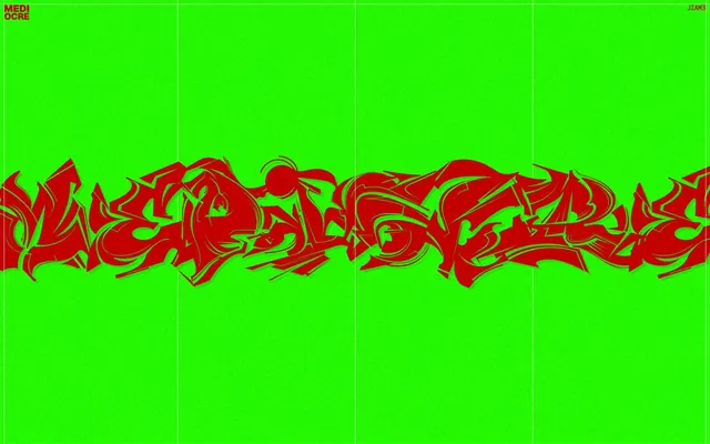
Primary typography, decorative accents, interactive element borders (e.g., ghost buttons/links). Its vivid red against electric green forms the core visual identity
Dominant background for the entire page canvas, providing a high-saturation, energetic base
Subtle background for UI elements if present, and very light, almost imperceptible grid lines or dividers, allowing the brand colors to dominate
Typography
- Weights
- 400
- Sizes
- 47px, 50px
- Line height
- 1.25
- Letter spacing
- -0.0100em
- Fallback
- Bebas Neue
Headlines and primary branding text. The letter spacing of -0.0100em creates a tight, impactful presence, while the '1.2500em' spacing is a signature for special, highly expressive text segments.
- Weights
- 700
- Sizes
- 14px
- Line height
- 1
- Letter spacing
- -0.0100em
- Fallback
- IBM Plex Sans Condensed
Small, bold utility text and links, used for navigation and metadata. The heavy weight and tight tracking ensure legibility despite its small size.
- Weights
- 400
- Sizes
- 14px, 16px
- Line height
- 1.25
- Letter spacing
- normal
- Fallback
- Inter
Body text and supporting information. Its normal letter spacing provides a contrast to the more aggressively tracked display fonts, acting as a functional anchor.
Spacing & shape
Guidelines
- Use Electric Green (#26ff00) as the primary background for all major page sections and the canvas itself.
- Apply Graffiti Red (#c20000) for all primary text elements, headlines, and interactive link/ghost button borders to maintain high contrast and visual energy.
- Prioritize MAELSTROM font (or Bebas Neue) at 47px or 50px for all page-level headlines with a letter spacing of -0.0100em.
- Utilize Victor font (or IBM Plex Sans Condensed) with weight 700 at 14px for navigational links and all-caps utility text.
- Maintain a section gap of 150px to create distinct visual divisions between content blocks, even if content is minimal.
- Ensure all interactive ghost buttons or links use a 1px Graffiti Red (#c20000) border, rather than a filled background.
- Implement the 'hue-spin' named animation for decorative elements that require dynamic color shifts, lasting 120s with an 'ease' timing function.
- Avoid softened corners; all UI elements should maintain sharp, 0px border radii.
- Do not introduce additional colors beyond Graffiti Red, Electric Green, and Faded Grid without strong functional justification—the system thrives on its limited palette.
- Do not use drop shadows or elevation effects; the design language is flat and direct, except for specified 'drop-shadow(rgb(33, 219, 1) 5px 5px 0px)' filter for unique elements.
- Do not use generic text colors like black or white; all text should be either Graffiti Red or Faded Grid to adhere to the brand palette.
- Avoid using standard button fills; prefer ghost buttons with strong red borders for interactive elements.
- Do not vary line heights excessively; adhere to 1.25 for body text and 1.00 for small utility text to maintain visual consistency.
About this system
ShowHide
MEDIOCRE embraces a gritty, high-contrast digital street art aesthetic, using a stark lime green canvas as a vibrant backdrop for red graffiti-style typography. The design is intentionally raw and visually assertive, reflecting a 'no-frills' counter-culture attitude. Text elements rely on bold, condensed gothic forms with distinctive character spacing, creating visual tension against the uniform background. The system is deliberately minimal in its componentry, focusing instead on impactful typography and color contrast.
The page exhibits a full-bleed layout, where the Electric Green canvas extends edge-to-edge. The hero section features large, centered graffiti typography, serving as the dominant visual element. Content is primarily arranged in centered stacks, with strong vertical rhythm established by the 150px section gaps. Subtle vertical Faded Grid lines appear as a background grid, occasionally interrupted by the central imagery. Navigation is minimal, limited to corner text links, with no sticky header or complex menus, reinforcing the stark, direct aesthetic.
The site's primary imagery is dense, tag-style graffiti text in Graffiti Red on an Electric Green background. Imagery serves as a central decorative and branding element, rather than illustrative or product-focused. The treatment is full-bleed, occupying significant visual space. The style is raw and aggressive, with abstract forms dominating. There are no outlined or filled icons, nor photography or 3D renders; the visual language is purely graphic and type-driven.
Reminiscent of Thrasher Magazine, Bratz.io, Obey Giant (Shepard Fairey), MSCHF.
# MEDIOCRE — Style Reference
> digital street art

**Theme:** light

**Site:** https://jacobleech.com

MEDIOCRE embraces a gritty, high-contrast digital street art aesthetic, using a stark lime green canvas as a vibrant backdrop for red graffiti-style typography. The design is intentionally raw and visually assertive, reflecting a 'no-frills' counter-culture attitude. Text elements rely on bold, condensed gothic forms with distinctive character spacing, creating visual tension against the uniform background. The system is deliberately minimal in its componentry, focusing instead on impactful typography and color contrast.

## Tokens — Colors

| Name | Value | Token | Role |
|------|------|------|------|
| Graffiti Red | `#c20000` | `--color-graffiti-red` | Primary typography, decorative accents, interactive element borders (e.g., ghost buttons/links). Its vivid red against electric green forms the core visual identity |
| Electric Green | `#26ff00` | `--color-electric-green` | Dominant background for the entire page canvas, providing a high-saturation, energetic base |
| Faded Grid | `#d9d9d9` | `--color-faded-grid` | Subtle background for UI elements if present, and very light, almost imperceptible grid lines or dividers, allowing the brand colors to dominate |

## Tokens — Typography

### MAELSTROM
- **Substitute:** Bebas Neue
- **Weights:** 400
- **Sizes:** 47px, 50px
- **Line height:** 1.25
- **Letter spacing:** -0.0100em
- **Role:** Headlines and primary branding text. The letter spacing of -0.0100em creates a tight, impactful presence, while the '1.2500em' spacing is a signature for special, highly expressive text segments.

### Victor
- **Substitute:** IBM Plex Sans Condensed
- **Weights:** 700
- **Sizes:** 14px
- **Line height:** 1
- **Letter spacing:** -0.0100em
- **Role:** Small, bold utility text and links, used for navigation and metadata. The heavy weight and tight tracking ensure legibility despite its small size.

### Geist
- **Substitute:** Inter
- **Weights:** 400
- **Sizes:** 14px, 16px
- **Line height:** 1.25
- **Letter spacing:** normal
- **Role:** Body text and supporting information. Its normal letter spacing provides a contrast to the more aggressively tracked display fonts, acting as a functional anchor.

## Tokens — Spacing

- **Section gap:** 150px
- **Card padding:** 8px
- **Element gap:** 8px

## Tokens — Radius

- **Default:** 0px

## Layout

The page exhibits a full-bleed layout, where the Electric Green canvas extends edge-to-edge. The hero section features large, centered graffiti typography, serving as the dominant visual element. Content is primarily arranged in centered stacks, with strong vertical rhythm established by the 150px section gaps. Subtle vertical Faded Grid lines appear as a background grid, occasionally interrupted by the central imagery. Navigation is minimal, limited to corner text links, with no sticky header or complex menus, reinforcing the stark, direct aesthetic.

## Imagery

The site's primary imagery is dense, tag-style graffiti text in Graffiti Red on an Electric Green background. Imagery serves as a central decorative and branding element, rather than illustrative or product-focused. The treatment is full-bleed, occupying significant visual space. The style is raw and aggressive, with abstract forms dominating. There are no outlined or filled icons, nor photography or 3D renders; the visual language is purely graphic and type-driven.

## Guidelines

### Do

- Use Electric Green (#26ff00) as the primary background for all major page sections and the canvas itself.
- Apply Graffiti Red (#c20000) for all primary text elements, headlines, and interactive link/ghost button borders to maintain high contrast and visual energy.
- Prioritize MAELSTROM font (or Bebas Neue) at 47px or 50px for all page-level headlines with a letter spacing of -0.0100em.
- Utilize Victor font (or IBM Plex Sans Condensed) with weight 700 at 14px for navigational links and all-caps utility text.
- Maintain a section gap of 150px to create distinct visual divisions between content blocks, even if content is minimal.
- Ensure all interactive ghost buttons or links use a 1px Graffiti Red (#c20000) border, rather than a filled background.
- Implement the 'hue-spin' named animation for decorative elements that require dynamic color shifts, lasting 120s with an 'ease' timing function.

### Don't

- Avoid softened corners; all UI elements should maintain sharp, 0px border radii.
- Do not introduce additional colors beyond Graffiti Red, Electric Green, and Faded Grid without strong functional justification—the system thrives on its limited palette.
- Do not use drop shadows or elevation effects; the design language is flat and direct, except for specified 'drop-shadow(rgb(33, 219, 1) 5px 5px 0px)' filter for unique elements.
- Do not use generic text colors like black or white; all text should be either Graffiti Red or Faded Grid to adhere to the brand palette.
- Avoid using standard button fills; prefer ghost buttons with strong red borders for interactive elements.
- Do not vary line heights excessively; adhere to 1.25 for body text and 1.00 for small utility text to maintain visual consistency.

## Agent Prompt Guide

Quick Color Reference:
text: #c20000
background: #26ff00
border: #d9d9d9
accent: #c20000
primary action: #c20000 (outlined action border)

Example Component Prompts:
1. Create an Outlined Primary Action: Transparent background, #c20000 border and text, 9999px radius, compact pill padding. Use it for the main CTA instead of a filled button.
2. Create a footer utility link: Electric Green background (#26ff00). Text 'SINCE 2010' in Victor font, 14px, weight 700, color #c20000, letter-spacing -0.0100em.
3. Create a ghost accent button: Electric Green background (#26ff00). Text 'CLICK ME' in Geist font, 16px, weight 400, color #c20000, normal letter-spacing, with a 1px solid border in Graffiti Red (#c20000).
More like this










Keep what you find
A free account saves references to boards and can send you a weekly email of picks based on what you save.
To see every result, go Pro.