
Preview image. Unlock full-res
Typographic Archive on Vellum. A precise, ordered display of form and content, like a beautifully cataloged library of type specimens.
Color palette
Primary text, headings, links, borders for content areas — establishes a strong, definitive presence against lighter backgrounds.
Page background, input fields, and elements requiring high contrast for readability.
Subtle background for list items, section separators, creating soft visual differentiation without breaking the monochrome theme.
Input borders, light dividers — a near-achromatic gray that provides soft definition.
Less prominent borders and inactive states.
Secondary text, placeholder text, disabled states on buttons — indicates less importance or interactivity.
Subtle box-shadows if applied, for a very restrained sense of elevation.
Typography
- Weights
- 400, 700
- Sizes
- 9px, 10px, 12px, 14px, 16px
- Line height
- 1.1, 1.2, 1.6
- Letter spacing
- normal
- Fallback
- Inter
The workhorse sans-serif for body text, links, headings, and navigation. Its condensed nature allows for dense information display, and the varying line heights indicate clear hierarchy in text blocks.
- Weights
- 400, 700
- Sizes
- 18px, 36px
- Line height
- 1, 1.6
- Letter spacing
- normal
- Fallback
- Oswald
Used for prominent page titles, navigation, and badges, its condensed, strong presence commands attention with an architectural feel against the more ubiquitous Benton Sans RE.
Spacing & shape
Components
Solid Ash background (#999999), Canvas text (#ffffff), 2px border radius, with 5px vertical and 10px horizontal padding. Borders match the button itself.
Canvas background (#ffffff), Inkwell text (#000000), 2px border radius, with 0px vertical and 10px horizontal padding. Border is Pewter (#dddddd).
Small, square buttons with a subtle 2px radius. Ash background (#999999), Canvas text (#ffffff), 5px vertical and 10px horizontal padding. Borders match button color.
Transparent background, Inkwell text (#000000), 0px border radius, 0px padding. Uses Relay Cond font at 18px and bold weight 700 to stand out.
Guidelines
- Use Benton Sans RE for all body, paragraph, and standard heading text, varying weight between 400 and 700, and sizes between 10px and 16px to maintain a dense, readable content block.
- Apply Relay Cond exclusively for prominent headings, navigation items, and badges, utilizing its 18px and 36px sizes with weights 400 or 700 to create impact.
- Maintain a strict monochrome palette with Inkwell (#000000) for text, Canvas (#ffffff) for backgrounds, and Mist (#f0f0f0) for subtle section differentiation.
- Implement 2px border radii for all interactive elements like buttons and input fields to imply functionality without softness.
- Separate distinct content sections with a 30px vertical gap, fostering a structured yet compact layout.
- Use 5-10px element spacing to create visual separation between adjacent UI elements without appearing sparse.
- Do not introduce chromatic colors outside the established monochrome and sponsor-driven accents for any UI elements; reserve color for content itself.
- Avoid large, rounded corners or fluid, organic shapes; maintain the precise, rectilinear aesthetic with maximum 2px radii.
- Do not use letter-spacing other than 'normal' for any text, as the custom fonts are designed for specific impact without alteration.
- Do not deviate from the established 5px vertical and 10px horizontal padding for buttons; consistency reinforces the utilitarian feel.
- Refrain from using prominent box-shadows or complex elevation patterns; subtle differentiation with gray backgrounds suffices for depth.
About this system
ShowHide
This design system presents as an academic archive: minimal, almost utilitarian, with a relentless focus on content. The stark monochrome palette of pure black and white emphasizes the typographic examples, with subtle gray surfaces providing structure without distraction. Custom fonts (BentonSansRE and RelayCond) lend a distinct, authoritative voice, reinforcing the site's role as a trusted resource. The tight spacing and modest 2px radius on interactive elements communicate efficiency and precision, prioritizing information delivery over decorative flourishes.
The page adheres to a max-width 1180px, centered layout. The hero section is minimal, primarily text-based with navigation. Content is presented in a dense, multi-column grid, featuring square or rectangular 'cards' each displaying a type example. This grid maintains consistent column gutters (20px column gap) and row spacing (30px marginBottom). Navigation is predominantly horizontal at the top, supplemented by a secondary filter bar. The overall rhythm emphasizes content density and visual cataloging, with sections divided by consistent vertical spacing rather than alternating backgrounds.
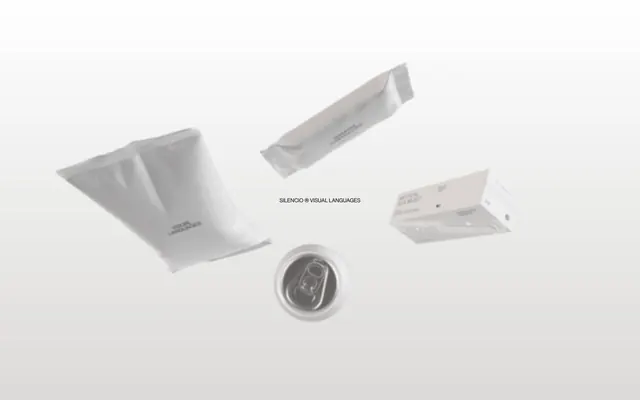
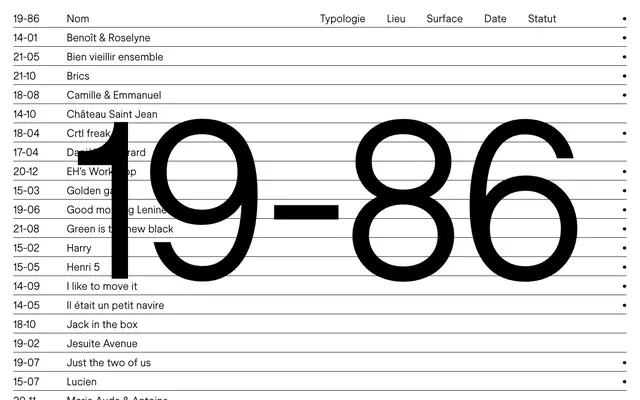
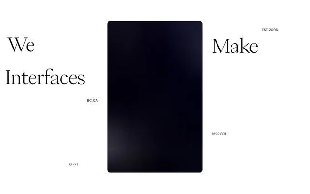
The site's visual language is dominated by the type specimens themselves, acting as the primary imagery. These are typically contained within a grid, often cropped, and showcasing diverse typographic applications. There are no lifestyle photos, illustrations, or 3D renders. Icons are minimal, usually simple arrows or abstract shapes for navigation. The focus is entirely on showcasing typography, and the images serve as direct examples, not decorative elements. They are displayed without additional masking or bespoke treatments, appearing to be raw, clear representations of their content.
Reminiscent of Typewolf, Wordmark.it, The Brand Identity.
# Fonts In Use — Style Reference
> Typographic Archive on Vellum. A precise, ordered display of form and content, like a beautifully cataloged library of type specimens.

**Theme:** light

**Site:** https://fontsinuse.com

This design system presents as an academic archive: minimal, almost utilitarian, with a relentless focus on content. The stark monochrome palette of pure black and white emphasizes the typographic examples, with subtle gray surfaces providing structure without distraction. Custom fonts (BentonSansRE and RelayCond) lend a distinct, authoritative voice, reinforcing the site's role as a trusted resource. The tight spacing and modest 2px radius on interactive elements communicate efficiency and precision, prioritizing information delivery over decorative flourishes.

## Tokens — Colors

| Name | Value | Token | Role |
|------|------|------|------|
| Inkwell | `#000000` | `--color-inkwell` | Primary text, headings, links, borders for content areas — establishes a strong, definitive presence against lighter backgrounds. |
| Canvas | `#ffffff` | `--color-canvas` | Page background, input fields, and elements requiring high contrast for readability. |
| Mist | `#f0f0f0` | `--color-mist` | Subtle background for list items, section separators, creating soft visual differentiation without breaking the monochrome theme. |
| Pewter | `#dddddd` | `--color-pewter` | Input borders, light dividers — a near-achromatic gray that provides soft definition. |
| Stone | `#cccccc` | `--color-stone` | Less prominent borders and inactive states. |
| Ash | `#999999` | `--color-ash` | Secondary text, placeholder text, disabled states on buttons — indicates less importance or interactivity. |
| Granite | `#b3b3b3` | `--color-granite` | Subtle box-shadows if applied, for a very restrained sense of elevation. |

## Tokens — Typography

### Benton Sans RE
- **Substitute:** Inter
- **Weights:** 400, 700
- **Sizes:** 9px, 10px, 12px, 14px, 16px
- **Line height:** 1.1, 1.2, 1.6
- **Letter spacing:** normal
- **Role:** The workhorse sans-serif for body text, links, headings, and navigation. Its condensed nature allows for dense information display, and the varying line heights indicate clear hierarchy in text blocks.

### Relay Cond
- **Substitute:** Oswald
- **Weights:** 400, 700
- **Sizes:** 18px, 36px
- **Line height:** 1, 1.6
- **Letter spacing:** normal
- **Role:** Used for prominent page titles, navigation, and badges, its condensed, strong presence commands attention with an architectural feel against the more ubiquitous Benton Sans RE.

## Tokens — Type Scale

| Role | Size | Line height | Letter spacing |
|------|------|------|------|
| caption | 10px | 1.1 | — |
| body | 14px | 1.6 | — |
| body-lg | 16px | 1.6 | — |
| subheading | 18px | 1 | — |
| heading | 36px | 1 | — |

## Tokens — Spacing

- **Max width:** 1180px
- **Section gap:** 30px
- **Card padding:** 20px
- **Element gap:** 10px

## Tokens — Radius

- **Buttons:** 2px
- **Inputs:** 2px

## Layout

The page adheres to a max-width 1180px, centered layout. The hero section is minimal, primarily text-based with navigation. Content is presented in a dense, multi-column grid, featuring square or rectangular 'cards' each displaying a type example. This grid maintains consistent column gutters (20px column gap) and row spacing (30px marginBottom). Navigation is predominantly horizontal at the top, supplemented by a secondary filter bar. The overall rhythm emphasizes content density and visual cataloging, with sections divided by consistent vertical spacing rather than alternating backgrounds.

## Imagery

The site's visual language is dominated by the type specimens themselves, acting as the primary imagery. These are typically contained within a grid, often cropped, and showcasing diverse typographic applications. There are no lifestyle photos, illustrations, or 3D renders. Icons are minimal, usually simple arrows or abstract shapes for navigation. The focus is entirely on showcasing typography, and the images serve as direct examples, not decorative elements. They are displayed without additional masking or bespoke treatments, appearing to be raw, clear representations of their content.

## Components

### Font Entry Cards Grid

### Search Bar with Filter Controls

### Sponsor Card

### Primary Action Button
*Interactive element*

Solid Ash background (#999999), Canvas text (#ffffff), 2px border radius, with 5px vertical and 10px horizontal padding. Borders match the button itself.

### Default Input Field
*User input*

Canvas background (#ffffff), Inkwell text (#000000), 2px border radius, with 0px vertical and 10px horizontal padding. Border is Pewter (#dddddd).

### Small Button
*Pagination/Navigation*

Small, square buttons with a subtle 2px radius. Ash background (#999999), Canvas text (#ffffff), 5px vertical and 10px horizontal padding. Borders match button color.

### Staff Pick Badge
*Decorative/Informational Tag*

Transparent background, Inkwell text (#000000), 0px border radius, 0px padding. Uses Relay Cond font at 18px and bold weight 700 to stand out.

## Guidelines

### Do

- Use Benton Sans RE for all body, paragraph, and standard heading text, varying weight between 400 and 700, and sizes between 10px and 16px to maintain a dense, readable content block.
- Apply Relay Cond exclusively for prominent headings, navigation items, and badges, utilizing its 18px and 36px sizes with weights 400 or 700 to create impact.
- Maintain a strict monochrome palette with Inkwell (#000000) for text, Canvas (#ffffff) for backgrounds, and Mist (#f0f0f0) for subtle section differentiation.
- Implement 2px border radii for all interactive elements like buttons and input fields to imply functionality without softness.
- Separate distinct content sections with a 30px vertical gap, fostering a structured yet compact layout.
- Use 5-10px element spacing to create visual separation between adjacent UI elements without appearing sparse.

### Don't

- Do not introduce chromatic colors outside the established monochrome and sponsor-driven accents for any UI elements; reserve color for content itself.
- Avoid large, rounded corners or fluid, organic shapes; maintain the precise, rectilinear aesthetic with maximum 2px radii.
- Do not use letter-spacing other than 'normal' for any text, as the custom fonts are designed for specific impact without alteration.
- Do not deviate from the established 5px vertical and 10px horizontal padding for buttons; consistency reinforces the utilitarian feel.
- Refrain from using prominent box-shadows or complex elevation patterns; subtle differentiation with gray backgrounds suffices for depth.

## Agent Prompt Guide

### Quick Color Reference
- Text: Inkwell (#000000)
- Background: Canvas (#ffffff)
- Button: Ash (#999999)
- Border (input): Pewter (#dddddd)
- Subtle Background: Mist (#f0f0f0)

### 3-5 Example Component Prompts
1. Create a `Primary Action Button` with the label 'Submit': Ash background (#999999), Canvas text (#ffffff), 2px border radius, 5px vertical padding, 10px horizontal padding, Benton Sans RE font weight 400, size 14px.
2. Create an `Input Field` component with placeholder 'Search...': Canvas background (#ffffff), Inkwell text (#000000), Pewter border (#dddddd), 2px border radius, 0px vertical padding, 10px horizontal padding, Benton Sans RE font size 14px.
3. Generate a `Staff Pick Badge` with the text 'Staff Pick': Transparent background, Inkwell text (#000000), 0px border radius, 0px padding, Relay Cond font weight 700, size 18px.
4. Design a `Gallery Item Card` placeholder, 200px by 200px. Below it, add a title 'Example Typeface': Text Inkwell (#000000), Benton Sans RE weight 700, size 16px, line height 1.2. Below that, 'Designer Name': Text Inkwell (#000000), Benton Sans RE weight 400, size 14px, line height 1.6. Use `elementGap` of 5px between title and designer name.
More like this







Keep what you find
A free account saves references to boards and can send you a weekly email of picks based on what you save.
To see every result, go Pro.