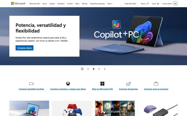
Preview image. Unlock full-res
Crisp White Blueprint
Color palette
Primary action buttons, interactive link highlights, brand accents in navigation and icons — provides a consistent chromatic touchpoint for interactivity and brand recognition.
Primary text across headings, body content, and navigation elements; outlines for cards and other structural components.
Secondary text for less prominent information, footer navigation links, and subtle icon details.
Page background, card surfaces, and text on contrasting colored buttons.
Subtle background for page sections and the primary canvas, providing a gentle off-white base.
Tertiary text for certain UI elements and subtle borders.
Text for specific list items and button text at lower prominence.
Typography
- Weights
- 400, 600
- Sizes
- 11px, 13px, 14px, 15px, 16px, 29px, 37px
- Line height
- 1, 1.2, 1.33, 1.45, 1.5, 2.27
- Letter spacing
- normal
- Fallback
- Arial
The primary typeface for all text content, from body and navigation to headings. Its system-standard clarity ensures broad accessibility and a consistent, professional tone across all content weights.
Spacing & shape
Elevation
Components
Background: Ocean Blue (#0067b8), Text: Cloud White (#ffffff), Border Radius: 2px, Padding: 10px top/bottom, 12px left/right.
Transparent background (rgba(0, 0, 0, 0)), Text: Charcoal Black (#000000), Border Color: Charcoal Black (#000000), Border Radius: 0px, Padding: 0px top/bottom, 16px left/right.
Transparent background (rgba(0, 0, 0, 0)), Text: Dark Slate (#262626), Border Color: Dark Slate (#262626), Border Radius: 0px, Padding: 1px top/bottom, 8px left/right.
Transparent background (rgba(0, 0, 0, 0)), Text: Dark Slate (#262626), Border Color: Dark Slate (#262626), Border Radius: 50%, Padding: 1px top/bottom, 6px left/right.
Background: Cloud White (#ffffff), Border Radius: 0px, Box Shadow: rgba(0, 0, 0, 0.13) 0px 3px 7px 0px, rgba(0, 0, 0, 0.11) 0px 1px 2px 0px, Padding: 48px on all sides.
Background: rgba(0, 0, 0, 0), Border Radius: 0px, No shadow, No padding.
Text Color: Graphite Gray (#616161) at 13px, (normal) letter-spacing, font-weight 400. On hover/active, a border underline will appear in Ocean Blue.
Guidelines
- Prioritize Ocean Blue (#0067b8) for primary calls to action and interactive elements to maintain brand consistency.
- Use Charcoal Black (#000000) for all main headings and body text to ensure maximum readability and contrast.
- Apply Cloud White (#ffffff) as the default background for content cards and elevated surfaces.
- Employ Fog Gray (#f2f2f2) for subtle background differentiation between page sections.
- Maintain a 2px border radius for all interactive buttons to introduce a subtle softness to actions.
- Always use Segoe UI with a 400 or 600 weight for all typographic elements.
- Apply 48px padding around content within Feature Cards to create a spacious internal layout.
- Avoid using background colors other than Cloud White (#ffffff) or Fog Gray (#f2f2f2) for primary content areas.
- Do not introduce sharp corners on primary action buttons; always use the specified 2px border radius.
- Refrain from using heavily saturated colors outside of the defined brand blue (#0067b8) for UI elements.
- Do not deviate from Segoe UI for text; avoid decorative or script fonts.
- Avoid using box shadows on elements other than Feature Cards.
- Do not use generic gray values; stick to the defined neutral palette (Charcoal Black, Graphite Gray, Dark Slate, Deep Ash).
- Do not apply padding or margins inconsistent with the 8px base unit system.
About this system
ShowHide
The Microsoft design system exudes a balanced composition, pairing clear-cut information presentation with a foundational blue accent. It leverages a strong neutral palette dominated by white and deep grays, providing high contrast and visual clarity. The consistent use of 2px radius on interactive elements like buttons subtly softens the otherwise sharp edges dictated by the 0px default. Bold imagery and product showcases are integrated seamlessly, often against a vibrant brand blue that contrasts with the clean, primarily white UI.
The page primarily utilizes a max-width contained layout, centering content within a defined horizontal space, though hero sections can span full-bleed. The hero pattern features a split layout with text on a neutral background to the left and a prominent product image on a branded gradient background to the right. Sections alternate between Fog Gray (#f2f2f2) and Cloud White (#ffffff) backgrounds, creating a clear vertical rhythm. Content is generally arranged in two-column layouts or multi-column grids (3-column, sometimes 4-column) for features and product showcasing. Navigation is a persistent top bar with clear links and utility icons.
The site primarily uses high-quality product photography, often displayed against clean white or abstract gradient backgrounds. These images are typically contained within rectangular frames, without rounded corners or overlapping elements. Beyond product shots, illustrations are colorful and often abstract, emphasizing dynamism and digital concepts. Icons are typically monochrome (Charcoal Black or Graphite Gray) and outlined. Imagery serves both to showcase products and to provide decorative atmosphere, with a balanced density relative to text content.
Reminiscent of HP, Dell, IBM.
# Microsoft — Style Reference
> Crisp White Blueprint

**Theme:** light

**Site:** https://www.microsoft.com

The Microsoft design system exudes a balanced composition, pairing clear-cut information presentation with a foundational blue accent. It leverages a strong neutral palette dominated by white and deep grays, providing high contrast and visual clarity. The consistent use of 2px radius on interactive elements like buttons subtly softens the otherwise sharp edges dictated by the 0px default. Bold imagery and product showcases are integrated seamlessly, often against a vibrant brand blue that contrasts with the clean, primarily white UI.

## Tokens — Colors

| Name | Value | Token | Role |
|------|------|------|------|
| Ocean Blue | `#0067b8` | `--color-ocean-blue` | Primary action buttons, interactive link highlights, brand accents in navigation and icons — provides a consistent chromatic touchpoint for interactivity and brand recognition. |
| Charcoal Black | `#000000` | `--color-charcoal-black` | Primary text across headings, body content, and navigation elements; outlines for cards and other structural components. |
| Graphite Gray | `#616161` | `--color-graphite-gray` | Secondary text for less prominent information, footer navigation links, and subtle icon details. |
| Cloud White | `#ffffff` | `--color-cloud-white` | Page background, card surfaces, and text on contrasting colored buttons. |
| Fog Gray | `#f2f2f2` | `--color-fog-gray` | Subtle background for page sections and the primary canvas, providing a gentle off-white base. |
| Dark Slate | `#262626` | `--color-dark-slate` | Tertiary text for certain UI elements and subtle borders. |
| Deep Ash | `#171717` | `--color-deep-ash` | Text for specific list items and button text at lower prominence. |

## Tokens — Typography

### Segoe UI
- **Substitute:** Arial
- **Weights:** 400, 600
- **Sizes:** 11px, 13px, 14px, 15px, 16px, 29px, 37px
- **Line height:** 1, 1.2, 1.33, 1.45, 1.5, 2.27
- **Letter spacing:** normal
- **Role:** The primary typeface for all text content, from body and navigation to headings. Its system-standard clarity ensures broad accessibility and a consistent, professional tone across all content weights.

## Tokens — Type Scale

| Role | Size | Line height | Letter spacing |
|------|------|------|------|
| caption | 11px | 1.45 | — |
| heading | 29px | 1.2 | — |
| display | 37px | 1 | — |

## Tokens — Spacing

- **Section gap:** 48px
- **Card padding:** 48px
- **Element gap:** 8px

## Tokens — Radius

- **Buttons:** 2px
- **Cards:** 0px

## Tokens — Elevation

- **Feature Card:** `rgba(0, 0, 0, 0.13) 0px 3px 7px 0px, rgba(0, 0, 0, 0.11) 0px 1px 2px 0px`

## Layout

The page primarily utilizes a max-width contained layout, centering content within a defined horizontal space, though hero sections can span full-bleed. The hero pattern features a split layout with text on a neutral background to the left and a prominent product image on a branded gradient background to the right. Sections alternate between Fog Gray (#f2f2f2) and Cloud White (#ffffff) backgrounds, creating a clear vertical rhythm. Content is generally arranged in two-column layouts or multi-column grids (3-column, sometimes 4-column) for features and product showcasing. Navigation is a persistent top bar with clear links and utility icons.

## Imagery

The site primarily uses high-quality product photography, often displayed against clean white or abstract gradient backgrounds. These images are typically contained within rectangular frames, without rounded corners or overlapping elements. Beyond product shots, illustrations are colorful and often abstract, emphasizing dynamism and digital concepts. Icons are typically monochrome (Charcoal Black or Graphite Gray) and outlined. Imagery serves both to showcase products and to provide decorative atmosphere, with a balanced density relative to text content.

## Components

### Primary Action Button
*Filled button*

Background: Ocean Blue (#0067b8), Text: Cloud White (#ffffff), Border Radius: 2px, Padding: 10px top/bottom, 12px left/right.

### Ghost Border Button
*Outlined button*

Transparent background (rgba(0, 0, 0, 0)), Text: Charcoal Black (#000000), Border Color: Charcoal Black (#000000), Border Radius: 0px, Padding: 0px top/bottom, 16px left/right.

### Subtle Link Button
*Text link styled as button*

Transparent background (rgba(0, 0, 0, 0)), Text: Dark Slate (#262626), Border Color: Dark Slate (#262626), Border Radius: 0px, Padding: 1px top/bottom, 8px left/right.

### Circular Icon Button
*Icon button*

Transparent background (rgba(0, 0, 0, 0)), Text: Dark Slate (#262626), Border Color: Dark Slate (#262626), Border Radius: 50%, Padding: 1px top/bottom, 6px left/right.

### Feature Card
*Information display card*

Background: Cloud White (#ffffff), Border Radius: 0px, Box Shadow: rgba(0, 0, 0, 0.13) 0px 3px 7px 0px, rgba(0, 0, 0, 0.11) 0px 1px 2px 0px, Padding: 48px on all sides.

### Transparent Content Card
*Image/text container without explicit background*

Background: rgba(0, 0, 0, 0), Border Radius: 0px, No shadow, No padding.

### Navigation Link
*Main navigation item*

Text Color: Graphite Gray (#616161) at 13px, (normal) letter-spacing, font-weight 400. On hover/active, a border underline will appear in Ocean Blue.

## Guidelines

### Do

- Prioritize Ocean Blue (#0067b8) for primary calls to action and interactive elements to maintain brand consistency.
- Use Charcoal Black (#000000) for all main headings and body text to ensure maximum readability and contrast.
- Apply Cloud White (#ffffff) as the default background for content cards and elevated surfaces.
- Employ Fog Gray (#f2f2f2) for subtle background differentiation between page sections.
- Maintain a 2px border radius for all interactive buttons to introduce a subtle softness to actions.
- Always use Segoe UI with a 400 or 600 weight for all typographic elements.
- Apply 48px padding around content within Feature Cards to create a spacious internal layout.

### Don't

- Avoid using background colors other than Cloud White (#ffffff) or Fog Gray (#f2f2f2) for primary content areas.
- Do not introduce sharp corners on primary action buttons; always use the specified 2px border radius.
- Refrain from using heavily saturated colors outside of the defined brand blue (#0067b8) for UI elements.
- Do not deviate from Segoe UI for text; avoid decorative or script fonts.
- Avoid using box shadows on elements other than Feature Cards.
- Do not use generic gray values; stick to the defined neutral palette (Charcoal Black, Graphite Gray, Dark Slate, Deep Ash).
- Do not apply padding or margins inconsistent with the 8px base unit system.

## Agent Prompt Guide

Quick Color Reference:
text: #000000
background: #ffffff
border: #000000
accent: #0067b8
primary action: #0067b8 (filled action)

Example Component Prompts:
1. Create a hero call-to-action button: Ocean Blue (#0067b8) background, Cloud White (#ffffff) text, Segoe UI weight 400, 2px radius, 10px top/bottom padding, 12px left/right padding.
2. Create a Feature Card: Cloud White (#ffffff) background, 0px border radius, shadow 'rgba(0, 0, 0, 0.13) 0px 3px 7px 0px, rgba(0, 0, 0, 0.11) 0px 1px 2px 0px', 48px internal padding. Headline is Charcoal Black (#000000) at 29px Segoe UI weight 600. Body text is Charcoal Black (#000000) at 14px Segoe UI weight 400.
3. Create a navigation link: Graphite Gray (#616161) text, Segoe UI weight 400, 13px size, normal letter-spacing, no background, 8px left/right padding. On hover, the text color changes to Ocean Blue (#0067b8).
More like this









Keep what you find
A free account saves references to boards and can send you a weekly email of picks based on what you save.
To see every result, go Pro.