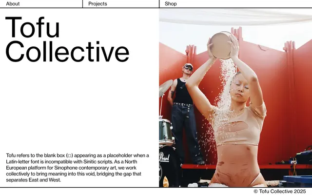
Preview image. Unlock full-res
Gallery Canvas, Monochromatic Punctuation
Color palette
Page backgrounds, card surfaces, primary surface elevation
Dark borders and separators for elevated surfaces and inverted UI. Do not promote it to the primary CTA color
Secondary text, subtle borders, and background elements, providing a softer alternative to Ink Black without introducing color
Typography
- Weights
- 400
- Sizes
- 18px
- Line height
- 1.44
- Letter spacing
- normal
- Fallback
- Inter
Body text and descriptive paragraphs, chosen for its clarity and legibility at smaller sizes.
- Weights
- 400
- Sizes
- 16px, 90px
- Line height
- 0.76, 0.97, 1.25
- Letter spacing
- -0.025em
- Fallback
- system-ui
All headings and navigation links. The font's broad character for headings creates a strong, editorial presence, while its use for links maintains typographic consistency.
- Weights
- 400
- Sizes
- 16px
- Line height
- 1
- Letter spacing
- normal
- Fallback
- system-ui
Fallback text, used sparingly for small, functional text such as footers or system defaults.
Spacing & shape
Components
A minimalist card with no visible borders, shadows, or rounded corners, blending seamlessly with the Canvas White background. Used for grouping visual content without imposing a strong visual boundary. Background: Canvas White (#ffffff). Border radius: 0px. Padding: 0px.
Large, bold text using the 'wtqc' typeface at 90px size and 0.97 line height, rendered in Ink Black (#000000). Letter spacing is -0.025em, creating a tight, structured appearance. Used for prominent titles like 'Tofu Collective'.
Text links for primary navigation. Uses 'wtqc' typeface, 0.76 line height for compactness, in Ink Black (#000000). A border of 1px Ink Black (#000000) appears below on hover or active state, providing interaction feedback.
Guidelines
- Use Ink Black (#000000) for all primary text and critical UI elements like borders to maintain high contrast.
- Employ Canvas White (#ffffff) as the dominant background color for all page sections and content cards.
- Apply 'wtqc' font at 90px with -0.025em letter spacing for main headings to achieve the signature bold, condensed look.
- Ensure horizontal and vertical lines (borders, dividers) use Ink Black (#000000) at 1px thickness.
- Maintain 0px border-radius for surfaces and active components to preserve the stark, angular aesthetic, with the exception of specific, highly decorative elements that may use 20px radius.
- Structure primary page sections with a 200px vertical gap, creating clear visual separation and breathing room.
- Utilize a split-screen or grid-based layout for content areas, balancing large typographic elements with visual imagery.
- Avoid introducing any colors outside of the defined Ink Black, Muted Ash, and Canvas White palette for UI elements.
- Do not use soft shadows or gradients on any interactive components or surfaces; elevation should be purely through borders and contrast.
- Do not use generic system fonts for headings or navigation; 'wtqc' is essential for brand identity.
- Avoid excessive padding within components; this system is compact and relies on minimal spacing between elements (e.g., 0px card padding, 1px element gap).
- Do not use rounded corners universally; most elements are sharp-edged, with 20px radius reserved for specific non-UI elements if needed.
- Do not break away from the dominant grid structure with asymmetrical or overlapping elements unless it's for photographic content.
About this system
ShowHide
Tofu Collective employs a stark, high-contrast, black and white aesthetic that evokes a gallery's minimalist elegance. The visual system foregrounds content through bold typography and generous negative space, with a deliberate absence of color and soft components. Layouts are strictly structured with strong horizontal and vertical lines maintaining a rigid grid. The overall impression is one of clean, intellectual presentation designed to frame artistic or niche content without visual distraction.
The page adheres to a maximalist layout with no explicit global max-width, allowing content to bleed to the edges. The hero section is characterized by a stark left-aligned, oversized typographic headline contrasting with a large, full-bleed aesthetic photograph on the right. Vertical rhythm is established through explicit section gaps of 200px. Content is often divided into two primary columns, featuring large text blocks on one side and an accompanying photograph or strong visual on the other. Navigation is a simple, fixed header with text links, divided by thin Ink Black vertical lines.
This site features curated photography, often abstract or artistic, presented without framing or heavy manipulation. Photography occupies significant visual real estate, frequently appearing as large, full-bleed backgrounds or occupying one half of a split layout. Images are typically vivid and raw, showcasing expressive subjects or scenes in high detail, juxtaposed against the minimalist UI to create strong visual tension. There are no illustrations, product screenshots, or 3D renders. Icons are minimal, likely text-based or simple geometric forms for navigation.
Reminiscent of The Serpentine Galleries, AIGA Design Archives, Unit.org.
# Tofu Collective — Style Reference
> Gallery Canvas, Monochromatic Punctuation

**Theme:** light

**Site:** https://tofucollective.com

Tofu Collective employs a stark, high-contrast, black and white aesthetic that evokes a gallery's minimalist elegance. The visual system foregrounds content through bold typography and generous negative space, with a deliberate absence of color and soft components. Layouts are strictly structured with strong horizontal and vertical lines maintaining a rigid grid. The overall impression is one of clean, intellectual presentation designed to frame artistic or niche content without visual distraction.

## Tokens — Colors

| Name | Value | Token | Role |
|------|------|------|------|
| Canvas White | `#ffffff` | `--color-canvas-white` | Page backgrounds, card surfaces, primary surface elevation |
| Ink Black | `#000000` | `--color-ink-black` | Dark borders and separators for elevated surfaces and inverted UI. Do not promote it to the primary CTA color |
| Muted Ash | `#282828` | `--color-muted-ash` | Secondary text, subtle borders, and background elements, providing a softer alternative to Ink Black without introducing color |

## Tokens — Typography

### Inter
- **Substitute:** Inter
- **Weights:** 400
- **Sizes:** 18px
- **Line height:** 1.44
- **Letter spacing:** normal
- **Role:** Body text and descriptive paragraphs, chosen for its clarity and legibility at smaller sizes.

### wtqc
- **Substitute:** system-ui
- **Weights:** 400
- **Sizes:** 16px, 90px
- **Line height:** 0.76, 0.97, 1.25
- **Letter spacing:** -0.025em
- **Role:** All headings and navigation links. The font's broad character for headings creates a strong, editorial presence, while its use for links maintains typographic consistency.

### -apple-system
- **Substitute:** system-ui
- **Weights:** 400
- **Sizes:** 16px
- **Line height:** 1
- **Letter spacing:** normal
- **Role:** Fallback text, used sparingly for small, functional text such as footers or system defaults.

## Tokens — Type Scale

| Role | Size | Line height | Letter spacing |
|------|------|------|------|
| body | 16px | 1 | — |
| body-lg | 18px | 1.44 | — |
| display | 90px | 0.97 | -0.025em |

## Tokens — Spacing

- **Section gap:** 200px
- **Card padding:** 0px
- **Element gap:** 1px

## Tokens — Radius

- **Default:** 20px

## Layout

The page adheres to a maximalist layout with no explicit global max-width, allowing content to bleed to the edges. The hero section is characterized by a stark left-aligned, oversized typographic headline contrasting with a large, full-bleed aesthetic photograph on the right. Vertical rhythm is established through explicit section gaps of 200px. Content is often divided into two primary columns, featuring large text blocks on one side and an accompanying photograph or strong visual on the other. Navigation is a simple, fixed header with text links, divided by thin Ink Black vertical lines.

## Imagery

This site features curated photography, often abstract or artistic, presented without framing or heavy manipulation. Photography occupies significant visual real estate, frequently appearing as large, full-bleed backgrounds or occupying one half of a split layout. Images are typically vivid and raw, showcasing expressive subjects or scenes in high detail, juxtaposed against the minimalist UI to create strong visual tension. There are no illustrations, product screenshots, or 3D renders. Icons are minimal, likely text-based or simple geometric forms for navigation.

## Components

### Basic Card
*Content container*

A minimalist card with no visible borders, shadows, or rounded corners, blending seamlessly with the Canvas White background. Used for grouping visual content without imposing a strong visual boundary. Background: Canvas White (#ffffff). Border radius: 0px. Padding: 0px.

### Primary Heading
*Main page titles*

Large, bold text using the 'wtqc' typeface at 90px size and 0.97 line height, rendered in Ink Black (#000000). Letter spacing is -0.025em, creating a tight, structured appearance. Used for prominent titles like 'Tofu Collective'.

### Navigation Link
*Top-level navigation items*

Text links for primary navigation. Uses 'wtqc' typeface, 0.76 line height for compactness, in Ink Black (#000000). A border of 1px Ink Black (#000000) appears below on hover or active state, providing interaction feedback.

## Guidelines

### Do

- Use Ink Black (#000000) for all primary text and critical UI elements like borders to maintain high contrast.
- Employ Canvas White (#ffffff) as the dominant background color for all page sections and content cards.
- Apply 'wtqc' font at 90px with -0.025em letter spacing for main headings to achieve the signature bold, condensed look.
- Ensure horizontal and vertical lines (borders, dividers) use Ink Black (#000000) at 1px thickness.
- Maintain 0px border-radius for surfaces and active components to preserve the stark, angular aesthetic, with the exception of specific, highly decorative elements that may use 20px radius.
- Structure primary page sections with a 200px vertical gap, creating clear visual separation and breathing room.
- Utilize a split-screen or grid-based layout for content areas, balancing large typographic elements with visual imagery.

### Don't

- Avoid introducing any colors outside of the defined Ink Black, Muted Ash, and Canvas White palette for UI elements.
- Do not use soft shadows or gradients on any interactive components or surfaces; elevation should be purely through borders and contrast.
- Do not use generic system fonts for headings or navigation; 'wtqc' is essential for brand identity.
- Avoid excessive padding within components; this system is compact and relies on minimal spacing between elements (e.g., 0px card padding, 1px element gap).
- Do not use rounded corners universally; most elements are sharp-edged, with 20px radius reserved for specific non-UI elements if needed.
- Do not break away from the dominant grid structure with asymmetrical or overlapping elements unless it's for photographic content.

## Agent Prompt Guide

primary action: no distinct CTA color
More like this









Keep what you find
A free account saves references to boards and can send you a weekly email of picks based on what you save.
To see every result, go Pro.