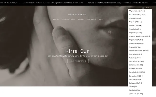
Preview image. Unlock full-res
monochrome canvas, refined contrast
Color palette
Page backgrounds, card surfaces, ghost button backgrounds, default icon fill
Neutral form states, badge text, and quiet UI feedback where color should stay understated. Do not promote it to the primary CTA color
Muted text or decorative borders, used for less prominent visual elements
Secondary body text for detailed content, slightly softer than Midnight Ink
Dark borders and separators for elevated surfaces and inverted UI. Do not promote it to the primary CTA color
Typography
- Weights
- 300, 400, 500
- Sizes
- 10px, 11px, 12px, 13px, 14px, 16px, 18px, 20px, 32px, 44px, 48px
- Line height
- 1, 1.2, 1.38, 1.4, 1.8
- Letter spacing
- -0.01em at 48px, 0.05em at 10px
- Fallback
- serif
The primary typeface for all text content. Its variable weight allows for subtle hierarchy; the lighter 300 weight for marketing headlines creates an airy, sophisticated feel, while the consistent tracking across sizes helps maintain a precise, refined look.
Spacing & shape
Components
Background rgba(0, 0, 0, 0), text Midnight Ink (#000000), 1px border in Midnight Ink (#000000), 0px border-radius, 1px vertical padding, 6px horizontal padding. This button is visually very light, almost blending with the background.
Background Canvas White (#ffffff), text Midnight Ink (#000000), 0px border-radius, 8px vertical padding, 13.6px horizontal padding. No visible border distinction, it's a solid block of white.
Background rgba(255, 255, 255, 0), text Canvas White (#ffffff), 1px border in Canvas White (#ffffff), 0px border-radius, 5px vertical padding, 11px horizontal padding.
Background Canvas White (#ffffff), 0px border-radius, no box shadow, 64px vertical padding, 32px horizontal padding. Features a very minimalist design with ample whitespace.
Background rgba(255, 255, 255, 0), text Midnight Ink (#000000), 0px border-radius, 1px bottom border in Midnight Ink (#000000), 16px vertical padding, 0px left padding. Emphasizes an understated form experience.
Background rgba(0, 0, 0, 0), text Midnight Ink (#000000), 0px border-radius, 5px all-around padding. Designed for minimal visual distraction.
Guidelines
- Prioritize Canvas White (#ffffff) for backgrounds and Midnight Ink (#000000) for text and interactive borders to maintain high contrast and clarity.
- Use Mihan typeface at weight 300 for all large headlines (32px and above) to convey authority through restraint.
- Apply 0px border-radius consistently across all UI elements, including buttons, cards, and inputs, for a sharp, angular aesthetic.
- Employ ghost buttons with 1px borders in the primary text color (Midnight Ink #000000) for secondary actions or where a lightweight interaction is desired.
- Maintain a clear vertical rhythm using 64px for section gaps and 32px for inner card padding, creating breathing room within the compact layout.
- Use -0.01em letter-spacing for display typography and 0.05em for caption-sized text to optimize readability at each scale.
- Ensure all interactive elements, even if ghost-style, have a visible border or clear text color in Midnight Ink (#000000) against Canvas White (#ffffff).
- Avoid chromatic colors for primary calls to action; stick to the black and white palette for core interactive elements.
- Do not introduce rounded corners; all elements must adhere to the strict 0px border-radius.
- Refrain from using heavy shadows or complex gradients; rely on contrast, fine borders, and spacing for visual hierarchy.
- Do not vary text letter-spacing randomly; apply specific values based on the type scale to maintain precision.
- Avoid using multiple font families or weights outside of the specified Mihan family and its defined weights.
- Do not use overly verbose or decorative language in component descriptions or labels; maintain compact and precise text.
- Do not use more than 1px for borders on interactive elements or separators unless for specific semantic purposes (e.g., error states).
About this system
ShowHide
Mihan Aromatics ™ operates on a high-contrast minimalist aesthetic, emphasizing stark black and white with subtle gray accents. Typography is compact and precise, maintaining a refined elegance. Surfaces are predominantly flat, and component weights are light, prioritizing content and product imagery. The overall impression is one of considered simplicity and understated luxury, with structure revealed through fine borders and purposeful spacing rather than heavy visual elements.
Reminiscent of Aesop, Byredo, Le Labo, Studio McGee.
# Mihan Aromatics ™ — Style Reference
> monochrome canvas, refined contrast

**Theme:** light

**Site:** https://mihanaromatics.com

Mihan Aromatics ™ operates on a high-contrast minimalist aesthetic, emphasizing stark black and white with subtle gray accents. Typography is compact and precise, maintaining a refined elegance. Surfaces are predominantly flat, and component weights are light, prioritizing content and product imagery. The overall impression is one of considered simplicity and understated luxury, with structure revealed through fine borders and purposeful spacing rather than heavy visual elements.

## Tokens — Colors

| Name | Value | Token | Role |
|------|------|------|------|
| Canvas White | `#ffffff` | `--color-canvas-white` | Page backgrounds, card surfaces, ghost button backgrounds, default icon fill |
| Midnight Ink | `#000000` | `--color-midnight-ink` | Neutral form states, badge text, and quiet UI feedback where color should stay understated. Do not promote it to the primary CTA color |
| Ash Gray | `#878787` | `--color-ash-gray` | Muted text or decorative borders, used for less prominent visual elements |
| Charcoal | `#333333` | `--color-charcoal` | Secondary body text for detailed content, slightly softer than Midnight Ink |
| Shadow Tint | `#4d4d4d` | `--color-shadow-tint` | Dark borders and separators for elevated surfaces and inverted UI. Do not promote it to the primary CTA color |

## Tokens — Typography

### Mihan
- **Substitute:** serif
- **Weights:** 300, 400, 500
- **Sizes:** 10px, 11px, 12px, 13px, 14px, 16px, 18px, 20px, 32px, 44px, 48px
- **Line height:** 1, 1.2, 1.38, 1.4, 1.8
- **Letter spacing:** -0.01em at 48px, 0.05em at 10px
- **Role:** The primary typeface for all text content. Its variable weight allows for subtle hierarchy; the lighter 300 weight for marketing headlines creates an airy, sophisticated feel, while the consistent tracking across sizes helps maintain a precise, refined look.

## Tokens — Type Scale

| Role | Size | Line height | Letter spacing |
|------|------|------|------|
| caption | 10px | 1.4 | 0.05em |
| heading | 32px | 1.2 | 0.036em |
| heading-lg | 44px | 1 | 0.023em |
| display | 48px | 1 | 0.02em |

## Tokens — Spacing

- **Section gap:** 64px
- **Card padding:** 32px
- **Element gap:** 8px

## Tokens — Radius

- **all:** 0px

## Components

### Ghost Button - Minimal
*Subtle call to action for secondary actions or navigation.*

Background rgba(0, 0, 0, 0), text Midnight Ink (#000000), 1px border in Midnight Ink (#000000), 0px border-radius, 1px vertical padding, 6px horizontal padding. This button is visually very light, almost blending with the background.

### Filled Button - White
*Primary Call to Action, stands out against darker backgrounds.*

Background Canvas White (#ffffff), text Midnight Ink (#000000), 0px border-radius, 8px vertical padding, 13.6px horizontal padding. No visible border distinction, it's a solid block of white.

### Ghost Button - White/Transparent
*Call to action used on hero images, designed for high contrast against diverse media.*

Background rgba(255, 255, 255, 0), text Canvas White (#ffffff), 1px border in Canvas White (#ffffff), 0px border-radius, 5px vertical padding, 11px horizontal padding.

### Feature Card
*Content container for showcasing features or product details.*

Background Canvas White (#ffffff), 0px border-radius, no box shadow, 64px vertical padding, 32px horizontal padding. Features a very minimalist design with ample whitespace.

### Text Input - Underlined
*Standard input field for user data.*

Background rgba(255, 255, 255, 0), text Midnight Ink (#000000), 0px border-radius, 1px bottom border in Midnight Ink (#000000), 16px vertical padding, 0px left padding. Emphasizes an understated form experience.

### Navigation Badge
*Categorization or informational tags within menus or lists.*

Background rgba(0, 0, 0, 0), text Midnight Ink (#000000), 0px border-radius, 5px all-around padding. Designed for minimal visual distraction.

## Guidelines

### Do

- Prioritize Canvas White (#ffffff) for backgrounds and Midnight Ink (#000000) for text and interactive borders to maintain high contrast and clarity.
- Use Mihan typeface at weight 300 for all large headlines (32px and above) to convey authority through restraint.
- Apply 0px border-radius consistently across all UI elements, including buttons, cards, and inputs, for a sharp, angular aesthetic.
- Employ ghost buttons with 1px borders in the primary text color (Midnight Ink #000000) for secondary actions or where a lightweight interaction is desired.
- Maintain a clear vertical rhythm using 64px for section gaps and 32px for inner card padding, creating breathing room within the compact layout.
- Use -0.01em letter-spacing for display typography and 0.05em for caption-sized text to optimize readability at each scale.
- Ensure all interactive elements, even if ghost-style, have a visible border or clear text color in Midnight Ink (#000000) against Canvas White (#ffffff).

### Don't

- Avoid chromatic colors for primary calls to action; stick to the black and white palette for core interactive elements.
- Do not introduce rounded corners; all elements must adhere to the strict 0px border-radius.
- Refrain from using heavy shadows or complex gradients; rely on contrast, fine borders, and spacing for visual hierarchy.
- Do not vary text letter-spacing randomly; apply specific values based on the type scale to maintain precision.
- Avoid using multiple font families or weights outside of the specified Mihan family and its defined weights.
- Do not use overly verbose or decorative language in component descriptions or labels; maintain compact and precise text.
- Do not use more than 1px for borders on interactive elements or separators unless for specific semantic purposes (e.g., error states).

## Agent Prompt Guide

Quick Color Reference:
text: #000000
background: #ffffff
border: #000000
accent: no distinct accent color
primary action: no distinct CTA color

Example Component Prompts:
1. Create a Hero Section: Full-bleed image background (monochromatic, desaturated). Centered heading 'Kirra Curl' using Mihan, 48px, weight 300, #000000, 0.02em letter-spacing. Subtext centered below, 18px, #000000. 'WEAR THE COASTLINE' ghost button below that: 1px Canvas White (#ffffff) border, Canvas White (#ffffff) text, 5px vertical padding, 11px horizontal padding, 0px radius.
2. Create a Feature Card: Background Canvas White (#ffffff), no shadows, 0px border-radius. Inner content uses 64px vertical padding and 32px horizontal padding. Heading 'Born in Melbourne' using Mihan, 32px, weight 400, #000000. Body text below in Mihan, 12px, #000000.
3. Create a Primary Navigation Item: Text 'Shop All' using Mihan, 14px, weight 400, #000000. Underlined on hover with a 1px border in #000000. No spacing/padding provided.
More like this





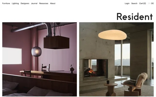




Keep what you find
A free account saves references to boards and can send you a weekly email of picks based on what you save.
To see every result, go Pro.