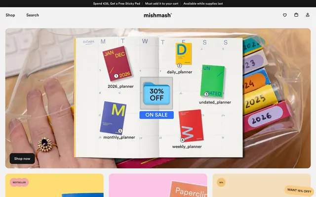
Preview image. Unlock full-res
Stationery storefront on paper
Color palette
Decorative card backgrounds, accent surfaces for promotional content
Call-to-action button fills for subtle emphasis, small promotional badges
Primary text, heading text, accent for interactive elements, solid button backgrounds, divider lines
Main page background, content cards
Light background for sections and navigation, button text on dark backgrounds
Subtle card backgrounds, hairline borders, muted button borders
Secondary text, descriptive body copy
Muted section headings, informational text
Placeholder text, tertiary information, footer links
Typography
- Weights
- 400, 500, 600
- Sizes
- 10px, 14px, 16px, 18px, 20px, 30px, 38px, 46px
- Line height
- 1.04, 1.12, 1.2
- Fallback
- system-ui
The primary typeface for all text elements. Its geometric precision and range of weights provide a versatile foundation for both headings and body copy, ensuring clarity across various information hierarchies. Tight leading and normal letter spacing maintain a compact, efficient feel.
Spacing & shape
Components
Solid background in Midnight Ink (#171717), Cloud Canvas (#ffffff) text, 12px border radius, 14px vertical padding, 20px horizontal padding.
Transparent background, Midnight Ink (#171717) text, 0px border radius, no padding, implicit sizing.
Transparent background, Midnight Ink (#171717) text, Whisper White (#e3e3e3) border, 8px border radius, 8px vertical padding, 14px horizontal padding.
Ghost background (transparent), no shadow, 16px border radius, 24px internal padding for content, with product image or detailed product shots filling the card.
Parchment Yellow (#f4debb) background, 16px border radius, full-bleed imagery, no internal padding for content. Text overlayed directly on image.
Sunset Gold (#f9cb86) solid background with Midnight Ink (#171717) text, 99999px border radius for a pill shape.
Transparent background, Midnight Ink (#171717) text, Midnight Ink (#171717) bottom border, 0px border radius, 14px vertical padding, 16px horizontal padding.
Guidelines
- Always use Circular for all typographic elements to maintain brand consistency.
- Utilize Midnight Ink (#171717) for primary text and critical UI elements to ensure high contrast and legibility.
- Apply Cloud Canvas (#ffffff) and Fog Gray (#f2f2f2) as dominant background colors to support the light theme and provide visual hierarchy.
- Employ a 12px border radius for interactive elements like buttons and an 16px radius for cards to add softness.
- Restrict padding to values from the spacing scale (2px, 4px, 6px, 8px, 12px, 14px, 16px, 20px, 24px, 32px, 40px, 48px) for consistent rhythm.
- Feature product photography prominently, using vibrant, full-color images against neutral UI elements.
- Use Sunset Gold (#f9cb86) sparingly for promotional badges or discrete CTA fills, contrasting with the dominant neutrals.
- Avoid introducing additional saturated colors unless they are part of product photography, maintaining a neutral UI palette.
- Do not use heavy shadows or gradients on UI elements; the system prioritizes flat modern surfaces.
- Refrain from altering the letter-spacing of the Circular typeface, it is inherently normal for this brand.
- Do not use dark backgrounds for main content sections; this system operates strictly on a light theme.
- Avoid decorative strokes or borders around cards unless for a specific interaction state; cards should generally be ghosted or have solid light backgrounds.
- Do not use overly large or decorative display fonts; maintain the compact, functional nature of Circular.
About this system
ShowHide
Mishmash projects a playful, product-centric aesthetic through a stark monochrome UI punctuated by an array of vibrant product photography. The design features a light theme with crisp, neutral surfaces, allowing the colorful stationery products to be the focal point. Typography is compact and precise, conveying information efficiently, while rounded elements add a touch of softness to an otherwise structured layout. This system prioritizes visual clarity and product showcase over decorative complexity.
The page primarily uses a max-width contained layout of 1536px, with content centered. The hero section often features a full-bleed vibrant image or a split layout with a prominent visual on one side and concise text/CTA on the other. Sections maintain a consistent vertical rhythm with 48px gaps, often alternating between visual content blocks and product grids. Content arrangement leans towards two-column layouts for featured sections (text and visual side-by-side) and multi-column card grids (typically 4-column) for product listings. Navigation is a sticky top bar with a search and cart icon, keeping the interface minimal and focused.
The visual language is dominated by high-quality product photography, specifically stationery items. Images are typically close-up, sharp, and vibrant, showcasing the product in full color against plain white or light backgrounds. In some instances, products are artfully arranged in abstract compositions or captured in hands for a lifestyle touch, always with clear focus on the item itself. Graphics are minimal, predominantly iconography with a filled style and moderate stroke weight, or simple brand accents. Imagery serves a dual role: both as decorative atmosphere (hero shots) and explanatory content (product grids), dominating visual space in product listings.
Reminiscent of Paper & Type, Poketo, Notem Studio, Ohh Deer.
# mishmash® — Style Reference
> Stationery storefront on paper

**Theme:** light

**Site:** https://mishmash.pt

Mishmash projects a playful, product-centric aesthetic through a stark monochrome UI punctuated by an array of vibrant product photography. The design features a light theme with crisp, neutral surfaces, allowing the colorful stationery products to be the focal point. Typography is compact and precise, conveying information efficiently, while rounded elements add a touch of softness to an otherwise structured layout. This system prioritizes visual clarity and product showcase over decorative complexity.

## Tokens — Colors

| Name | Value | Token | Role |
|------|------|------|------|
| Parchment Yellow | `#f4debb` | `--color-parchment-yellow` | Decorative card backgrounds, accent surfaces for promotional content |
| Sunset Gold | `#f9cb86` | `--color-sunset-gold` | Call-to-action button fills for subtle emphasis, small promotional badges |
| Midnight Ink | `#171717` | `--color-midnight-ink` | Primary text, heading text, accent for interactive elements, solid button backgrounds, divider lines |
| Cloud Canvas | `#ffffff` | `--color-cloud-canvas` | Main page background, content cards |
| Fog Gray | `#f2f2f2` | `--color-fog-gray` | Light background for sections and navigation, button text on dark backgrounds |
| Whisper White | `#e3e3e3` | `--color-whisper-white` | Subtle card backgrounds, hairline borders, muted button borders |
| Ash Gray | `#858585` | `--color-ash-gray` | Secondary text, descriptive body copy |
| Slate Gray | `#919191` | `--color-slate-gray` | Muted section headings, informational text |
| Silver Mist | `#a1a1a1` | `--color-silver-mist` | Placeholder text, tertiary information, footer links |

## Tokens — Typography

### Circular
- **Substitute:** system-ui
- **Weights:** 400, 500, 600
- **Sizes:** 10px, 14px, 16px, 18px, 20px, 30px, 38px, 46px
- **Line height:** 1.04, 1.12, 1.2
- **Role:** The primary typeface for all text elements. Its geometric precision and range of weights provide a versatile foundation for both headings and body copy, ensuring clarity across various information hierarchies. Tight leading and normal letter spacing maintain a compact, efficient feel.

## Tokens — Type Scale

Major Third (1.25) from 16px base.

| Role | Size | Line height | Letter spacing |
|------|------|------|------|
| caption | 10px | 1.04 | — |
| body-sm | 14px | 1.12 | — |
| body | 16px | 1.2 | — |
| subheading | 18px | 1.2 | — |
| heading-sm | 20px | 1.2 | — |
| heading | 30px | 1.2 | — |
| heading-lg | 38px | 1.12 | — |
| display | 46px | 1.04 | — |

## Tokens — Spacing

- **Max width:** 1536px
- **Section gap:** 48px
- **Card padding:** 24px
- **Element gap:** 16px

## Tokens — Radius

- **Buttons:** 12px
- **Cards:** 16px
- **badges:** 99999px
- **forms:** 4px

## Layout

The page primarily uses a max-width contained layout of 1536px, with content centered. The hero section often features a full-bleed vibrant image or a split layout with a prominent visual on one side and concise text/CTA on the other. Sections maintain a consistent vertical rhythm with 48px gaps, often alternating between visual content blocks and product grids. Content arrangement leans towards two-column layouts for featured sections (text and visual side-by-side) and multi-column card grids (typically 4-column) for product listings. Navigation is a sticky top bar with a search and cart icon, keeping the interface minimal and focused.

## Imagery

The visual language is dominated by high-quality product photography, specifically stationery items. Images are typically close-up, sharp, and vibrant, showcasing the product in full color against plain white or light backgrounds. In some instances, products are artfully arranged in abstract compositions or captured in hands for a lifestyle touch, always with clear focus on the item itself. Graphics are minimal, predominantly iconography with a filled style and moderate stroke weight, or simple brand accents. Imagery serves a dual role: both as decorative atmosphere (hero shots) and explanatory content (product grids), dominating visual space in product listings.

## Components

### Primary Filled Button
*Call to action.*

Solid background in Midnight Ink (#171717), Cloud Canvas (#ffffff) text, 12px border radius, 14px vertical padding, 20px horizontal padding.

### Ghost Button
*Secondary action or navigation.*

Transparent background, Midnight Ink (#171717) text, 0px border radius, no padding, implicit sizing.

### Outlined Button
*Tertiary action.*

Transparent background, Midnight Ink (#171717) text, Whisper White (#e3e3e3) border, 8px border radius, 8px vertical padding, 14px horizontal padding.

### Product Card
*Displays product information in a grid.*

Ghost background (transparent), no shadow, 16px border radius, 24px internal padding for content, with product image or detailed product shots filling the card.

### Promotional Card
*Highlights special offers or collections.*

Parchment Yellow (#f4debb) background, 16px border radius, full-bleed imagery, no internal padding for content. Text overlayed directly on image.

### Sale Badge
*Indicates products on discount.*

Sunset Gold (#f9cb86) solid background with Midnight Ink (#171717) text, 99999px border radius for a pill shape.

### Text Input
*Form fields for user input.*

Transparent background, Midnight Ink (#171717) text, Midnight Ink (#171717) bottom border, 0px border radius, 14px vertical padding, 16px horizontal padding.

## Guidelines

### Do

- Always use Circular for all typographic elements to maintain brand consistency.
- Utilize Midnight Ink (#171717) for primary text and critical UI elements to ensure high contrast and legibility.
- Apply Cloud Canvas (#ffffff) and Fog Gray (#f2f2f2) as dominant background colors to support the light theme and provide visual hierarchy.
- Employ a 12px border radius for interactive elements like buttons and an 16px radius for cards to add softness.
- Restrict padding to values from the spacing scale (2px, 4px, 6px, 8px, 12px, 14px, 16px, 20px, 24px, 32px, 40px, 48px) for consistent rhythm.
- Feature product photography prominently, using vibrant, full-color images against neutral UI elements.
- Use Sunset Gold (#f9cb86) sparingly for promotional badges or discrete CTA fills, contrasting with the dominant neutrals.

### Don't

- Avoid introducing additional saturated colors unless they are part of product photography, maintaining a neutral UI palette.
- Do not use heavy shadows or gradients on UI elements; the system prioritizes flat modern surfaces.
- Refrain from altering the letter-spacing of the Circular typeface, it is inherently normal for this brand.
- Do not use dark backgrounds for main content sections; this system operates strictly on a light theme.
- Avoid decorative strokes or borders around cards unless for a specific interaction state; cards should generally be ghosted or have solid light backgrounds.
- Do not use overly large or decorative display fonts; maintain the compact, functional nature of Circular.

## Agent Prompt Guide

Quick Color Reference:
- text: #171717
- background: #ffffff
- border: #e3e3e3
- accent: #f9cb86
- primary action: #f9cb86 (filled action)

Example Component Prompts:
- Create a product listing card: Whisper White (#e3e3e3) background, 16px radius, with a large square product image, a product title in Midnight Ink (#171717) Circular 18px weight 600, and a price in Midnight Ink (#171717) Circular 16px weight 400. Include a small 'Add' button outlined in Whisper White (#e3e3e3), text in Midnight Ink (#171717), 8px radius, 8px vertical padding, 14px horizontal padding.
- Create a Primary Action Button: #f9cb86 background, #171717 text, 9999px radius, compact pill padding. Use this filled treatment for the main CTA.
- Build a promotional banner: Full-bleed Parchment Yellow (#f4debb) background with the headline 'Get 15% off' in Midnight Ink (#171717) Circular 30px weight 600 centered over it, and a small Sunset Gold (#f9cb86) pill badge with 'WANT 15% OFF?' in Midnight Ink (#171717) Circular 10px weight 400 in the bottom right corner.
More like this









Keep what you find
A free account saves references to boards and can send you a weekly email of picks based on what you save.
To see every result, go Pro.