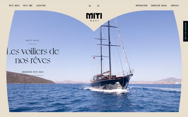
Preview image. Unlock full-res
Nautical parchment and polished brass.
Color palette
Outlined link borders, subtle interactive highlights. This muted yellow acts as the sole chromatic accent, drawing attention without being flashy
Page backgrounds, hero section background, muted text where high contrast is not desired, decorative strokes, button text on dark backgrounds
Primary text, button backgrounds, some navigational elements, strong borders. Creates a deep, anchoring contrast against Parchment
Secondary text, icons, and strong graphical elements. Provides a slightly softer alternative to Deep Charcoal while maintaining high contrast
Subtle body text, navigational text, and borders for less prominent elements. A mid-tone gray for tertiary information
Typography
- Weights
- 400
- Sizes
- 16px, 46px, 72px, 130px, 180px
- Line height
- 0.9, 0.92, 0.94, 1.4
- Letter spacing
- normal
- Fallback
- Playfair Display
Primary headings and large display text, used for impactful statements. Its decorative, classic serif style establishes an elegant, bespoke feel.
- Weights
- 400
- Sizes
- 26px
- Line height
- 1.2
- Letter spacing
- normal
- Fallback
- Tiempos Text
Secondary headings. This elegant serif font supports the luxury positioning with a refined touch.
- Weights
- 400
- Sizes
- 14px
- Line height
- 1.4
- Letter spacing
- 0.286em
- Fallback
- Times New Roman
Tertiary headings and small contextual labels. The wide tracking and traditional serif feel add to the classic, understated elegance.
- Weights
- 400
- Sizes
- 10px, 12px, 14px, 16px
- Line height
- 1.4
- Letter spacing
- 0.071em at 10px, 0.083em at 12px, 0.100em at 14px
- Fallback
- Space Mono
Body copy, navigation, buttons, and all functional text. The monospace nature introduces a technical, precise counterpoint to the elegant serifs, providing clarity for UI elements.
Spacing & shape
Components
Uses GT Pressura Mono, size 10px, weight 400, color Linen (#999999). Active state changes text color to Deep Charcoal (#000e13) and has specific borders on hover/active.
Background color Deep Charcoal (#000e13), text color Parchment (#e6dece). 0px border-radius, 10px vertical padding, 15px horizontal padding. Font is GT Pressura Mono.
Border color Amber Glaze (#ffdead), text color Deep Charcoal (#000e13). No background fill, 0px border-radius. Font is GT Pressura Mono.
Transparent background (rgba(0, 0, 0, 0)), 0px border-radius, no box-shadow. Padding is 0px vertical, 24px horizontal. Relies on content and layout for structure.
Guidelines
- Use Parchment (#e6dece) for primary page backgrounds to maintain a warm, inviting canvas.
- Apply Deep Charcoal (#000e13) for primary text and filled button backgrounds, providing strong contrast and visual weight.
- Reserve Voyage (400) for hero-level headlines and GTSectraDisplay (400) for sub-headlines, emphasizing a classic, elegant tone.
- Employ GT Pressura Mono (400) for all body text, navigation, and functional UI elements to ensure legibility and a consistent modern-classic contrast.
- Use Amber Glaze (#ffdead) strictly for outlined link borders or subtle interactive accents, making it the only chromatic element for gentle emphasis.
- Maintain 0px border-radius for all components like buttons and cards, reinforcing a rigid, structured aesthetic.
- Structure page content within a maximum width of 1320px, maintaining generous side margins on wider screens.
- Avoid using bright or vivid colors; the design system limits chromatic accents to a single muted Amber Glaze.
- Do not introduce rounded corners; all elements should adhere to the 0px border-radius for a consistent aesthetic.
- Do not add drop shadows or significant elevation; surfaces should remain flat to preserve the understated, clean look.
- Avoid generic sans-serif fonts; stick to the specified classic serifs and monospace for distinct typographic roles.
- Do not deviate from the established letter-spacing for GT Pressura Mono and Times; specific tracking is key to their visual identity.
- Do not use gradients; the system relies on solid color blocks and photographic imagery.
- Avoid excessive use of icons or complex illustrations that might distract from the minimalist, photographic focus.
About this system
ShowHide
Miti Navi establishes a refined, classic maritime aesthetic through a muted, near-monochromatic palette dominated by warm beige-gray and deep charcoal. Seriffed headlines juxtapose with monospace utility type, suggesting a balance of heritage and precision. The overall impression is one of understatement and quality, with functional elements subtly framed rather than aggressively highlighted. Surfaces are flat and unadorned, allowing typography and imagery to convey richness.
The page primarily uses a max-width contained layout of 1320px, with content centered. The hero section often features a full-bleed image with prominent, centered headline text styled with Voyage font. Sections flow with consistent vertical spacing (sectionGap 30px), featuring a mixture of centered text blocks and potentially alternating text-left/image-right or image-left/text-right compositions, although detailed section structure for that is not visible in the provided data. Navigation is a minimal top bar, with a unique vertical 'Brochure MITI One' button aligned to the right edge and angled.
The site heavily features high-quality, full-bleed photography of luxury sailboats on open water, often with deep blue skies or serene coastlines. Images are treated realistically, without stylized filters, conveying a sense of adventure, luxury, and tranquility. There's an absence of other graphic elements like illustrations or abstract shapes, emphasizing the product and its natural environment. Imagery serves as the primary visual interest and often dictates section backgrounds.
Reminiscent of Riva Yachts, Heesen Yachts, Amels, Rolls-Royce.
# Miti Navi — Style Reference
> Nautical parchment and polished brass.

**Theme:** light

**Site:** https://miti-navi.com

Miti Navi establishes a refined, classic maritime aesthetic through a muted, near-monochromatic palette dominated by warm beige-gray and deep charcoal. Seriffed headlines juxtapose with monospace utility type, suggesting a balance of heritage and precision. The overall impression is one of understatement and quality, with functional elements subtly framed rather than aggressively highlighted. Surfaces are flat and unadorned, allowing typography and imagery to convey richness.

## Tokens — Colors

| Name | Value | Token | Role |
|------|------|------|------|
| Amber Glaze | `#ffdead` | `--color-amber-glaze` | Outlined link borders, subtle interactive highlights. This muted yellow acts as the sole chromatic accent, drawing attention without being flashy |
| Parchment | `#e6dece` | `--color-parchment` | Page backgrounds, hero section background, muted text where high contrast is not desired, decorative strokes, button text on dark backgrounds |
| Deep Charcoal | `#000e13` | `--color-deep-charcoal` | Primary text, button backgrounds, some navigational elements, strong borders. Creates a deep, anchoring contrast against Parchment |
| Ebony | `#232323` | `--color-ebony` | Secondary text, icons, and strong graphical elements. Provides a slightly softer alternative to Deep Charcoal while maintaining high contrast |
| Linen | `#999999` | `--color-linen` | Subtle body text, navigational text, and borders for less prominent elements. A mid-tone gray for tertiary information |

## Tokens — Typography

### Voyage
- **Substitute:** Playfair Display
- **Weights:** 400
- **Sizes:** 16px, 46px, 72px, 130px, 180px
- **Line height:** 0.9, 0.92, 0.94, 1.4
- **Letter spacing:** normal
- **Role:** Primary headings and large display text, used for impactful statements. Its decorative, classic serif style establishes an elegant, bespoke feel.

### GTSectraDisplay
- **Substitute:** Tiempos Text
- **Weights:** 400
- **Sizes:** 26px
- **Line height:** 1.2
- **Letter spacing:** normal
- **Role:** Secondary headings. This elegant serif font supports the luxury positioning with a refined touch.

### Times
- **Substitute:** Times New Roman
- **Weights:** 400
- **Sizes:** 14px
- **Line height:** 1.4
- **Letter spacing:** 0.286em
- **Role:** Tertiary headings and small contextual labels. The wide tracking and traditional serif feel add to the classic, understated elegance.

### GT Pressura Mono
- **Substitute:** Space Mono
- **Weights:** 400
- **Sizes:** 10px, 12px, 14px, 16px
- **Line height:** 1.4
- **Letter spacing:** 0.071em at 10px, 0.083em at 12px, 0.100em at 14px
- **Role:** Body copy, navigation, buttons, and all functional text. The monospace nature introduces a technical, precise counterpoint to the elegant serifs, providing clarity for UI elements.

## Tokens — Type Scale

| Role | Size | Line height | Letter spacing |
|------|------|------|------|
| caption | 10px | 1.4 | — |
| body-sm | 12px | 1.4 | — |
| body | 14px | 1.4 | — |
| body-lg | 16px | 1.4 | — |

## Tokens — Spacing

- **Max width:** 1320px
- **Section gap:** 30px
- **Card padding:** 15px
- **Element gap:** 16px

## Tokens — Radius

- **Buttons:** 0px
- **Cards:** 0px

## Layout

The page primarily uses a max-width contained layout of 1320px, with content centered. The hero section often features a full-bleed image with prominent, centered headline text styled with Voyage font. Sections flow with consistent vertical spacing (sectionGap 30px), featuring a mixture of centered text blocks and potentially alternating text-left/image-right or image-left/text-right compositions, although detailed section structure for that is not visible in the provided data. Navigation is a minimal top bar, with a unique vertical 'Brochure MITI One' button aligned to the right edge and angled.

## Imagery

The site heavily features high-quality, full-bleed photography of luxury sailboats on open water, often with deep blue skies or serene coastlines. Images are treated realistically, without stylized filters, conveying a sense of adventure, luxury, and tranquility. There's an absence of other graphic elements like illustrations or abstract shapes, emphasizing the product and its natural environment. Imagery serves as the primary visual interest and often dictates section backgrounds.

## Components

### Primary Navigation Link
*Top-level navigation items*

Uses GT Pressura Mono, size 10px, weight 400, color Linen (#999999). Active state changes text color to Deep Charcoal (#000e13) and has specific borders on hover/active.

### Filled Button (Deep Charcoal)
*Call to action for primary actions like 'Brochure MITI One'*

Background color Deep Charcoal (#000e13), text color Parchment (#e6dece). 0px border-radius, 10px vertical padding, 15px horizontal padding. Font is GT Pressura Mono.

### Outlined Link (Amber Glaze)
*Distinguished interactive links, often for social media or legal pages*

Border color Amber Glaze (#ffdead), text color Deep Charcoal (#000e13). No background fill, 0px border-radius. Font is GT Pressura Mono.

### Ghost Card
*Content containers with no visual boundaries*

Transparent background (rgba(0, 0, 0, 0)), 0px border-radius, no box-shadow. Padding is 0px vertical, 24px horizontal. Relies on content and layout for structure.

## Guidelines

### Do

- Use Parchment (#e6dece) for primary page backgrounds to maintain a warm, inviting canvas.
- Apply Deep Charcoal (#000e13) for primary text and filled button backgrounds, providing strong contrast and visual weight.
- Reserve Voyage (400) for hero-level headlines and GTSectraDisplay (400) for sub-headlines, emphasizing a classic, elegant tone.
- Employ GT Pressura Mono (400) for all body text, navigation, and functional UI elements to ensure legibility and a consistent modern-classic contrast.
- Use Amber Glaze (#ffdead) strictly for outlined link borders or subtle interactive accents, making it the only chromatic element for gentle emphasis.
- Maintain 0px border-radius for all components like buttons and cards, reinforcing a rigid, structured aesthetic.
- Structure page content within a maximum width of 1320px, maintaining generous side margins on wider screens.

### Don't

- Avoid using bright or vivid colors; the design system limits chromatic accents to a single muted Amber Glaze.
- Do not introduce rounded corners; all elements should adhere to the 0px border-radius for a consistent aesthetic.
- Do not add drop shadows or significant elevation; surfaces should remain flat to preserve the understated, clean look.
- Avoid generic sans-serif fonts; stick to the specified classic serifs and monospace for distinct typographic roles.
- Do not deviate from the established letter-spacing for GT Pressura Mono and Times; specific tracking is key to their visual identity.
- Do not use gradients; the system relies on solid color blocks and photographic imagery.
- Avoid excessive use of icons or complex illustrations that might distract from the minimalist, photographic focus.

## Agent Prompt Guide

Quick Color Reference:
text: #000e13
background: #e6dece
border: #e6dece
accent: #ffdead
primary action: #ffdead (outlined action border)

Example Component Prompts:
Create a Hero Headline: 'Les voiliers de nos rêves' using Voyage, 400 weight, 72px size, normal letter-spacing, color Deep Charcoal (#000e13).
Create a Navigation Link: 'MITI NAVI' using GT Pressura Mono, 400 weight, 10px size, 0.071em letter-spacing, color Linen (#999999).
Create a Filled Button: 'Brochure' with background Deep Charcoal (#000e13), text Parchment (#e6dece), 0px radius, 10px vertical and 15px horizontal padding, using GT Pressura Mono, 400 weight, 14px size.
Create an Outlined Accent Link: 'Instagram' with border Amber Glaze (#ffdead), text Deep Charcoal (#000e13), 0px radius, 10px vertical and 15px horizontal padding, using GT Pressura Mono, 400 weight, 14px size.
More like this









Keep what you find
A free account saves references to boards and can send you a weekly email of picks based on what you save.
To see every result, go Pro.