Preview image. Unlock full-res
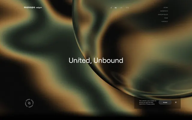
Shifting gradient depths on frosted glass
Color palette
Atmospheric background for hero sections and full-bleed visual elements, creating an immersive, fluid environment
Primary background for pages, cards, and dark-themed sections
Primary text color, link defaults, borders for ghost components, and accents against dark backgrounds. Used for text on primary buttons
Secondary text in footers and less prominent information. Subtly darker borders
Muted body text and auxiliary text where lower contrast is desired
Background for subtle, low-contrast interactive elements like the cookie consent button
Typography
- Weights
- 300, 400, 600
- Sizes
- 11px, 12px, 16px, 18px, 29px, 30px, 39px, 45px, 54px, 78px, 94px, 225px
- Line height
- 0.7, 0.76, 1.1, 1.15, 1.19, 1.21, 1.22, 1.24, 1.25, 1.36, 1.39, 1.58, 1.82
- Letter spacing
- normal
- Fallback
- system-ui, sans-serif
Primary brand typeface for all headings, body text, links, and buttons. Its wide range of weights and sizes supports a detailed typographic hierarchy, from subtle metadata to commanding display text. The default 'normal' letter spacing keeps it highly legible.
- Weights
- 400
- Sizes
- 54px
- Line height
- 1.39
- Letter spacing
- normal
- Fallback
- serif
Used for specific heading elements, providing an alternative, slightly more classic feel than Roobert.
- Weights
- 400
- Sizes
- 9px, 16px
- Line height
- 1.15, 1.32
system-ui — detected in extracted data but not described by AI
Spacing & shape
Components
Background: rgba(0, 0, 0, 0), Text: #000000, Border: 1px solid rgba(255, 255, 255, 0.3) on top only, Radius: 75.024px, Padding: 1px 6px.
Background: rgba(0, 0, 0, 0), Text: #000000, No border, Radius: 0px, Padding: 0px.
Background: rgba(55, 55, 55, 0.78), Text: #ffffff, Border: 1px solid #ffffff, Radius: 75.024px, Padding: 11.232px 33.696px.
Background: rgba(0, 0, 0, 0), Text: #ffffff, No border, Radius: 0px, Padding: 0px.
Background: rgba(0, 0, 0, 0), Border-radius: 0px, No shadow, Padding: 0px.
Guidelines
- Prioritize Roobert as the primary typeface for all textual content, utilizing its diverse weights to establish hierarchy.
- Maintain a spacious layout with a base unit of 4px and aim for an element gap of 14px to ensure visual breathing room.
- Use Midnight Canvas (#000000) for all primary backgrounds and Frost White (#ffffff) for primary text to ensure high contrast.
- Apply a border-radius of 75.024px to all buttons for a distinctly rounded, pill-like appearance.
- Implement the Deep Ocean Gradient (linear-gradient(90deg, rgb(160, 224, 171), rgb(255, 172, 46) 50%, rgb(165, 45, 37))) as a background for hero and large interactive sections.
- Ensure interactive elements like buttons and links use Frost White (#ffffff) text against dark backgrounds unless a specific muted tone (Whisper Gray #6d6d6d) is explicitly called for.
- Use a subtle 1px border with rgba(255, 255, 255, 0.3) for ghost buttons to maintain a minimalist aesthetic.
- Avoid using harsh, saturated accent colors that would disrupt the site's subdued and atmospheric palette.
- Do not introduce square or sharp borders on interactive elements; button radii should always be 75.024px.
- Refrain from using strong box-shadows or heavy elevation, as the design relies on gradient depth rather than layered elements.
- Do not deviate from the specified Roobert and Raleway font families; avoid generic system fonts for branding elements.
- Avoid tight information density; maintain spacious relationships between elements and sections.
- Do not treat #636363 as a primary action color; reserve it for specific, muted interactive elements like secondary consent buttons.
- Never use solid color backgrounds in feature sections where the organic gradient is intended to create atmosphere.
About this system
ShowHide
monopo saigon operates with a sophisticated dark aesthetic, employing a backdrop of organic, shifting gradients that give the impression of fluid, sculpted surfaces. The UI elements are minimal and translucent, appearing as if etched onto or floating within this rich, atmospheric background. Typography is stark white against dark, providing a strong contrast for readability while maintaining an understated elegance. The overall impression is one of artful depth and a restrained, almost ethereal digital presence.
The page primarily uses a full-bleed layout for its immersive background gradients, with content contained within a consistent max-width of 1078px, centered on the screen. The hero section features a large, centered headline directly on the animated gradient background. Sections maintain a consistent vertical rhythm, with generous section gaps of 46px. Content elements are typically stacked or arranged in minimal two-column text-left/image-right patterns (where 'image' refers to the abstract gradient visuals), but all elements appear to live within the main content well. The header is a sticky top navigation bar with minimal text links.
The site deploys abstract, organic gradients and translucent spherical shapes as primary background visuals, creating a sense of depth and fluid motion. There is an absence of traditional photography or illustrations. Icons (if present) are minimal, outlined, and monochromatic, matching the overall dark and understated UI. The visual density is image-heavy in terms of atmospheric graphics, but text-dominant for content presentation, allowing the background to provide mood without distracting from information.
Reminiscent of Stripe, Apple (services pages), Framer, Spotify (desktop app).
# monopo saigon — Style Reference
> Shifting gradient depths on frosted glass

**Theme:** dark

**Site:** https://monopo.vn

monopo saigon operates with a sophisticated dark aesthetic, employing a backdrop of organic, shifting gradients that give the impression of fluid, sculpted surfaces. The UI elements are minimal and translucent, appearing as if etched onto or floating within this rich, atmospheric background. Typography is stark white against dark, providing a strong contrast for readability while maintaining an understated elegance. The overall impression is one of artful depth and a restrained, almost ethereal digital presence.

## Tokens — Colors

| Name | Value | Token | Role |
|------|------|------|------|
| Deep Ocean Gradient | `#a0e0ab` | `--color-deep-ocean-gradient` | Atmospheric background for hero sections and full-bleed visual elements, creating an immersive, fluid environment |
| Midnight Canvas | `#000000` | `--color-midnight-canvas` | Primary background for pages, cards, and dark-themed sections |
| Frost White | `#ffffff` | `--color-frost-white` | Primary text color, link defaults, borders for ghost components, and accents against dark backgrounds. Used for text on primary buttons |
| Deep Shadow | `#181818` | `--color-deep-shadow` | Secondary text in footers and less prominent information. Subtly darker borders |
| Whisper Gray | `#6d6d6d` | `--color-whisper-gray` | Muted body text and auxiliary text where lower contrast is desired |
| Misty Gray | `#636363` | `--color-misty-gray` | Background for subtle, low-contrast interactive elements like the cookie consent button |

## Tokens — Typography

### Roobert
- **Substitute:** system-ui, sans-serif
- **Weights:** 300, 400, 600
- **Sizes:** 11px, 12px, 16px, 18px, 29px, 30px, 39px, 45px, 54px, 78px, 94px, 225px
- **Line height:** 0.7, 0.76, 1.1, 1.15, 1.19, 1.21, 1.22, 1.24, 1.25, 1.36, 1.39, 1.58, 1.82
- **Letter spacing:** normal
- **Role:** Primary brand typeface for all headings, body text, links, and buttons. Its wide range of weights and sizes supports a detailed typographic hierarchy, from subtle metadata to commanding display text. The default 'normal' letter spacing keeps it highly legible.

### Raleway
- **Substitute:** serif
- **Weights:** 400
- **Sizes:** 54px
- **Line height:** 1.39
- **Letter spacing:** normal
- **Role:** Used for specific heading elements, providing an alternative, slightly more classic feel than Roobert.

### system-ui
- **Weights:** 400
- **Sizes:** 9px, 16px
- **Line height:** 1.15, 1.32
- **Role:** system-ui — detected in extracted data but not described by AI

## Tokens — Type Scale

Golden Ratio (1.618) from 16px base.

| Role | Size | Line height | Letter spacing |
|------|------|------|------|
| caption | 11px | 1.58 | — |
| body | 16px | 1.25 | — |
| subheading | 18px | 1.22 | — |
| heading-sm | 29px | 1.21 | — |
| heading | 39px | 1.15 | — |
| heading-lg | 54px | 1.39 | — |
| display | 225px | 0.7 | — |

## Tokens — Spacing

- **Max width:** 1078px
- **Section gap:** 46px
- **Card padding:** 34px
- **Element gap:** 14px

## Tokens — Radius

- **Buttons:** 75.024px
- **Cards:** 10px

## Layout

The page primarily uses a full-bleed layout for its immersive background gradients, with content contained within a consistent max-width of 1078px, centered on the screen. The hero section features a large, centered headline directly on the animated gradient background. Sections maintain a consistent vertical rhythm, with generous section gaps of 46px. Content elements are typically stacked or arranged in minimal two-column text-left/image-right patterns (where 'image' refers to the abstract gradient visuals), but all elements appear to live within the main content well. The header is a sticky top navigation bar with minimal text links.

## Imagery

The site deploys abstract, organic gradients and translucent spherical shapes as primary background visuals, creating a sense of depth and fluid motion. There is an absence of traditional photography or illustrations. Icons (if present) are minimal, outlined, and monochromatic, matching the overall dark and understated UI. The visual density is image-heavy in terms of atmospheric graphics, but text-dominant for content presentation, allowing the background to provide mood without distracting from information.

## Components

### Ghost Button - Light Border
*Interactive element allowing light interaction without dominating the dark background. Features a very subtle border.*

Background: rgba(0, 0, 0, 0), Text: #000000, Border: 1px solid rgba(255, 255, 255, 0.3) on top only, Radius: 75.024px, Padding: 1px 6px.

### Text Link Button
*Minimal interactive element, appearing as simple text. Used for navigation and tertiary actions.*

Background: rgba(0, 0, 0, 0), Text: #000000, No border, Radius: 0px, Padding: 0px.

### Filled Cookie Consent Button
*Primary action button within transient UI elements like cookie consent pop-ups. Offers a clear, actionable contrast.*

Background: rgba(55, 55, 55, 0.78), Text: #ffffff, Border: 1px solid #ffffff, Radius: 75.024px, Padding: 11.232px 33.696px.

### Dark Text Link Button
*Minimal interactive element for navigation and tertiary actions, in context where text color should be white.*

Background: rgba(0, 0, 0, 0), Text: #ffffff, No border, Radius: 0px, Padding: 0px.

### Information Card Overlay
*Base card element for presenting content. Designed to blend seamlessly into the background, letting content take precedence.*

Background: rgba(0, 0, 0, 0), Border-radius: 0px, No shadow, Padding: 0px.

## Guidelines

### Do

- Prioritize Roobert as the primary typeface for all textual content, utilizing its diverse weights to establish hierarchy.
- Maintain a spacious layout with a base unit of 4px and aim for an element gap of 14px to ensure visual breathing room.
- Use Midnight Canvas (#000000) for all primary backgrounds and Frost White (#ffffff) for primary text to ensure high contrast.
- Apply a border-radius of 75.024px to all buttons for a distinctly rounded, pill-like appearance.
- Implement the Deep Ocean Gradient (linear-gradient(90deg, rgb(160, 224, 171), rgb(255, 172, 46) 50%, rgb(165, 45, 37))) as a background for hero and large interactive sections.
- Ensure interactive elements like buttons and links use Frost White (#ffffff) text against dark backgrounds unless a specific muted tone (Whisper Gray #6d6d6d) is explicitly called for.
- Use a subtle 1px border with rgba(255, 255, 255, 0.3) for ghost buttons to maintain a minimalist aesthetic.

### Don't

- Avoid using harsh, saturated accent colors that would disrupt the site's subdued and atmospheric palette.
- Do not introduce square or sharp borders on interactive elements; button radii should always be 75.024px.
- Refrain from using strong box-shadows or heavy elevation, as the design relies on gradient depth rather than layered elements.
- Do not deviate from the specified Roobert and Raleway font families; avoid generic system fonts for branding elements.
- Avoid tight information density; maintain spacious relationships between elements and sections.
- Do not treat #636363 as a primary action color; reserve it for specific, muted interactive elements like secondary consent buttons.
- Never use solid color backgrounds in feature sections where the organic gradient is intended to create atmosphere.

## Agent Prompt Guide

Quick Color Reference:
text: #ffffff
background: #000000
border: rgba(255, 255, 255, 0.3)
accent: none observed
primary action: no distinct CTA color

Example Component Prompts:
1. Create a primary page section: Full-bleed background with Deep Ocean Gradient. Headline 'United, Unbound' using Roobert weight 400 at 54px, color Frost White (#ffffff), centered within the 1078px max-width content area.
2. Create a ghost navigation button: Text 'WORK' using Roobert weight 400 at 16px, color #000000. Background transparent. Top border 1px solid rgba(255, 255, 255, 0.3). Radius 75.024px. Padding 1px 6px.
3. Create a cookie consent dialog button: Text 'Accept' using Roobert weight 400 at 16px, color Frost White (#ffffff). Background Misty Gray (#636363). Border 1px solid Frost White (#ffffff). Radius 75.024px. Padding 11.232px 33.696px.
More like this









Keep what you find
A free account saves references to boards and can send you a weekly email of picks based on what you save.
To see every result, go Pro.