
Preview image. Unlock full-res
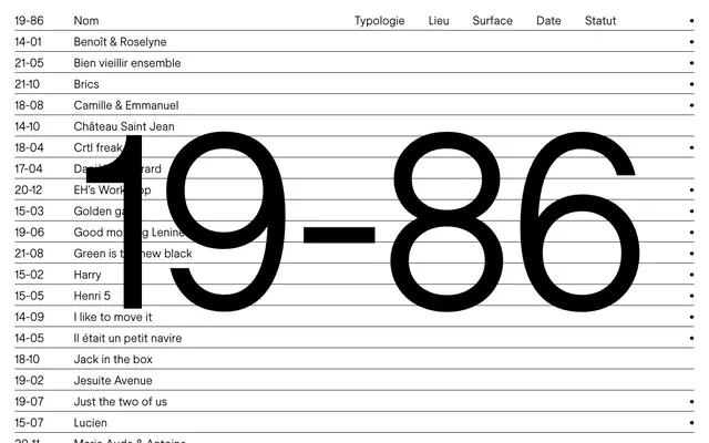
Academic monograph on a clean desk. Information density without visual clutter, framed by stark black and white.
Color palette
Primary text, headings, button background, critical UI borders. The dominant dark element, providing visual weight.
Secondary text, navigation items, subtle borders. Establishes hierarchy and softens strict black without introducing color.
Page background, primary surface color, text on dark buttons. The pervasive white creates an open, almost stark, environment.
Subtle button background for secondary actions. A very light gray providing a hint of separation without adding visual noise.
Button background for primary actions. A slightly lighter black than 'Ink', offering a subtle variation for interactive elements.
Typography
- Weights
- 400
- Sizes
- 14px, 16px, 22px
- Line height
- 1.25, 1.43
- Letter spacing
- -0.238, -0.24, -0.242
- Fallback
- system-ui
The sole typeface, Inter, handles all text roles. Its neutral, highly legible geometry at weight 400 is signature, emphasizing content over decorative flair.
Spacing & shape
Components
A pill-shaped button with 'Charcoal' (#0a0a0a) background, 'Canvas' (#ffffff) text, and 'Canvas' (#ffffff) border, indicating a primary call to action. Padding is 0px vertical, 12px horizontal. Text is Inter 16px, 400 weight.
A pill-shaped button with 'Ghost' (#f5f5f5) background, 'Ink' (#000000) text, and 'Ink' (#000000) border. This variant signals a less emphatic action. Padding is 0px vertical, 12px horizontal. Text is Inter 16px, 400 weight.
Text link using 'Ink' (#000000) for standard state and 'Graphite' (#737373) for inactive or less prominent items. Uses Inter 14px, 400 weight.
Headline text using 'Ink' (#000000), Inter 22px, 400 weight, with a tight lineHeight of 1.25 and letter-spacing -0.242px, making it precise and compact.
General body text primarily in 'Ink' (#000000), utilizing Inter 16px, 400 weight, with a lineHeight of 1.43 and letter-spacing -0.24px for readability in information-dense blocks.
Smaller descriptive text, often in 'Graphite' (#737373), using Inter 14px, 400 weight, with lineHeight 1.43 and letter-spacing -0.238px for detailed information.
Guidelines
- Prioritize 'Ink' (#000000) for all primary text and critical UI elements, ensuring maximum contrast against 'Canvas' (#ffffff).
- Maintain a maximal radius of 9999px for all interactive buttons or tags, creating a distinct pill shape.
- Utilize Inter at weight 400 for all typography, adjusting size and letter-spacing (-0.238px to -0.242px) to define hierarchy, not weight variation.
- Employ 'Graphite' (#737373) specifically for secondary information or subdued interactive states, adhering to its moderate contrast.
- Adhere to the compact spacing system, using 2px, 4px, 6px, 8px, 12px, 16px, 20px, and 32px increments to create dense but organized layouts.
- Do not introduce additional font weights or families; Inter 400 is the only typeface.
- Avoid using saturated colors in the main UI; restrict color to embedded portfolio imagery or gradients.
- Do not deviate from the pill shape (9999px radius) for buttons; all other elements should retain sharp 0px corners, or very subtle rounding where necessary for images.
- Do not use generic box shadows or elevation; depth should be created through color contrast and layered gradients within content blocks, not UI chrome.
- Do not use letter-spacing values outside the established -0.011em to -0.017em range; tight tracking is a signature element.
About this system
ShowHide
This system projects an academic, almost clinical, precision with its sparse layout and strict monochrome palette. The design balances significant negative space with dense, information-rich text blocks, reminiscent of a research paper's appendix. Inter's subtle letter-spacing adjustments, especially noticeable at smaller text sizes, carve out readable blocks, contrasting with the bold visual statements of fluid, almost psychedelic, gradients used in portfolio showcases. The singular design choice is the use of perfectly circular 9999px pill buttons, offering the only soft, organic shape in an otherwise angular and purely functional interface.
The page adheres to a max-width of 950px, centered on a 'Canvas' (#ffffff) background. The hero section is a minimal, left-aligned text column with a bold headline. Content primarily flows in a single column, with occasionally split sections (e.g., client lists). Information is densified through tight line heights and compact block elements, creating a sense of a packed, highly organized document. Navigation is a simple top-left set of text links, maintaining a subdued presence.
The visual language is split: the UI itself is text-dominant with no decorative imagery, focusing on pure content. However, portfolio showcases prominently feature vibrant, abstract, swirling gradient backgrounds with product screenshots or logos superimposed. These are full-bleed within their card containers, often featuring soft, organic color blends that stand in stark contrast to the monochrome UI. The imagery serves as a 'window' into client work, visually rich but isolated from the functional interface.
Reminiscent of Linear, Stripe (Docs), Contra, Framer.
# Endless — Style Reference
> Academic monograph on a clean desk. Information density without visual clutter, framed by stark black and white.

**Theme:** light

**Site:** https://endless.design

This system projects an academic, almost clinical, precision with its sparse layout and strict monochrome palette. The design balances significant negative space with dense, information-rich text blocks, reminiscent of a research paper's appendix. Inter's subtle letter-spacing adjustments, especially noticeable at smaller text sizes, carve out readable blocks, contrasting with the bold visual statements of fluid, almost psychedelic, gradients used in portfolio showcases. The singular design choice is the use of perfectly circular 9999px pill buttons, offering the only soft, organic shape in an otherwise angular and purely functional interface.

## Tokens — Colors

| Name | Value | Token | Role |
|------|------|------|------|
| Ink | `#000000` | `--color-ink` | Primary text, headings, button background, critical UI borders. The dominant dark element, providing visual weight. |
| Graphite | `#737373` | `--color-graphite` | Secondary text, navigation items, subtle borders. Establishes hierarchy and softens strict black without introducing color. |
| Canvas | `#ffffff` | `--color-canvas` | Page background, primary surface color, text on dark buttons. The pervasive white creates an open, almost stark, environment. |
| Ghost | `#f5f5f5` | `--color-ghost` | Subtle button background for secondary actions. A very light gray providing a hint of separation without adding visual noise. |
| Charcoal | `#0a0a0a` | `--color-charcoal` | Button background for primary actions. A slightly lighter black than 'Ink', offering a subtle variation for interactive elements. |

## Tokens — Typography

### Inter
- **Substitute:** system-ui
- **Weights:** 400
- **Sizes:** 14px, 16px, 22px
- **Line height:** 1.25, 1.43
- **Letter spacing:** -0.238, -0.24, -0.242
- **Role:** The sole typeface, Inter, handles all text roles. Its neutral, highly legible geometry at weight 400 is signature, emphasizing content over decorative flair.

## Tokens — Type Scale

Major Third (1.25) from 16px base.

| Role | Size | Line height | Letter spacing |
|------|------|------|------|
| caption | 14px | 1.43 | -0.238px |
| body | 16px | 1.43 | -0.24px |
| heading-sm | 22px | 1.25 | -0.242px |

## Tokens — Spacing

- **Max width:** 950px
- **Section gap:** 32px
- **Card padding:** 12px
- **Element gap:** 8px

## Tokens — Radius

- **Default:** 0px
- **Buttons:** 9999px

## Layout

The page adheres to a max-width of 950px, centered on a 'Canvas' (#ffffff) background. The hero section is a minimal, left-aligned text column with a bold headline. Content primarily flows in a single column, with occasionally split sections (e.g., client lists). Information is densified through tight line heights and compact block elements, creating a sense of a packed, highly organized document. Navigation is a simple top-left set of text links, maintaining a subdued presence.

## Imagery

The visual language is split: the UI itself is text-dominant with no decorative imagery, focusing on pure content. However, portfolio showcases prominently feature vibrant, abstract, swirling gradient backgrounds with product screenshots or logos superimposed. These are full-bleed within their card containers, often featuring soft, organic color blends that stand in stark contrast to the monochrome UI. The imagery serves as a 'window' into client work, visually rich but isolated from the functional interface.

## Components

### CTA Button Group

### Hero Text Block with Client List

### Services & Pricing Info Block

### Primary Action Button
*Interactive element*

A pill-shaped button with 'Charcoal' (#0a0a0a) background, 'Canvas' (#ffffff) text, and 'Canvas' (#ffffff) border, indicating a primary call to action. Padding is 0px vertical, 12px horizontal. Text is Inter 16px, 400 weight.

### Secondary Action Button
*Interactive element*

A pill-shaped button with 'Ghost' (#f5f5f5) background, 'Ink' (#000000) text, and 'Ink' (#000000) border. This variant signals a less emphatic action. Padding is 0px vertical, 12px horizontal. Text is Inter 16px, 400 weight.

### Navigation Link
*Navigation element*

Text link using 'Ink' (#000000) for standard state and 'Graphite' (#737373) for inactive or less prominent items. Uses Inter 14px, 400 weight.

### Main Heading
*Headline*

Headline text using 'Ink' (#000000), Inter 22px, 400 weight, with a tight lineHeight of 1.25 and letter-spacing -0.242px, making it precise and compact.

### Body Text
*Content*

General body text primarily in 'Ink' (#000000), utilizing Inter 16px, 400 weight, with a lineHeight of 1.43 and letter-spacing -0.24px for readability in information-dense blocks.

### Caption/Utility Text
*Supporting content*

Smaller descriptive text, often in 'Graphite' (#737373), using Inter 14px, 400 weight, with lineHeight 1.43 and letter-spacing -0.238px for detailed information.

## Guidelines

### Do

- Prioritize 'Ink' (#000000) for all primary text and critical UI elements, ensuring maximum contrast against 'Canvas' (#ffffff).
- Maintain a maximal radius of 9999px for all interactive buttons or tags, creating a distinct pill shape.
- Utilize Inter at weight 400 for all typography, adjusting size and letter-spacing (-0.238px to -0.242px) to define hierarchy, not weight variation.
- Employ 'Graphite' (#737373) specifically for secondary information or subdued interactive states, adhering to its moderate contrast.
- Adhere to the compact spacing system, using 2px, 4px, 6px, 8px, 12px, 16px, 20px, and 32px increments to create dense but organized layouts.

### Don't

- Do not introduce additional font weights or families; Inter 400 is the only typeface.
- Avoid using saturated colors in the main UI; restrict color to embedded portfolio imagery or gradients.
- Do not deviate from the pill shape (9999px radius) for buttons; all other elements should retain sharp 0px corners, or very subtle rounding where necessary for images.
- Do not use generic box shadows or elevation; depth should be created through color contrast and layered gradients within content blocks, not UI chrome.
- Do not use letter-spacing values outside the established -0.011em to -0.017em range; tight tracking is a signature element.

## Agent Prompt Guide

### Quick Color Reference
- Text: #000000 (Ink)
- Background: #ffffff (Canvas)
- Primary Button: #0a0a0a (Charcoal)
- Secondary Text: #737373 (Graphite)
- Secondary Button Background: #f5f5f5 (Ghost)

### Example Component Prompts
1. Create a primary call-to-action button: 'Charcoal' (#0a0a0a) background, 'Canvas' (#ffffff) text, 'Canvas' (#ffffff) border, 9999px border-radius, 0px vertical padding, 12px horizontal padding. Text is Inter 16px, 400 weight, letter-spacing -0.24px.
2. Design a navigation item: Inter 14px, 400 weight, 'Ink' (#000000) color, letter-spacing -0.238px. For inactive, use 'Graphite' (#737373).
3. Generate a main heading for a section: 'Ink' (#000000) color, Inter 22px, 400 weight, line-height 1.25, letter-spacing -0.242px.
4. Produce a body text block: 'Ink' (#000000) color, Inter 16px, 400 weight, line-height 1.43, letter-spacing -0.24px. Use a horizontal max-width of 950px for the content container.
More like this









Keep what you find
A free account saves references to boards and can send you a weekly email of picks based on what you save.
To see every result, go Pro.