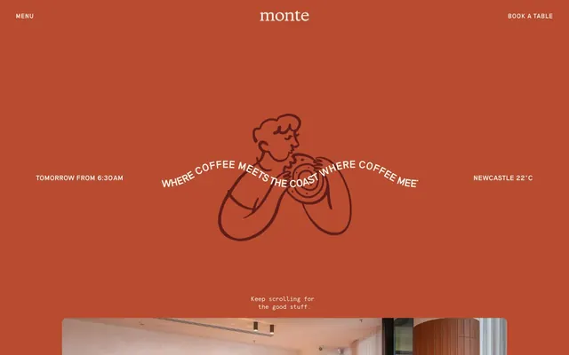
Preview image. Unlock full-res
Warm Terracotta Cafe
Color palette
Dominant brand color, used for backgrounds, card surfaces, primary text accents, and interactive elements. It defines the site's entire warm visual identity
Deep, almost-black accent color used for secondary text and decorative fills, providing rich visual contrast
Primary page background and light surface color, creates a soft, inviting base for content
Subtle border color for UI elements and dividers, offering a delicate visual separation
Main body text and icon fill color, ensuring high contrast on light backgrounds
Inverse text color for dark backgrounds and occasional UI accents
Secondary text color for less emphasized information
Muted text or decorative details
Subtle dark overlay used for specific badge backgrounds
Typography
- Weights
- 400, 600
- Sizes
- 10px, 11px, 12px, 13px, 14px, 15px, 16px, 17px, 20px, 23px, 24px, 36px
- Line height
- 0.9, 1, 1.1, 1.2, 1.25, 1.35, 1.4
- Letter spacing
- 0.025em, 0.05em, 0.1em
- Fallback
- Georgia, serif
Primary display font for headings, calls to action, and prominent page elements. Its varying letter spacing and weights give it a distinct, almost custom-drawn feel, contributing to the brand's unique identity.
- Weights
- 400
- Sizes
- 12px, 15px, 16px
- Line height
- 1.33, 1.35
- Letter spacing
- -0.025em
- Fallback
- monospace
Used for body text, descriptive labels, and input fields. Its monospaced nature and subtle negative letter-spacing add a hint of vintage or functional print aesthetic, balancing the more expressive display font.
Spacing & shape
Components
Text in Carbon Text (#000000) on a transparent background, with no defined border radius. Padding of 0px vertical and 16px horizontal. Uses Riposte font.
Text in Terracotta (#b84b30) on a Cream Canvas (#f8f4e9) background, with a 1px Terracotta (#b84b30) border and 9999px border-radius. Padding is 12px vertical and 24px horizontal. Uses Riposte font.
Terracotta (#b84b30) background with a 14px border-radius. No padding or box-shadow. Imagery or content is placed directly within.
Semi-transparent black (rgba(0,0,0,0.15)) background with 0px border-radius. No padding or box-shadow. Designed to blend with underlying images.
Cream Canvas (#f8f4e9) background, Terracotta (#b84b30) accent text and border, with a 9999px border-radius for a pill-like shape. Padding is 12px vertical and 24px horizontal.
Terracotta (#b84b30) text on a transparent background, 0px border-radius, with 12px vertical padding. Uses Riposte font.
White (#ffffff) text on a Dark Overlay (#3e3d3a) background, 0px border-radius. No padding. Uses Riposte font.
Guidelines
- Use Terracotta (#b84b30) as the primary brand color for backgrounds, key interactive elements, and prominent headings to maintain brand identity.
- Apply Cream Canvas (#f8f4e9) as the default page background and for light surface elements, ensuring a soft, inviting base.
- Employ the Riposte font for all headlines, navigation, and call-to-action text, leveraging its distinct letter-spacing and weights for brand personality.
- Utilize Apercu Mono font for body copy and input fields, pairing its functional mono-spaced character with the expressive display font.
- Always use a 9999px border-radius for input fields and an outlined style for primary action buttons to achieve a soft, approachable aesthetic.
- Ensure generous vertical spacing between sections (48px) to create a relaxed, comfortable density.
- Employ the Silver Border (#e5e7eb) for subtle dividers and borders on neutral backgrounds to maintain a delicate visual separation.
- Avoid using bright, saturated colors not present in the defined palette, as they will clash with the warm, muted brand theme.
- Do not introduce sharp, angular card or button radii; the system favors soft curves (14px for cards, 9999px for inputs, 0px for navigation buttons).
- Under no circumstances substitute the custom `Riposte` or `Apercu Mono` fonts without ensuring the chosen alternative carries the same distinctive letter-spacing and weight properties.
- Do not use heavy box-shadows; the design favors flat surfaces and borders for depth.
- Avoid excessive use of different font colors; stick to Terracotta, Espresso Shot, Carbon Text, Stone Gray, and Pure Frost to maintain a cohesive scheme.
- Do not create dense, text-heavy blocks without sufficient line height; Riposte and Apercu Mono lines should breathe with their specified line heights.
- Do not use dark backgrounds for entire sections unless Terracotta or Dark Overlay are specifically employed to align with brand colors, otherwise stick to Cream Canvas.
About this system
ShowHide
Monte evokes a warm, rustic cafe atmosphere with a distinctive terracotta brand color, soft cream backgrounds, and strong typographic contrast. The design emphasizes clear hierarchy through a limited color palette focused on the primary brand hue and subtle neutrals. Components are lightweight with defined borders and generous rounded corners, suggesting an approachable, handcrafted feel.
The page uses a centered, max-width layout (implicitly around 1200px based on content centering, though not fixed) with a dynamic hero section. The initial hero is full-bleed Terracotta featuring centered large text and an illustrative graphic. Scrolling reveals a Cream Canvas background with a soft card stack containing images. Content sections alternate between images and text, often in a left-right arrangement, with consistent vertical spacing of 48px between major blocks. A fixed header provides minimalist navigation. The overall rhythm is unhurried and spacious, creating a comfortable browsing experience.
Imagery primarily features in-situ cafe photography with a warm, natural lighting. Product-focused shots of food and drinks are vibrant and inviting, often with soft backgrounds that don't distract. Illustrations are hand-drawn, line-art style, depicting simple, organic forms of people or objects (like coffee cups) in the Terracotta brand color, serving as decorative accents. Icons are minimal, outlined, in Carbon Text, and used functionally for navigation. Visuals balance atmospheric photography with charming, characterful illustrations, lending a friendly and casual brand feel.
Reminiscent of Aesthetics Coffee, Ritual Coffee Roasters, Intelligentsia Coffee.
# Monte — Style Reference
> Warm Terracotta Cafe

**Theme:** light

**Site:** https://montecafe.com.au

Monte evokes a warm, rustic cafe atmosphere with a distinctive terracotta brand color, soft cream backgrounds, and strong typographic contrast. The design emphasizes clear hierarchy through a limited color palette focused on the primary brand hue and subtle neutrals. Components are lightweight with defined borders and generous rounded corners, suggesting an approachable, handcrafted feel.

## Tokens — Colors

| Name | Value | Token | Role |
|------|------|------|------|
| Terracotta | `#b84b30` | `--color-terracotta` | Dominant brand color, used for backgrounds, card surfaces, primary text accents, and interactive elements. It defines the site's entire warm visual identity |
| Espresso Shot | `#5f1d1a` | `--color-espresso-shot` | Deep, almost-black accent color used for secondary text and decorative fills, providing rich visual contrast |
| Cream Canvas | `#f8f4e9` | `--color-cream-canvas` | Primary page background and light surface color, creates a soft, inviting base for content |
| Silver Border | `#e5e7eb` | `--color-silver-border` | Subtle border color for UI elements and dividers, offering a delicate visual separation |
| Carbon Text | `#000000` | `--color-carbon-text` | Main body text and icon fill color, ensuring high contrast on light backgrounds |
| Pure Frost | `#ffffff` | `--color-pure-frost` | Inverse text color for dark backgrounds and occasional UI accents |
| Stone Gray | `#666666` | `--color-stone-gray` | Secondary text color for less emphasized information |
| Medium Gray | `#999999` | `--color-medium-gray` | Muted text or decorative details |
| Dark Overlay | `#3e3d3a` | `--color-dark-overlay` | Subtle dark overlay used for specific badge backgrounds |

## Tokens — Typography

### Riposte
- **Substitute:** Georgia, serif
- **Weights:** 400, 600
- **Sizes:** 10px, 11px, 12px, 13px, 14px, 15px, 16px, 17px, 20px, 23px, 24px, 36px
- **Line height:** 0.9, 1, 1.1, 1.2, 1.25, 1.35, 1.4
- **Letter spacing:** 0.025em, 0.05em, 0.1em
- **Role:** Primary display font for headings, calls to action, and prominent page elements. Its varying letter spacing and weights give it a distinct, almost custom-drawn feel, contributing to the brand's unique identity.

### Apercu Mono
- **Substitute:** monospace
- **Weights:** 400
- **Sizes:** 12px, 15px, 16px
- **Line height:** 1.33, 1.35
- **Letter spacing:** -0.025em
- **Role:** Used for body text, descriptive labels, and input fields. Its monospaced nature and subtle negative letter-spacing add a hint of vintage or functional print aesthetic, balancing the more expressive display font.

## Tokens — Type Scale

Perfect Fifth (1.5) from 10px base.

| Role | Size | Line height | Letter spacing |
|------|------|------|------|
| caption | 10px | 1.4 | 0.05em |
| heading-sm | 20px | 1.1 | — |
| heading | 24px | 1 | 0.025em |
| display | 36px | 0.9 | 0.1px |

## Tokens — Spacing

- **Section gap:** 48px
- **Card padding:** 24px
- **Element gap:** 5px

## Tokens — Radius

- **Buttons:** 0px
- **Inputs:** 9999px
- **Cards:** 14px

## Layout

The page uses a centered, max-width layout (implicitly around 1200px based on content centering, though not fixed) with a dynamic hero section. The initial hero is full-bleed Terracotta featuring centered large text and an illustrative graphic. Scrolling reveals a Cream Canvas background with a soft card stack containing images. Content sections alternate between images and text, often in a left-right arrangement, with consistent vertical spacing of 48px between major blocks. A fixed header provides minimalist navigation. The overall rhythm is unhurried and spacious, creating a comfortable browsing experience.

## Imagery

Imagery primarily features in-situ cafe photography with a warm, natural lighting. Product-focused shots of food and drinks are vibrant and inviting, often with soft backgrounds that don't distract. Illustrations are hand-drawn, line-art style, depicting simple, organic forms of people or objects (like coffee cups) in the Terracotta brand color, serving as decorative accents. Icons are minimal, outlined, in Carbon Text, and used functionally for navigation. Visuals balance atmospheric photography with charming, characterful illustrations, lending a friendly and casual brand feel.

## Components

### Ghost Header Button
*Navigation and secondary actions.*

Text in Carbon Text (#000000) on a transparent background, with no defined border radius. Padding of 0px vertical and 16px horizontal. Uses Riposte font.

### Outlined Call to Action Button
*Primary interactive element.*

Text in Terracotta (#b84b30) on a Cream Canvas (#f8f4e9) background, with a 1px Terracotta (#b84b30) border and 9999px border-radius. Padding is 12px vertical and 24px horizontal. Uses Riposte font.

### Terracotta Feature Card
*Highlights features or product categories.*

Terracotta (#b84b30) background with a 14px border-radius. No padding or box-shadow. Imagery or content is placed directly within.

### Transparent Image Overlay Card
*Used for subtle visual effects over images.*

Semi-transparent black (rgba(0,0,0,0.15)) background with 0px border-radius. No padding or box-shadow. Designed to blend with underlying images.

### Rounded Input Field
*User data entry.*

Cream Canvas (#f8f4e9) background, Terracotta (#b84b30) accent text and border, with a 9999px border-radius for a pill-like shape. Padding is 12px vertical and 24px horizontal.

### Ghost Badge
*Decorative labels or textual accents.*

Terracotta (#b84b30) text on a transparent background, 0px border-radius, with 12px vertical padding. Uses Riposte font.

### Overlay Badge
*Informational labels on darker backgrounds.*

White (#ffffff) text on a Dark Overlay (#3e3d3a) background, 0px border-radius. No padding. Uses Riposte font.

## Guidelines

### Do

- Use Terracotta (#b84b30) as the primary brand color for backgrounds, key interactive elements, and prominent headings to maintain brand identity.
- Apply Cream Canvas (#f8f4e9) as the default page background and for light surface elements, ensuring a soft, inviting base.
- Employ the Riposte font for all headlines, navigation, and call-to-action text, leveraging its distinct letter-spacing and weights for brand personality.
- Utilize Apercu Mono font for body copy and input fields, pairing its functional mono-spaced character with the expressive display font.
- Always use a 9999px border-radius for input fields and an outlined style for primary action buttons to achieve a soft, approachable aesthetic.
- Ensure generous vertical spacing between sections (48px) to create a relaxed, comfortable density.
- Employ the Silver Border (#e5e7eb) for subtle dividers and borders on neutral backgrounds to maintain a delicate visual separation.

### Don't

- Avoid using bright, saturated colors not present in the defined palette, as they will clash with the warm, muted brand theme.
- Do not introduce sharp, angular card or button radii; the system favors soft curves (14px for cards, 9999px for inputs, 0px for navigation buttons).
- Under no circumstances substitute the custom `Riposte` or `Apercu Mono` fonts without ensuring the chosen alternative carries the same distinctive letter-spacing and weight properties.
- Do not use heavy box-shadows; the design favors flat surfaces and borders for depth.
- Avoid excessive use of different font colors; stick to Terracotta, Espresso Shot, Carbon Text, Stone Gray, and Pure Frost to maintain a cohesive scheme.
- Do not create dense, text-heavy blocks without sufficient line height; Riposte and Apercu Mono lines should breathe with their specified line heights.
- Do not use dark backgrounds for entire sections unless Terracotta or Dark Overlay are specifically employed to align with brand colors, otherwise stick to Cream Canvas.

## Agent Prompt Guide

Quick Color Reference:
text: #000000
background: #f8f4e9
border: #e5e7eb
accent: #b84b30
primary action: #b84b30 (outlined action border)

Example Component Prompts:
1. Create a header navigation button: transparent background, Carbon Text (#000000), Riposte font, weight 400, 0px vertical padding, 16px horizontal padding.
2. Create an Outlined Primary Action: Transparent background, #b84b30 border and text, 9999px radius, compact pill padding. Use it for the main CTA instead of a filled button.
3. Create a feature card: Terracotta (#b84b30) background, 14px border-radius, no padding, no shadow.
4. Create a text input field: Cream Canvas (#f8f4e9) background, Terracotta (#b84b30) text and 1px border, Apercu Mono font, weight 400, 12px vertical padding, 24px horizontal padding, 9999px border-radius.
5. Create a ghost badge with Terracotta text: transparent background, Terracotta (#b84b30) text, Riposte font, weight 400, 12px vertical padding, 0px border-radius.
More like this









Keep what you find
A free account saves references to boards and can send you a weekly email of picks based on what you save.
To see every result, go Pro.