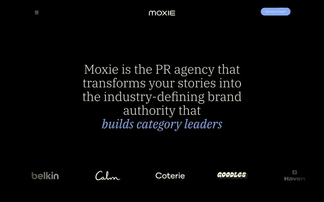
Preview image. Unlock full-res
Midnight velvet, shimmering ink
Color palette
Violet action color for filled buttons, selected navigation states, and focused conversion moments.
Page background, primary dark surface
Primary text, icon fill, ghost button text and borders, outline for cards
Muted text, secondary borders, subtle dividers
Decorative borders, detailed link colors
Typography
- Weights
- 300, 400, 500
- Sizes
- 17px, 22px, 26px, 28px, 43px, 55px
- Line height
- 1.1, 1.2
- Fallback
- Source Serif Pro
Headlines and prominent display text – the delicate weight of 300 for larger sizes lends an antique, authoritative whisper, eschewing typical bold declarations.
- Weights
- 300, 400, 500
- Sizes
- 10px, 12px, 14px, 16px, 17px, 24px
- Line height
- 1, 1.2, 1.5
- Fallback
- Inter
Body copy, navigation, buttons, and functional interface elements – provides clarity and legibility for detailed information against a dark background.
Spacing & shape
Components
Filled button with 'Authority Blue' background, 'Parchment White' text, and full pill-shaped '1000px' radius. Padding is 6.92px vertical, 20.76px horizontal. Background color is #84acfb, text color is #f4efd4.
Ghost button with a subtle 'Parchment White' border and text. The border is 1px, color #f4efd4, and radius is 1000px, creating a delicate pill shape. Text color is #f4efd4.
Content card with no background fill, a rounded border radius of 13.84px, and an interior padding of 19.03px on all sides. Border color is #626055, creating a subtle division.
Transparent background cards for client logos, outlined with a 1px border in 'Parchment White' and a full pill-shaped radius of 1000px. Padding is minimal to contain the logo.
Card with nearly square corners (0px), transparent background, generous padding of 19.03px on all sides. The content within relies on text color to stand out against the background.
Guidelines
- Prioritize 'Background Ink' (#000000) for all page backgrounds to maintain the deep, dark aesthetic.
- Use 'Parchment White' (#f4efd4) for primary text and icon elements across the interface.
- Apply IBM Plex Serif with a weight of 300 for headlines to achieve an understated, elegant authority.
- Employ the 'Authority Blue' (#84acfb) exclusively for primary interactive elements, such as button backgrounds and key accents, to create high-impact punctuation.
- Utilize a 1000px border-radius for all interactive buttons and tags to ensure a consistent pill-shaped appearance.
- Maintain comfortable density by using 19px for card padding and 21px for element gaps.
- Outline content cards and sections with subtle borders in 'Twilight Gray' (#626055) or 'Parchment White' (#f4efd4) rather than using strong background fills.
- Avoid using bright or overly saturated colors beyond 'Authority Blue' to prevent distracting from the dark, sophisticated palette.
- Do not use heavy box shadows; the system relies on subtle borders and transparent fills for depth.
- Refrain from using bold or heavy weights for IBM Plex Serif headlines; the system's impact comes from lightness and restraint.
- Do not introduce additional sans-serif fonts; stick to IBM Plex Sans for all functional text.
- Avoid large blocks of filled background colors for cards or content sections; prefer transparent or subtly bordered containers.
- Do not deviate from the defined border radii; maintain 1000px for buttons and tags, and 13.84px/8.65px for cards.
- Do not use generic system greys; ensure all achromatic elements align with 'Parchment White','Twilight Gray', or 'Deep Shadow'.
About this system
ShowHide
Moxie embraces a dark, atmospheric interface where rich blacks and deep grays provide a dramatic backdrop for subtle typography and a singular, vivid blue accent. Content appears on soft, low-contrast surfaces, outlined by fine borders, creating a quiet depth rather than sharp separation. Typography is a deliberate interplay of classic serifs for impact and clean sans-serifs for detail, all rendered in a warm, near-white hue that feels inviting against the dark theme. The overall aesthetic is one of understated authority, with controlled bursts of color for key interactive elements.
The page primarily uses a full-bleed dark background and a centered content area with varying widths. The hero section features a large, centered headline (IBM Plex Serif) over an unadorned dark expanse, immediately establishing the brand's quiet authority. Subsequent sections alternate between full-width presentations (like client logos) and more structured content blocks, often laid out with alternating text-left/visual-right patterns. Testimonials are presented in a horizontal scroll arrangement of transparent cards with subtle borders. Vertical spacing between sections is generous, contributing to a spacious feel despite the content density. Navigation is a minimal top bar with a hamburger menu and a single 'Become a Client' button, reinforcing the uncluttered aesthetic.
The site uses minimal imagery, primarily relying on embedded videos or product shots within framed containers. When present, images are contained within cards, often with rounded corners or subtle borders, blending into the dark interface without harsh edges. There's an implied focus on product showcases or testimonials through video content, rather than decorative photography. Icons are outlined, typically monochrome using 'Parchment White', with thin stroke weights, providing functional clarity without visual clutter. The density is image-light, text-dominant, with visuals serving an explanatory or evidence-based role.
Reminiscent of Framer, Linear, Vercel.
# Moxie — Style Reference
> Midnight velvet, shimmering ink

**Theme:** dark

**Site:** https://moxiegrouppr.com

Moxie embraces a dark, atmospheric interface where rich blacks and deep grays provide a dramatic backdrop for subtle typography and a singular, vivid blue accent. Content appears on soft, low-contrast surfaces, outlined by fine borders, creating a quiet depth rather than sharp separation. Typography is a deliberate interplay of classic serifs for impact and clean sans-serifs for detail, all rendered in a warm, near-white hue that feels inviting against the dark theme. The overall aesthetic is one of understated authority, with controlled bursts of color for key interactive elements.

## Tokens — Colors

| Name | Value | Token | Role |
|------|------|------|------|
| Authority Blue | `#84acfb` | `--color-authority-blue` | Violet action color for filled buttons, selected navigation states, and focused conversion moments. |
| Background Ink | `#000000` | `--color-background-ink` | Page background, primary dark surface |
| Parchment White | `#f4efd4` | `--color-parchment-white` | Primary text, icon fill, ghost button text and borders, outline for cards |
| Twilight Gray | `#626055` | `--color-twilight-gray` | Muted text, secondary borders, subtle dividers |
| Deep Shadow | `#333333` | `--color-deep-shadow` | Decorative borders, detailed link colors |

## Tokens — Typography

### IBM Plex Serif
- **Substitute:** Source Serif Pro
- **Weights:** 300, 400, 500
- **Sizes:** 17px, 22px, 26px, 28px, 43px, 55px
- **Line height:** 1.1, 1.2
- **Role:** Headlines and prominent display text – the delicate weight of 300 for larger sizes lends an antique, authoritative whisper, eschewing typical bold declarations.

### IBM Plex Sans
- **Substitute:** Inter
- **Weights:** 300, 400, 500
- **Sizes:** 10px, 12px, 14px, 16px, 17px, 24px
- **Line height:** 1, 1.2, 1.5
- **Role:** Body copy, navigation, buttons, and functional interface elements – provides clarity and legibility for detailed information against a dark background.

## Tokens — Type Scale

Perfect Fourth (1.333) from 14px base.

| Role | Size | Line height | Letter spacing |
|------|------|------|------|
| caption | 10px | 1 | — |
| body | 14px | 1 | — |
| heading-sm | 22px | 1.1 | — |
| heading | 26px | 1.1 | — |
| heading-lg | 28px | 1.1 | — |
| display-sm | 43px | 1.1 | — |
| display | 55px | 1.1 | — |

## Tokens — Spacing

- **Section gap:** 107px
- **Card padding:** 19px
- **Element gap:** 21px

## Tokens — Radius

- **Buttons:** 1000px
- **Cards:** 13.8417px
- **smallCards:** 8.65108px
- **tags:** 1000px

## Layout

The page primarily uses a full-bleed dark background and a centered content area with varying widths. The hero section features a large, centered headline (IBM Plex Serif) over an unadorned dark expanse, immediately establishing the brand's quiet authority. Subsequent sections alternate between full-width presentations (like client logos) and more structured content blocks, often laid out with alternating text-left/visual-right patterns. Testimonials are presented in a horizontal scroll arrangement of transparent cards with subtle borders. Vertical spacing between sections is generous, contributing to a spacious feel despite the content density. Navigation is a minimal top bar with a hamburger menu and a single 'Become a Client' button, reinforcing the uncluttered aesthetic.

## Imagery

The site uses minimal imagery, primarily relying on embedded videos or product shots within framed containers. When present, images are contained within cards, often with rounded corners or subtle borders, blending into the dark interface without harsh edges. There's an implied focus on product showcases or testimonials through video content, rather than decorative photography. Icons are outlined, typically monochrome using 'Parchment White', with thin stroke weights, providing functional clarity without visual clutter. The density is image-light, text-dominant, with visuals serving an explanatory or evidence-based role.

## Components

### Primary Action Button
*Interactive element*

Filled button with 'Authority Blue' background, 'Parchment White' text, and full pill-shaped '1000px' radius. Padding is 6.92px vertical, 20.76px horizontal. Background color is #84acfb, text color is #f4efd4.

### Ghost Outline Button
*Interactive element*

Ghost button with a subtle 'Parchment White' border and text. The border is 1px, color #f4efd4, and radius is 1000px, creating a delicate pill shape. Text color is #f4efd4.

### Soft Border Card
*Content container*

Content card with no background fill, a rounded border radius of 13.84px, and an interior padding of 19.03px on all sides. Border color is #626055, creating a subtle division.

### Client Logo Card
*Display brand logos*

Transparent background cards for client logos, outlined with a 1px border in 'Parchment White' and a full pill-shaped radius of 1000px. Padding is minimal to contain the logo.

### Quote Card
*Testimonial display*

Card with nearly square corners (0px), transparent background, generous padding of 19.03px on all sides. The content within relies on text color to stand out against the background.

## Guidelines

### Do

- Prioritize 'Background Ink' (#000000) for all page backgrounds to maintain the deep, dark aesthetic.
- Use 'Parchment White' (#f4efd4) for primary text and icon elements across the interface.
- Apply IBM Plex Serif with a weight of 300 for headlines to achieve an understated, elegant authority.
- Employ the 'Authority Blue' (#84acfb) exclusively for primary interactive elements, such as button backgrounds and key accents, to create high-impact punctuation.
- Utilize a 1000px border-radius for all interactive buttons and tags to ensure a consistent pill-shaped appearance.
- Maintain comfortable density by using 19px for card padding and 21px for element gaps.
- Outline content cards and sections with subtle borders in 'Twilight Gray' (#626055) or 'Parchment White' (#f4efd4) rather than using strong background fills.

### Don't

- Avoid using bright or overly saturated colors beyond 'Authority Blue' to prevent distracting from the dark, sophisticated palette.
- Do not use heavy box shadows; the system relies on subtle borders and transparent fills for depth.
- Refrain from using bold or heavy weights for IBM Plex Serif headlines; the system's impact comes from lightness and restraint.
- Do not introduce additional sans-serif fonts; stick to IBM Plex Sans for all functional text.
- Avoid large blocks of filled background colors for cards or content sections; prefer transparent or subtly bordered containers.
- Do not deviate from the defined border radii; maintain 1000px for buttons and tags, and 13.84px/8.65px for cards.
- Do not use generic system greys; ensure all achromatic elements align with 'Parchment White','Twilight Gray', or 'Deep Shadow'.

## Agent Prompt Guide

### Quick Color Reference
text: #f4efd4
background: #000000
border: #626055
accent: #84acfb
primary action: #84acfb (filled action)

### 3-5 Example Component Prompts
1. Create a Primary Action Button: #84acfb background, #333333 text, 9999px radius, compact pill padding. Use this filled treatment for the main CTA.
2. Design a ghost button for secondary actions: 1px border in Parchment White (#f4efd4), text in Parchment White (#f4efd4) using IBM Plex Sans weight 400 at 16px, full pill shape (1000px radius).
3. Generate a testimonial card: transparent background, rounded corners (13.8417px radius), 19px padding all around. Body text in Parchment White (#f4efd4) using IBM Plex Sans weight 400 at 14px.
4. Create a hero headline: Centered, using IBM Plex Serif weight 300 at 55px, color Parchment White (#f4efd4).
5. Build a client logo section: Display client logos within transparent cards with a 1px border in Parchment White (#f4efd4), 1000px radius, minimal padding.
More like this








Keep what you find
A free account saves references to boards and can send you a weekly email of picks based on what you save.
To see every result, go Pro.