Preview image. Unlock full-res
Playful Indulgence on a White Canvas
Color palette
Primary action backgrounds, brand accents, prominent hero elements, active states — signals vibrancy and direct action
Page backgrounds, card surfaces, ghost button text and borders, outline element strokes
Primary body text, headers, filled button text, outlined button borders
Secondary surface backgrounds, subtle hover states, ghost button backgrounds – a warm, light neutral
Typography
- Weights
- 400, 500
- Sizes
- 16px, 18px, 22px, 42px, 64px, 72px, 144px
- Line height
- 0.75, 0.9, 1
- Letter spacing
- 0.0500em
- Fallback
- Georgia
Primary headings and display text. Its high letter-spacing and varied weights give titles a distinctive, impactful presence.
- Weights
- 400
- Sizes
- 12px, 15px, 16px, 18px
- Line height
- 1.15, 1.2, 1.3, 1.4
- Letter spacing
- normal
- Fallback
- Arial
Body text, links, smaller functional text, input text. Provides clarity and legibility against the decorative headings.
Spacing & shape
Components
Background: Candy Apple (#b00e2f). Text: Licorice (#000000). Border Radius: 50% for a pill shape. Padding not consistently defined from data, infer 16px vertical, 30px horizontal.
Background: transparent. Text: Snow (#ffffff) or Licorice (#000000). Border: 1px solid matching text color (Snow or Licorice). No border radius, sharp corners. Padding not consistently defined, infer 16px bottom, 30px horizontal for larger text elements.
Background: transparent. Text: Snow (#ffffff). No border. No border radius. Top and bottom padding are not consistently defined, refer to global padding for element-gap.
Background: transparent. Text: Snow (#ffffff). Border: 1px solid Snow (#ffffff) at the bottom. No border radius. Padding: 10px top, 30px right.
Background: Nude Peach (#fee5ca). Text: Licorice (#000000). Border Radius: 50%. Size is small, typically 40x40px.
Guidelines
- Use Candy Apple (#b00e2f) strictly for primary actions, critical highlights, and brand accents to maintain its impact.
- Pair Cervo for all headings with HelveticaNeueCyr for body text to leverage the contrast between decorative and legible typography.
- Implement letter-spacing of 0.0500em for all Cervo text sizes to maintain its distinct character.
- Apply 50% border-radius to all primary action buttons for a consistent pill shape.
- Maintain a spacious density with at least 40px section gaps and 10px element gaps to allow visual breathing room.
- Prioritize high-contrast text-on-background combinations, using Licorice (#000000) on Snow (#ffffff) or Nude Peach (#fee5ca), and Snow on Candy Apple (#b00e2f).
- Do not introduce new primary brand colors; restrict the palette to Snow, Licorice, Candy Apple, and Nude Peach.
- Avoid using Cervo for body text or any functional text, as its decorative nature reduces readability in smaller sizes.
- Do not use subtle background gradients or complex shadows; aim for flat, defined surfaces.
- Do not apply padding or margins that significantly break the established 10px base element gap, 30px card padding, or 40px section gap.
- Avoid mixed-case headings when using Cervo; stick to the dominant all-caps or title-case style for visual consistency.
- Do not use rectangular buttons with sharp corners for primary actions; reserve that for ghost/secondary buttons if necessary.
About this system
ShowHide
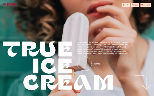
Mr. Pops projects a playful, premium, indulgent atmosphere through its high-contrast aesthetic. It pairs bold, whimsical typography with a dominant, vivid red accent, creating a sense of energetic fun. Surfaces are generally clean and light, ensuring the vibrant brand color truly pops. The design prioritizes visual impact and direct engagement rather than complex UI elements or subtle hierarchies.
The page structure is full-bleed, with content dynamically layered over large hero images. Sections typically stack vertically, maintaining consistent vertical spacing derived from sectionGap. Content within sections varies; the hero presents large, centered, and left-aligned display typography over an image. Other sections feature combinations of headings with short descriptive text. Layout density is spacious, allowing images and large text to command attention. Navigation is a minimal top-right bar with icon-only and ghost buttons.
The site uses photography as its primary imagery. These are high-key, likely full-bleed product shots showing ice creams, often held by people, emphasizing indulgence and the product experience. They are not contained by frames or masks, blending into the background or acting as the dominant visual. The treatment is vibrant and rich, focusing on the product's appealing textures and colors.
Reminiscent of Ben & Jerry's, Oatly, Glossier, Magnum Ice Cream.
# Mr. Pops — Style Reference
> Playful Indulgence on a White Canvas

**Theme:** light

**Site:** https://mrpops.ua/en

Mr. Pops projects a playful, premium, indulgent atmosphere through its high-contrast aesthetic. It pairs bold, whimsical typography with a dominant, vivid red accent, creating a sense of energetic fun. Surfaces are generally clean and light, ensuring the vibrant brand color truly pops. The design prioritizes visual impact and direct engagement rather than complex UI elements or subtle hierarchies.

## Tokens — Colors

| Name | Value | Token | Role |
|------|------|------|------|
| Candy Apple | `#b00e2f` | `--color-candy-apple` | Primary action backgrounds, brand accents, prominent hero elements, active states — signals vibrancy and direct action |
| Snow | `#ffffff` | `--color-snow` | Page backgrounds, card surfaces, ghost button text and borders, outline element strokes |
| Licorice | `#000000` | `--color-licorice` | Primary body text, headers, filled button text, outlined button borders |
| Nude Peach | `#fee5ca` | `--color-nude-peach` | Secondary surface backgrounds, subtle hover states, ghost button backgrounds – a warm, light neutral |

## Tokens — Typography

### Cervo
- **Substitute:** Georgia
- **Weights:** 400, 500
- **Sizes:** 16px, 18px, 22px, 42px, 64px, 72px, 144px
- **Line height:** 0.75, 0.9, 1
- **Letter spacing:** 0.0500em
- **Role:** Primary headings and display text. Its high letter-spacing and varied weights give titles a distinctive, impactful presence.

### HelveticaNeueCyr
- **Substitute:** Arial
- **Weights:** 400
- **Sizes:** 12px, 15px, 16px, 18px
- **Line height:** 1.15, 1.2, 1.3, 1.4
- **Letter spacing:** normal
- **Role:** Body text, links, smaller functional text, input text. Provides clarity and legibility against the decorative headings.

## Tokens — Type Scale

Perfect Fifth (1.5) from 12px base.

| Role | Size | Line height | Letter spacing |
|------|------|------|------|
| caption | 12px | 1.15 | — |
| body-sm | 15px | 1.2 | — |
| subheading | 18px | 1.4 | 0.05em |
| heading-sm | 22px | 1 | 0.05em |
| heading | 42px | 0.9 | 0.05em |
| heading-lg | 64px | 0.75 | 0.05em |
| display | 144px | 0.75 | 0.05em |

## Tokens — Spacing

- **Section gap:** 40px
- **Card padding:** 30px
- **Element gap:** 10px

## Tokens — Radius

- **Default:** 40px
- **Buttons:** 50%
- **circularElements:** 300px

## Layout

The page structure is full-bleed, with content dynamically layered over large hero images. Sections typically stack vertically, maintaining consistent vertical spacing derived from sectionGap. Content within sections varies; the hero presents large, centered, and left-aligned display typography over an image. Other sections feature combinations of headings with short descriptive text. Layout density is spacious, allowing images and large text to command attention. Navigation is a minimal top-right bar with icon-only and ghost buttons.

## Imagery

The site uses photography as its primary imagery. These are high-key, likely full-bleed product shots showing ice creams, often held by people, emphasizing indulgence and the product experience. They are not contained by frames or masks, blending into the background or acting as the dominant visual. The treatment is vibrant and rich, focusing on the product's appealing textures and colors.

## Components

### Primary Filled Button
*Call to action button for core tasks*

Background: Candy Apple (#b00e2f). Text: Licorice (#000000). Border Radius: 50% for a pill shape. Padding not consistently defined from data, infer 16px vertical, 30px horizontal.

### Secondary Ghost Button
*Alternative actions or navigation elements*

Background: transparent. Text: Snow (#ffffff) or Licorice (#000000). Border: 1px solid matching text color (Snow or Licorice). No border radius, sharp corners. Padding not consistently defined, infer 16px bottom, 30px horizontal for larger text elements.

### Navigation Menu Button
*Toggle for site navigation*

Background: transparent. Text: Snow (#ffffff). No border. No border radius. Top and bottom padding are not consistently defined, refer to global padding for element-gap.

### Form Input Field
*User input fields for forms*

Background: transparent. Text: Snow (#ffffff). Border: 1px solid Snow (#ffffff) at the bottom. No border radius. Padding: 10px top, 30px right.

### Circular Callout Button
*Small interactive circular elements, often for quantity or selection*

Background: Nude Peach (#fee5ca). Text: Licorice (#000000). Border Radius: 50%. Size is small, typically 40x40px.

## Guidelines

### Do

- Use Candy Apple (#b00e2f) strictly for primary actions, critical highlights, and brand accents to maintain its impact.
- Pair Cervo for all headings with HelveticaNeueCyr for body text to leverage the contrast between decorative and legible typography.
- Implement letter-spacing of 0.0500em for all Cervo text sizes to maintain its distinct character.
- Apply 50% border-radius to all primary action buttons for a consistent pill shape.
- Maintain a spacious density with at least 40px section gaps and 10px element gaps to allow visual breathing room.
- Prioritize high-contrast text-on-background combinations, using Licorice (#000000) on Snow (#ffffff) or Nude Peach (#fee5ca), and Snow on Candy Apple (#b00e2f).

### Don't

- Do not introduce new primary brand colors; restrict the palette to Snow, Licorice, Candy Apple, and Nude Peach.
- Avoid using Cervo for body text or any functional text, as its decorative nature reduces readability in smaller sizes.
- Do not use subtle background gradients or complex shadows; aim for flat, defined surfaces.
- Do not apply padding or margins that significantly break the established 10px base element gap, 30px card padding, or 40px section gap.
- Avoid mixed-case headings when using Cervo; stick to the dominant all-caps or title-case style for visual consistency.
- Do not use rectangular buttons with sharp corners for primary actions; reserve that for ghost/secondary buttons if necessary.

## Agent Prompt Guide

**Quick Color Reference**
text: #000000
background: #ffffff
border: #000000
accent: #b00e2f
primary action: #b00e2f (filled action)

**3-5 Example Component Prompts**
1. Create a Primary Action Button: #b00e2f background, #ffffff text, 9999px radius, compact pill padding. Use this filled treatment for the main CTA.
2. Create a Hero Headline: 'TRUE ICE CREAM' using Cervo 144px, 0.75 lineHeight, 0.0500em letter spacing, Snow (#ffffff) color.
3. Create a Secondary Ghost Button: transparent background, Snow (#ffffff) text and 1px border, no border-radius, using HelveticaNeueCyr 400 weight for text.
4. Create a Form Input Field: transparent background, Snow (#ffffff) text and 1px bottom border, using HelveticaNeueCyr 400 weight 16px with 1.3 lineHeight for text, 10px top and 30px right padding.
5. Create a Circular Callout Button: Nude Peach (#fee5ca) background, Licorice (#000000) text, 50% border-radius, 40x40px dimensions.
More like this









Keep what you find
A free account saves references to boards and can send you a weekly email of picks based on what you save.
To see every result, go Pro.