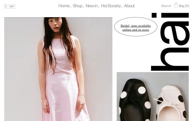
Preview image. Unlock full-res
white gallery, black ink
Color palette
Alerts, notifications, and potentially subtle brand accents. A secondary, reserved accent color
Dark borders and separators for elevated surfaces and inverted UI. Do not promote it to the primary CTA color
Page backgrounds, card surfaces, default UI elements. Establishes a bright, expansive visual field
Typography
- Weights
- 400, 600
- Sizes
- 16px, 22px, 24px, 28px, 32px
- Line height
- 0.8, 0.98, 1, 1.15, 1.25
- Letter spacing
- -0.15em at 32px, -0.10em at 28px, -0.086em at 24px, -0.075em at 22px, -0.062em at 16px
- Fallback
- Montserrat
Headlines and prominent UI elements. Its confident but finely-tracked presence creates a modern, architectural feel.
- Weights
- 400
- Sizes
- 16px, 18px, 24px, 26px, 31px, 32px
- Line height
- 0.8, 1, 1.15, 1.25
- Letter spacing
- 0.05em at 16px, -0.027em at 18px, -0.037em at 24px, -0.05em at 26px, -0.062em at 31px
- Fallback
- Lora
Body copy, product descriptions, and subheadings. The serif provides a classic, luxurious counterpoint to the sans-serif headlines, with tight tracking adding to its refined character.
Spacing & shape
Components
Transparent background, a 1px solid Midnight Ink border, 10px border radius, and Midnight Ink text. Padding is generous at 16px vertical and 32px horizontal. This button style reinforces the elegant, understated aesthetic.
Forma Nuovo typeface at 32px, weight 400, with a tight letter-spacing of -0.15em, rendered in Midnight Ink. Provides a bold but not shouting presence for product names.
Times Now typeface at 18px, weight 400, with letter-spacing -0.027em, rendered in Midnight Ink. Used for descriptive links, maintaining a classic, legible feel.
A unique card style with a 50% border-radius, effectively making it circular or an oval depending on content. Background is Canvas White with no box shadow, padding of 32px on all sides. Used for visual distinction.
Forma Nuovo typeface at 16px, weight 400, with a letter-spacing of -0.062em, in Midnight Ink. These links are minimal, direct, and rely on spacing for separation.
Guidelines
- Prioritize ample negative space around all elements to maintain a clean, high-end feel.
- Use Midnight Ink (#000000) for all text and UI outlines to ensure stark contrast and definition.
- Apply Forma Nuovo for all headings and key UI labels, utilizing its specified letter-spacing for each size.
- Use Times Now for body text and descriptive elements, adhering to its specific letter-spacing for a refined look.
- Implement the Ghost Outline Button for all interactive elements, featuring the 1px Midnight Ink border and 10px radius.
- Maintain a clear visual hierarchy by limiting saturated colors; reserve Ferry Red (#CF2442) for highly specific and subtle accents if needed.
- Ensure all buttons and links utilize a 10px border-radius, while specialized circular cards use a 50% radius for distinctiveness.
- Avoid using harsh drop shadows or heavy backgrounds; maintain the light and airy feel.
- Do not introduce new typefaces, as the chosen custom fonts are core to the brand's identity.
- Do not deviate from the specified letter-spacing values as they are a signature characteristic of the typography.
- Avoid filling buttons with solid background colors; stick to the ghost outline style for primary interactions.
- Do not clutter layouts with excessive elements; embrace spaciousness and minimalism.
- Do not use gradients unless explicitly part of the design system beyond the current data.
- Avoid using any color other than Midnight Ink for borders on interactive elements, or for primary text.
About this system
ShowHide
Hai employs a minimalist aesthetic that centers on a clean, almost stark white canvas providing ample negative space for product photography and subtle typography. Contrasting with the light backdrop, all text and interactive elements are rendered in a deep, absolute black, creating sophisticated definition. The brand's distinctive visual identity is further characterized by the use of custom serif and sans-serif fonts with unique letter-spacing, giving a sense of exclusivity and handcrafted precision. Buttons feature a refined, subtle outline rather than bold fills, maintaining the quiet luxury feel.
The page primarily employs a full-bleed layout for hero sections featuring large imagery, while internal content often adheres to a max-width contained model. The hero section frequently presents a large visual on one side (e.g., a model) and a distinct brand element or text on the other. Vertical rhythm is characterized by comfortable, consistent section gaps, creating a spacious feel. Content arrangement often alternates between imagery and text, with text labels positioned deliberately adjacent to products. Navigation is a minimal top bar, displaying key links without overwhelming the header space. The overall density is light, with significant breathing room.
The site predominantly uses high-key product photography, often featuring candid-style models in lifestyle shots or tightly cropped product details (e.g., shoes). Imagery is integrated seamlessly into the white canvas, frequently appearing as full-bleed sections or subtly framed without strong borders. The visual focus is on the product and its texture, often with a raw, authentic feel. Icons, if present, are likely minimal, outlined, and monochromatic, matching the overall stark aesthetic. Imagery plays an atmospheric and showcase role, with a strong emphasis on texture and natural light.
Reminiscent of Acne Studios, Arket, CDLP, Totême.
# Hai — Style Reference
> white gallery, black ink

**Theme:** light

**Site:** https://www.homeofhai.com

Hai employs a minimalist aesthetic that centers on a clean, almost stark white canvas providing ample negative space for product photography and subtle typography. Contrasting with the light backdrop, all text and interactive elements are rendered in a deep, absolute black, creating sophisticated definition. The brand's distinctive visual identity is further characterized by the use of custom serif and sans-serif fonts with unique letter-spacing, giving a sense of exclusivity and handcrafted precision. Buttons feature a refined, subtle outline rather than bold fills, maintaining the quiet luxury feel.

## Tokens — Colors

| Name | Value | Token | Role |
|------|------|------|------|
| Ferry Red | `#CF2442` | `--color-ferry-red` | Alerts, notifications, and potentially subtle brand accents. A secondary, reserved accent color |
| Midnight Ink | `#000000` | `--color-midnight-ink` | Dark borders and separators for elevated surfaces and inverted UI. Do not promote it to the primary CTA color |
| Canvas White | `#FFFFFF` | `--color-canvas-white` | Page backgrounds, card surfaces, default UI elements. Establishes a bright, expansive visual field |

## Tokens — Typography

### Forma Nuovo
- **Substitute:** Montserrat
- **Weights:** 400, 600
- **Sizes:** 16px, 22px, 24px, 28px, 32px
- **Line height:** 0.8, 0.98, 1, 1.15, 1.25
- **Letter spacing:** -0.15em at 32px, -0.10em at 28px, -0.086em at 24px, -0.075em at 22px, -0.062em at 16px
- **Role:** Headlines and prominent UI elements. Its confident but finely-tracked presence creates a modern, architectural feel.

### Times Now
- **Substitute:** Lora
- **Weights:** 400
- **Sizes:** 16px, 18px, 24px, 26px, 31px, 32px
- **Line height:** 0.8, 1, 1.15, 1.25
- **Letter spacing:** 0.05em at 16px, -0.027em at 18px, -0.037em at 24px, -0.05em at 26px, -0.062em at 31px
- **Role:** Body copy, product descriptions, and subheadings. The serif provides a classic, luxurious counterpoint to the sans-serif headlines, with tight tracking adding to its refined character.

## Tokens — Type Scale

Minor Third (1.2) from 18px base.

| Role | Size | Line height | Letter spacing |
|------|------|------|------|
| caption | 16px | 1 | 0.8px |
| body | 18px | 1.25 | -0.8px |
| subheading | 22px | 1 | -1.65px |
| heading | 24px | 1 | -2.06px |
| heading-lg | 31px | 0.8 | -1.92px |

## Tokens — Spacing

- **Section gap:** 32px
- **Card padding:** 32px
- **Element gap:** 16px

## Tokens — Radius

- **Buttons:** 10px
- **Cards:** 50%
- **links:** 10px

## Layout

The page primarily employs a full-bleed layout for hero sections featuring large imagery, while internal content often adheres to a max-width contained model. The hero section frequently presents a large visual on one side (e.g., a model) and a distinct brand element or text on the other. Vertical rhythm is characterized by comfortable, consistent section gaps, creating a spacious feel. Content arrangement often alternates between imagery and text, with text labels positioned deliberately adjacent to products. Navigation is a minimal top bar, displaying key links without overwhelming the header space. The overall density is light, with significant breathing room.

## Imagery

The site predominantly uses high-key product photography, often featuring candid-style models in lifestyle shots or tightly cropped product details (e.g., shoes). Imagery is integrated seamlessly into the white canvas, frequently appearing as full-bleed sections or subtly framed without strong borders. The visual focus is on the product and its texture, often with a raw, authentic feel. Icons, if present, are likely minimal, outlined, and monochromatic, matching the overall stark aesthetic. Imagery plays an atmospheric and showcase role, with a strong emphasis on texture and natural light.

## Components

### Ghost Outline Button
*Primary action button*

Transparent background, a 1px solid Midnight Ink border, 10px border radius, and Midnight Ink text. Padding is generous at 16px vertical and 32px horizontal. This button style reinforces the elegant, understated aesthetic.

### Product Title (Forma Nuovo)
*Product listing headline*

Forma Nuovo typeface at 32px, weight 400, with a tight letter-spacing of -0.15em, rendered in Midnight Ink. Provides a bold but not shouting presence for product names.

### Product Link (Times Now)
*Product detail link*

Times Now typeface at 18px, weight 400, with letter-spacing -0.027em, rendered in Midnight Ink. Used for descriptive links, maintaining a classic, legible feel.

### Circular Card
*Decorative or featured product card*

A unique card style with a 50% border-radius, effectively making it circular or an oval depending on content. Background is Canvas White with no box shadow, padding of 32px on all sides. Used for visual distinction.

### Navigation Link
*Top-level navigation item*

Forma Nuovo typeface at 16px, weight 400, with a letter-spacing of -0.062em, in Midnight Ink. These links are minimal, direct, and rely on spacing for separation.

## Guidelines

### Do

- Prioritize ample negative space around all elements to maintain a clean, high-end feel.
- Use Midnight Ink (#000000) for all text and UI outlines to ensure stark contrast and definition.
- Apply Forma Nuovo for all headings and key UI labels, utilizing its specified letter-spacing for each size.
- Use Times Now for body text and descriptive elements, adhering to its specific letter-spacing for a refined look.
- Implement the Ghost Outline Button for all interactive elements, featuring the 1px Midnight Ink border and 10px radius.
- Maintain a clear visual hierarchy by limiting saturated colors; reserve Ferry Red (#CF2442) for highly specific and subtle accents if needed.
- Ensure all buttons and links utilize a 10px border-radius, while specialized circular cards use a 50% radius for distinctiveness.

### Don't

- Avoid using harsh drop shadows or heavy backgrounds; maintain the light and airy feel.
- Do not introduce new typefaces, as the chosen custom fonts are core to the brand's identity.
- Do not deviate from the specified letter-spacing values as they are a signature characteristic of the typography.
- Avoid filling buttons with solid background colors; stick to the ghost outline style for primary interactions.
- Do not clutter layouts with excessive elements; embrace spaciousness and minimalism.
- Do not use gradients unless explicitly part of the design system beyond the current data.
- Avoid using any color other than Midnight Ink for borders on interactive elements, or for primary text.

## Agent Prompt Guide

Quick Color Reference: text: #000000, background: #FFFFFF, border: #000000, accent: #CF2442, primary action: no distinct CTA color

Example Component Prompts:
1. Create a navigation link: 'Shop' in Forma Nuovo, weight 400, size 16px, letter-spacing -0.062em, color #000000.
2. Create a ghost button: Text 'Shop Now' in Forma Nuovo, weight 400, size 16px, letter-spacing -0.062em, color #000000. Background transparent. Border 1px solid #000000. Border-radius 10px. Padding 16px vertical, 32px horizontal.
3. Create a product title: 'Lia Dress in Pink' in Forma Nuovo, weight 400, size 32px, letter-spacing -0.15em, color #000000.
4. Create a product description link: 'Harmony Ballerinas in Black and White Polka Dot' in Times Now, weight 400, size 18px, letter-spacing -0.027em, color #000000.
5. Create a circular card: Background #FFFFFF, border-radius 50%, no shadow. Padding 32px on all sides.
More like this








Keep what you find
A free account saves references to boards and can send you a weekly email of picks based on what you save.
To see every result, go Pro.