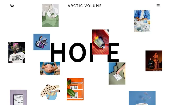
Preview image. Unlock full-res
Color palette
Primary page canvas and white card surfaces. Do not promote it to the primary CTA color
Primary text, headings, outlines for buttons, active navigation items, filled button backgrounds, decorative borders
Typography
- Weights
- 400, 700, 900
- Sizes
- 16px, 20px, 30px, 40px, 230px
- Line height
- 1, 1.2, 1.35, 1.5
- Fallback
- Inter
All text elements, from body copy and links to navigation and massive display headings. Its clean, sans-serif geometry with distinct proportions establishes the site's editorial and art-forward feel.
Spacing & shape
Components
Text in Midnight Ink (#000000) on an Arctic Snow (#f7f7f7) background, with a 1px Midnight Ink (#000000) border. Padding is 6px around the text. Radius is 0px.
Text in Arctic Snow (#f7f7f7) on a Midnight Ink (#000000) background, with a 1px Midnight Ink (#000000) border. Padding is 14px vertically and 38px horizontally. Radius is 0px.
No background color, no borders, no box shadow, and no padding. Content is presented directly. Radius is 0px. Text inside cards uses Midnight Ink (#000000).
Guidelines
- Always use Munken Sans Web for all text elements.
- Implement Midnight Ink (#000000) for all primary text and active states.
- Utilize Arctic Snow (#f7f7f7) as the dominant background color for clarity.
- Adhere to a 0px border-radius for all elements (buttons, cards) to maintain a sharp, editorial edge.
- Maintain high contrast between text and background, typically Midnight Ink on Arctic Snow.
- Employ consistent 48px vertical spacing between major page sections and headings.
- Design with a spacious layout, allowing ample white space around elements.
- Avoid rounded corners; all interface elements should have a 0px radius.
- Do not introduce additional saturated colors; the palette is strictly achromatic for UI elements.
- Refrain from using drop shadows or complex elevation; surfaces are flat and direct.
- Do not add padding or borders to primary content cards; they should float freely or be placed directly.
- Avoid decorative gradients or background images for UI components; stick to solid colors.
- Do not use letter-spacing other than normal, except where explicitly specified by type scale.
About this system
ShowHide
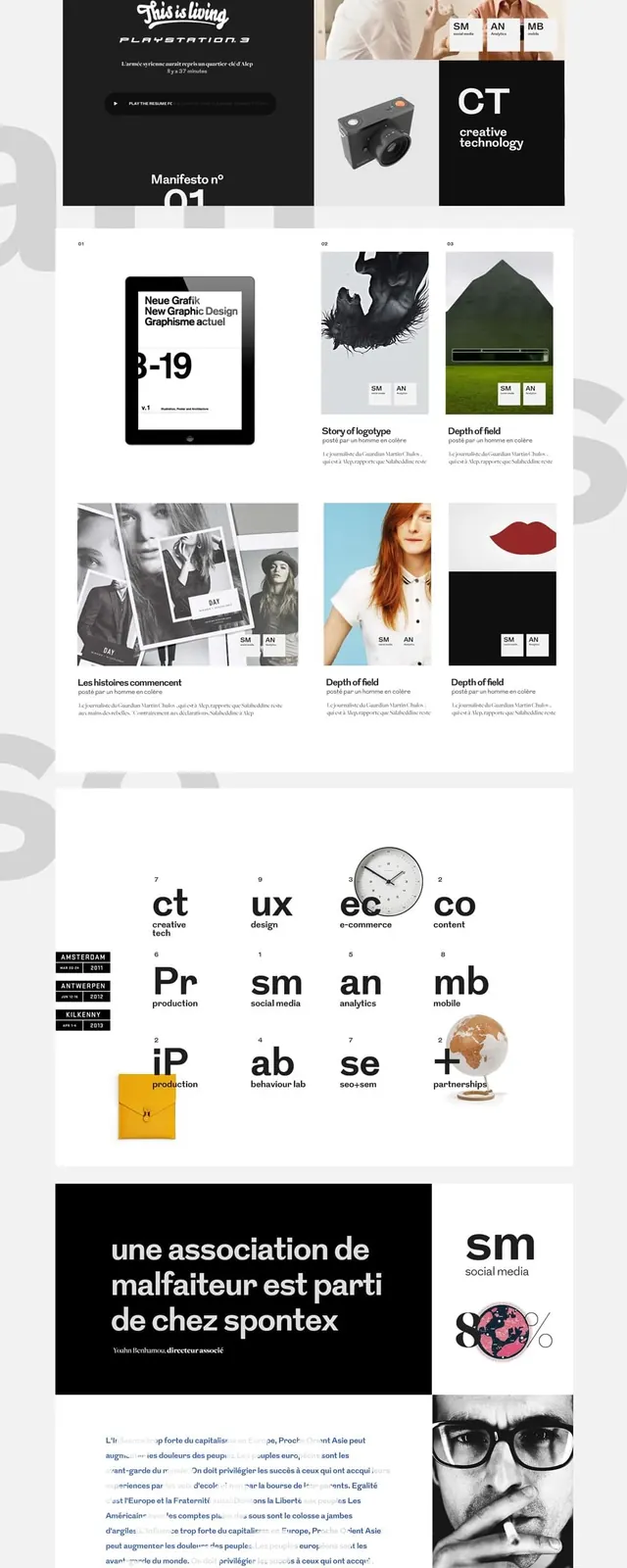
Arctic Volume presents a bold, editorial aesthetic. It emphasizes high contrast typography on vast, unobtrusive white space. Visuals are treated as distinct collage elements, drawing attention without being enclosed. The overall impression is one of stark graphic clarity, where content is king and design serves to amplify rather than decorate.
The page uses a full-bleed layout without a fixed max-width, allowing content to span the browser's width, though elements frequently align to loose vertical columns or grids. The hero section features unusually large, overlapping text with an irregular arrangement of small image cards, setting a dynamic, non-uniform tone. Section rhythm is primarily driven by generous vertical spacing between content blocks. Content arrangement is fluid; sometimes text-left/image-right, but more often a collage of visual elements surrounding central textual content. The navigation is minimal, a simple top-bar with a hamburger menu.
This site features a heavy reliance on photography and occasional abstract graphics, treated with a collage-like sensibility. Images are typically contained within their own bounding boxes, but arranged in dynamic, overlapping, and seemingly unconstrained layouts, creating a 'mood board' effect. Photography styles vary, from product-focused to artistic lifestyle shots. The imagery serves primarily as decorative atmosphere and content showcase, often appearing in high density relative to text, contributing to the visual-first editorial feel.
Reminiscent of AIGA Journal, The New York Times (digital), Esquire Magazine (digital), Are.na.
# Surface — Style Reference
> Minimalist gallery canvas

**Theme:** light

**Site:** https://surface.arcticvolume.com

Arctic Volume presents a bold, editorial aesthetic. It emphasizes high contrast typography on vast, unobtrusive white space. Visuals are treated as distinct collage elements, drawing attention without being enclosed. The overall impression is one of stark graphic clarity, where content is king and design serves to amplify rather than decorate.

## Tokens — Colors

| Name | Value | Token | Role |
|------|------|------|------|
| Arctic Snow | `#f7f7f7` | `--color-arctic-snow` | Primary page canvas and white card surfaces. Do not promote it to the primary CTA color |
| Midnight Ink | `#000000` | `--color-midnight-ink` | Primary text, headings, outlines for buttons, active navigation items, filled button backgrounds, decorative borders |

## Tokens — Typography

### Munken Sans Web
- **Substitute:** Inter
- **Weights:** 400, 700, 900
- **Sizes:** 16px, 20px, 30px, 40px, 230px
- **Line height:** 1, 1.2, 1.35, 1.5
- **Role:** All text elements, from body copy and links to navigation and massive display headings. Its clean, sans-serif geometry with distinct proportions establishes the site's editorial and art-forward feel.

## Tokens — Type Scale

| Role | Size | Line height | Letter spacing |
|------|------|------|------|
| body | 16px | 1.5 | — |
| subheading | 20px | 1.35 | — |
| heading-sm | 30px | 1.2 | — |
| heading | 40px | 1.2 | — |
| display | 230px | 1 | — |

## Tokens — Spacing

- **Section gap:** 48px
- **Card padding:** 0px
- **Element gap:** 10px

## Tokens — Radius

- **none:** 0px

## Layout

The page uses a full-bleed layout without a fixed max-width, allowing content to span the browser's width, though elements frequently align to loose vertical columns or grids. The hero section features unusually large, overlapping text with an irregular arrangement of small image cards, setting a dynamic, non-uniform tone. Section rhythm is primarily driven by generous vertical spacing between content blocks. Content arrangement is fluid; sometimes text-left/image-right, but more often a collage of visual elements surrounding central textual content. The navigation is minimal, a simple top-bar with a hamburger menu.

## Imagery

This site features a heavy reliance on photography and occasional abstract graphics, treated with a collage-like sensibility. Images are typically contained within their own bounding boxes, but arranged in dynamic, overlapping, and seemingly unconstrained layouts, creating a 'mood board' effect. Photography styles vary, from product-focused to artistic lifestyle shots. The imagery serves primarily as decorative atmosphere and content showcase, often appearing in high density relative to text, contributing to the visual-first editorial feel.

## Components

### Ghost Button
*Secondary actions and navigation links*

Text in Midnight Ink (#000000) on an Arctic Snow (#f7f7f7) background, with a 1px Midnight Ink (#000000) border. Padding is 6px around the text. Radius is 0px.

### Filled Primary Button
*Primary calls to action*

Text in Arctic Snow (#f7f7f7) on a Midnight Ink (#000000) background, with a 1px Midnight Ink (#000000) border. Padding is 14px vertically and 38px horizontally. Radius is 0px.

### Content Card (Image/Text)
*Displaying images and associated text in a grid or collage layout*

No background color, no borders, no box shadow, and no padding. Content is presented directly. Radius is 0px. Text inside cards uses Midnight Ink (#000000).

## Guidelines

### Do

- Always use Munken Sans Web for all text elements.
- Implement Midnight Ink (#000000) for all primary text and active states.
- Utilize Arctic Snow (#f7f7f7) as the dominant background color for clarity.
- Adhere to a 0px border-radius for all elements (buttons, cards) to maintain a sharp, editorial edge.
- Maintain high contrast between text and background, typically Midnight Ink on Arctic Snow.
- Employ consistent 48px vertical spacing between major page sections and headings.
- Design with a spacious layout, allowing ample white space around elements.

### Don't

- Avoid rounded corners; all interface elements should have a 0px radius.
- Do not introduce additional saturated colors; the palette is strictly achromatic for UI elements.
- Refrain from using drop shadows or complex elevation; surfaces are flat and direct.
- Do not add padding or borders to primary content cards; they should float freely or be placed directly.
- Avoid decorative gradients or background images for UI components; stick to solid colors.
- Do not use letter-spacing other than normal, except where explicitly specified by type scale.

## Agent Prompt Guide

**Quick Color Reference**
text: #000000
background: #f7f7f7
border: #000000
accent: no distinct accent color
primary action: no distinct CTA color

**3-5 Example Component Prompts**
Create a ghost button: text 'Learn More' in Midnight Ink (#000000), background Arctic Snow (#f7f7f7), 1px border in Midnight Ink (#000000), 6px padding on all sides, 0px border-radius.
No distinct primary action color was observed; use the extracted neutral button treatments instead of inventing a filled CTA color.
Create a heading: 'Surface N° 3' using Munken Sans Web weight 900 at 230px size, line-height 1.00, color Midnight Ink (#000000).
More like this






Keep what you find
A free account saves references to boards and can send you a weekly email of picks based on what you save.
To see every result, go Pro.