Preview image. Unlock full-res
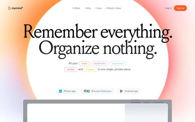
Sunlit personal archive — a warm afternoon light spilling across a private collection of saved thoughts, images, and bookmarks, curated without folders.
Color palette
Brand accent — outlined pill buttons, nav bullet markers, section eyebrow text. Never filled. Appears as coral-warm mark, not command.; Decorative gradient on brand moments and section backgrounds — orange to warm amber; Hero section background — radial bloom from intense orange bleeding into white canvas, creating the signature warm ambient atmosphere
Inline hyperlinks and underlined interactive text — only chromatic non-orange color in the UI
Page background (dark sections), primary display text, icon fills
Primary page canvas — the base surface of all main content sections
Card surfaces, elevated panels, inner containers requiring maximum contrast from canvas
Warm-tinted section backgrounds, alternating with canvas white for rhythm
Dividers, subtle borders, structural separators
Cool-tinted card backgrounds — technology/productivity content cards
Warm off-white card backgrounds — notes, writing content cards
Green-tinted card backgrounds — third content category surface
Primary heading text in body sections, secondary display text
Body text, paragraph copy, secondary content text
Tertiary body text, captions, metadata labels
Ghost button text/border (inactive platform buttons: iPhone app, Browser Extension, Android app)
Navigation text items in active/scrolled state
Muted nav labels, disabled states, placeholder text
Strikethrough / completed list item text inside product demo cards
Typography
- Weights
- 400
- Sizes
- 18px, 22px
- Line height
- 1
- Letter spacing
- normal
- Fallback
- Open Sans (Google Fonts)
Fallback / supporting body text in specific CMS-driven content blocks.
- Weights
- 400
- Sizes
- 18px, 32px, 36px, 42px, 52px, 54px, 80px, 96px, 140px
- Line height
- 0.8
- Letter spacing
- -6.2px at 100px / -5.3px at 80px / -2.3px at 36px — tight across all display sizes
- Fallback
- Freight Display Pro, or Playfair Display at weight 400
Editorial display and section headlines. The defining typographic voice — a transitional serif with ink-trap details. At 96–140px with -0.062em tracking, letterforms compress into a single visual mass. Anti-conventional: weight 400 (not bold) at enormous sizes creates authority through mass and scale rather than weight.
- Weights
- 400
- Sizes
- 80px, 84px
- Line height
- 0.88
- Letter spacing
- -2.88px at 80px, -1.93px at 84px
- Fallback
- Freight Display Pro Italic
Italic variant for editorial emphasis within headlines — creates contrast between upright and italic forms at the same display size
- Weights
- 400–500
- Sizes
- 15px, 16px, 18px, 20px
- Line height
- 1.2
- Letter spacing
- -2.2px at large / +0.4em to +1.25em for all-caps labels at small sizes
- Fallback
- Nunito (Google Fonts)
UI micro-labels, button text, nav items, section eyebrows. Tracked out at +0.025em to +0.125em for uppercase labels — the widest positive tracking in the system, contrasting sharply with Louize's negative tracking. Rounded forms soften UI chrome against the editorial serif.
- Weights
- 400
- Sizes
- 15px, 16px, 20px, 24px, 32px, 40px, 42px, 48px, 54px, 80px, 96px, 140px
- Line height
- 0.85
- Letter spacing
- -0.96px at 16px / -1.44px at 24px / uniform -0.06em ratio across the scale
- Fallback
- DM Sans or Nunito Sans
Body copy and long-form explanatory text. Humanist geometric grotesque — bridges the editorial serif headlines and the rounded UI labels. Letter-spacing held at -0.06em across all sizes.
- Weights
- 400
- Sizes
- 16px, 18px, 20px, 24px, 40px
- Line height
- 1.11
- Letter spacing
- -0.64px at 16px, -0.26px at 20px
- Fallback
- Inter (Google Fonts)
Navigation labels, UI body text, list items. Neutral workhorse for medium-density interface contexts where Avenir's personality would compete. Tracking at -0.04em to -0.013em.
- Weights
- 500
- Sizes
- 16px, 24px
- Line height
- 1
- Letter spacing
- +1.0px at 16px
- Fallback
- Helvetica Neue
Small-caps section category labels and UI micro-headings. Tracked out at +0.063em — used where Nunito's roundness is too informal.
- Weights
- 400
- Sizes
- 42px
- Line height
- 1.19
- Letter spacing
- -0.019
Louize-Bold-205TF — detected in extracted data but not described by AI
- Weights
- 400
- Sizes
- 48px
- Line height
- 0.92
- Letter spacing
- -0.033
Louize-Medium-205TF — detected in extracted data but not described by AI
- Weights
- 400
- Sizes
- 96px
- Line height
- 0.88
- Letter spacing
- -0.044
mymindai-Regular — detected in extracted data but not described by AI
Spacing & shape
Elevation
Components
Background transparent, border 1px solid #ff5924, text #ff5924, border-radius 100px, padding 10px 24px. Nunito-SemiBold 15–16px, letter-spacing +0.053em uppercase. The absence of a filled CTA is deliberate — the brand never commands, only invites.
Background transparent, border 1px solid #748297, text #748297, border-radius 100px, padding 10px 24px. Identical structure to Ember Outlined — differentiated only by Slate (#748297) replacing Ember Orange.
Background transparent, border 1px solid #ffffff, text #ffffff, border-radius 120px, padding 10px 22px. Used exclusively over dark/black section backgrounds.
Border-radius 36px, border 1px solid, each tag uses its own accent color matching the keyword category (Ember Orange for some, Cobalt #1573dd for links). Small pill form, inline with body text at 18px. Creates a 'tag cloud embedded in prose' pattern.
Background alternates: #e5eaf2 (blue), #f3f0e7 (parchment), or #dde9d3 (sage). Border-radius 16px. No shadow. Padding 50px all sides. No border. Color selection encodes content category — each card type has its own tinted surface.
Background #ffffff, border-radius 12px, padding 100px top / 30px sides and bottom. Shadow: rgba(255,167,129,0.44) 0px 57px 60px -54px, rgba(255,128,36,0.27) 0px -27px 50px -40px. The warm orange-glow shadow is unique to this one card — it echoes the hero bloom.
Background #ffffff or transparent over hero. Logo at left. Nav links (What, Why, How, What's New) centered with small Ember Orange bullet dots preceding each item. 'Log in' as plain text link in #24272d. 'Sign up' as Ember Outlined Pill Button. Nunito/Inter at 16px. No border-bottom — separates via position only.
Each nav label preceded by a small filled circle in #ff5924. Text in #24272d at 16px Inter-Medium. No underline. The orange dots are the primary navigation affordance — brand identity woven into wayfinding.
Text #ff5924, Nunito-SemiBold or neue-haas-grotesk-display 15–16px, letter-spacing +0.063em to +0.125em uppercase. No background. Positioned directly above the Louize display heading. Example: 'YOUR PRIVATE OASIS'.
Rounded rectangle at 12–16px radius, gray border (#e2e2e2) 1px solid, white interior. Contains a simulated browser/app UI inside. No shadow. Appears partially cropped at viewport edge — creates 'peek' effect suggesting more content below.
Background linear-gradient from #000000 to #2f343c. White text (#ffffff) at Louize-Regular 52–80px, tightly tracked at -0.04em. White outlined pill buttons over dark. Creates stark contrast against the warm-white surrounding sections.
Parchment card (#f3f0e7) at 16px radius, 50px padding. List items at Inter-Regular 16–18px: checked items in #a6a8aa with strikethrough, active items in #3a475a. Minimal checkbox circles, no filled checkmarks except as gray circles.
Guidelines
- Use Louize-Regular-205TF for all headline text at 32px and above, with letter-spacing of -0.04em to -0.062em — tighter as size increases.
- Apply the Hero Bloom gradient (orange → blush → white) only to hero-scale backgrounds; never as a card or button fill.
- Use 100px border-radius on all pill buttons regardless of variant — the full-circle pill is the only button shape in the system.
- Differentiate feature cards exclusively by background color (Slate Blue #e5eaf2 / Parchment #f3f0e7 / Sage #dde9d3) — never by border or shadow.
- Prefix navigation links with a small Ember Orange (#ff5924) filled dot — it is the primary visual affordance of the nav.
- Track Nunito uppercase labels at +0.063em to +0.125em — the extreme positive tracking contrasts the extreme negative tracking of Louize headlines and defines the system's typographic rhythm.
- Place section eyebrow labels in Ember Orange (#ff5924) ALL CAPS above every Louize display heading.
- Never fill any button with Ember Orange (#ff5924) as a solid background — it is an outline-only accent color. Filled orange breaks the brand's restrained invitation tone.
- Never use box shadows on feature cards — the three pastel card variants (#e5eaf2, #f3f0e7, #dde9d3) elevate through color contrast alone.
- Never set Louize headlines above 32px with positive or zero letter-spacing — negative tracking at scale is the typography system's core rule.
- Do not use more than three surface tints per page section — Slate Blue, Parchment, and Sage are a complete set; adding a fourth card color breaks the categorical system.
- Do not use Inter or Open Sans for display-size text — Louize owns all sizes above 28px; Avenir and Inter serve body and UI only.
- Never apply the warm orange-glow card shadow (rgba(255,167,129,0.44)) to anything other than the hero product preview card — it is a signature moment, not a reusable elevation style.
- Do not use hard dividers (visible border-bottom rules or <hr>) between page sections — rhythm is created by alternating background colors (#f9fafc vs #fff1f1), not structural lines.
About this system
ShowHide
mymind feels like a private journal left open on a warm windowsill — soft, diffuse light bleeding in from orange-to-white gradients that suffuse the entire canvas in ambient warmth. The hero background is a radial bloom of coral-orange fading to white, not a photograph or illustration, just color as atmosphere. Typography does the heavy lifting: Louize serif at 96–140px with aggressive negative tracking (-0.062em) creates editorial weight that editorial magazines would recognize, while Nunito handles micro-UI labels at tracked-out uppercase (0.063em to 0.125em) — the two extremes of the letter-spacing scale are the system's visual signature. Cards sit on tinted pastel surfaces (#e5eaf2, #f3f0e7, #dde9d3) rather than generic white, each hue suggesting a different mood of content. The single chromatic accent — Ember Orange #ff5924 — appears only as an outlined pill button border and brand moment, never as a filled CTA, making it feel like a mark rather than a command.
Max-width 1440px centered on a near-white (#f9fafc) canvas. Hero is full-viewport with centered headline over the warm bloom gradient — no split layout, pure text-over-atmosphere. Navigation is minimal sticky top bar: logo left, centered links, auth right. Sections alternate between warm-white (#f9fafc) and blush (#fff1f1) backgrounds with no visible dividers. Content sections use 2-column layouts: feature text left / demo card right, or vice versa (alternating). Feature card grids are 2-column at desktop. The dark manifesto section is full-bleed, breaking the warm palette completely for tonal contrast. Product demo appears as an oversized browser-frame card that bleeds slightly off the section edge — deliberately cropped to imply a larger product. Vertical spacing between sections is generous (80–120px), giving the page a slow, unhurried reading pace. No sidebar, no mega-menu, no sticky sidebar.
Product screenshots are the primary visual content — shown inside browser/app frames with rounded corners (12–16px), cropped at viewport edges to suggest depth. No lifestyle photography. Abstract color as atmosphere: the hero uses pure gradient bloom (orange to white) rather than any photograph. Illustrations are absent. Product UI cards float as isolated artifacts against pastel surfaces — a soap bar, a magazine cover, movie posters — shown as-found content items, not staged product photography. Icons are minimal: outlined style, single-stroke weight, monochrome. The 'Magic is happening...' ambient loader appears as a soft red radial glow with a wave icon — purely decorative atmospheric feedback. Overall image density is low: large expanses of tinted background with single focused content artifacts, text-dominant layout. The content items inside demo cards (Dior editorial, GQ cover, Top Gun poster) are reproduced at natural proportions with no color treatment or filters.
Reminiscent of Notion, Are.na, Craft Docs, Readwise, Framer.
# mymind — Style Reference
> Sunlit personal archive — a warm afternoon light spilling across a private collection of saved thoughts, images, and bookmarks, curated without folders.

**Theme:** light

**Site:** https://mymind.com

mymind feels like a private journal left open on a warm windowsill — soft, diffuse light bleeding in from orange-to-white gradients that suffuse the entire canvas in ambient warmth. The hero background is a radial bloom of coral-orange fading to white, not a photograph or illustration, just color as atmosphere. Typography does the heavy lifting: Louize serif at 96–140px with aggressive negative tracking (-0.062em) creates editorial weight that editorial magazines would recognize, while Nunito handles micro-UI labels at tracked-out uppercase (0.063em to 0.125em) — the two extremes of the letter-spacing scale are the system's visual signature. Cards sit on tinted pastel surfaces (#e5eaf2, #f3f0e7, #dde9d3) rather than generic white, each hue suggesting a different mood of content. The single chromatic accent — Ember Orange #ff5924 — appears only as an outlined pill button border and brand moment, never as a filled CTA, making it feel like a mark rather than a command.

## Tokens — Colors

| Name | Value | Token | Role |
|------|------|------|------|
| Ember Orange | `#ff5924` | `--color-ember-orange` | Brand accent — outlined pill buttons, nav bullet markers, section eyebrow text. Never filled. Appears as coral-warm mark, not command.; Decorative gradient on brand moments and section backgrounds — orange to warm amber; Hero section background — radial bloom from intense orange bleeding into white canvas, creating the signature warm ambient atmosphere |
| Cobalt Link | `#1573dd` | `--color-cobalt-link` | Inline hyperlinks and underlined interactive text — only chromatic non-orange color in the UI |
| Midnight Ink | `#000000` | `--color-midnight-ink` | Page background (dark sections), primary display text, icon fills |
| Canvas White | `#f9fafc` | `--color-canvas-white` | Primary page canvas — the base surface of all main content sections |
| Pure White | `#ffffff` | `--color-pure-white` | Card surfaces, elevated panels, inner containers requiring maximum contrast from canvas |
| Blush Tint | `#fff1f1` | `--color-blush-tint` | Warm-tinted section backgrounds, alternating with canvas white for rhythm |
| Mist | `#e2e2e2` | `--color-mist` | Dividers, subtle borders, structural separators |
| Slate Blue Card | `#e5eaf2` | `--color-slate-blue-card` | Cool-tinted card backgrounds — technology/productivity content cards |
| Parchment Card | `#f3f0e7` | `--color-parchment-card` | Warm off-white card backgrounds — notes, writing content cards |
| Sage Card | `#dde9d3` | `--color-sage-card` | Green-tinted card backgrounds — third content category surface |
| Deep Slate | `#3a475a` | `--color-deep-slate` | Primary heading text in body sections, secondary display text |
| Storm | `#4a5465` | `--color-storm` | Body text, paragraph copy, secondary content text |
| Steel | `#717286` | `--color-steel` | Tertiary body text, captions, metadata labels |
| Slate | `#748297` | `--color-slate` | Ghost button text/border (inactive platform buttons: iPhone app, Browser Extension, Android app) |
| Graphite Nav | `#24272d` | `--color-graphite-nav` | Navigation text items in active/scrolled state |
| Ash | `#afb5c1` | `--color-ash` | Muted nav labels, disabled states, placeholder text |
| Chalk | `#a6a8aa` | `--color-chalk` | Strikethrough / completed list item text inside product demo cards |

## Tokens — Typography

### Open Sans
- **Substitute:** Open Sans (Google Fonts)
- **Weights:** 400
- **Sizes:** 18px, 22px
- **Line height:** 1
- **Letter spacing:** normal
- **Role:** Fallback / supporting body text in specific CMS-driven content blocks.

### Louize-Regular-205TF
- **Substitute:** Freight Display Pro, or Playfair Display at weight 400
- **Weights:** 400
- **Sizes:** 18px, 32px, 36px, 42px, 52px, 54px, 80px, 96px, 140px
- **Line height:** 0.8
- **Letter spacing:** -6.2px at 100px / -5.3px at 80px / -2.3px at 36px — tight across all display sizes
- **Role:** Editorial display and section headlines. The defining typographic voice — a transitional serif with ink-trap details. At 96–140px with -0.062em tracking, letterforms compress into a single visual mass. Anti-conventional: weight 400 (not bold) at enormous sizes creates authority through mass and scale rather than weight.

### Louize-Italic-205TF
- **Substitute:** Freight Display Pro Italic
- **Weights:** 400
- **Sizes:** 80px, 84px
- **Line height:** 0.88
- **Letter spacing:** -2.88px at 80px, -1.93px at 84px
- **Role:** Italic variant for editorial emphasis within headlines — creates contrast between upright and italic forms at the same display size

### Nunito-SemiBold / Nunito-Regular
- **Substitute:** Nunito (Google Fonts)
- **Weights:** 400–500
- **Sizes:** 15px, 16px, 18px, 20px
- **Line height:** 1.2
- **Letter spacing:** -2.2px at large / +0.4em to +1.25em for all-caps labels at small sizes
- **Role:** UI micro-labels, button text, nav items, section eyebrows. Tracked out at +0.025em to +0.125em for uppercase labels — the widest positive tracking in the system, contrasting sharply with Louize's negative tracking. Rounded forms soften UI chrome against the editorial serif.

### Avenir LT W01_45 Book1475508
- **Substitute:** DM Sans or Nunito Sans
- **Weights:** 400
- **Sizes:** 15px, 16px, 20px, 24px, 32px, 40px, 42px, 48px, 54px, 80px, 96px, 140px
- **Line height:** 0.85
- **Letter spacing:** -0.96px at 16px / -1.44px at 24px / uniform -0.06em ratio across the scale
- **Role:** Body copy and long-form explanatory text. Humanist geometric grotesque — bridges the editorial serif headlines and the rounded UI labels. Letter-spacing held at -0.06em across all sizes.

### Inter-Medium / Inter-Regular
- **Substitute:** Inter (Google Fonts)
- **Weights:** 400
- **Sizes:** 16px, 18px, 20px, 24px, 40px
- **Line height:** 1.11
- **Letter spacing:** -0.64px at 16px, -0.26px at 20px
- **Role:** Navigation labels, UI body text, list items. Neutral workhorse for medium-density interface contexts where Avenir's personality would compete. Tracking at -0.04em to -0.013em.

### neue-haas-grotesk-display
- **Substitute:** Helvetica Neue
- **Weights:** 500
- **Sizes:** 16px, 24px
- **Line height:** 1
- **Letter spacing:** +1.0px at 16px
- **Role:** Small-caps section category labels and UI micro-headings. Tracked out at +0.063em — used where Nunito's roundness is too informal.

### Louize-Bold-205TF
- **Weights:** 400
- **Sizes:** 42px
- **Line height:** 1.19
- **Letter spacing:** -0.019
- **Role:** Louize-Bold-205TF — detected in extracted data but not described by AI

### Louize-Medium-205TF
- **Weights:** 400
- **Sizes:** 48px
- **Line height:** 0.92
- **Letter spacing:** -0.033
- **Role:** Louize-Medium-205TF — detected in extracted data but not described by AI

### mymindai-Regular
- **Weights:** 400
- **Sizes:** 96px
- **Line height:** 0.88
- **Letter spacing:** -0.044
- **Role:** mymindai-Regular — detected in extracted data but not described by AI

## Tokens — Type Scale

| Role | Size | Line height | Letter spacing |
|------|------|------|------|
| caption | 15px | 1.33 | 2px |
| body | 18px | 1.67 | -0.36px |
| subheading | 22px | 1.4 | -0.44px |
| heading-sm | 32px | 1.19 | -1.92px |
| heading | 52px | 1 | -2.08px |
| heading-lg | 80px | 0.88 | -4.96px |
| display | 140px | 0.85 | -8.68px |

## Tokens — Spacing

- **Max width:** 1440px
- **Section gap:** 80-120px
- **Card padding:** 50px
- **Element gap:** 20px

## Tokens — Radius

- **Buttons:** 100px
- **Cards:** 16px
- **buttonsAlt:** 120px
- **cardsAlt:** 12px
- **nav:** 30px
- **tags:** 36px

## Tokens — Elevation

- **Hero Product Card:** `rgba(255, 167, 129, 0.44) 0px 57px 60px -54px, rgba(255, 128, 36, 0.27) 0px -27px 50px -40px`
- **Floating Card:** `rgba(140, 142, 151, 0.32) 0px 4px 7px -4px`

## Layout

Max-width 1440px centered on a near-white (#f9fafc) canvas. Hero is full-viewport with centered headline over the warm bloom gradient — no split layout, pure text-over-atmosphere. Navigation is minimal sticky top bar: logo left, centered links, auth right. Sections alternate between warm-white (#f9fafc) and blush (#fff1f1) backgrounds with no visible dividers. Content sections use 2-column layouts: feature text left / demo card right, or vice versa (alternating). Feature card grids are 2-column at desktop. The dark manifesto section is full-bleed, breaking the warm palette completely for tonal contrast. Product demo appears as an oversized browser-frame card that bleeds slightly off the section edge — deliberately cropped to imply a larger product. Vertical spacing between sections is generous (80–120px), giving the page a slow, unhurried reading pace. No sidebar, no mega-menu, no sticky sidebar.

## Imagery

Product screenshots are the primary visual content — shown inside browser/app frames with rounded corners (12–16px), cropped at viewport edges to suggest depth. No lifestyle photography. Abstract color as atmosphere: the hero uses pure gradient bloom (orange to white) rather than any photograph. Illustrations are absent. Product UI cards float as isolated artifacts against pastel surfaces — a soap bar, a magazine cover, movie posters — shown as-found content items, not staged product photography. Icons are minimal: outlined style, single-stroke weight, monochrome. The 'Magic is happening...' ambient loader appears as a soft red radial glow with a wave icon — purely decorative atmospheric feedback. Overall image density is low: large expanses of tinted background with single focused content artifacts, text-dominant layout. The content items inside demo cards (Dior editorial, GQ cover, Top Gun poster) are reproduced at natural proportions with no color treatment or filters.

## Components

### Content Category Tags (Hero Inline Pills)

### Platform Download Buttons (Ghost Slate Pills)

### Inline Checklist Card (Pastel Parchment Feature Card)

### Ember Outlined Pill Button
*Primary brand action button — outlined, never filled*

Background transparent, border 1px solid #ff5924, text #ff5924, border-radius 100px, padding 10px 24px. Nunito-SemiBold 15–16px, letter-spacing +0.053em uppercase. The absence of a filled CTA is deliberate — the brand never commands, only invites.

### Ghost Slate Pill Button
*Secondary platform download buttons (iPhone app, Browser Extension, Android app)*

Background transparent, border 1px solid #748297, text #748297, border-radius 100px, padding 10px 24px. Identical structure to Ember Outlined — differentiated only by Slate (#748297) replacing Ember Orange.

### White Outlined Pill Button
*Dark-background section CTAs*

Background transparent, border 1px solid #ffffff, text #ffffff, border-radius 120px, padding 10px 22px. Used exclusively over dark/black section backgrounds.

### Content Category Tag
*Inline keyword tags within hero body text (notes, bookmarks, inspiration, articles, images)*

Border-radius 36px, border 1px solid, each tag uses its own accent color matching the keyword category (Ember Orange for some, Cobalt #1573dd for links). Small pill form, inline with body text at 18px. Creates a 'tag cloud embedded in prose' pattern.

### Pastel Feature Card
*Primary content feature card in 2-column feature grids*

Background alternates: #e5eaf2 (blue), #f3f0e7 (parchment), or #dde9d3 (sage). Border-radius 16px. No shadow. Padding 50px all sides. No border. Color selection encodes content category — each card type has its own tinted surface.

### White Elevated Card
*Hero product preview card / elevated demo surface*

Background #ffffff, border-radius 12px, padding 100px top / 30px sides and bottom. Shadow: rgba(255,167,129,0.44) 0px 57px 60px -54px, rgba(255,128,36,0.27) 0px -27px 50px -40px. The warm orange-glow shadow is unique to this one card — it echoes the hero bloom.

### Navigation Bar
*Persistent top navigation*

Background #ffffff or transparent over hero. Logo at left. Nav links (What, Why, How, What's New) centered with small Ember Orange bullet dots preceding each item. 'Log in' as plain text link in #24272d. 'Sign up' as Ember Outlined Pill Button. Nunito/Inter at 16px. No border-bottom — separates via position only.

### Nav Bullet Link
*Navigation items with decorative orange dot prefix*

Each nav label preceded by a small filled circle in #ff5924. Text in #24272d at 16px Inter-Medium. No underline. The orange dots are the primary navigation affordance — brand identity woven into wayfinding.

### Section Eyebrow Label
*Small uppercase category labels above section headings*

Text #ff5924, Nunito-SemiBold or neue-haas-grotesk-display 15–16px, letter-spacing +0.063em to +0.125em uppercase. No background. Positioned directly above the Louize display heading. Example: 'YOUR PRIVATE OASIS'.

### Product Demo Screenshot Frame
*Browser-frame wrapper showing app UI*

Rounded rectangle at 12–16px radius, gray border (#e2e2e2) 1px solid, white interior. Contains a simulated browser/app UI inside. No shadow. Appears partially cropped at viewport edge — creates 'peek' effect suggesting more content below.

### Dark Manifesto Section
*Full-bleed dark narrative section*

Background linear-gradient from #000000 to #2f343c. White text (#ffffff) at Louize-Regular 52–80px, tightly tracked at -0.04em. White outlined pill buttons over dark. Creates stark contrast against the warm-white surrounding sections.

### Inline Checklist Card
*Product feature demo — task list inside a pastel card*

Parchment card (#f3f0e7) at 16px radius, 50px padding. List items at Inter-Regular 16–18px: checked items in #a6a8aa with strikethrough, active items in #3a475a. Minimal checkbox circles, no filled checkmarks except as gray circles.

## Guidelines

### Do

- Use Louize-Regular-205TF for all headline text at 32px and above, with letter-spacing of -0.04em to -0.062em — tighter as size increases.
- Apply the Hero Bloom gradient (orange → blush → white) only to hero-scale backgrounds; never as a card or button fill.
- Use 100px border-radius on all pill buttons regardless of variant — the full-circle pill is the only button shape in the system.
- Differentiate feature cards exclusively by background color (Slate Blue #e5eaf2 / Parchment #f3f0e7 / Sage #dde9d3) — never by border or shadow.
- Prefix navigation links with a small Ember Orange (#ff5924) filled dot — it is the primary visual affordance of the nav.
- Track Nunito uppercase labels at +0.063em to +0.125em — the extreme positive tracking contrasts the extreme negative tracking of Louize headlines and defines the system's typographic rhythm.
- Place section eyebrow labels in Ember Orange (#ff5924) ALL CAPS above every Louize display heading.

### Don't

- Never fill any button with Ember Orange (#ff5924) as a solid background — it is an outline-only accent color. Filled orange breaks the brand's restrained invitation tone.
- Never use box shadows on feature cards — the three pastel card variants (#e5eaf2, #f3f0e7, #dde9d3) elevate through color contrast alone.
- Never set Louize headlines above 32px with positive or zero letter-spacing — negative tracking at scale is the typography system's core rule.
- Do not use more than three surface tints per page section — Slate Blue, Parchment, and Sage are a complete set; adding a fourth card color breaks the categorical system.
- Do not use Inter or Open Sans for display-size text — Louize owns all sizes above 28px; Avenir and Inter serve body and UI only.
- Never apply the warm orange-glow card shadow (rgba(255,167,129,0.44)) to anything other than the hero product preview card — it is a signature moment, not a reusable elevation style.
- Do not use hard dividers (visible border-bottom rules or <hr>) between page sections — rhythm is created by alternating background colors (#f9fafc vs #fff1f1), not structural lines.

## Agent Prompt Guide

**Quick Color Reference**
- text (primary): #000000
- text (body): #4a5465
- text (secondary): #3a475a
- background (canvas): #f9fafc
- border (structural): #e2e2e2
- accent / brand outline: #ff5924
- primary action: #ff5924 (outlined action border)

**Example Component Prompts**

1. **Hero Section**: Full-viewport background using the Hero Bloom gradient (linear-gradient from #ff5924 at 0% → #ffc0b4 at 21% → #ffffff at 37% → #fff2f2 at 100%). Center a Louize-Regular headline at 96–140px, color #000000, letter-spacing -0.062em, line-height 0.85. Below it, body text at 18px Avenir Book color #4a5465. Add inline category tags (border-radius 36px, 1px solid #ff5924 for orange, 1px solid #1573dd for blue) within the body line.

2. **Outlined Ember Pill Button**: Transparent background, border 1px solid #ff5924, text #ff5924, border-radius 100px, padding 10px 24px. Nunito-SemiBold 15px, letter-spacing +0.053em uppercase. No fill on hover background — transition border opacity.

3. **Pastel Feature Card (Blue)**: Background #e5eaf2, border-radius 16px, padding 50px, no shadow, no border. Inside: Louize-Regular heading at 32px, color #3a475a, letter-spacing -0.04em. Body text at 18px Avenir color #4a5465, line-height 1.67.

4. **Section Eyebrow + Headline**: Eyebrow in Nunito-SemiBold 14px #ff5924, letter-spacing +0.125em, ALL CAPS, margin-bottom 16px. Headline below in Louize-Regular 52–80px #000000, letter-spacing -0.045em, line-height 0.94. No other elements between eyebrow and headline.

5. **Dark Manifesto Block**: Full-bleed background linear-gradient(#000000 0%, #2f343c 100%). Louize-Regular text at 52–80px, color #ffffff, letter-spacing -0.04em. White outlined pill button (border 1px solid #ffffff, text #ffffff, radius 120px, padding 10px 22px) as the section action. No other colors.

## Gradient System

Three gradients serve distinct roles:
1. **Hero Bloom** (linear from #ff5924 → #ffc0b4 → #ffffff → #fff2f2): Applied as the hero full-viewport background — the most visible brand moment. Gives the impression of warm light flooding through a window.
2. **Ember Vertical** (linear from #ff5924 → #ffa86a): Used on brand decorative elements, not backgrounds. Appears on iconographic or illustrative surfaces.
3. **Midnight Depth** (linear from #000000 → #2f343c): Dark manifesto section background — the only dark section on the page. Creates a tonal rupture in the warm-light system, adding narrative weight to the brand philosophy text.

## Motion Philosophy

Animation personality is expressive but slow. Primary easing is cubic-bezier(0.19, 1, 0.22, 1) — a fast-in-slow-out curve at 0.7s that makes elements arrive with momentum and settle gently, like something placed rather than dropped. Secondary micro-interactions use ease at 0.2s. Named animations 'play-pop-out' and 'pop-out' suggest card expansion patterns. Color and transform are the primary transitioned properties — no opacity-fade reveals. The combination of slow easing (0.7s) with a decelerating curve creates the 'unhurried' pace that matches the brand's anti-organizational philosophy.
More like this









Keep what you find
A free account saves references to boards and can send you a weekly email of picks based on what you save.
To see every result, go Pro.