Preview image. Unlock full-res
Archival white space
Color palette
Red decorative accent for icons, marks, and small graphic details. Do not promote it to the primary CTA color
Page backgrounds, elevated surfaces, button text on filled buttons
Card backgrounds, secondary container surfaces
Primary text, strong headings, default body copy
Primary action button backgrounds, default button borders, darker text details
Muted body text, secondary information, decorative borders
Subtle body text, tertiary information
Typography
- Weights
- 400
- Sizes
- 16px
- Line height
- 1.2
- Letter spacing
- normal
- Fallback
- Times New Roman
Fallback font for general text, links, and minor UI elements. Provides a classic, almost report-like baseline.
- Weights
- 400
- Sizes
- 14px, 20px, 42px
- Line height
- 1.24, 1.33, 1.4, 1.43
- Letter spacing
- normal
The primary font for headings, body text, and interactive elements. Its condensed structure and consistent weight support the efficient, archival feel of the site.
Spacing & shape
Components
Text in Ink Detail (#111111), background transparent, 1px Ink Detail (#111111) border on hover/active. Radius: 10px. Padding 6px vertical, 12px horizontal. Font: Arial Narrow, weight 400.
Background Ink Detail (#111111), text Canvas White (#ffffff). Radius: 10px. Padding 6px vertical, 12px horizontal. Font: Arial Narrow, weight 400.
Background Pale Gray Surface (#f9f9f9), no shadow. Radius: 10px. Padding 30px on all sides.
Text Ink Detail (#111111), background transparent, no border. Radius: 0px. No padding.
Guidelines
- Prioritize Canvas White (#ffffff) as the dominant background color for most page content, ensuring ample negative space.
- Use Text Black (#000000) for primary textual content and Ink Detail (#111111) for interactive elements and stronger outlines.
- Maintain a clear visual hierarchy with Arial Narrow as the primary display and body font, reserving Times for secondary roles.
- Apply 10px border-radius consistently to all interactive components like buttons and cards for a softened but contained feel.
- Utilize Archive Red (#ff0000) strictly as a decorative brand accent, primarily in large-scale graphical elements or SVGs, avoiding its use for interactive states or general UI.
- Implement a spacious layout rhythm, maintaining at least 20px gap between elements and 30px padding within cards.
- Employ the light shadow rgba(17, 17, 17, 0.3) 0px 0px 20px 0px sparingly, specifically for prominent, interactive elements as a subtle elevation cue.
- Do not use Archive Red (#ff0000) for interactive elements like buttons, links, or alerts; it is a decorative brand element only.
- Avoid introducing additional chromatic colors; the system is designed around a monochrome base with one vivid red accent.
- Do not vary the border-radius from 10px for standard UI components like buttons and cards, unless for specific, deliberate exceptions like the 23px radius noted for distinct elements.
- Refrain from using bold typefaces or excessively large font sizes for body text, maintaining an understated and efficient textual presentation.
- Do not clutter page sections; adhere to the spacious density by using 40px section gaps and 20px element gaps.
- Avoid heavy drop shadows or vibrant background gradients; the visual identity relies on flatness and subtle elevation.
About this system
ShowHide
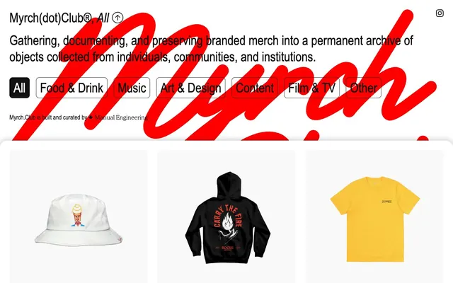
Myrch Club employs a stark, archival aesthetic, where content is displayed on clean white or near-white surfaces, punctuated by crisp black typography. A single vibrant red is used sparingly as a striking, almost disruptive brand accent. The system favors spacious layouts, minimal ornamentation, and clear visual separation of elements, evoking a catalog or museum exhibition feel.
The page operates on a contained max-width model, with content centered on a dominant Canvas White (#ffffff) background. The hero section features a large, decorative Archive Red (#ff0000) graphic or wordmark, with core text overlaid, establishing the brand's graphic identity immediately. Content sections below are primarily grids of Product Cards on a Pale Gray Surface (#f9f9f9) or Canvas White (#ffffff), maintaining consistent 30px padding and 20px element gaps. The overall rhythm is spacious and orderly, prioritizing clear visual separation and uncrowded presentation of items, reminiscent of a gallery or archive display.
The site's imagery primarily consists of high-quality product photography: items isolated on pure white backgrounds, often centered, treated with soft, even lighting to showcase detail. There's an absence of lifestyle photography or complex compositions. Icons are minimal, mostly text-based (All caps, no fill, 1px stroke for 'All' or 'Other' text). The visual emphasis is on the object itself, presented in a clean, catalog-like manner, without extraneous decorative elements or busy backdrops.
Reminiscent of Are.na, Superscript, The Brand Identity, Vessel Gallery.
# Myrch Club — Style Reference
> Archival white space

**Theme:** light

**Site:** https://www.myrch.club

Myrch Club employs a stark, archival aesthetic, where content is displayed on clean white or near-white surfaces, punctuated by crisp black typography. A single vibrant red is used sparingly as a striking, almost disruptive brand accent. The system favors spacious layouts, minimal ornamentation, and clear visual separation of elements, evoking a catalog or museum exhibition feel.

## Tokens — Colors

| Name | Value | Token | Role |
|------|------|------|------|
| Archive Red | `#ff0000` | `--color-archive-red` | Red decorative accent for icons, marks, and small graphic details. Do not promote it to the primary CTA color |
| Canvas White | `#ffffff` | `--color-canvas-white` | Page backgrounds, elevated surfaces, button text on filled buttons |
| Pale Gray Surface | `#f9f9f9` | `--color-pale-gray-surface` | Card backgrounds, secondary container surfaces |
| Text Black | `#000000` | `--color-text-black` | Primary text, strong headings, default body copy |
| Ink Detail | `#111111` | `--color-ink-detail` | Primary action button backgrounds, default button borders, darker text details |
| Muted Gray Text | `#cfcfcf` | `--color-muted-gray-text` | Muted body text, secondary information, decorative borders |
| Dark Gray Text | `#888888` | `--color-dark-gray-text` | Subtle body text, tertiary information |

## Tokens — Typography

### Times
- **Substitute:** Times New Roman
- **Weights:** 400
- **Sizes:** 16px
- **Line height:** 1.2
- **Letter spacing:** normal
- **Role:** Fallback font for general text, links, and minor UI elements. Provides a classic, almost report-like baseline.

### Arial Narrow
- **Weights:** 400
- **Sizes:** 14px, 20px, 42px
- **Line height:** 1.24, 1.33, 1.4, 1.43
- **Letter spacing:** normal
- **Role:** The primary font for headings, body text, and interactive elements. Its condensed structure and consistent weight support the efficient, archival feel of the site.

## Tokens — Type Scale

Augmented Fourth (1.414) from 16px base.

| Role | Size | Line height | Letter spacing |
|------|------|------|------|
| caption | 14px | 1.43 | — |
| body | 16px | 1.2 | — |
| subheading | 20px | 1.4 | — |
| heading | 42px | 1.33 | — |

## Tokens — Spacing

- **Section gap:** 40px
- **Card padding:** 30px
- **Element gap:** 20px

## Tokens — Radius

- **Buttons:** 10px
- **Cards:** 10px
- **misc:** 23px

## Layout

The page operates on a contained max-width model, with content centered on a dominant Canvas White (#ffffff) background. The hero section features a large, decorative Archive Red (#ff0000) graphic or wordmark, with core text overlaid, establishing the brand's graphic identity immediately. Content sections below are primarily grids of Product Cards on a Pale Gray Surface (#f9f9f9) or Canvas White (#ffffff), maintaining consistent 30px padding and 20px element gaps. The overall rhythm is spacious and orderly, prioritizing clear visual separation and uncrowded presentation of items, reminiscent of a gallery or archive display.

## Imagery

The site's imagery primarily consists of high-quality product photography: items isolated on pure white backgrounds, often centered, treated with soft, even lighting to showcase detail. There's an absence of lifestyle photography or complex compositions. Icons are minimal, mostly text-based (All caps, no fill, 1px stroke for 'All' or 'Other' text). The visual emphasis is on the object itself, presented in a clean, catalog-like manner, without extraneous decorative elements or busy backdrops.

## Components

### Navigation Button
*Ghost interactive element*

Text in Ink Detail (#111111), background transparent, 1px Ink Detail (#111111) border on hover/active. Radius: 10px. Padding 6px vertical, 12px horizontal. Font: Arial Narrow, weight 400.

### Active Navigation Button
*Filled interactive element*

Background Ink Detail (#111111), text Canvas White (#ffffff). Radius: 10px. Padding 6px vertical, 12px horizontal. Font: Arial Narrow, weight 400.

### Product Card
*Display individual merchandise items*

Background Pale Gray Surface (#f9f9f9), no shadow. Radius: 10px. Padding 30px on all sides.

### Minimal Badge
*Informational label*

Text Ink Detail (#111111), background transparent, no border. Radius: 0px. No padding.

## Guidelines

### Do

- Prioritize Canvas White (#ffffff) as the dominant background color for most page content, ensuring ample negative space.
- Use Text Black (#000000) for primary textual content and Ink Detail (#111111) for interactive elements and stronger outlines.
- Maintain a clear visual hierarchy with Arial Narrow as the primary display and body font, reserving Times for secondary roles.
- Apply 10px border-radius consistently to all interactive components like buttons and cards for a softened but contained feel.
- Utilize Archive Red (#ff0000) strictly as a decorative brand accent, primarily in large-scale graphical elements or SVGs, avoiding its use for interactive states or general UI.
- Implement a spacious layout rhythm, maintaining at least 20px gap between elements and 30px padding within cards.
- Employ the light shadow rgba(17, 17, 17, 0.3) 0px 0px 20px 0px sparingly, specifically for prominent, interactive elements as a subtle elevation cue.

### Don't

- Do not use Archive Red (#ff0000) for interactive elements like buttons, links, or alerts; it is a decorative brand element only.
- Avoid introducing additional chromatic colors; the system is designed around a monochrome base with one vivid red accent.
- Do not vary the border-radius from 10px for standard UI components like buttons and cards, unless for specific, deliberate exceptions like the 23px radius noted for distinct elements.
- Refrain from using bold typefaces or excessively large font sizes for body text, maintaining an understated and efficient textual presentation.
- Do not clutter page sections; adhere to the spacious density by using 40px section gaps and 20px element gaps.
- Avoid heavy drop shadows or vibrant background gradients; the visual identity relies on flatness and subtle elevation.

## Agent Prompt Guide

Quick Color Reference:
text: #000000
background: #ffffff
border: #111111
accent: #ff0000
primary action: #111111 (filled action)

Example Component Prompts:
1. Create a primary filled button: background #111111, text #ffffff, 10px border-radius, font Arial Narrow weight 400, 6px vertical and 12px horizontal padding.
2. Create a ghost button for navigation: text #111111, transparent background, 10px border-radius, font Arial Narrow weight 400, 6px vertical and 12px horizontal padding, with a 1px #111111 border on hover.
3. Design a product card: background #f9f9f9, 10px border-radius, 30px all-around padding. Inside, use a centered image and body text #000000 with Arial Narrow font, 16px size and 1.2 line-height.
4. Layout a section with a grid of 3 product cards: background #f9f9f9 for cards, surrounding canvas #ffffff, 20px gap between cards, and 40px section gap above and below the grid.
More like this









Keep what you find
A free account saves references to boards and can send you a weekly email of picks based on what you save.
To see every result, go Pro.