Preview image. Unlock full-res
Brutalist industrial canvas
Color palette
Supporting palette color for small decorative accents when the core palette needs contrast. Do not promote it to the primary CTA color
Primary page background, main content area
Primary text, strong borders, prominent headings, footer background. Creates high contrast and a grounded feel
Circular component backgrounds, button fills, subtle borders against dark elements
Typography
- Weights
- 500
- Sizes
- 11px, 20px
- Line height
- 1
- Letter spacing
- -0.0090em at 20px, -0.0050em at 11px
- Fallback
- Helvetica Neue
Primary font for all textual content, including headings and body text. Its compact, slightly extended form underpins the system's direct and robust character.
Spacing & shape
Components
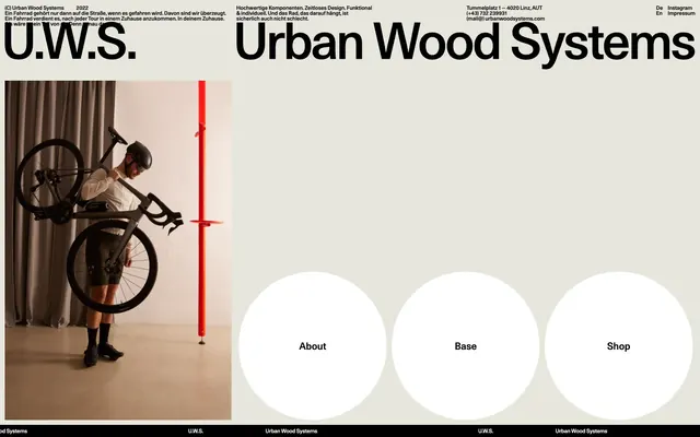
Large-scale 'U.W.S.' and 'Urban Wood Systems' in Midnight Ink (#000000) on Canvas Oyster (#e6e6dd), reflecting a bold, almost architectural presence. Typographically impactful.
Ghost White (#ffffff) circular background with a 300px border-radius, featuring Midnight Ink (#000000) text (Unica77, 500 weight). The large radius makes these elements distinct, soft-edged interaction points despite the overall stark aesthetic.
Midnight Ink (#000000) text (Unica77) on various backgrounds. Used for subtle navigation like language selectors, social media links, and legal information. Minimal in visual weight to defer to the page's prominent elements.
Guidelines
- Use Canvas Oyster (#e6e6dd) as the default background for all primary content surfaces.
- Apply Midnight Ink (#000000) for all body text, headings, and strong borders to maintain high contrast.
- Utilize Unica77 weight 500 for all typography, adjusting size and letter-spacing according to the type scale.
- Form interactive elements with a 300px border-radius to create distinct circular shapes against the angular layout.
- Maintain generous spacing, with a base element gap of 10px, to ensure content breathability.
- Employ Ghost White (#ffffff) for backgrounds of interactive circular elements to differentiate them clearly.
- Avoid subtle gradients or soft drop shadows; the system favors stark, flat surfaces and strong contrasts.
- Do not use multiple font families; stick strictly to Unica77 for all text.
- Do not introduce mid-tone grays for text or backgrounds; use only Midnight Ink (#000000), Canvas Oyster (#e6e6dd), and Ghost White (#ffffff) for neutrals.
- Do not vary border-radius sizes for interactive elements; consistently use 300px for circular forms.
- Avoid decorative imagery or complex illustrations; imagery should be photographic and functional.
- Do not create complex layouts; favor clear, block-based arrangements with ample negative space.
About this system
ShowHide
Urban Wood Systems presents a raw, industrial aesthetic with stark contrasts and minimal embellishments. Its visual identity prioritizes functionality and directness through a largely monochrome palette, punctuated by a single vibrant accent color not present in this data crop but visible in the screenshot (red element). Large-scale, high-impact typography dominates the header, creating a bold, almost brutalist statement. Components are defined by strong outlines and generous circular forms, maintaining visual weight against a subdued background.
The page operates on a full-bleed grid, with primary content areas stretching to the edges. The hero section is dominated by an large image on the left and bold typography on the right. Content sections generally use a two-column division, with a strong visual element on one side and text/secondary content on the other. A notable pattern is the use of circular UI elements (like 'About', 'Base', 'Shop') that break from the linear grid, acting as visual anchors. The footer is a compact, dark band contrasting with the light main canvas, containing minimal text links. The overall rhythm is open and spacious, allowing elements to breathe without dense information blocks.
The imagery features high-contrast, product-focused photography and functional objects. A prominent photograph of a person with a bicycle against a simple background highlights the product's use case directly. The visual style is stark and realistic, without filters or stylized treatments. There is a singular, vivid red structural element (implied from the image but not in color data) that serves as a functional art piece. Overall, imagery is either purely functional (like the red support pole) or product-showcasing, occupying significant visual space to ground the design.
Reminiscent of Acme Co., Brutalism.com, Fashion brand with minimalist website, Industrial design agency.
# Home — Style Reference
> Brutalist industrial canvas

**Theme:** light

**Site:** https://www.urbanwoodsystems.com

Urban Wood Systems presents a raw, industrial aesthetic with stark contrasts and minimal embellishments. Its visual identity prioritizes functionality and directness through a largely monochrome palette, punctuated by a single vibrant accent color not present in this data crop but visible in the screenshot (red element). Large-scale, high-impact typography dominates the header, creating a bold, almost brutalist statement. Components are defined by strong outlines and generous circular forms, maintaining visual weight against a subdued background.

## Tokens — Colors

| Name | Value | Token | Role |
|------|------|------|------|
| Signal Red | `#ff0000` | `--color-signal-red` | Supporting palette color for small decorative accents when the core palette needs contrast. Do not promote it to the primary CTA color |
| Canvas Oyster | `#e6e6dd` | `--color-canvas-oyster` | Primary page background, main content area |
| Midnight Ink | `#000000` | `--color-midnight-ink` | Primary text, strong borders, prominent headings, footer background. Creates high contrast and a grounded feel |
| Ghost White | `#ffffff` | `--color-ghost-white` | Circular component backgrounds, button fills, subtle borders against dark elements |

## Tokens — Typography

### Unica77
- **Substitute:** Helvetica Neue
- **Weights:** 500
- **Sizes:** 11px, 20px
- **Line height:** 1
- **Letter spacing:** -0.0090em at 20px, -0.0050em at 11px
- **Role:** Primary font for all textual content, including headings and body text. Its compact, slightly extended form underpins the system's direct and robust character.

## Tokens — Type Scale

| Role | Size | Line height | Letter spacing |
|------|------|------|------|
| caption | 11px | 1 | -0.005em |
| body | 20px | 1 | -0.009em |

## Tokens — Spacing

- **Element gap:** 10px

## Tokens — Radius

- **circularElements:** 300px

## Layout

The page operates on a full-bleed grid, with primary content areas stretching to the edges. The hero section is dominated by an large image on the left and bold typography on the right. Content sections generally use a two-column division, with a strong visual element on one side and text/secondary content on the other. A notable pattern is the use of circular UI elements (like 'About', 'Base', 'Shop') that break from the linear grid, acting as visual anchors. The footer is a compact, dark band contrasting with the light main canvas, containing minimal text links. The overall rhythm is open and spacious, allowing elements to breathe without dense information blocks.

## Imagery

The imagery features high-contrast, product-focused photography and functional objects. A prominent photograph of a person with a bicycle against a simple background highlights the product's use case directly. The visual style is stark and realistic, without filters or stylized treatments. There is a singular, vivid red structural element (implied from the image but not in color data) that serves as a functional art piece. Overall, imagery is either purely functional (like the red support pole) or product-showcasing, occupying significant visual space to ground the design.

## Components

### Primary Header
*Display Branding*

Large-scale 'U.W.S.' and 'Urban Wood Systems' in Midnight Ink (#000000) on Canvas Oyster (#e6e6dd), reflecting a bold, almost architectural presence. Typographically impactful.

### Circular Link
*Navigation/Call-to-action*

Ghost White (#ffffff) circular background with a 300px border-radius, featuring Midnight Ink (#000000) text (Unica77, 500 weight). The large radius makes these elements distinct, soft-edged interaction points despite the overall stark aesthetic.

### Minimal Link
*Utility Navigation/Sub-navigation*

Midnight Ink (#000000) text (Unica77) on various backgrounds. Used for subtle navigation like language selectors, social media links, and legal information. Minimal in visual weight to defer to the page's prominent elements.

## Guidelines

### Do

- Use Canvas Oyster (#e6e6dd) as the default background for all primary content surfaces.
- Apply Midnight Ink (#000000) for all body text, headings, and strong borders to maintain high contrast.
- Utilize Unica77 weight 500 for all typography, adjusting size and letter-spacing according to the type scale.
- Form interactive elements with a 300px border-radius to create distinct circular shapes against the angular layout.
- Maintain generous spacing, with a base element gap of 10px, to ensure content breathability.
- Employ Ghost White (#ffffff) for backgrounds of interactive circular elements to differentiate them clearly.

### Don't

- Avoid subtle gradients or soft drop shadows; the system favors stark, flat surfaces and strong contrasts.
- Do not use multiple font families; stick strictly to Unica77 for all text.
- Do not introduce mid-tone grays for text or backgrounds; use only Midnight Ink (#000000), Canvas Oyster (#e6e6dd), and Ghost White (#ffffff) for neutrals.
- Do not vary border-radius sizes for interactive elements; consistently use 300px for circular forms.
- Avoid decorative imagery or complex illustrations; imagery should be photographic and functional.
- Do not create complex layouts; favor clear, block-based arrangements with ample negative space.

## Agent Prompt Guide

Quick Color Reference:
text: #000000
background: #e6e6dd
border: #000000
accent: #ff0000 (functional accent, implied)
primary action: no distinct CTA color

Example Component Prompts:
1. Create a primary navigation link: "About" with a Ghost White (#ffffff) circular background with a 300px border-radius, Midnight Ink (#000000) text using Unica77 weight 500, size 20px, letter-spacing -0.009em.
2. Create a header block: 'U.W.S.' text in Midnight Ink (#000000), Unica77 weight 500, approx 80px size, letter-spacing tuned for visual balance, on a Canvas Oyster (#e6e6dd) background.
3. Create a utility footer link: 'Instagram' text in Midnight Ink (#000000), Unica77 weight 500, size 11px, letter-spacing -0.005em. This link should appear on a Midnight Ink (#000000) background.
More like this








Keep what you find
A free account saves references to boards and can send you a weekly email of picks based on what you save.
To see every result, go Pro.