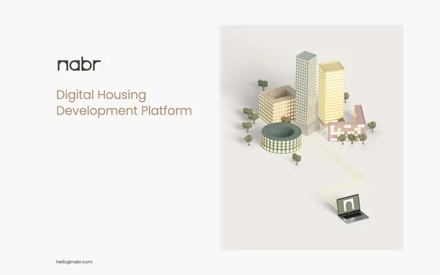
Preview image. Unlock full-res
Architectural blueprint on white marble. Lines are clean and intentional, against a calm, expansive background.
Color palette
Headline accents and subtle typographic distinctions — a warm, earthy tone that indicates importance without high saturation
Page background — a pristine, expansive surface that anchors all content
Primary text, structural UI elements, and strong borders — providing solid contrast against the light canvas
Dark borders and separators for elevated surfaces and inverted UI. Do not promote it to the primary CTA color
Typography
- Weights
- 300
- Sizes
- 14px, 16px, 40px
- Line height
- 1.2, 1.3
- Fallback
- system-ui
Display headlines and sub-headlines — a lightweight expression that conveys authority through restraint.
- Weights
- 400
- Sizes
- 14px, 16px, 40px
- Line height
- 1.2, 1.3
- Fallback
- system-ui
Body text, links, and secondary UI copy — standard weight for optimal readability.
Spacing & shape
Guidelines
- Prioritize a spacious, minimalist canvas using Canvas White (#ffffff) for backgrounds.
- Use Graphite (#333333) for primary textual content that requires strong emphasis.
- Apply Desert Sienna (#b08968) exclusively for headline accents; avoid using it for critical interactive elements.
- Maintain a clear visual hierarchy with Poppins weight 300 for display text (40px) and weight 400 for body text (14px, 16px).
- Employ consistent 64px horizontal padding to contain content within sections, allowing ample negative space.
- Utilize Muted Truffle (#555555) for secondary informational text and unobtrusive link styling.
- Avoid introducing additional saturated colors; Desert Sienna (#b08968) is the primary chromatic accent.
- Do not use heavy shadows or gradients; the design relies on flat surfaces and clean lines.
- Refrain from using bold typography for body text; Poppins weight 400 is the standard for readability.
- Do not break the wide, uncluttered layout with unnecessary borders or visual dividers.
- Avoid complex component styling; components should remain simple, functional, and blend into the light canvas.
- Do not use decorative imagery that introduces conflicting color palettes; stick to subtle, illustrative brand visuals.
About this system
ShowHide
Nabr presents a visually serene and understated system, balancing traditional corporate professionalism with a touch of warmth. Its design relies on a minimalist canvas, punctuated by a single muted accent color that provides guidance without demanding attention. Typography is compact and precise, maintaining clarity within a spacious layout that champions legibility over ornate visual flair. The overall impression is one of quiet competence and thoughtful, unhurried communication.
The page primarily employs a max-width contained layout, though the section containing the 3D illustration appears to fill the available width while maintaining significant internal padding. The primary structure (as seen in the screenshot) consists of a two-column hero section with text on the left and a prominent illustrative visual on the right. Content sections generally follow a vertical rhythm with ample spacing between them. The navigation is minimal, consisting of a standalone logo. The layout is spacious with large areas of negative space, suggesting a focus on clarity rather than information density.
This system primarily uses rendered 3D architectural illustrations to represent concepts. These visuals are depicted from an isometric perspective, using muted, pastel-like colors (light blues, pale yellows, soft pinks, and earthy greens). The elements within these illustrations, like buildings and trees, are simple, geometric forms, and often appear illuminated as if from within by a soft, warm glow. They serve an explanatory role, concretely illustrating abstract ideas (like connected systems) without detailed realism, maintaining a clean aesthetic. There are no photographs or complex textures, reinforcing the clean, schematic feel. No discernible icon style is present beyond the 'n' logo in the illustration.
Reminiscent of Linear, Figma, Stripe.
# nabr — Style Reference
> Architectural blueprint on white marble. Lines are clean and intentional, against a calm, expansive background.

**Theme:** light

**Site:** https://nabr.com

Nabr presents a visually serene and understated system, balancing traditional corporate professionalism with a touch of warmth. Its design relies on a minimalist canvas, punctuated by a single muted accent color that provides guidance without demanding attention. Typography is compact and precise, maintaining clarity within a spacious layout that champions legibility over ornate visual flair. The overall impression is one of quiet competence and thoughtful, unhurried communication.

## Tokens — Colors

| Name | Value | Token | Role |
|------|------|------|------|
| Desert Sienna | `#b08968` | `--color-desert-sienna` | Headline accents and subtle typographic distinctions — a warm, earthy tone that indicates importance without high saturation |
| Canvas White | `#ffffff` | `--color-canvas-white` | Page background — a pristine, expansive surface that anchors all content |
| Graphite | `#333333` | `--color-graphite` | Primary text, structural UI elements, and strong borders — providing solid contrast against the light canvas |
| Muted Truffle | `#555555` | `--color-muted-truffle` | Dark borders and separators for elevated surfaces and inverted UI. Do not promote it to the primary CTA color |

## Tokens — Typography

### Poppins
- **Substitute:** system-ui
- **Weights:** 300
- **Sizes:** 14px, 16px, 40px
- **Line height:** 1.2, 1.3
- **Role:** Display headlines and sub-headlines — a lightweight expression that conveys authority through restraint.

### Poppins
- **Substitute:** system-ui
- **Weights:** 400
- **Sizes:** 14px, 16px, 40px
- **Line height:** 1.2, 1.3
- **Role:** Body text, links, and secondary UI copy — standard weight for optimal readability.

## Tokens — Type Scale

| Role | Size | Line height | Letter spacing |
|------|------|------|------|
| caption | 14px | 1.3 | — |
| body | 16px | 1.3 | — |
| display | 40px | 1.2 | — |

## Tokens — Spacing

- **Section gap:** 64px
- **Card padding:** 64px
- **Element gap:** 16px

## Tokens — Radius

- **none:** 0px

## Layout

The page primarily employs a max-width contained layout, though the section containing the 3D illustration appears to fill the available width while maintaining significant internal padding. The primary structure (as seen in the screenshot) consists of a two-column hero section with text on the left and a prominent illustrative visual on the right. Content sections generally follow a vertical rhythm with ample spacing between them. The navigation is minimal, consisting of a standalone logo. The layout is spacious with large areas of negative space, suggesting a focus on clarity rather than information density.

## Imagery

This system primarily uses rendered 3D architectural illustrations to represent concepts. These visuals are depicted from an isometric perspective, using muted, pastel-like colors (light blues, pale yellows, soft pinks, and earthy greens). The elements within these illustrations, like buildings and trees, are simple, geometric forms, and often appear illuminated as if from within by a soft, warm glow. They serve an explanatory role, concretely illustrating abstract ideas (like connected systems) without detailed realism, maintaining a clean aesthetic. There are no photographs or complex textures, reinforcing the clean, schematic feel. No discernible icon style is present beyond the 'n' logo in the illustration.

## Guidelines

### Do

- Prioritize a spacious, minimalist canvas using Canvas White (#ffffff) for backgrounds.
- Use Graphite (#333333) for primary textual content that requires strong emphasis.
- Apply Desert Sienna (#b08968) exclusively for headline accents; avoid using it for critical interactive elements.
- Maintain a clear visual hierarchy with Poppins weight 300 for display text (40px) and weight 400 for body text (14px, 16px).
- Employ consistent 64px horizontal padding to contain content within sections, allowing ample negative space.
- Utilize Muted Truffle (#555555) for secondary informational text and unobtrusive link styling.

### Don't

- Avoid introducing additional saturated colors; Desert Sienna (#b08968) is the primary chromatic accent.
- Do not use heavy shadows or gradients; the design relies on flat surfaces and clean lines.
- Refrain from using bold typography for body text; Poppins weight 400 is the standard for readability.
- Do not break the wide, uncluttered layout with unnecessary borders or visual dividers.
- Avoid complex component styling; components should remain simple, functional, and blend into the light canvas.
- Do not use decorative imagery that introduces conflicting color palettes; stick to subtle, illustrative brand visuals.

## Agent Prompt Guide

Quick Color Reference:
text: #333333
background: #ffffff
border: #333333
accent: #b08968
primary action: no distinct CTA color

Example Component Prompts:
1. Create a hero section: Canvas White (#ffffff) background. Left side: main headline using Poppins weight 300 at 40px, Desert Sienna (#b08968), line-height 1.2. Below, subtext using Poppins weight 400 at 16px, Graphite (#333333), line-height 1.3. Right side: an isometric 3D illustration centered vertically within the section.
2. Create a contact link: using Poppins weight 400 at 14px, Muted Truffle (#555555), line-height 1.3. Positioned at the bottom-left of a given page section, with no hover states or visual enhancements for the link itself.
More like this









Keep what you find
A free account saves references to boards and can send you a weekly email of picks based on what you save.
To see every result, go Pro.