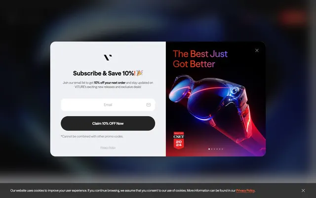
Preview image. Unlock full-res
High-contrast tech canvas
Color palette
Primary calls to action, accent branding, active states, important links — providing a vibrant focal point; Error messages, destructive actions, form validation feedback — consistent with brand orange but in semantic context; Branded hero sections, spotlight effects on product imagery — creating a dynamic, electric visual
Promotional banners, background washes for featured content — a rich, dramatic multi-hue blend
Primary text, deep surface backgrounds, strong borders — establishing the core dark contrast against light surfaces
Page backgrounds, card surfaces, primary button text, interactive element outlines — providing luminosity and clean separation
Muted text, secondary information, subtle borders — offering a softer contrast than Midnight
Footer backgrounds, overlay elements — for maximum depth and visual separation
Subtle background panels, alternative card backgrounds, ghost button fills — for soft structural differentiation
Elevated card backgrounds, input fields — a slightly off-white serving as a secondary surface
Tertiary card backgrounds, subtle UI elements — a very light gray for minimal contrast against Canvas White
Placeholder text, subtle contextual accents — providing a medium-dark neutral for interface details
Lightest grey for disabled states, hairline borders, very soft secondary text
Typography
- Weights
- 400, 500, 600, 700, 800
- Sizes
- 12px, 14px, 16px, 20px, 23px, 28px, 32px, 60px, 72px, 105px, 340px
- Line height
- 1, 1.2, 1.25, 1.33, 1.35, 1.38, 1.4, 1.43, 1.5, 1.63
- Letter spacing
- 0.0120em at 12px, 0.0200em at 14px, 0.0260em at 16px, 0.0500em at 20px+
- Fallback
- Inter
The primary typeface for all text content, from subtle captions to heroic display headings. Its versatility across weights and a range of sizes supports both clarity in detail and strong visual impact for brand messaging. Varied letter-spacing tightens very small text and provides openness for large headings.
Spacing & shape
Elevation
Components
Filled with Blaze Orange (#ff5f34), text in Canvas White (#ffffff). Features a fully rounded 'pill' shape (9999px radius) for a friendly yet distinct call to action.
Transparent background with a 1px Canvas White (#ffffff) border, text in Canvas White. Also uses a 9999px pill radius. Used where primary action color would be too dominant.
Transparent background, text set to Midnight (#0c0c0c) on light surfaces or Canvas White (#ffffff) on dark. No border, no radius, used for navigation or subtle interactions.
Background in Light Frost (#f7f7f8) or Pale Clay (#eff0f3) with a 28px or 24px border radius. No shadow, maintaining a flat, clean aesthetic.
Canvas White (#ffffff) background with a Blaze Orange (#ff5f34) border and 16px radius. Placeholder text in Storm Gray (#5b5c5d). Large padding: 28px vertical, 20-40px horizontal.
Text in Midnight (#0c0c0c) by default. On hover or active state, text adopts Blaze Orange (#ff5f34). No background or border, minimal styling focusing on underline or text color change for interaction.
Uses Ink Black (#000000) as background, ensuring maximum contrast for white text links. No visible border or radius on the block itself.
Image within a container that uses a 28px border radius. Often appears without a distinct background, blending into the surrounding context with a focus on the visual itself.
Guidelines
- Prioritize Midnight (#0c0c0c) for primary text and Canvas White (#ffffff) for backgrounds to maintain clarity and high contrast.
- Use Blaze Orange (#ff5f34) exclusively for primary calls to action, interactive states, and key brand highlights to ensure visual impact.
- Apply 9999px border radius to all buttons and tags to create a consistent 'pill' shape, indicating interactive elements.
- Maintain comfortable element spacing with a base unit of 4px and frequent use of 16px row and column gaps for readability.
- Employ the FontSeasonSans typeface consistently across all text elements, leveraging its weight variations for hierarchy.
- Design interactive elements with subtle but clear feedback, such as text color changes to Blaze Orange (#ff5f34) for links.
- Ensure all backgrounds are solid colors, avoiding decorative patterns unless explicitly part of dynamic product visualizations.
- Do not introduce new chromatic colors outside of Blaze Orange (#ff5f34) and the predefined gradients, to preserve brand focus.
- Avoid excessive use of shadows; maintain a flat UI unless a single, subtle elevation is strictly needed for interactive elements.
- Do not use generic system fonts; always map to FontSeasonSans or its substitute to maintain typographic brand identity.
- Refrain from using small, sharp radii; all interactive and content containers should use generous radii like 16px, 24px, 28px, or 9999px.
- Do not break the established contrast hierarchy by using low-contrast color pairs for essential text or interactive elements.
- Avoid cluttering layouts; prioritize comfortable spacing and clear visual separation between sections and elements.
- Do not apply Blaze Orange to non-interactive decorative elements, restricting its use to functional accents and calls to action.
About this system
ShowHide
VITURE designs with a high-contrast, modern tech aesthetic. Black and white dominate the UI, serving as a canvas for striking product imagery and a singular vivid orange accent that highlights calls to action and critical information. Typography is sophisticated and varied, supporting both extensive content and bold headlines. Components are minimal, focusing on functionality with soft, large radii and subtle elevation for interactive elements.
The page primarily uses a full-bleed layout for sections, with content often contained within a flexible maximum width. Hero sections are typically dark, featuring large headlines centered over dynamic product imagery or gradients. Section rhythm is often created through alternating background colors, moving between light Canvas White and deeper Silver Mist, with prominent Ink Black for the footer. Content is arranged in alternating text-and-image blocks or multi-column card grids, aiming for a spacious, comfortable density with clear vertical separation. The navigation is a sticky top bar, providing persistent access.
This design system heavily relies on slick, often abstract product photography with vibrant neon accents or gradients. Product visuals are mostly tight crops on dark or monochrome backgrounds, emphasizing the technology and its glowing elements. Images are generally contained within rectangular boundaries, sometimes with large radii (28px). Icons are minimalist, using outlines unless for decorative 'hero' branding. The focus is on showcasing the product's advanced nature through stylized visuals rather than lifestyle shots or complex illustrations. Imagery acts as content showcase and brand atmosphere rather than purely decorative elements.
Reminiscent of Ray-Ban Stories, Oculus (Meta Quest), Nothing (Phone), Framework Laptop.
# VITURE — Style Reference
> High-contrast tech canvas

**Theme:** light

**Site:** https://www.viture.com

VITURE designs with a high-contrast, modern tech aesthetic. Black and white dominate the UI, serving as a canvas for striking product imagery and a singular vivid orange accent that highlights calls to action and critical information. Typography is sophisticated and varied, supporting both extensive content and bold headlines. Components are minimal, focusing on functionality with soft, large radii and subtle elevation for interactive elements.

## Tokens — Colors

| Name | Value | Token | Role |
|------|------|------|------|
| Blaze Orange | `#ff5f34` | `--color-blaze-orange` | Primary calls to action, accent branding, active states, important links — providing a vibrant focal point; Error messages, destructive actions, form validation feedback — consistent with brand orange but in semantic context; Branded hero sections, spotlight effects on product imagery — creating a dynamic, electric visual |
| Deep Sunset Gradient | `#ff2900` | `--color-deep-sunset-gradient` | Promotional banners, background washes for featured content — a rich, dramatic multi-hue blend |
| Midnight | `#0c0c0c` | `--color-midnight` | Primary text, deep surface backgrounds, strong borders — establishing the core dark contrast against light surfaces |
| Canvas White | `#ffffff` | `--color-canvas-white` | Page backgrounds, card surfaces, primary button text, interactive element outlines — providing luminosity and clean separation |
| Ash Gray | `#7e7e7f` | `--color-ash-gray` | Muted text, secondary information, subtle borders — offering a softer contrast than Midnight |
| Ink Black | `#000000` | `--color-ink-black` | Footer backgrounds, overlay elements — for maximum depth and visual separation |
| Silver Mist | `#949597` | `--color-silver-mist` | Subtle background panels, alternative card backgrounds, ghost button fills — for soft structural differentiation |
| Light Frost | `#f7f7f8` | `--color-light-frost` | Elevated card backgrounds, input fields — a slightly off-white serving as a secondary surface |
| Pale Clay | `#eff0f3` | `--color-pale-clay` | Tertiary card backgrounds, subtle UI elements — a very light gray for minimal contrast against Canvas White |
| Storm Gray | `#5b5c5d` | `--color-storm-gray` | Placeholder text, subtle contextual accents — providing a medium-dark neutral for interface details |
| Muted Clay | `#abacae` | `--color-muted-clay` | Lightest grey for disabled states, hairline borders, very soft secondary text |

## Tokens — Typography

### FontSeasonSans
- **Substitute:** Inter
- **Weights:** 400, 500, 600, 700, 800
- **Sizes:** 12px, 14px, 16px, 20px, 23px, 28px, 32px, 60px, 72px, 105px, 340px
- **Line height:** 1, 1.2, 1.25, 1.33, 1.35, 1.38, 1.4, 1.43, 1.5, 1.63
- **Letter spacing:** 0.0120em at 12px, 0.0200em at 14px, 0.0260em at 16px, 0.0500em at 20px+
- **Role:** The primary typeface for all text content, from subtle captions to heroic display headings. Its versatility across weights and a range of sizes supports both clarity in detail and strong visual impact for brand messaging. Varied letter-spacing tightens very small text and provides openness for large headings.

## Tokens — Type Scale

Major Third (1.25) from 16px base.

| Role | Size | Line height | Letter spacing |
|------|------|------|------|
| caption | 12px | 1.4 | 0.144px |
| body-sm | 14px | 1.5 | 0.28px |
| body | 16px | 1.63 | 0.416px |
| subheading | 20px | 1.35 | 1px |
| heading-sm | 23px | 1.33 | — |
| heading | 28px | 1.25 | — |
| heading-lg | 32px | 1.2 | — |
| display | 60px | 1 | — |

## Tokens — Spacing

- **Section gap:** 48px
- **Card padding:** 44px
- **Element gap:** 4px

## Tokens — Radius

- **Buttons:** 9999px
- **Inputs:** 16px
- **Cards:** 28px
- **Images:** 28px
- **largeFeatures:** 120px
- **pills:** 9999px

## Tokens — Elevation

- **Button:** `rgba(0, 0, 0, 0.1) 0px 4px 6px -1px, rgba(0, 0, 0, 0.1) 0px 2px 4px -2px`

## Layout

The page primarily uses a full-bleed layout for sections, with content often contained within a flexible maximum width. Hero sections are typically dark, featuring large headlines centered over dynamic product imagery or gradients. Section rhythm is often created through alternating background colors, moving between light Canvas White and deeper Silver Mist, with prominent Ink Black for the footer. Content is arranged in alternating text-and-image blocks or multi-column card grids, aiming for a spacious, comfortable density with clear vertical separation. The navigation is a sticky top bar, providing persistent access.

## Imagery

This design system heavily relies on slick, often abstract product photography with vibrant neon accents or gradients. Product visuals are mostly tight crops on dark or monochrome backgrounds, emphasizing the technology and its glowing elements. Images are generally contained within rectangular boundaries, sometimes with large radii (28px). Icons are minimalist, using outlines unless for decorative 'hero' branding. The focus is on showcasing the product's advanced nature through stylized visuals rather than lifestyle shots or complex illustrations. Imagery acts as content showcase and brand atmosphere rather than purely decorative elements.

## Components

### Primary Filled Button
*High-emphasis action*

Filled with Blaze Orange (#ff5f34), text in Canvas White (#ffffff). Features a fully rounded 'pill' shape (9999px radius) for a friendly yet distinct call to action.

### Ghost Border Button
*Secondary action on dark backgrounds*

Transparent background with a 1px Canvas White (#ffffff) border, text in Canvas White. Also uses a 9999px pill radius. Used where primary action color would be too dominant.

### Text Button
*Minimalistic interactive element*

Transparent background, text set to Midnight (#0c0c0c) on light surfaces or Canvas White (#ffffff) on dark. No border, no radius, used for navigation or subtle interactions.

### Feature Card
*Content container with subtle elevation*

Background in Light Frost (#f7f7f8) or Pale Clay (#eff0f3) with a 28px or 24px border radius. No shadow, maintaining a flat, clean aesthetic.

### Input Field
*Standard form input*

Canvas White (#ffffff) background with a Blaze Orange (#ff5f34) border and 16px radius. Placeholder text in Storm Gray (#5b5c5d). Large padding: 28px vertical, 20-40px horizontal.

### Navigation Link
*Interactive text in primary navigation*

Text in Midnight (#0c0c0c) by default. On hover or active state, text adopts Blaze Orange (#ff5f34). No background or border, minimal styling focusing on underline or text color change for interaction.

### Footer Black Background
*Section background for global footer*

Uses Ink Black (#000000) as background, ensuring maximum contrast for white text links. No visible border or radius on the block itself.

### Product Image Card
*Showcasing product visuals*

Image within a container that uses a 28px border radius. Often appears without a distinct background, blending into the surrounding context with a focus on the visual itself.

## Guidelines

### Do

- Prioritize Midnight (#0c0c0c) for primary text and Canvas White (#ffffff) for backgrounds to maintain clarity and high contrast.
- Use Blaze Orange (#ff5f34) exclusively for primary calls to action, interactive states, and key brand highlights to ensure visual impact.
- Apply 9999px border radius to all buttons and tags to create a consistent 'pill' shape, indicating interactive elements.
- Maintain comfortable element spacing with a base unit of 4px and frequent use of 16px row and column gaps for readability.
- Employ the FontSeasonSans typeface consistently across all text elements, leveraging its weight variations for hierarchy.
- Design interactive elements with subtle but clear feedback, such as text color changes to Blaze Orange (#ff5f34) for links.
- Ensure all backgrounds are solid colors, avoiding decorative patterns unless explicitly part of dynamic product visualizations.

### Don't

- Do not introduce new chromatic colors outside of Blaze Orange (#ff5f34) and the predefined gradients, to preserve brand focus.
- Avoid excessive use of shadows; maintain a flat UI unless a single, subtle elevation is strictly needed for interactive elements.
- Do not use generic system fonts; always map to FontSeasonSans or its substitute to maintain typographic brand identity.
- Refrain from using small, sharp radii; all interactive and content containers should use generous radii like 16px, 24px, 28px, or 9999px.
- Do not break the established contrast hierarchy by using low-contrast color pairs for essential text or interactive elements.
- Avoid cluttering layouts; prioritize comfortable spacing and clear visual separation between sections and elements.
- Do not apply Blaze Orange to non-interactive decorative elements, restricting its use to functional accents and calls to action.

## Agent Prompt Guide

Quick Color Reference:
text: #0c0c0c
background: #ffffff
border: #abacae
accent: #ff5f34
primary action: #ff5f34 (filled action)

Example Component Prompts:
1. Create a Primary Action Button: #ff5f34 background, #0c0c0c text, 9999px radius, compact pill padding. Use this filled treatment for the main CTA.
2. Design an input field: Canvas White (#ffffff) background, 1px solid Blaze Orange (#ff5f34) border, 16px border-radius, with Storm Gray (#5b5c5d) placeholder text (FontSeasonSans weight 400). Padding is 28px vertical, 20px horizontal.
3. Implement a feature card: Light Frost (#f7f7f8) background, 28px border-radius, no border, 16px general internal padding. Headline in Midnight (#0c0c0c) (FontSeasonSans weight 600, 28px size). Body text in Ash Gray (#7e7e7f) (FontSeasonSans weight 400, 16px size).
4. Build a Ghost Navigation Button for a dark background: transparent background, Canvas White (#ffffff) text (FontSeasonSans weight 500), 9999px border-radius, with a 1px Canvas White (#ffffff) border. Default padding of 18px vertical, 24px horizontal.
5. Create a footer section: Ink Black (#000000) background, with navigation links in Canvas White (#ffffff) (FontSeasonSans weight 400, 14px size).
More like this









Keep what you find
A free account saves references to boards and can send you a weekly email of picks based on what you save.
To see every result, go Pro.