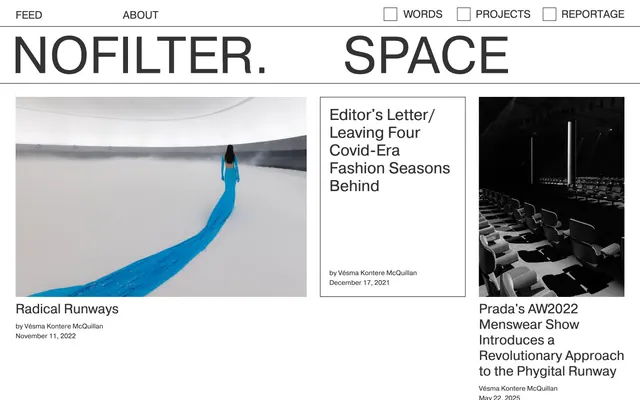
Preview image. Unlock full-res
Architectural grid on newsprint.
Color palette
Page backgrounds, surface accents
Prominent headlines, strong borders for structural elements
Primary text, secondary headlines, link borders, and subtle accent details
Typography
- Weights
- 400
- Sizes
- 12px, 15px, 24px, 30px, 35px
- Line height
- 1.14, 1.17, 1.25, 1.47, 2.5
- Letter spacing
- normal
- Fallback
- Inter
The singular typeface for all content. Its consistent weight reinforces the utilitarian, direct tone, with size changes solely driving hierarchy.
Spacing & shape
Components
Pragmatica 400, 15px font-size, Ink Gray (#333333) text, with an implicit 4px top padding and 20px of padding on the right, no border-radius. Active state indicated by a 1px solid Ink Gray (#333333) bottom border.
White background, with a 1px solid Ink Gray (#333333) border on its bottom edge when part of a grid, or a 1px solid Headline Black (#000000) border defining its full perimeter for standalone featured cards. No border-radius. Internal padding applied at 20px.
Pragmatica 400, Headline Black (#000000), typically 30px or 35px. Presented without visual embellishment, often followed by meta-information.
Pragmatica 400, 12px font-size, Ink Gray (#333333) color.
Images are presented without border or radius, directly abutting text or other cards, often filling available horizontal space. They enforce a 1px solid Ink Gray (#333333) border around the implied content area.
A 1px solid Ink Gray (#333333) square with 0px radius. Checked state implies a subtle visual fill not explicitly captured in token data but visually distinct from unchecked state.
Guidelines
- Use Pragmatica 400 for all text elements.
- Maintain a high contrast ratio with black text on white backgrounds; use #000000 for headlines and #333333 for body text.
- Define content areas using 1px solid borders, primarily #333333, with #000000 for primary structural divisions.
- Prioritize explicit spacing values like 10px for element gaps and 60px for section gaps to create distinct content blocks.
- Ensure all interactive elements, like navigation links, respond with a subtle border, such as a 1px solid #333333 bottom border for active or hovered states.
- Utilize 0px border-radius explicitly for all components, enforcing a sharp, architectural edge.
- Present imagery as unstyled rectangles, allowing its content to speak without UI embellishment, often bounded by implied 1px #333333 borders.
- Avoid using any colors other than Canvas White (#ffffff), Headline Black (#000000), and Ink Gray (#333333).
- Do not apply any border-radius greater than 0px to any elements.
- Refrain from using shadows or gradients; the system relies on flat surfaces and hard lines.
- Do not introduce decorative elements or iconography that deviates from the monochromatic, line-drawn aesthetic.
- Do not vary font weights; stick strictly to Pragmatica 400 for all text.
- Avoid soft padding or margin values that create vague boundaries; use precise, consistent measured spacing like 10px and 20px.
- Do not use subtle background tints for cards or sections; rely on Canvas White as the sole background.
About this system
ShowHide
Nofilter.space employs a stark, almost brutalist typographic aesthetic, resembling a digital broadsheet. Its visual system relies heavily on high-contrast black text on white backgrounds, framed by bold, architectural lines. Content is organized with clear visual boundaries rather than soft hierarchies, using strong borders and ample negative space to define sections and cards. The overall impression is one of raw information delivery, devoid of visual embellishment.
Reminiscent of Are.na, The NYT Magazine, Manual, AIGA Eye on Design.
# Nofilter.space — Style Reference
> Architectural grid on newsprint.

**Theme:** light

**Site:** https://www.nofilter.space

Nofilter.space employs a stark, almost brutalist typographic aesthetic, resembling a digital broadsheet. Its visual system relies heavily on high-contrast black text on white backgrounds, framed by bold, architectural lines. Content is organized with clear visual boundaries rather than soft hierarchies, using strong borders and ample negative space to define sections and cards. The overall impression is one of raw information delivery, devoid of visual embellishment.

## Tokens — Colors

| Name | Value | Token | Role |
|------|------|------|------|
| Canvas White | `#ffffff` | `--color-canvas-white` | Page backgrounds, surface accents |
| Headline Black | `#000000` | `--color-headline-black` | Prominent headlines, strong borders for structural elements |
| Ink Gray | `#333333` | `--color-ink-gray` | Primary text, secondary headlines, link borders, and subtle accent details |

## Tokens — Typography

### Pragmatica
- **Substitute:** Inter
- **Weights:** 400
- **Sizes:** 12px, 15px, 24px, 30px, 35px
- **Line height:** 1.14, 1.17, 1.25, 1.47, 2.5
- **Letter spacing:** normal
- **Role:** The singular typeface for all content. Its consistent weight reinforces the utilitarian, direct tone, with size changes solely driving hierarchy.

## Tokens — Type Scale

Perfect Fourth (1.333) from 15px base.

| Role | Size | Line height | Letter spacing |
|------|------|------|------|
| caption | 12px | 1.14 | — |
| body | 15px | 1.17 | — |
| subheading | 24px | 1.25 | — |
| heading | 30px | 1.47 | — |
| display | 35px | 2.5 | — |

## Tokens — Spacing

- **Section gap:** 60px
- **Card padding:** 20px
- **Element gap:** 10px

## Tokens — Radius

- **none:** 0px

## Components

### Navigation Link
*Primary site navigation items.*

Pragmatica 400, 15px font-size, Ink Gray (#333333) text, with an implicit 4px top padding and 20px of padding on the right, no border-radius. Active state indicated by a 1px solid Ink Gray (#333333) bottom border.

### Basic Content Card
*Container for articles and visual content.*

White background, with a 1px solid Ink Gray (#333333) border on its bottom edge when part of a grid, or a 1px solid Headline Black (#000000) border defining its full perimeter for standalone featured cards. No border-radius. Internal padding applied at 20px.

### Editorial Header
*Headline for articles and sections.*

Pragmatica 400, Headline Black (#000000), typically 30px or 35px. Presented without visual embellishment, often followed by meta-information.

### Meta Info Text
*Author and date information.*

Pragmatica 400, 12px font-size, Ink Gray (#333333) color.

### Image Card
*Display of visual content.*

Images are presented without border or radius, directly abutting text or other cards, often filling available horizontal space. They enforce a 1px solid Ink Gray (#333333) border around the implied content area.

### Nav Checkbox
*Minimalistic checkbox for navigation filters.*

A 1px solid Ink Gray (#333333) square with 0px radius. Checked state implies a subtle visual fill not explicitly captured in token data but visually distinct from unchecked state.

## Guidelines

### Do

- Use Pragmatica 400 for all text elements.
- Maintain a high contrast ratio with black text on white backgrounds; use #000000 for headlines and #333333 for body text.
- Define content areas using 1px solid borders, primarily #333333, with #000000 for primary structural divisions.
- Prioritize explicit spacing values like 10px for element gaps and 60px for section gaps to create distinct content blocks.
- Ensure all interactive elements, like navigation links, respond with a subtle border, such as a 1px solid #333333 bottom border for active or hovered states.
- Utilize 0px border-radius explicitly for all components, enforcing a sharp, architectural edge.
- Present imagery as unstyled rectangles, allowing its content to speak without UI embellishment, often bounded by implied 1px #333333 borders.

### Don't

- Avoid using any colors other than Canvas White (#ffffff), Headline Black (#000000), and Ink Gray (#333333).
- Do not apply any border-radius greater than 0px to any elements.
- Refrain from using shadows or gradients; the system relies on flat surfaces and hard lines.
- Do not introduce decorative elements or iconography that deviates from the monochromatic, line-drawn aesthetic.
- Do not vary font weights; stick strictly to Pragmatica 400 for all text.
- Avoid soft padding or margin values that create vague boundaries; use precise, consistent measured spacing like 10px and 20px.
- Do not use subtle background tints for cards or sections; rely on Canvas White as the sole background.

## Agent Prompt Guide

Quick Color Reference:
text: #333333
background: #ffffff
border: #333333
accent: no distinct accent color
primary action: no distinct CTA color

Example Component Prompts:
1. Create a Header Navigation item: Pragmatica 400, 15px font-size, #333333 color, 4px paddingTop, 20px paddingRight, 0px borderRadius.
2. Create an Article Headline: Pragmatica 400, 30px font-size, #000000 color, 10px paddingBottom.
3. Create a Content Card: background #ffffff, 1px solid #333333 bottom border, 0px borderRadius, 20px cardPadding inside.
4. Create a Meta-info Text label: Pragmatica 400, 12px font-size, #333333 color.
5. Create a Nav Checkbox: 1px solid #333333 border, 0px borderRadius.
More like this









Keep what you find
A free account saves references to boards and can send you a weekly email of picks based on what you save.
To see every result, go Pro.