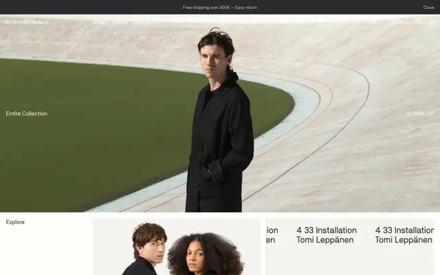
Preview image. Unlock full-res
Monochromatic architectural canvas.
Color palette
Primary text, deep surface elements, prominent borders, active interactive states. Its near-black depth grounds the all-white canvas
Dominant page background, primary card surfaces. Provides a bright, expansive field for content against sharp text
Secondary surface background, subtle button backgrounds, highlighted states. A barely-there off-white that offers gentle visual contrast
Muted text, ghost button borders, inactive link text. Provides a soft counterpoint to primary text without strong visual hierarchy
Hairline separators, subtle borders, navigation dividers. A light, desaturated gray for delicate structural lines
Input field borders, very light secondary borders. The lightest of the grays, used for fine details that need minimal distinction
Typography
- Weights
- 400
- Sizes
- 14px, 15px, 16px, 18px, 19px, 28px, 36px
- Line height
- 0.71, 1, 1.05, 1.11, 1.2, 1.25, 1.26, 1.33, 1.43
- Letter spacing
- -0.0360em at 36px, -0.0280em at 28px, -0.0210em at 19px, -0.0200em at 18px, -0.0170em at 16px, -0.0160em at 15px, -0.0080em at 14px, 0.0070em
- Fallback
- system-ui, sans-serif
The singular font choice for all text elements. Its consistent presence reinforces a unified, minimalist brand voice. The slight negative letter-spacing on larger sizes creates a composed, intentional feel.
Spacing & shape
Components
Outline button with 1px border in Limestone (#bebcb4) and text in Limestone (#bebcb4). No background or border radius, with 1px vertical padding and 6px left padding. On hover, text becomes Midnight Charcoal (#2b2b2e).
Transparent background with no borders, shadows, or padding. Inherits the Arctic Canvas (#fdfdfa) background from the page. Content within defines its visual boundaries.
Transparent background, text in Midnight Charcoal (#2b2b2e). Underlined with a 1px border in Midnight Charcoal (#2b2b2e) at the bottom. No border radius, 6px bottom padding. Placeholder text is assumed to be in Limestone (#bebcb4).
Transparent background, text in Midnight Charcoal (#2b2b2e), no border or radius, and no explicit padding. It appears primarily as text that functions as a label.
Guidelines
- Prioritize Midnight Charcoal (#2b2b2e) for all primary text over any other color to ensure maximum readability and stark contrast against light backgrounds.
- Maintain a strict 0px border-radius for all components and elements to uphold the sharp, minimalist aesthetic.
- Use Arctic Canvas (#fdfdfa) as the default background for all primary content areas, cards, and sections.
- Apply Whiskey Gray (#f5f3ee) for subtle background shifts to indicate secondary content blocks or hover states, avoiding any strong color accents.
- Implement Ghost Border Buttons with Limestone (#bebcb4) border and text for all interactive elements to maintain a lightweight, interactive feel.
- Ensure all interactive elements, including text links and buttons, change to Midnight Charcoal (#2b2b2e) on hover to provide clear feedback.
- Preserve abundant whitespace with a base element gap of 20px and a section gap of approximately 39px to give content room to breathe.
- Avoid the introduction of any saturated colors for accents or interactive states; stick strictly to the achromatic palette.
- Do not use box-shadows or elevation effects; the design relies on flat surfaces and direct contrast for visual hierarchy.
- Do not introduce decorative borders or strong graphical elements; maintain a focus on typography and high-quality imagery.
- Avoid heavy filled buttons or pronounced call-to-action styles that would disrupt the ghosted, understated component language.
- Do not use varying font families or weights beyond the single 'nomennescio' family at weight 400; typographic consistency is key.
- Do not break the 0px border-radius rule for any UI elements, regardless of context.
- Avoid small text sizes and tight line spacing for body content, as the system relies on clear, readable type against high contrast.
About this system
ShowHide
Nomen Nescio employs a stark, monochromatic aesthetic reminiscent of minimal brutalism, where form and function merge without decorative flourishes. The design emphasizes content through abundant clear space, precise typography, and a deliberate absence of color, aside from deep charcoal text and near-white backgrounds. Components are visually lightweight, often ghosted or outlined, allowing imagery and text to command attention. This system evokes a sense of quiet authority and refined simplicity, typical of high-end fashion or architectural studios.
The page maintains a maximum-width contained layout, likely centered, allowing ample side margins for structure. The hero section often features a full-width image with contrasting header text. Content sections alternate between visually distinct blocks, though no explicit color banding is shown beyond the main background. A common pattern is text on one side and an image on the other, or a grid of product cards. The navigation is a persistent top bar, with minimalist text links. The overall density is comfortable, with generous vertical spacing between content blocks.
Photography is central to the brand, featuring models dressed in products, or close-up product shots. The treatment is high-key, with clean lighting, often isolated against neutral backgrounds like concrete or subtle off-white environments, emphasizing texture and form. Imagery is contained within defined areas, not full-bleed, and integrates seamlessly with the minimalist grid. No obvious custom icons or illustrations are present, relying entirely on photography for visual interest and product showcase.
Reminiscent of Acne Studios, COS (Collection of Style), Aēsop, The Row.
# Nomen Nescio — Style Reference
> Monochromatic architectural canvas.

**Theme:** light

**Site:** https://nomennescio.fi

Nomen Nescio employs a stark, monochromatic aesthetic reminiscent of minimal brutalism, where form and function merge without decorative flourishes. The design emphasizes content through abundant clear space, precise typography, and a deliberate absence of color, aside from deep charcoal text and near-white backgrounds. Components are visually lightweight, often ghosted or outlined, allowing imagery and text to command attention. This system evokes a sense of quiet authority and refined simplicity, typical of high-end fashion or architectural studios.

## Tokens — Colors

| Name | Value | Token | Role |
|------|------|------|------|
| Midnight Charcoal | `#2b2b2e` | `--color-midnight-charcoal` | Primary text, deep surface elements, prominent borders, active interactive states. Its near-black depth grounds the all-white canvas |
| Arctic Canvas | `#fdfdfa` | `--color-arctic-canvas` | Dominant page background, primary card surfaces. Provides a bright, expansive field for content against sharp text |
| Whisper Gray | `#f5f3ee` | `--color-whisper-gray` | Secondary surface background, subtle button backgrounds, highlighted states. A barely-there off-white that offers gentle visual contrast |
| Limestone | `#bebcb4` | `--color-limestone` | Muted text, ghost button borders, inactive link text. Provides a soft counterpoint to primary text without strong visual hierarchy |
| Dusty Road | `#deddd8` | `--color-dusty-road` | Hairline separators, subtle borders, navigation dividers. A light, desaturated gray for delicate structural lines |
| Porcelain Whisper | `#d9d7c9` | `--color-porcelain-whisper` | Input field borders, very light secondary borders. The lightest of the grays, used for fine details that need minimal distinction |

## Tokens — Typography

### nomennescio
- **Substitute:** system-ui, sans-serif
- **Weights:** 400
- **Sizes:** 14px, 15px, 16px, 18px, 19px, 28px, 36px
- **Line height:** 0.71, 1, 1.05, 1.11, 1.2, 1.25, 1.26, 1.33, 1.43
- **Letter spacing:** -0.0360em at 36px, -0.0280em at 28px, -0.0210em at 19px, -0.0200em at 18px, -0.0170em at 16px, -0.0160em at 15px, -0.0080em at 14px, 0.0070em
- **Role:** The singular font choice for all text elements. Its consistent presence reinforces a unified, minimalist brand voice. The slight negative letter-spacing on larger sizes creates a composed, intentional feel.

## Tokens — Type Scale

Major Third (1.25) from 16px base.

| Role | Size | Line height | Letter spacing |
|------|------|------|------|
| caption | 14px | 1.33 | -0.008em |
| body | 16px | 1.26 | -0.017em |
| subheading | 18px | 1.25 | -0.02em |
| heading | 28px | 1.11 | -0.028em |
| display | 36px | 1.05 | -0.036em |

## Tokens — Spacing

- **Section gap:** 39px
- **Card padding:** 0px
- **Element gap:** 20px

## Tokens — Radius

- **all:** 0px

## Layout

The page maintains a maximum-width contained layout, likely centered, allowing ample side margins for structure. The hero section often features a full-width image with contrasting header text. Content sections alternate between visually distinct blocks, though no explicit color banding is shown beyond the main background. A common pattern is text on one side and an image on the other, or a grid of product cards. The navigation is a persistent top bar, with minimalist text links. The overall density is comfortable, with generous vertical spacing between content blocks.

## Imagery

Photography is central to the brand, featuring models dressed in products, or close-up product shots. The treatment is high-key, with clean lighting, often isolated against neutral backgrounds like concrete or subtle off-white environments, emphasizing texture and form. Imagery is contained within defined areas, not full-bleed, and integrates seamlessly with the minimalist grid. No obvious custom icons or illustrations are present, relying entirely on photography for visual interest and product showcase.

## Components

### Ghost Border Button
*Interactive elements, secondary actions, and navigational links.*

Outline button with 1px border in Limestone (#bebcb4) and text in Limestone (#bebcb4). No background or border radius, with 1px vertical padding and 6px left padding. On hover, text becomes Midnight Charcoal (#2b2b2e).

### Minimal Card
*Content containers for product listings, informational blocks.*

Transparent background with no borders, shadows, or padding. Inherits the Arctic Canvas (#fdfdfa) background from the page. Content within defines its visual boundaries.

### Transparent Input Field
*Data entry fields within forms.*

Transparent background, text in Midnight Charcoal (#2b2b2e). Underlined with a 1px border in Midnight Charcoal (#2b2b2e) at the bottom. No border radius, 6px bottom padding. Placeholder text is assumed to be in Limestone (#bebcb4).

### Ghost Badge
*Informational labels, category tags, promotional indicators.*

Transparent background, text in Midnight Charcoal (#2b2b2e), no border or radius, and no explicit padding. It appears primarily as text that functions as a label.

## Guidelines

### Do

- Prioritize Midnight Charcoal (#2b2b2e) for all primary text over any other color to ensure maximum readability and stark contrast against light backgrounds.
- Maintain a strict 0px border-radius for all components and elements to uphold the sharp, minimalist aesthetic.
- Use Arctic Canvas (#fdfdfa) as the default background for all primary content areas, cards, and sections.
- Apply Whiskey Gray (#f5f3ee) for subtle background shifts to indicate secondary content blocks or hover states, avoiding any strong color accents.
- Implement Ghost Border Buttons with Limestone (#bebcb4) border and text for all interactive elements to maintain a lightweight, interactive feel.
- Ensure all interactive elements, including text links and buttons, change to Midnight Charcoal (#2b2b2e) on hover to provide clear feedback.
- Preserve abundant whitespace with a base element gap of 20px and a section gap of approximately 39px to give content room to breathe.

### Don't

- Avoid the introduction of any saturated colors for accents or interactive states; stick strictly to the achromatic palette.
- Do not use box-shadows or elevation effects; the design relies on flat surfaces and direct contrast for visual hierarchy.
- Do not introduce decorative borders or strong graphical elements; maintain a focus on typography and high-quality imagery.
- Avoid heavy filled buttons or pronounced call-to-action styles that would disrupt the ghosted, understated component language.
- Do not use varying font families or weights beyond the single 'nomennescio' family at weight 400; typographic consistency is key.
- Do not break the 0px border-radius rule for any UI elements, regardless of context.
- Avoid small text sizes and tight line spacing for body content, as the system relies on clear, readable type against high contrast.

## Agent Prompt Guide

Quick Color Reference:
text: #2b2b2e
background: #fdfdfa
border: #2b2b2e (input, prominent); #bebcb4 (ghost button, subtle)
accent: no distinct accent color
primary action: no distinct CTA color

Example Component Prompts:
1. Create a header navigation link: text 'Shop' in nomennescio weight 400, 16px, line-height 1.26, #2b2b2e, letter-spacing -0.017em. On hover, text color remains #2b2b2e (This system implies that such links change implicitly by their context, not necessarily by explicit color change unless hovered for clarity in other systems).
2. Create a product listing card: Arctic Canvas (#fdfdfa) background, 0px border-radius, no padding. Product image, below it product name 'Loose Parka Coat' in nomennescio weight 400, 18px, line-height 1.25, #2b2b2e, letter-spacing -0.02em.
3. Create a ghost button: Text 'Entire Collection' in nomennescio weight 400, 15px, line-height 1.20, #bebcb4, letter-spacing -0.016em. 1px solid #bebcb4 border, 0px border-radius, 1px vertical padding, 6px left padding.
4. Create a page title: 'Entire Collection' in nomennescio weight 400, 36px, line-height 1.05, #2b2b2e, letter-spacing -0.036em. Margined above by at least 39px.
More like this









Keep what you find
A free account saves references to boards and can send you a weekly email of picks based on what you save.
To see every result, go Pro.