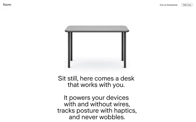
Preview image. Unlock full-res
Architectural blueprint on white marble. Precision, clean lines, and stark mono-palette highlight a single, functional object.
Color palette
Page backgrounds, card surfaces, general container backgrounds
Primary text, prominent headings, default icon fills, active outline borders
Dark borders and separators for elevated surfaces and inverted UI. Do not promote it to the primary CTA color
Typography
- Weights
- 400
- Sizes
- 16px, 24px, 48px
- Line height
- 1, 1.5, 1.56
- Letter spacing
- -0.0170em at 48px, -0.0080em at 24px, normal at 16px
Primary headings, subheadings, and key marketing statements. The limited weights coupled with large, precise sizing creates a strong, no-nonsense voice.
- Weights
- 400
- Sizes
- 16px
- Line height
- 1
- Letter spacing
- normal
- Fallback
- system-ui
Interface text, navigation links, and small functional labels. A system font ensures clarity and efficiency for utility content.
- Weights
- 400
- Sizes
- 18px
- Line height
- 1.33
- Letter spacing
- normal
- Fallback
- Inter Sans
Supportive body text. Its inclusion suggests a slight textural variation for longer passages without deviating from the overall sparse aesthetic.
Spacing & shape
Components
Text: Pitch Black (#000000), custom_50109 400, 16px. Background: Canvas White (#ffffff). Border: 0.5px solid Pitch Black (#000000). Padding: 16px vertical, 24px horizontal. Corner radius: 12px.
Text: Pitch Black (#000000), -apple-system 400, 16px. Background: Canvas White (#ffffff), Border: 0.5px solid Pitch Black (#000000). Padding: 8px vertical, 12px horizontal. Corner radius: 12px.
Text: Pitch Black (#000000), -apple-system 400, 16px. Background: Canvas White (#ffffff). Border: 0.5px solid Pitch Black (#000000). Padding: 4px vertical, 12px horizontal. Corner radius: 57px.
Height: 0.5px. Color: Near Black (#282828).
Guidelines
- Prioritize Canvas White (#ffffff) as the primary background for all major content sections and surfaces.
- Use Pitch Black (#000000) for all primary body text, headlines, and calls to action text.
- Employ custom_50109 400 at 48px or 24px, with specific letter-spacing, for all prominent headings and content titles.
- Use Ghost Button styling, with a 0.5px Pitch Black (#000000) border and 12px radius, for all interactive elements.
- Apply 12px border-radius consistently to all button-like components, and 57px for small tags.
- Maintain generous negative space around content blocks, using implied section gaps of 64px.
- Apply 0.5px borders in Near Black (#282828) for subtle visual separation and detailed outlines.
- Avoid using saturated colors; the palette is strictly achromatic.
- Do not use solid background buttons; all interactive elements should be ghosted or text-only.
- Do not introduce shadows; elevation is achieved solely through stark contrast and spacing.
- Avoid decorative imagery that competes with the product photography or text-heavy content.
- Do not deviate from the specified letter-spacing for custom_50109, especially for display sizes.
- Do not use heavy weights for typography; 400 is the only active weight in the system.
- Do not use small, tight radii; larger radii of 12px or 57px are signature elements.
About this system
ShowHide
Norm employs a utilitarian, minimalist visual language, focusing on stark contrasts and direct communication. The design uses a limited achromatic palette, relying heavily on pure black text on clean white surfaces. Typography is a central element, with commanding display-sized text setting a precise, unornamented tone. Components are stripped down, favoring simple outlined forms and large, soft radii to provide subtle tactile warmth against the otherwise stark visual field.
The page primarily uses a full-bleed, vertically segmented layout, alternating between large, centered text blocks and centered product imagery. Each section has a consistent vertical rhythm, with generous implied section gaps. The hero features a centered product shot above a large, centered multi-line headline. Subsequent sections also predominantly use centered stacks of text. There is no explicit grid for cards, and content is primarily a single column. Navigation is minimal, limited to a top-right utility bar with ghost buttons, suggesting a more focused, uncluttered experience.
The site's imagery is characterized by minimalist, product-focused photography under bright, even lighting. The 'Norm' desk is presented in tight crops on a pure white background, emphasizing its physical form and material without lifestyle context. There are no illustrations or abstract graphics. Icons are minimal, implied through text or simple outlined shapes. The visual language is image-scarce, with photography serving as a direct product showcase rather than decorative atmosphere, allowing text to dominate the layout's density.
Reminiscent of Apple (product pages), Field Notes, Braun (historical product design), Oura Ring.
# Norm — Style Reference
> Architectural blueprint on white marble. Precision, clean lines, and stark mono-palette highlight a single, functional object.

**Theme:** light

**Site:** https://norm.store

Norm employs a utilitarian, minimalist visual language, focusing on stark contrasts and direct communication. The design uses a limited achromatic palette, relying heavily on pure black text on clean white surfaces. Typography is a central element, with commanding display-sized text setting a precise, unornamented tone. Components are stripped down, favoring simple outlined forms and large, soft radii to provide subtle tactile warmth against the otherwise stark visual field.

## Tokens — Colors

| Name | Value | Token | Role |
|------|------|------|------|
| Canvas White | `#ffffff` | `--color-canvas-white` | Page backgrounds, card surfaces, general container backgrounds |
| Pitch Black | `#000000` | `--color-pitch-black` | Primary text, prominent headings, default icon fills, active outline borders |
| Near Black | `#282828` | `--color-near-black` | Dark borders and separators for elevated surfaces and inverted UI. Do not promote it to the primary CTA color |

## Tokens — Typography

### custom_50109
- **Weights:** 400
- **Sizes:** 16px, 24px, 48px
- **Line height:** 1, 1.5, 1.56
- **Letter spacing:** -0.0170em at 48px, -0.0080em at 24px, normal at 16px
- **Role:** Primary headings, subheadings, and key marketing statements. The limited weights coupled with large, precise sizing creates a strong, no-nonsense voice.

### -apple-system
- **Substitute:** system-ui
- **Weights:** 400
- **Sizes:** 16px
- **Line height:** 1
- **Letter spacing:** normal
- **Role:** Interface text, navigation links, and small functional labels. A system font ensures clarity and efficiency for utility content.

### Inter
- **Substitute:** Inter Sans
- **Weights:** 400
- **Sizes:** 18px
- **Line height:** 1.33
- **Letter spacing:** normal
- **Role:** Supportive body text. Its inclusion suggests a slight textural variation for longer passages without deviating from the overall sparse aesthetic.

## Tokens — Type Scale

Augmented Fourth (1.414) from 16px base.

| Role | Size | Line height | Letter spacing |
|------|------|------|------|
| body | 16px | 1 | — |
| body-lg | 18px | 1.33 | — |
| heading | 24px | 1.5 | -0.48px |
| display | 48px | 1.56 | -0.816px |

## Tokens — Spacing

- **Section gap:** 64px
- **Card padding:** 0px
- **Element gap:** 16px

## Tokens — Radius

- **Buttons:** 12px
- **tags:** 57px

## Layout

The page primarily uses a full-bleed, vertically segmented layout, alternating between large, centered text blocks and centered product imagery. Each section has a consistent vertical rhythm, with generous implied section gaps. The hero features a centered product shot above a large, centered multi-line headline. Subsequent sections also predominantly use centered stacks of text. There is no explicit grid for cards, and content is primarily a single column. Navigation is minimal, limited to a top-right utility bar with ghost buttons, suggesting a more focused, uncluttered experience.

## Imagery

The site's imagery is characterized by minimalist, product-focused photography under bright, even lighting. The 'Norm' desk is presented in tight crops on a pure white background, emphasizing its physical form and material without lifestyle context. There are no illustrations or abstract graphics. Icons are minimal, implied through text or simple outlined shapes. The visual language is image-scarce, with photography serving as a direct product showcase rather than decorative atmosphere, allowing text to dominate the layout's density.

## Components

### Ghost Button Large
*Secondary calls to action and navigational links within content blocks. Its transparent background and thick border suggest a less intrusive action.*

Text: Pitch Black (#000000), custom_50109 400, 16px. Background: Canvas White (#ffffff). Border: 0.5px solid Pitch Black (#000000). Padding: 16px vertical, 24px horizontal. Corner radius: 12px.

### Ghost Button Small
*Utility links in header navigation. A compact, outlined button that provides clear interaction without visual dominance.*

Text: Pitch Black (#000000), -apple-system 400, 16px. Background: Canvas White (#ffffff), Border: 0.5px solid Pitch Black (#000000). Padding: 8px vertical, 12px horizontal. Corner radius: 12px.

### Ghost Button Tag
*Informational tags or very subtle calls to action within header. The extreme radius makes it visually distinct.*

Text: Pitch Black (#000000), -apple-system 400, 16px. Background: Canvas White (#ffffff). Border: 0.5px solid Pitch Black (#000000). Padding: 4px vertical, 12px horizontal. Corner radius: 57px.

### Section Divider
*Horizontal rule for content separation. Provides visual structure between sections.*

Height: 0.5px. Color: Near Black (#282828).

## Guidelines

### Do

- Prioritize Canvas White (#ffffff) as the primary background for all major content sections and surfaces.
- Use Pitch Black (#000000) for all primary body text, headlines, and calls to action text.
- Employ custom_50109 400 at 48px or 24px, with specific letter-spacing, for all prominent headings and content titles.
- Use Ghost Button styling, with a 0.5px Pitch Black (#000000) border and 12px radius, for all interactive elements.
- Apply 12px border-radius consistently to all button-like components, and 57px for small tags.
- Maintain generous negative space around content blocks, using implied section gaps of 64px.
- Apply 0.5px borders in Near Black (#282828) for subtle visual separation and detailed outlines.

### Don't

- Avoid using saturated colors; the palette is strictly achromatic.
- Do not use solid background buttons; all interactive elements should be ghosted or text-only.
- Do not introduce shadows; elevation is achieved solely through stark contrast and spacing.
- Avoid decorative imagery that competes with the product photography or text-heavy content.
- Do not deviate from the specified letter-spacing for custom_50109, especially for display sizes.
- Do not use heavy weights for typography; 400 is the only active weight in the system.
- Do not use small, tight radii; larger radii of 12px or 57px are signature elements.

## Agent Prompt Guide

Quick Color Reference:
text: #000000
background: #ffffff
border: #282828
accent: no distinct accent color
primary action: no distinct CTA color

Example Component Prompts:
1. Create a Primary Heading: text 'Sit still, here comes a desk' using custom_50109 400, 48px, lineHeight 1.56, Pitch Black (#000000), letter-spacing -0.816px, centered on Canvas White (#ffffff) background.
2. Create a Ghost Button: 'Get now on Kickstarter' with custom_50109 400, 16px, Pitch Black (#000000), on a Canvas White (#ffffff) background, with a 0.5px solid Pitch Black (#000000) border, 12px border-radius, and 16px vertical, 24px horizontal padding.
3. Create a secondary text block: 'Made of warm acrylic stone and hard-coated Aluminum, all fully recyclable.' using Inter 400, 18px, lineHeight 1.33, Pitch Black (#000000), centered on a Canvas White (#ffffff) background.
4. Create a Header Navigation Link: 'Out on Kickstarter' using -apple-system 400, 16px, Pitch Black (#000000), with a 0.5px solid Pitch Black (#000000) border, 57px border-radius, and 4px vertical, 12px horizontal padding. The background should be Canvas White (#ffffff).
More like this









Keep what you find
A free account saves references to boards and can send you a weekly email of picks based on what you save.
To see every result, go Pro.