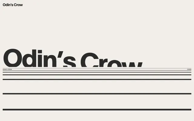
Preview image. Unlock full-res
Minimalist ledger, sharp lines
Color palette
Page backgrounds, subtle borders, inactive elements – a warm, light neutral that serves as the dominant surface
Primary text, headings, and foundational elements – providing high contrast against the light canvas
Alternate background surface, offering a slightly warmer, muted distinction from the main canvas
Subtle background surface for sectioning or subtle emphasis, a slightly darker variant of Faded Stone
Secondary surface background, for subtle elevation or distinction
Tertiary surface background, similar to other neutrals but used for specific content blocks
Hairline borders and divider lines, providing subtle separation without visual obtrusiveness
Typography
- Weights
- 400, 700
- Sizes
- 10px, 16px, 20px, 27px, 34px, 36px, 42px, 60px, 187px, 190px
- Line height
- 1, 1.08, 1.11, 1.25, 1.4, 1.5, 2
- Letter spacing
- -0.0500em, -0.0470em, -0.0400em, -0.0250em
- Fallback
- Inter
The sole typeface, providing a modern, impactful presence for all text elements. Its wide range of sizes and precise letter-spacing allows for significant typographic hierarchy and visual play, making it a cornerstone of the brand's stripped-down aesthetic. The deliberate use of dramatic letter-spacing on larger sizes creates a distinctive, almost logotype-like feel for headlines.
Spacing & shape
Components
Minimalist button with no background or border, using padding 5px; text color from Carbon Ink. Relies on context and text styling for visual recognition.
An input field with no background, a Carbon Ink text color, and a 1px solid Carbon Ink border-bottom for definition. Placeholder text uses Carbon Ink. Padding of 22px top/bottom and 1px left/right. Border-radius 0px.
A badge with no background or border, using Carbon Ink for text and 0px padding and border-radius. Relies on the text itself for content and placement.
Guidelines
- Prioritize Canvas Bone (#e5e7eb) as the dominant background color for all primary page surfaces.
- Use Carbon Ink (#2b2b2b) for all primary text, ensuring high contrast and a consistent dark typography.
- Employ the 'Plain' typeface exclusively for all text, manipulating size, weight, and letter-spacing to establish hierarchy.
- Utilize 0px border-radius for all UI elements to maintain a sharp, angular aesthetic.
- Define section boundaries and information blocks using subtle background color shifts (Faded Stone #e5d5c3, Pale Driftwood #cdc0b1) or thin Graphine Line (#535251) borders, not heavy outlines or shadows.
- Apply precise letter-spacing from the token list (-0.0500em to -0.0250em) to larger text sizes for brand consistency.
- Maintain generous vertical spacing between content blocks (40px sectionGap) and elements (20px elementGap) to create a sparse, comfortable density.
- Do not introduce vibrant or saturated colors into the main UI; reserve them purely for semantic states if necessary, or illustrative purposes.
- Avoid using any drop shadows or heavy elevation styles; the design relies on flat surfaces and line work for depth.
- Do not use border-radius values other than 0px for any interactive or display elements.
- Refrain from using any additional typefaces; the 'Plain' font is fundamental to the brand's typographic identity.
- Do not create complex backgrounds or textures; the visual system is based on clean, uniform color fields.
- Avoid tight, information-dense layouts; the design prioritizes breathing room and a minimalist presentation.
- Do not use generic, unstyled buttons; all interactive elements should conform to ghost or underlined styles.
About this system
ShowHide
Odin's Crow embodies a stark, architectural minimalism, using an off-white canvas and deep charcoal typography to establish a sophisticated, almost ledger-like aesthetic. The design relies heavily on strong typographic expressions and precise, thin linear elements to define structure and create rhythm rather than relying on heavy panels or shadows. Visual interest is achieved through scale and exact letter-spacing, with a complete absence of vibrant color in the primary interface to maintain a focused, no-nonsense atmosphere.
The page structure is fundamentally a centered, contained layout, although a specific max-width is not defined for the overall page, implying content may stretch across the viewport for certain elements like text. The hero section appears as a full-bleed block with a dominant, oversized centered headline and linear decorative elements. Sections follow a consistent vertical rhythm, primarily relying on significant vertical white space (40px section gap) and subtle background color changes between blocks rather than explicit dividers. Content arrangement leans towards centered stacks of text with prominent headlines and thin lines used as visual separators or accents. Navigation is minimal, likely a top-left logo and functional links, emphasizing a clear, no-distraction user journey. The density is spacious, reflecting a deliberate choice for clarity over information overload.
This design system uses imagery extremely sparingly, if at all, prioritizing a text-dominant and stark UI. If photography or graphics are used, they should likely be monochromatic or heavily desaturated, maintaining the understated, authoritative tone. Icons, if present, would be minimalist, outlined, and in Carbon Ink, serving purely functional roles without decorative embellishment. The density of imagery is extremely low, focusing on pure UI.
Reminiscent of Alinea, Linear, Hey.com.
# Odin's Crow — Style Reference
> Minimalist ledger, sharp lines

**Theme:** light

**Site:** https://odins-crow.com

Odin's Crow embodies a stark, architectural minimalism, using an off-white canvas and deep charcoal typography to establish a sophisticated, almost ledger-like aesthetic. The design relies heavily on strong typographic expressions and precise, thin linear elements to define structure and create rhythm rather than relying on heavy panels or shadows. Visual interest is achieved through scale and exact letter-spacing, with a complete absence of vibrant color in the primary interface to maintain a focused, no-nonsense atmosphere.

## Tokens — Colors

| Name | Value | Token | Role |
|------|------|------|------|
| Canvas Bone | `#e5e7eb` | `--color-canvas-bone` | Page backgrounds, subtle borders, inactive elements – a warm, light neutral that serves as the dominant surface |
| Carbon Ink | `#2b2b2b` | `--color-carbon-ink` | Primary text, headings, and foundational elements – providing high contrast against the light canvas |
| Faded Stone | `#e5d5c3` | `--color-faded-stone` | Alternate background surface, offering a slightly warmer, muted distinction from the main canvas |
| Pale Driftwood | `#cdc0b1` | `--color-pale-driftwood` | Subtle background surface for sectioning or subtle emphasis, a slightly darker variant of Faded Stone |
| Cloud Gray | `#c9c8c9` | `--color-cloud-gray` | Secondary surface background, for subtle elevation or distinction |
| Muted Ash | `#afa7a2` | `--color-muted-ash` | Tertiary surface background, similar to other neutrals but used for specific content blocks |
| Graphite Line | `#535251` | `--color-graphite-line` | Hairline borders and divider lines, providing subtle separation without visual obtrusiveness |

## Tokens — Typography

### Plain
- **Substitute:** Inter
- **Weights:** 400, 700
- **Sizes:** 10px, 16px, 20px, 27px, 34px, 36px, 42px, 60px, 187px, 190px
- **Line height:** 1, 1.08, 1.11, 1.25, 1.4, 1.5, 2
- **Letter spacing:** -0.0500em, -0.0470em, -0.0400em, -0.0250em
- **Role:** The sole typeface, providing a modern, impactful presence for all text elements. Its wide range of sizes and precise letter-spacing allows for significant typographic hierarchy and visual play, making it a cornerstone of the brand's stripped-down aesthetic. The deliberate use of dramatic letter-spacing on larger sizes creates a distinctive, almost logotype-like feel for headlines.

## Tokens — Type Scale

Golden Ratio (1.618) from 16px base.

| Role | Size | Line height | Letter spacing |
|------|------|------|------|
| caption | 10px | 1.5 | — |
| body | 16px | 1.5 | — |
| subheading | 20px | 1.25 | — |
| heading-sm | 27px | 1.11 | -0.48px |
| heading | 34px | 1.08 | -0.85px |
| heading-lg | 42px | 1 | -1.05px |
| display | 190px | 1 | -4.75px |

## Tokens — Spacing

- **Section gap:** 40px
- **Card padding:** 22px
- **Element gap:** 20px

## Tokens — Radius

- **none:** 0px

## Layout

The page structure is fundamentally a centered, contained layout, although a specific max-width is not defined for the overall page, implying content may stretch across the viewport for certain elements like text. The hero section appears as a full-bleed block with a dominant, oversized centered headline and linear decorative elements. Sections follow a consistent vertical rhythm, primarily relying on significant vertical white space (40px section gap) and subtle background color changes between blocks rather than explicit dividers. Content arrangement leans towards centered stacks of text with prominent headlines and thin lines used as visual separators or accents. Navigation is minimal, likely a top-left logo and functional links, emphasizing a clear, no-distraction user journey. The density is spacious, reflecting a deliberate choice for clarity over information overload.

## Imagery

This design system uses imagery extremely sparingly, if at all, prioritizing a text-dominant and stark UI. If photography or graphics are used, they should likely be monochromatic or heavily desaturated, maintaining the understated, authoritative tone. Icons, if present, would be minimalist, outlined, and in Carbon Ink, serving purely functional roles without decorative embellishment. The density of imagery is extremely low, focusing on pure UI.

## Components

### Ghost Button
*Interactive element*

Minimalist button with no background or border, using padding 5px; text color from Carbon Ink. Relies on context and text styling for visual recognition.

### Underlined Input Field
*Form input*

An input field with no background, a Carbon Ink text color, and a 1px solid Carbon Ink border-bottom for definition. Placeholder text uses Carbon Ink. Padding of 22px top/bottom and 1px left/right. Border-radius 0px.

### Minimal Badge
*Decorative/Informational Tag*

A badge with no background or border, using Carbon Ink for text and 0px padding and border-radius. Relies on the text itself for content and placement.

## Guidelines

### Do

- Prioritize Canvas Bone (#e5e7eb) as the dominant background color for all primary page surfaces.
- Use Carbon Ink (#2b2b2b) for all primary text, ensuring high contrast and a consistent dark typography.
- Employ the 'Plain' typeface exclusively for all text, manipulating size, weight, and letter-spacing to establish hierarchy.
- Utilize 0px border-radius for all UI elements to maintain a sharp, angular aesthetic.
- Define section boundaries and information blocks using subtle background color shifts (Faded Stone #e5d5c3, Pale Driftwood #cdc0b1) or thin Graphine Line (#535251) borders, not heavy outlines or shadows.
- Apply precise letter-spacing from the token list (-0.0500em to -0.0250em) to larger text sizes for brand consistency.
- Maintain generous vertical spacing between content blocks (40px sectionGap) and elements (20px elementGap) to create a sparse, comfortable density.

### Don't

- Do not introduce vibrant or saturated colors into the main UI; reserve them purely for semantic states if necessary, or illustrative purposes.
- Avoid using any drop shadows or heavy elevation styles; the design relies on flat surfaces and line work for depth.
- Do not use border-radius values other than 0px for any interactive or display elements.
- Refrain from using any additional typefaces; the 'Plain' font is fundamental to the brand's typographic identity.
- Do not create complex backgrounds or textures; the visual system is based on clean, uniform color fields.
- Avoid tight, information-dense layouts; the design prioritizes breathing room and a minimalist presentation.
- Do not use generic, unstyled buttons; all interactive elements should conform to ghost or underlined styles.

## Agent Prompt Guide

Quick Color Reference:
text: #2b2b2b
background: #e5e7eb
border: #535251
accent: no distinct accent color
primary action: no distinct CTA color

Example Component Prompts:
1. Create a primary headline: 'Odin's Crow' in Plain font, weight 700, size 190px, Carbon Ink (#2b2b2b) color, letterSpacing -4.75px. Place it centered on a Canvas Bone (#e5e7eb) background.
2. Design a form input field: Plain font, weight 400, size 16px, Carbon Ink (#2b2b2b) text. No background, 1px solid Carbon Ink (#2b2b2b) border bottom only. Padding 22px top/bottom, 1px left/right.
3. Create a navigation link: 'About' in Plain font, weight 400, size 16px, Carbon Ink (#2b2b2b) color. No background, no border, padding 5px all sides.
More like this









Keep what you find
A free account saves references to boards and can send you a weekly email of picks based on what you save.
To see every result, go Pro.