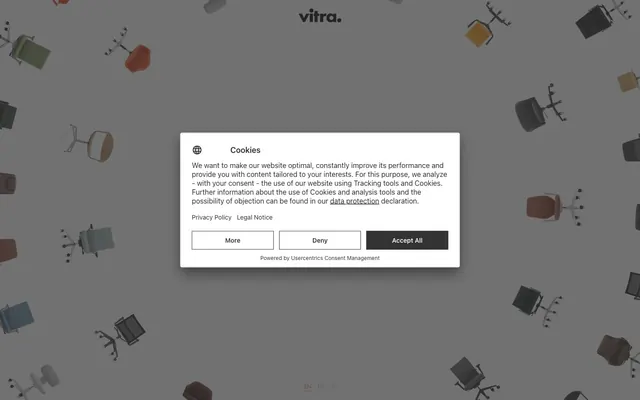
Preview image. Unlock full-res
Monochrome utility with active red accents.
Color palette
Outlined interactive elements (links, buttons) — provides the only chromatic highlight to draw attention to actionable items without overwhelming the monochrome interface
Most prominent text color, default borders, major headings, content text
Page backgrounds, card surfaces, button text for filled buttons, outlines for ghost buttons
Filled button backgrounds, subtle decorative fills in navigation
Muted link text, secondary border details
Typography
- Weights
- 400
- Sizes
- 16px
- Line height
- 1
- Fallback
- serif
Body text and miscellaneous content, providing a classic, readable foundation.
- Weights
- 400
- Sizes
- 12px, 14px, 48px
- Line height
- 1.15, 1.2, 1.3
- Fallback
- sans-serif
Headings, navigation elements, and interactive text. Its geometric sans-serif nature provides a modern counterpoint to the body text for clear hierarchy and calls to action.
Spacing & shape
Elevation
Components
Solid Ink Wash background (#333333) with Canvas White text (#ffffff), a 5px border-radius, and a soft shadow. Padding is 12px vertical and 52px horizontal, creating substantial visual weight.
Canvas White background with an Action Red border (#ef6b6b) and Action Red text. Used for navigation where an interactive state is highlighted, typically with minimal padding (implicit from text size).
Ash Gray text (#a9a9a9) with an Ash Gray border, used for less prominent links like country selectors. Provides visual differentiation from primary links.
Canvas White background (#ffffff) with Absolute Zero text (#272727). Implicitly uses page padding for internal content, and a border radius of 5px if buttons inside match this radius.
Canvas White background (#ffffff) with Ink Wash (#333333) decorative elements. Text is typically sized 14px Futura at weight 400 with a line height of 1.2.
Guidelines
- Use Absolute Zero (#272727) for all primary text content and main headings.
- Implement Canvas White (#ffffff) as the default background for all cards and page surfaces.
- Apply Ink Wash (#333333) exclusively for filled button backgrounds, paired with Canvas White text.
- Reserve Action Red (#ef6b6b) for borders and text of outlined interactive elements, indicating primary actions or important links.
- Ensure all buttons have a 5px border-radius and use 12px vertical padding.
- Maintain a spacious feel, using 173px for vertical section gaps and 13px for element spacing.
- Utilize Futura (sans-serif) for all headings, navigation, and interactive text, and Times New Roman (serif) for body copy.
- Avoid using multiple chromatic colors; limit color accents strictly to Action Red (#ef6b6b).
- Do not use shadows on elements other than buttons or distinct interactive components.
- Refrain from deviating from the established monochromatic palette for backgrounds or primary textual elements.
- Do not apply decorative text styles or weights other than what is specified for Futura and Times New Roman.
- Avoid tight spacing; maintain the generous 173px section gaps and 13px element gaps.
- Do not use generic blue for links; all interactive link text should either be Absolute Zero or Action Red.
- Do not introduce complex gradients; the system relies heavily on solid colors and subtle elevation.
About this system
ShowHide
Vitra's Office Chair Finder adopts a functional, no-frills aesthetic, prioritizing clear user interaction over decorative flourishes. The design relies on a monochrome palette of deep charcoals and bright whites, complemented by a single muted red for interactive elements. Typography is direct and legible, with button components featuring defined borders and a subtle shadow for clear affordance rather than visual spectacle. The overall impression is one of practical utility, guiding the user through a structured process.
The page exhibits a max-width contained layout rather than full-bleed. The hero section, if present, is obscured by a modal, but background elements suggest a visually dynamic, full-viewport aesthetic. Content is arranged with consistent vertical spacing, and sections appear to predominantly stack. The primary content is presented within a central modal that overlays the background, indicating a highly focused, task-oriented user flow. Navigation is a minimal top bar, suggesting an overlay or simplified experience rather than complex hierarchies.
The site uses a 'no imagery, pure UI' approach for its interface elements, relying on typography and solid color fields to convey information. For product display, it features 3D rendered office chairs presented in a dynamic, scattered pattern on a neutral background, serving as decorative atmosphere rather than direct content support. Icons, where present, appear to be minimal and monochromatic, adhering to the overall utilitarian design.
Reminiscent of Herman Miller, Hay, Artek, Flos.
# Office Chair Finder — Style Reference
> Monochrome utility with active red accents.

**Theme:** light

**Site:** https://findmy.vitra.com/en-en

Vitra's Office Chair Finder adopts a functional, no-frills aesthetic, prioritizing clear user interaction over decorative flourishes. The design relies on a monochrome palette of deep charcoals and bright whites, complemented by a single muted red for interactive elements. Typography is direct and legible, with button components featuring defined borders and a subtle shadow for clear affordance rather than visual spectacle. The overall impression is one of practical utility, guiding the user through a structured process.

## Tokens — Colors

| Name | Value | Token | Role |
|------|------|------|------|
| Action Red | `#ef6b6b` | `--color-action-red` | Outlined interactive elements (links, buttons) — provides the only chromatic highlight to draw attention to actionable items without overwhelming the monochrome interface |
| Absolute Zero | `#272727` | `--color-absolute-zero` | Most prominent text color, default borders, major headings, content text |
| Canvas White | `#ffffff` | `--color-canvas-white` | Page backgrounds, card surfaces, button text for filled buttons, outlines for ghost buttons |
| Ink Wash | `#333333` | `--color-ink-wash` | Filled button backgrounds, subtle decorative fills in navigation |
| Ash Gray | `#a9a9a9` | `--color-ash-gray` | Muted link text, secondary border details |

## Tokens — Typography

### Times New Roman
- **Substitute:** serif
- **Weights:** 400
- **Sizes:** 16px
- **Line height:** 1
- **Role:** Body text and miscellaneous content, providing a classic, readable foundation.

### Futura
- **Substitute:** sans-serif
- **Weights:** 400
- **Sizes:** 12px, 14px, 48px
- **Line height:** 1.15, 1.2, 1.3
- **Role:** Headings, navigation elements, and interactive text. Its geometric sans-serif nature provides a modern counterpoint to the body text for clear hierarchy and calls to action.

## Tokens — Type Scale

| Role | Size | Line height | Letter spacing |
|------|------|------|------|
| caption | 12px | 1.2 | — |
| body-sm | 14px | 1.2 | — |
| body | 48px | 1.2 | — |

## Tokens — Spacing

- **Section gap:** 173px
- **Card padding:** 12px
- **Element gap:** 13px

## Tokens — Radius

- **button:** 5px

## Tokens — Elevation

- **Filled Action Button:** `rgba(0, 0, 0, 0.094) 2px 2px 4px 0px`

## Layout

The page exhibits a max-width contained layout rather than full-bleed. The hero section, if present, is obscured by a modal, but background elements suggest a visually dynamic, full-viewport aesthetic. Content is arranged with consistent vertical spacing, and sections appear to predominantly stack. The primary content is presented within a central modal that overlays the background, indicating a highly focused, task-oriented user flow. Navigation is a minimal top bar, suggesting an overlay or simplified experience rather than complex hierarchies.

## Imagery

The site uses a 'no imagery, pure UI' approach for its interface elements, relying on typography and solid color fields to convey information. For product display, it features 3D rendered office chairs presented in a dynamic, scattered pattern on a neutral background, serving as decorative atmosphere rather than direct content support. Icons, where present, appear to be minimal and monochromatic, adhering to the overall utilitarian design.

## Components

### Filled Action Button
*Primary Call to Action*

Solid Ink Wash background (#333333) with Canvas White text (#ffffff), a 5px border-radius, and a soft shadow. Padding is 12px vertical and 52px horizontal, creating substantial visual weight.

### Outlined Action Link
*Secondary Interaction*

Canvas White background with an Action Red border (#ef6b6b) and Action Red text. Used for navigation where an interactive state is highlighted, typically with minimal padding (implicit from text size).

### Muted Link Text
*Tertiary Navigation/Information*

Ash Gray text (#a9a9a9) with an Ash Gray border, used for less prominent links like country selectors. Provides visual differentiation from primary links.

### Modal Card
*Content Overlay*

Canvas White background (#ffffff) with Absolute Zero text (#272727). Implicitly uses page padding for internal content, and a border radius of 5px if buttons inside match this radius.

### Navigation Bar
*Persistent Global Navigation*

Canvas White background (#ffffff) with Ink Wash (#333333) decorative elements. Text is typically sized 14px Futura at weight 400 with a line height of 1.2.

## Guidelines

### Do

- Use Absolute Zero (#272727) for all primary text content and main headings.
- Implement Canvas White (#ffffff) as the default background for all cards and page surfaces.
- Apply Ink Wash (#333333) exclusively for filled button backgrounds, paired with Canvas White text.
- Reserve Action Red (#ef6b6b) for borders and text of outlined interactive elements, indicating primary actions or important links.
- Ensure all buttons have a 5px border-radius and use 12px vertical padding.
- Maintain a spacious feel, using 173px for vertical section gaps and 13px for element spacing.
- Utilize Futura (sans-serif) for all headings, navigation, and interactive text, and Times New Roman (serif) for body copy.

### Don't

- Avoid using multiple chromatic colors; limit color accents strictly to Action Red (#ef6b6b).
- Do not use shadows on elements other than buttons or distinct interactive components.
- Refrain from deviating from the established monochromatic palette for backgrounds or primary textual elements.
- Do not apply decorative text styles or weights other than what is specified for Futura and Times New Roman.
- Avoid tight spacing; maintain the generous 173px section gaps and 13px element gaps.
- Do not use generic blue for links; all interactive link text should either be Absolute Zero or Action Red.
- Do not introduce complex gradients; the system relies heavily on solid colors and subtle elevation.

## Agent Prompt Guide

Create an Outlined Primary Action: Transparent background, #ef6b6b border and text, 9999px radius, compact pill padding. Use it for the main CTA instead of a filled button.

Example Component Prompts:
Create a Modal with a white background, Absolute Zero (#272727) heading text (Futura, 48px, weight 400, lineHeight 1.3), and Times New Roman body text (16px, weight 400, lineHeight 1). Include a Filled Action Button: Ink Wash background (#333333), Canvas White text (#ffffff), 5px radius, 12px vertical padding, 52px horizontal padding, with shadow rgba(0, 0, 0, 0.094) 2px 2px 4px 0px.
Create an Outlined Action Link: link text 'More' with Action Red color (#ef6b6b), 5px radius border of Action Red (#ef6b6b). The button has 12px vertical padding, 52.32px horizontal padding.
Create a Navigation item: 'en' link with Action Red text (#ef6b6b) (Futura, 12px, weight 400, lineHeight 1.15) and a thin Action Red (#ef6b6b) underline border, with an element gap of 13px.
More like this









Keep what you find
A free account saves references to boards and can send you a weekly email of picks based on what you save.
To see every result, go Pro.