Preview image. Unlock full-res
ink on parchment
Color palette
Primary call-to-action buttons, key interactive elements – a deep, warm accent that signifies action and focus
Decorative text accents, highlights for specific content blocks
Decorative text accents, highlights for specific content blocks
Decorative text accents, highlights for specific content blocks
Decorative highlights, background accents on certain content blocks — a bright, joyful punctuation
Page backgrounds, card surfaces, UI canvases — creates a soft, inviting backdrop
Primary text, headings, icons – provides strong contrast against light backgrounds
Secondary text, muted descriptions, helper text, subtle icon detailing
Tertiary text, sub-labels, subtle dividers, less emphasized information
Subtle borders, dividers, outlines for ghost buttons and input fields — defines structure without visual weight
Hairline borders, dividers, input outlines, and card edges on light surfaces. Do not promote it to the primary CTA color
Typography
- Weights
- 400, 500
- Sizes
- 16px, 20px, 32px, 42px, 48px
- Line height
- 1.08, 1.1, 1.12, 1.2, 1.5
- Fallback
- Iowan Old Style
Headings and prominent display text — a traditional serif that lends a considered, thoughtful tone.
- Weights
- 400
- Sizes
- 14px, 16px
- Line height
- 1, 1.43, 1.5
- Fallback
- Inter
Body text, navigation, buttons, and all functional UI elements — a clean, neutral sans-serif that ensures clarity and legibility.
Spacing & shape
Components
Background: Burnt Umber (#512906). Text: Ink Black (#0a0a0a). Padding: 16px vertical, 24px horizontal. Border radius: 10px.
Background: transparent. Text: Ink Black (#0a0a0a). Border: 1px Ghost Border (#d1d1d1) solid. Padding: 15px vertical, 23px horizontal. Border radius: 10px.
Background: transparent. Text: Ink Black (#0a0a0a). Underline: 1px Whisper Border (#e5e5e5) solid, 8px offset. No padding or radius.
Guidelines
- Prioritize IowanOld for all headings and display text to deliver a traditional, thoughtful voice.
- Use SuisseIntl for all body text, button labels, and navigation to maintain readability and a clean feel.
- Apply Parchment (#fffdf8) as the dominant background color across all pages and main content areas.
- Use Burnt Umber (#512906) exclusively for primary action buttons to clearly signpost key interactions.
- Employ Ink Black (#0a0a0a) for all primary text and critical UI elements to ensure high contrast and legibility.
- Define UI boundaries and elements with subtle Whisper Border (#e5e5e5) 1px solid borders, avoiding heavy lines.
- Maintain a consistent 10px border-radius for all interactive components and cards to soften edges uniformly.
- Do not introduce new serif fonts beyond IowanOld, as it would dilute the typographic identity.
- Avoid using highly saturated colors for background elements; reserve saturation for functional accents and brand highlights.
- Do not use heavy shadows or gradients on interactive elements; prefer solid color fills and subtle borders.
- Do not deviate from the Parchment (#fffdf8) background color for core content sections; alternative backgrounds should be used sparingly and only for distinct sections.
- Avoid excessive use of colors like Blue Violet, Forest Green, or Crimson Blush in body text; reserve them for decorative accent blocks or specific highlighted elements.
- Do not use less than 12px padding around clickable elements; maintain a comfortable tap/click target.
- Avoid text colors with insufficient contrast against the background; always prioritize Ink Black or Slate Gray for readability.
About this system
ShowHide
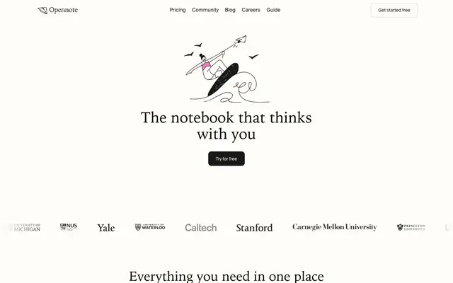
Opennote employs a minimalist, paper-like aesthetic featuring a high-contrast typographical hierarchy set against a soft, near-white canvas. Subtle border treatments and distinct, functional button styles define interactive elements. Color is used sparingly, primarily for accent and to distinguish action states, creating moments of focus within an otherwise calm and content-centric design.
The site uses a max-width contained layout, typically centered, allowing ample whitespace on either side. The hero section often features a centered headline with an illustration above, sometimes on a slightly tinted background. Sections mostly follow a vertical rhythm with consistent spacing, lacking strong visual dividers between them, creating a seamless flow. Content frequently alternates between centered stacks of text and visual elements, and occasionally two-column layouts with text and iconography. Navigation is a sticky top-bar, minimal and text-based, with a 'Get started free' button. The overall density is spacious, favoring clear separation and readability over information compactness.
The visual language is characterized by simple, outlined, hand-drawn style illustrations that are whimsical and often depict figures interacting with abstract concepts or tools. These illustrations are mono-color, typically in black outline, with occasional small colored fills like Goldenrod (#ffc934) or muted pastels. They are contained within the white space, serving as explanatory and decorative elements rather than full-bleed imagery. Icons are minimal, outlined, and monochromatic, matching the linear illustration style. Product screenshots are absent, focusing instead on symbolic representation. Imagery is sparse, ensuring the UI remains text-dominant.
Reminiscent of Notion, Roam Research, Readwise Reader, Craft.do.
# Opennote — Style Reference
> ink on parchment

**Theme:** light

**Site:** https://www.opennote.com

Opennote employs a minimalist, paper-like aesthetic featuring a high-contrast typographical hierarchy set against a soft, near-white canvas. Subtle border treatments and distinct, functional button styles define interactive elements. Color is used sparingly, primarily for accent and to distinguish action states, creating moments of focus within an otherwise calm and content-centric design.

## Tokens — Colors

| Name | Value | Token | Role |
|------|------|------|------|
| Burnt Umber | `#512906` | `--color-burnt-umber` | Primary call-to-action buttons, key interactive elements – a deep, warm accent that signifies action and focus |
| Blue Violet | `#242d64` | `--color-blue-violet` | Decorative text accents, highlights for specific content blocks |
| Forest Green | `#0c3b1a` | `--color-forest-green` | Decorative text accents, highlights for specific content blocks |
| Crimson Blush | `#5e0831` | `--color-crimson-blush` | Decorative text accents, highlights for specific content blocks |
| Goldenrod | `#ffc934` | `--color-goldenrod` | Decorative highlights, background accents on certain content blocks — a bright, joyful punctuation |
| Parchment | `#fffdf8` | `--color-parchment` | Page backgrounds, card surfaces, UI canvases — creates a soft, inviting backdrop |
| Ink Black | `#0a0a0a` | `--color-ink-black` | Primary text, headings, icons – provides strong contrast against light backgrounds |
| Slate Gray | `#474747` | `--color-slate-gray` | Secondary text, muted descriptions, helper text, subtle icon detailing |
| Ash Gray | `#8c8c8c` | `--color-ash-gray` | Tertiary text, sub-labels, subtle dividers, less emphasized information |
| Whisper Border | `#e5e5e5` | `--color-whisper-border` | Subtle borders, dividers, outlines for ghost buttons and input fields — defines structure without visual weight |
| Ghost Border | `#d1d1d1` | `--color-ghost-border` | Hairline borders, dividers, input outlines, and card edges on light surfaces. Do not promote it to the primary CTA color |

## Tokens — Typography

### IowanOld
- **Substitute:** Iowan Old Style
- **Weights:** 400, 500
- **Sizes:** 16px, 20px, 32px, 42px, 48px
- **Line height:** 1.08, 1.1, 1.12, 1.2, 1.5
- **Role:** Headings and prominent display text — a traditional serif that lends a considered, thoughtful tone.

### SuisseIntl
- **Substitute:** Inter
- **Weights:** 400
- **Sizes:** 14px, 16px
- **Line height:** 1, 1.43, 1.5
- **Role:** Body text, navigation, buttons, and all functional UI elements — a clean, neutral sans-serif that ensures clarity and legibility.

## Tokens — Type Scale

Major Third (1.25) from 16px base.

| Role | Size | Line height | Letter spacing |
|------|------|------|------|
| body-sm | 14px | 1.43 | — |
| body | 16px | 1.5 | — |
| subheading | 20px | 1.5 | — |
| heading-sm | 32px | 1.2 | — |
| heading | 42px | 1.12 | — |
| display | 48px | 1.08 | — |

## Tokens — Spacing

- **Max width:** 1200px
- **Section gap:** 40-80px
- **Card padding:** 16px
- **Element gap:** 12px

## Tokens — Radius

- **General:** 10px
- **Buttons:** 10px
- **Cards:** 10px

## Layout

The site uses a max-width contained layout, typically centered, allowing ample whitespace on either side. The hero section often features a centered headline with an illustration above, sometimes on a slightly tinted background. Sections mostly follow a vertical rhythm with consistent spacing, lacking strong visual dividers between them, creating a seamless flow. Content frequently alternates between centered stacks of text and visual elements, and occasionally two-column layouts with text and iconography. Navigation is a sticky top-bar, minimal and text-based, with a 'Get started free' button. The overall density is spacious, favoring clear separation and readability over information compactness.

## Imagery

The visual language is characterized by simple, outlined, hand-drawn style illustrations that are whimsical and often depict figures interacting with abstract concepts or tools. These illustrations are mono-color, typically in black outline, with occasional small colored fills like Goldenrod (#ffc934) or muted pastels. They are contained within the white space, serving as explanatory and decorative elements rather than full-bleed imagery. Icons are minimal, outlined, and monochromatic, matching the linear illustration style. Product screenshots are absent, focusing instead on symbolic representation. Imagery is sparse, ensuring the UI remains text-dominant.

## Components

### Primary Filled Button
*Main call to action, drawing immediate attention.*

Background: Burnt Umber (#512906). Text: Ink Black (#0a0a0a). Padding: 16px vertical, 24px horizontal. Border radius: 10px.

### Secondary Outlined Button
*Alternative actions, less emphasized than the primary.*

Background: transparent. Text: Ink Black (#0a0a0a). Border: 1px Ghost Border (#d1d1d1) solid. Padding: 15px vertical, 23px horizontal. Border radius: 10px.

### Ghost Navigation Link
*Main navigation items, in-text links.*

Background: transparent. Text: Ink Black (#0a0a0a). Underline: 1px Whisper Border (#e5e5e5) solid, 8px offset. No padding or radius.

## Guidelines

### Do

- Prioritize IowanOld for all headings and display text to deliver a traditional, thoughtful voice.
- Use SuisseIntl for all body text, button labels, and navigation to maintain readability and a clean feel.
- Apply Parchment (#fffdf8) as the dominant background color across all pages and main content areas.
- Use Burnt Umber (#512906) exclusively for primary action buttons to clearly signpost key interactions.
- Employ Ink Black (#0a0a0a) for all primary text and critical UI elements to ensure high contrast and legibility.
- Define UI boundaries and elements with subtle Whisper Border (#e5e5e5) 1px solid borders, avoiding heavy lines.
- Maintain a consistent 10px border-radius for all interactive components and cards to soften edges uniformly.

### Don't

- Do not introduce new serif fonts beyond IowanOld, as it would dilute the typographic identity.
- Avoid using highly saturated colors for background elements; reserve saturation for functional accents and brand highlights.
- Do not use heavy shadows or gradients on interactive elements; prefer solid color fills and subtle borders.
- Do not deviate from the Parchment (#fffdf8) background color for core content sections; alternative backgrounds should be used sparingly and only for distinct sections.
- Avoid excessive use of colors like Blue Violet, Forest Green, or Crimson Blush in body text; reserve them for decorative accent blocks or specific highlighted elements.
- Do not use less than 12px padding around clickable elements; maintain a comfortable tap/click target.
- Avoid text colors with insufficient contrast against the background; always prioritize Ink Black or Slate Gray for readability.

## Agent Prompt Guide

**Quick Color Reference:**
text: #0a0a0a
background: #fffdf8
border: #e5e5e5
accent: #242d64
primary action: #512906 (filled action)

**3-5 Example Component Prompts:**
1. Create a page header: transparent background. Left-aligned logo. Right-aligned navigation links: SuisseIntl 16px, Ink Black (#0a0a0a), on hover text-decoration-color: Ink Black (#0a0a0a). Right-most Secondary Outlined Button 'Get started free' (Background: transparent, Text: Ink Black (#0a0a0a), Border: 1px Ghost Border (#d1d1d1) solid, 15px vertical 23px horizontal padding, 10px radius).
2. Create a Primary Action Button: #512906 background, #8c8c8c text, 9999px radius, compact pill padding. Use this filled treatment for the main CTA.
3. Build a feature card: Parchment background (#fffdf8). 10px border-radius. Padding: 16px. Border: 1px Whisper Border (#e5e5e5) solid. Headline: IowanOld 32px heading-sm, Ink Black (#0a0a0a). Body text: SuisseIntl 16px body, Slate Gray (#474747).
4. Create a callout box with an accent background: Background: Goldenrod (#ffc934). IowanOld 20px subheading text, Ink Black (#0a0a0a). SuisseIntl 16px body text, Slate Gray (#474747).
More like this









Keep what you find
A free account saves references to boards and can send you a weekly email of picks based on what you save.
To see every result, go Pro.