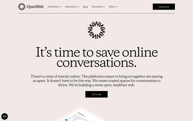
Preview image. Unlock full-res
Editorial calm on parchment.
Color palette
Link text, outlined button borders, and interactive highlights. Serves as the primary chromatic accent, drawing attention to actionable items without overwhelming the muted design
Page backgrounds and primary content surfaces. Provides a soft, warm canvas contrasting with the sharp typography
Primary text, headings, prominent borders, and filled action buttons. Establishes strong contrast and a sense of authority
Text on dark backgrounds, ghost button borders, and accenting structural elements like header borders. Maintains high contrast against Midnight Ink
Muted text, iconography, and subtle borders. Used for secondary information and design elements that recede
Typography
- Weights
- 400, 700
- Sizes
- 11px, 14px, 15px, 16px, 18px, 25px, 30px, 40px, 48px, 60px, 70px, 80px, 90px
- Line height
- 0.84, 1, 1.04, 1.05, 1.08, 1.1, 1.15, 1.17, 1.2, 1.21, 1.27, 1.28, 1.3
- Letter spacing
- -0.092em at 90px, -0.013em at 15px, -0.010em at 11px
- Fallback
- Georgia
Primary display font for all headings and substantial body text. Its sharp serifs and generous x-height give a classic, authoritative feel. Significant negative letter-spacing for large sizes tightens headlines for impact.
- Weights
- 400
- Sizes
- 15px
- Line height
- 1.5
- Letter spacing
- 0.007em
- Fallback
- Arial
Secondary functional font for utilitarian elements like navigation items and small buttons. Its neutral sans-serif form ensures clarity without competing with Copernicus.
Spacing & shape
Components
Transparent background, Arctic Frost text color (#ffffff), no border or padding by default. Used for main navigation items where the background is typically dark. For light backgrounds, uses Midnight Ink text and a 1px Midnight Ink bottom border on hover for interaction.
Midnight Ink background (#000000), Arctic Frost text color (#ffffff), 0px border-radius, 12px vertical padding, 26px horizontal padding. Delivers strong visual emphasis for key actions.
Transparent background, Vivid Cobalt text color (#0058fe), 1px solid Vivid Cobalt bottom border, no padding. Used for linked text elements that require a distinct interactive appearance.
Transparent background, Midnight Ink text color (#000000), 1px solid Midnight Ink bottom border, no padding. Used for linked text elements on light backgrounds that require a distinct interactive appearance.
Transparent background, Midnight Ink text color (#000000), 1px solid Midnight Ink bottom border, 10px vertical padding, 0px horizontal padding. Features a 0px border-radius for sharp, clean lines. Radio buttons use a 50% border-radius.
Guidelines
- Prioritize Copernicus font for all headings, subheadings, and lead paragraphs to maintain the editorial tone, adjusting letter spacing to match the specified values, particularly negative tracking for larger sizes.
- Use Parchment White (#f1e9e7) for all main page backgrounds and content canvases.
- All primary text, including headings and body copy on light backgrounds, should be Midnight Ink (#000000).
- Apply Vivid Cobalt (#0058fe) exclusively for interactive elements like links and outlined button borders to preserve its accent status.
- Maintain 0px border-radius for most interactive elements and cards, emphasizing crisp, defined edges.
- Use Midnight Ink (#000000) filled buttons for high-priority actions, ensuring they stand out with strong contrast.
- Implement consistent internal padding of 12px vertical and 26px horizontal for primary action buttons.
- Avoid introducing additional chromatic colors; the palette is intentionally restrained to Parchment White, Midnight Ink, Arctic Frost, Slate Gray, and Vivid Cobalt.
- Do not use highly rounded corners (e.g., 8px or 16px radius) for standard UI elements; stick to 0px for clean edges, or 40px for specific decorative elements where noted.
- Do not use generic sans-serif fonts for headlines; always use Copernicus to preserve the distinctive brand voice.
- Avoid excessive use of drop shadows; the design relies on flat planes and strong typographic hierarchy for visual depth.
- Do not vary line heights without explicit instruction; adhere strictly to the specified lineHeight values per text size to control content density.
- Do not use Vivid Cobalt for static elements or large background areas; its impact comes from its selective application as an accent.
- Avoid breaking the established spacing rhythm; maintain an element gap of 15px, and a section gap of 50px as default.
About this system
ShowHide
OpenWeb employs a refined, editorial aesthetic, utilizing a restrained palette dominated by off-white and stark black. Typography is central, featuring a serif display font for headlines and a system sans-serif for functional text, establishing a balance between classic gravitas and modern clarity. The design prioritizes generous spacing and clean lines over heavy ornamentation, allowing content to breathe and accentuating the sophisticated type choices. Interactions are subtle, highlighted by a single vibrant blue that acts as a precise functional accent.
The page adheres to a maximum width of 1200px, with content centered. The hero section is full-bleed, featuring a dark background extending to the edges of the viewport with a centered headline. Subsequent sections alternate between the soft Parchment background and the deep Midnight Ink, creating a clear vertical rhythm. Content is generally arranged in centered stacks for headlines and subtext, or in two-column layouts with text and visuals side-by-side. Navigation is a persistent top bar, sticky or otherwise. The layout is spacious with comfortable vertical breathing room between sections, emphasizing clarity and readability over dense information architecture.
This site features product screenshots presented within minimal, modern smartphone mockups, displayed at an angle and layered, suggesting depth while maintaining a clean aesthetic. Visuals are functional and explanatory, showing the product in use rather than decorative stock photography. Icons are outlined, simple, and monochrome, primarily in Midnight Ink or Arctic Frost, serving as direct visual cues without ornamentation. The overall density of imagery is balanced, with visuals strategically placed to break up text blocks and provide context, but text remains dominant and core to the communication.
Reminiscent of The Generalist, Figma, Substack, Medium.
# OpenWeb — Style Reference
> Editorial calm on parchment.

**Theme:** light

**Site:** https://www.openweb.com

OpenWeb employs a refined, editorial aesthetic, utilizing a restrained palette dominated by off-white and stark black. Typography is central, featuring a serif display font for headlines and a system sans-serif for functional text, establishing a balance between classic gravitas and modern clarity. The design prioritizes generous spacing and clean lines over heavy ornamentation, allowing content to breathe and accentuating the sophisticated type choices. Interactions are subtle, highlighted by a single vibrant blue that acts as a precise functional accent.

## Tokens — Colors

| Name | Value | Token | Role |
|------|------|------|------|
| Vivid Cobalt | `#0058fe` | `--color-vivid-cobalt` | Link text, outlined button borders, and interactive highlights. Serves as the primary chromatic accent, drawing attention to actionable items without overwhelming the muted design |
| Parchment White | `#f1e9e7` | `--color-parchment-white` | Page backgrounds and primary content surfaces. Provides a soft, warm canvas contrasting with the sharp typography |
| Midnight Ink | `#000000` | `--color-midnight-ink` | Primary text, headings, prominent borders, and filled action buttons. Establishes strong contrast and a sense of authority |
| Arctic Frost | `#ffffff` | `--color-arctic-frost` | Text on dark backgrounds, ghost button borders, and accenting structural elements like header borders. Maintains high contrast against Midnight Ink |
| Slate Gray | `#7b7f83` | `--color-slate-gray` | Muted text, iconography, and subtle borders. Used for secondary information and design elements that recede |

## Tokens — Typography

### Copernicus
- **Substitute:** Georgia
- **Weights:** 400, 700
- **Sizes:** 11px, 14px, 15px, 16px, 18px, 25px, 30px, 40px, 48px, 60px, 70px, 80px, 90px
- **Line height:** 0.84, 1, 1.04, 1.05, 1.08, 1.1, 1.15, 1.17, 1.2, 1.21, 1.27, 1.28, 1.3
- **Letter spacing:** -0.092em at 90px, -0.013em at 15px, -0.010em at 11px
- **Role:** Primary display font for all headings and substantial body text. Its sharp serifs and generous x-height give a classic, authoritative feel. Significant negative letter-spacing for large sizes tightens headlines for impact.

### Helvetica
- **Substitute:** Arial
- **Weights:** 400
- **Sizes:** 15px
- **Line height:** 1.5
- **Letter spacing:** 0.007em
- **Role:** Secondary functional font for utilitarian elements like navigation items and small buttons. Its neutral sans-serif form ensures clarity without competing with Copernicus.

## Tokens — Type Scale

Major Third (1.25) from 11px base.

| Role | Size | Line height | Letter spacing |
|------|------|------|------|
| caption | 11px | 1.3 | -0.11px |
| body-sm | 14px | 1.28 | -0.18px |
| subheading | 18px | 1.27 | -0.23px |
| heading-sm | 25px | 1.21 | -0.38px |
| heading | 30px | 1.2 | -0.3px |
| heading-lg | 40px | 1.15 | -0.47px |
| display | 48px | 1.1 | -0.48px |

## Tokens — Spacing

- **Max width:** 1200px
- **Section gap:** 50px
- **Card padding:** 30px
- **Element gap:** 15px

## Tokens — Radius

- **Default:** 0px
- **Buttons:** 0px
- **Inputs:** 0px
- **avatar:** 50%
- **misc:** 40px

## Layout

The page adheres to a maximum width of 1200px, with content centered. The hero section is full-bleed, featuring a dark background extending to the edges of the viewport with a centered headline. Subsequent sections alternate between the soft Parchment background and the deep Midnight Ink, creating a clear vertical rhythm. Content is generally arranged in centered stacks for headlines and subtext, or in two-column layouts with text and visuals side-by-side. Navigation is a persistent top bar, sticky or otherwise. The layout is spacious with comfortable vertical breathing room between sections, emphasizing clarity and readability over dense information architecture.

## Imagery

This site features product screenshots presented within minimal, modern smartphone mockups, displayed at an angle and layered, suggesting depth while maintaining a clean aesthetic. Visuals are functional and explanatory, showing the product in use rather than decorative stock photography. Icons are outlined, simple, and monochrome, primarily in Midnight Ink or Arctic Frost, serving as direct visual cues without ornamentation. The overall density of imagery is balanced, with visuals strategically placed to break up text blocks and provide context, but text remains dominant and core to the communication.

## Components

### Ghost Navigation Button
*Primary navigation links and secondary actions*

Transparent background, Arctic Frost text color (#ffffff), no border or padding by default. Used for main navigation items where the background is typically dark. For light backgrounds, uses Midnight Ink text and a 1px Midnight Ink bottom border on hover for interaction.

### Filled Action Button
*Primary call to action.*

Midnight Ink background (#000000), Arctic Frost text color (#ffffff), 0px border-radius, 12px vertical padding, 26px horizontal padding. Delivers strong visual emphasis for key actions.

### Outlined Link Button (Cobalt)
*Secondary call to action, promoting related content or navigation.*

Transparent background, Vivid Cobalt text color (#0058fe), 1px solid Vivid Cobalt bottom border, no padding. Used for linked text elements that require a distinct interactive appearance.

### Outlined Link Button (Ink)
*Secondary call to action, promoting related content or navigation.*

Transparent background, Midnight Ink text color (#000000), 1px solid Midnight Ink bottom border, no padding. Used for linked text elements on light backgrounds that require a distinct interactive appearance.

### Input Field
*Standard user input fields for text or selections.*

Transparent background, Midnight Ink text color (#000000), 1px solid Midnight Ink bottom border, 10px vertical padding, 0px horizontal padding. Features a 0px border-radius for sharp, clean lines. Radio buttons use a 50% border-radius.

## Guidelines

### Do

- Prioritize Copernicus font for all headings, subheadings, and lead paragraphs to maintain the editorial tone, adjusting letter spacing to match the specified values, particularly negative tracking for larger sizes.
- Use Parchment White (#f1e9e7) for all main page backgrounds and content canvases.
- All primary text, including headings and body copy on light backgrounds, should be Midnight Ink (#000000).
- Apply Vivid Cobalt (#0058fe) exclusively for interactive elements like links and outlined button borders to preserve its accent status.
- Maintain 0px border-radius for most interactive elements and cards, emphasizing crisp, defined edges.
- Use Midnight Ink (#000000) filled buttons for high-priority actions, ensuring they stand out with strong contrast.
- Implement consistent internal padding of 12px vertical and 26px horizontal for primary action buttons.

### Don't

- Avoid introducing additional chromatic colors; the palette is intentionally restrained to Parchment White, Midnight Ink, Arctic Frost, Slate Gray, and Vivid Cobalt.
- Do not use highly rounded corners (e.g., 8px or 16px radius) for standard UI elements; stick to 0px for clean edges, or 40px for specific decorative elements where noted.
- Do not use generic sans-serif fonts for headlines; always use Copernicus to preserve the distinctive brand voice.
- Avoid excessive use of drop shadows; the design relies on flat planes and strong typographic hierarchy for visual depth.
- Do not vary line heights without explicit instruction; adhere strictly to the specified lineHeight values per text size to control content density.
- Do not use Vivid Cobalt for static elements or large background areas; its impact comes from its selective application as an accent.
- Avoid breaking the established spacing rhythm; maintain an element gap of 15px, and a section gap of 50px as default.

## Agent Prompt Guide

Quick Color Reference:
text: #000000
background: #f1e9e7
border: #000000
accent: #0058fe
primary action: #000000 (filled action)

Example Component Prompts:
1. Create a hero section: Midnight Ink background (#000000). Headline 'It’s time to save online conversations.' in Copernicus weight 400, 60px, Arctic Frost (#ffffff), letter-spacing -0.72px. Subtext 'There’s a crisis of toxicity online.' in Copernicus weight 400, 18px, Arctic Frost (#ffffff), letter-spacing -0.23px. Centered Filled Action Button 'Let's talk'.
2. Create a navigation bar item: 'Publishers' in Helvetica weight 400, 15px, Midnight Ink (#000000), letter-spacing 0.105px. Apply a 1px solid Midnight Ink bottom border on hover.
3. Create an input field: Label 'Work Email' in Copernicus weight 400, 15px, Midnight Ink (#000000), letter-spacing -0.19px. Input area with transparent background, Midnight Ink text (#000000), a 1px solid Midnight Ink bottom border, 10px vertical padding, 0px horizontal padding, and 0px border-radius.
More like this
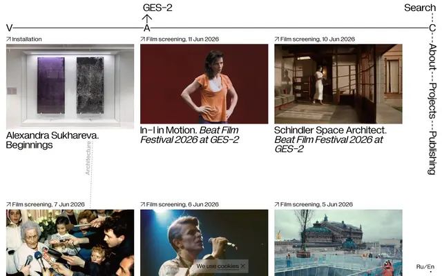



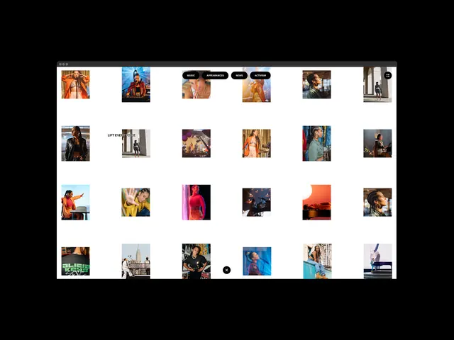




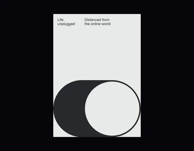
Keep what you find
A free account saves references to boards and can send you a weekly email of picks based on what you save.
To see every result, go Pro.