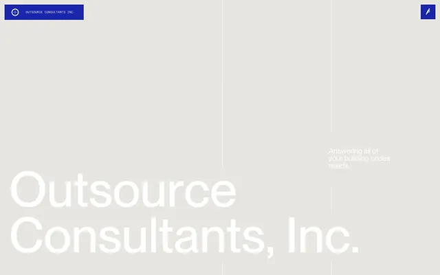
Preview image. Unlock full-res
Architectural Blueprint on Stark Grey
Color palette
Primary brand color; used for interactive elements, navigation accents, headings, and key information. Its vividness provides a clear focal point against the neutral backgrounds.
Used sparingly for deeper background accents in navigation, providing subtle depth.
Primary text color for maximum contrast and readability on light backgrounds.
Dominant page background, card surfaces, and subtle borders. Its light, cool tone forms the canvas for the design.
Used for button backgrounds, elevated card surfaces, and some text elements, providing high contrast and visual breaks.
Typography
- Weights
- 400, 500
- Sizes
- 12px, 16px, 18px, 24px, 30px, 36px, 46px, 160px
- Line height
- 0.94, 1, 1.5
- Fallback
- system-ui
Primary display and headline font. Its wide range of sizes, especially the 160px for display, creates the architectural scale. Also used for badge and button text, maintaining brand consistency.
- Weights
- 400, 500
- Sizes
- 10px, 12px, 14px
- Line height
- 1, 1.3, 1.33, 1.5
- Letter spacing
- -0.05em at 10px, 0.02em at 12px and 14px
- Fallback
- ui-monospace
Secondary functional font for navigation, buttons, and detailed body text. Its monospaced nature evokes technical documentation, reinforcing the 'blueprint' theme.
- Weights
- 400
- Sizes
- 16px
- Line height
- 1.5
- Fallback
- system-ui
Tertiary body text, used for general content where a standard sans-serif is appropriate.
Spacing & shape
Components
Text uses GT America Mono, weight 400, size 12px, line-height 1, Blueprint Gray #e8e6e0 text on a Blueprint Violet #1925aa background. No border radius, emphasizing sharp angles.
GT America Mono, weight 400, size 12px, line-height 1, Blueprint Gray #e8e6e0 text on a transparent background. Features an underline effect on hover, borderTopColor=oklab(0.372857 -0.0071817 -0.204536) on hover.
Text is Base Graphite #000000. Uses PP Neue Montreal, size 16px. Transparent background with no border radius. Explicitly styled for content sections, not general interaction.
Blueprint Gray #e8e6e0 background with 0px border radius and no shadow. Internal padding of 9.99999px top, 22px right, 22px bottom, 22px left. Accommodates various content types.
Text in Blueprint Violet #1925aa, transparent background, 0px border radius. Padding of 0px top, 15px right, 0px bottom, 15px left. Used for inline calls to action like 'learn more'.
Square, no border radius, transparent background with Paper White #ffffff icon. Example of circular variant for an edit icon.
Guidelines
- Prioritize Blueprint Violet #1925aa for all primary interactive elements and key headings to guide user attention.
- Maintain a strict 0px border-radius across all components (buttons, cards, inputs) to reinforce the sharp, precise aesthetic.
- Use GT America Mono for all navigation, buttons, and informational text to establish the technical, blueprint-like tone.
- Employ PP Neue Montreal exclusively for large display text and main headings to create a bold, architectural feel.
- Leverage the Blueprint Gray #e8e6e0 as the dominant background color for most page sections, and Paper White #ffffff for contrast on cards or specific content blocks.
- Ensure high contrast ratios: Base Graphite #000000 text on Blueprint Gray #e8e6e0 or Paper White #ffffff backgrounds is crucial.
- Avoid any soft shadows or rounded elements; the design emphasizes sharp edges and flat surfaces.
- Do not introduce additional saturated colors beyond Blueprint Violet #1925aa; maintain a controlled two-color brand palette.
- Refrain from using generic sans-serif fonts for primary navigation or component text; GT America Mono is essential for brand identity.
- Do not add gradients or complex background patterns; backgrounds should primarily be solid Blueprint Gray #e8e6e0 or Paper White #ffffff.
- Avoid excessive spacing between elements to maintain a sense of density and order, adhering to specified element gaps like 10px.
- Do not use system default link styles; all interactive text should adhere to Blueprint Violet #1925aa or Base Graphite #000000 based on context.
About this system
ShowHide
Outsource Consultants adopts an 'architectural blueprint' aesthetic, defined by stark contrasts, precise typography, and a deliberate absence of soft edges. The interplay of a cool, almost industrial grey background with bold violet accents creates a sense of rigorous order and technical authority. Large, statement typography in a custom sans-serif font dominates, giving the impression of blueprints or large-scale technical drawings, while monospaced text provides detailed annotations.
The site employs a max-width contained layout, centered on the page. The hero section features a large, off-center display heading, utilizing the expansive Blueprint Gray #e8e6e0 background as negative space. Content sections alternate between visually distinct blocks, often with a full-bleed Blueprint Violet #1925aa section acting as a strong visual divider or call-out. Information is frequently presented in two-column layouts, with text on one side and a more structured visual or interactive element on the other. Navigation is a sticky top bar with a minimal, subtle approach, expanding into a full-screen overlay menu. The overall rhythm is controlled and deliberate, emphasizing clear segmentation and information hierarchy.
The site uses minimal imagery, focusing instead on stark UI elements and typography. When present, images appear to be product/service-related, possibly technical drawings or relevant documentation snippets, treated in a functional, non-decorative manner. Icons are simple, outlined, and monochromatic, designed to integrate seamlessly rather than stand out. The visual density is text-dominant, with images playing a supporting, explanatory role.
Reminiscent of Architectural firms online, Brutalism-inspired portfolios, Technical documentation sites.
# Outsource Consultants — Style Reference
> Architectural Blueprint on Stark Grey

**Theme:** light

**Site:** https://oci.madebybuzzworthy.com

Outsource Consultants adopts an 'architectural blueprint' aesthetic, defined by stark contrasts, precise typography, and a deliberate absence of soft edges. The interplay of a cool, almost industrial grey background with bold violet accents creates a sense of rigorous order and technical authority. Large, statement typography in a custom sans-serif font dominates, giving the impression of blueprints or large-scale technical drawings, while monospaced text provides detailed annotations.

## Tokens — Colors

| Name | Value | Token | Role |
|------|------|------|------|
| Blueprint Violet | `#1925aa` | `--color-blueprint-violet` | Primary brand color; used for interactive elements, navigation accents, headings, and key information. Its vividness provides a clear focal point against the neutral backgrounds. |
| Deep Violet | `#0d1355` | `--color-deep-violet` | Used sparingly for deeper background accents in navigation, providing subtle depth. |
| Base Graphite | `#000000` | `--color-base-graphite` | Primary text color for maximum contrast and readability on light backgrounds. |
| Blueprint Gray | `#e8e6e0` | `--color-blueprint-gray` | Dominant page background, card surfaces, and subtle borders. Its light, cool tone forms the canvas for the design. |
| Paper White | `#ffffff` | `--color-paper-white` | Used for button backgrounds, elevated card surfaces, and some text elements, providing high contrast and visual breaks. |

## Tokens — Typography

### PP Neue Montreal
- **Substitute:** system-ui
- **Weights:** 400, 500
- **Sizes:** 12px, 16px, 18px, 24px, 30px, 36px, 46px, 160px
- **Line height:** 0.94, 1, 1.5
- **Role:** Primary display and headline font. Its wide range of sizes, especially the 160px for display, creates the architectural scale. Also used for badge and button text, maintaining brand consistency.

### GT America Mono
- **Substitute:** ui-monospace
- **Weights:** 400, 500
- **Sizes:** 10px, 12px, 14px
- **Line height:** 1, 1.3, 1.33, 1.5
- **Letter spacing:** -0.05em at 10px, 0.02em at 12px and 14px
- **Role:** Secondary functional font for navigation, buttons, and detailed body text. Its monospaced nature evokes technical documentation, reinforcing the 'blueprint' theme.

### ui-sans-serif
- **Substitute:** system-ui
- **Weights:** 400
- **Sizes:** 16px
- **Line height:** 1.5
- **Role:** Tertiary body text, used for general content where a standard sans-serif is appropriate.

## Tokens — Type Scale

Perfect Fifth (1.5) from 14px base.

| Role | Size | Line height | Letter spacing |
|------|------|------|------|
| caption | 10px | 1.3 | -0.5px |
| body | 14px | 1.5 | 0.28px |
| body-lg | 16px | 1.5 | — |
| subheading | 18px | 1.5 | — |
| heading-sm | 24px | 1.5 | — |
| heading | 30px | 1.5 | — |
| heading-lg | 36px | 1.5 | — |
| display | 160px | 0.94 | — |

## Tokens — Spacing

- **Section gap:** 40px
- **Element gap:** 10px

## Tokens — Radius

- **all:** 0px

## Layout

The site employs a max-width contained layout, centered on the page. The hero section features a large, off-center display heading, utilizing the expansive Blueprint Gray #e8e6e0 background as negative space. Content sections alternate between visually distinct blocks, often with a full-bleed Blueprint Violet #1925aa section acting as a strong visual divider or call-out. Information is frequently presented in two-column layouts, with text on one side and a more structured visual or interactive element on the other. Navigation is a sticky top bar with a minimal, subtle approach, expanding into a full-screen overlay menu. The overall rhythm is controlled and deliberate, emphasizing clear segmentation and information hierarchy.

## Imagery

The site uses minimal imagery, focusing instead on stark UI elements and typography. When present, images appear to be product/service-related, possibly technical drawings or relevant documentation snippets, treated in a functional, non-decorative manner. Icons are simple, outlined, and monochromatic, designed to integrate seamlessly rather than stand out. The visual density is text-dominant, with images playing a supporting, explanatory role.

## Components

### Services Accordion

### About Stat Block

### CTA Button Group

### Navigation Link – Menu
*Primary navigation item*

Text uses GT America Mono, weight 400, size 12px, line-height 1, Blueprint Gray #e8e6e0 text on a Blueprint Violet #1925aa background. No border radius, emphasizing sharp angles.

### Primary Header Link
*Interactive menu item*

GT America Mono, weight 400, size 12px, line-height 1, Blueprint Gray #e8e6e0 text on a transparent background. Features an underline effect on hover, borderTopColor=oklab(0.372857 -0.0071817 -0.204536) on hover.

### Service Accordion Button
*Expandable content trigger*

Text is Base Graphite #000000. Uses PP Neue Montreal, size 16px. Transparent background with no border radius. Explicitly styled for content sections, not general interaction.

### Service Card
*Content container*

Blueprint Gray #e8e6e0 background with 0px border radius and no shadow. Internal padding of 9.99999px top, 22px right, 22px bottom, 22px left. Accommodates various content types.

### Ghost Button (Accent)
*Secondary action or link*

Text in Blueprint Violet #1925aa, transparent background, 0px border radius. Padding of 0px top, 15px right, 0px bottom, 15px left. Used for inline calls to action like 'learn more'.

### Mini Menu Icon
*Navigation toggle icon*

Square, no border radius, transparent background with Paper White #ffffff icon. Example of circular variant for an edit icon.

## Guidelines

### Do

- Prioritize Blueprint Violet #1925aa for all primary interactive elements and key headings to guide user attention.
- Maintain a strict 0px border-radius across all components (buttons, cards, inputs) to reinforce the sharp, precise aesthetic.
- Use GT America Mono for all navigation, buttons, and informational text to establish the technical, blueprint-like tone.
- Employ PP Neue Montreal exclusively for large display text and main headings to create a bold, architectural feel.
- Leverage the Blueprint Gray #e8e6e0 as the dominant background color for most page sections, and Paper White #ffffff for contrast on cards or specific content blocks.
- Ensure high contrast ratios: Base Graphite #000000 text on Blueprint Gray #e8e6e0 or Paper White #ffffff backgrounds is crucial.

### Don't

- Avoid any soft shadows or rounded elements; the design emphasizes sharp edges and flat surfaces.
- Do not introduce additional saturated colors beyond Blueprint Violet #1925aa; maintain a controlled two-color brand palette.
- Refrain from using generic sans-serif fonts for primary navigation or component text; GT America Mono is essential for brand identity.
- Do not add gradients or complex background patterns; backgrounds should primarily be solid Blueprint Gray #e8e6e0 or Paper White #ffffff.
- Avoid excessive spacing between elements to maintain a sense of density and order, adhering to specified element gaps like 10px.
- Do not use system default link styles; all interactive text should adhere to Blueprint Violet #1925aa or Base Graphite #000000 based on context.

## Agent Prompt Guide

### Quick Color Reference
- Text: Base Graphite #000000
- Background: Blueprint Gray #e8e6e0
- CTA: Blueprint Violet #1925aa
- Interactive Text: Blueprint Violet #1925aa
- Accent Background: Deep Violet #0d1355

### 3-5 Example Component Prompts
1. Create a Hero Section: Blueprint Gray #e8e6e0 background. Centered headline 'Outsource Consultants, Inc.' in PP Neue Montreal, 160px, weight 400, line-height 0.94, Base Graphite #000000. Subtext 'Answering all of your building codes needs.' in PP Neue Montreal, 18px, weight 400, Base Graphite #000000. Ensure 0px border-radius for all elements.
2. Design a primary navigation bar: Fixed at top. Background of Deep Violet #0d1355. Left-aligned logo text 'Outsource Consultants Inc.' in GT America Mono 12px, weight 400, Paper White #ffffff. Right-aligned 'Menu' button in GT America Mono 12px, weight 400, Blueprint Gray #e8e6e0 on transparent background, no border, 0px radius.
3. Build a Service Card: Blueprint Gray #e8e6e0 background, 0px border-radius, no shadow. Padding 9.99999px top, 22px right/left, 22px bottom. Inside, a heading 'Construction Expediting' in PP Neue Montreal, 16px, weight 400, Base Graphite #000000. Include a 'Learn More' ghost button: transparent background, Blueprint Violet #1925aa text (GT America Mono, 10px, weight 400, letter-spacing -0.5px), 0px padding, 0px radius.
4. Create a full-width section with Blueprint Violet #1925aa background: Content includes a centered paragraph 'Our team of over 50 in-house consultants...' in PP Neue Montreal, 24px, weight 400, Paper White #ffffff. Ensure ample vertical padding to reflect the 'density: comfortable' spacing.
More like this









Keep what you find
A free account saves references to boards and can send you a weekly email of picks based on what you save.
To see every result, go Pro.