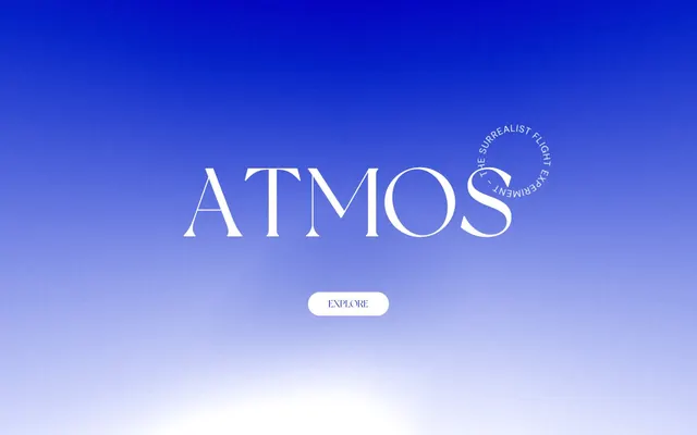
Preview image. Unlock full-res
Color palette
Background gradient for hero sections and immersive experiences, transitioning from deep indigo to bright sky blue
Primary background for all content sections, cards, and most text. Also used for outlined button borders
Primary text color for headlines and body copy, providing high contrast against white backgrounds. Used for some decorative fills
Typography
- Weights
- 400
- Sizes
- 50px, 200px
- Line height
- 1.15
- Fallback
- Playfair Display
Decorative display font for branding and large section headlines. Its elegant serif forms create a strong, artistic statement.
- Weights
- 400, 700
- Sizes
- 20px, 25px, 30px
- Line height
- 1.15, 1.5
- Fallback
- Inter
Primary sans-serif for body text, links, and complementary information. Its clean geometry ensures readability in various contexts.
- Weights
- 400
- Sizes
- 10px
- Line height
- 1.15
- Fallback
- Times New Roman
Small, functional text for auxiliary elements and fine print. Used at a very small size for subtle details.
Spacing & shape
Components
Uses 'NewYork' font at 200px (weight 400) in Ink Black, centered on the Sky Gradient background.
Curved text, DM Sans, 10px, Ink Black, describing the experience, often appearing within a boundary element.
DM Sans, 20px, Canvas White text on a transparent background, with a 1px Canvas White border and 9999px border-radius. Padding around 30px vertical and horizontal.
DM Sans, 30px (weight 700), Ink Black, typically followed by a 42px margin-bottom.
DM Sans, 20px (weight 400), Ink Black, typically followed by a 20px margin-bottom for paragraph spacing.
DM Sans, 25px (weight 400), Ink Black, with a 10px top margin when appearing in lists.
Guidelines
- Prioritize generous vertical spacing, using 100px for section gaps and 20px for element gaps to maintain a spacious feel.
- Use 'NewYork' font exclusively for large, declarative headlines and branding elements, leveraging its unique serif character.
- Apply 'DM Sans' for all functional text, including body copy, links, and smaller headings, ensuring high readability.
- Employ the Sky Gradient as a full-bleed background for immersive sections, letting it define the visual tone.
- Utilize Canvas White as the dominant background color for textual content areas and Ink Black for primary text to ensure contrast.
- Ensure interactive elements like buttons use Canvas White for their borders and text when on gradient or dark backgrounds.
- Maintain a minimal approach to UI elements; focus on typography and spaciousness over complex component structures.
- Do not introduce heavy shadows or complex elevation; the design emphasizes a flat aesthetic.
- Avoid using saturated colors other than the brand's blues for any UI elements; restrict color to backgrounds and branding.
- Do not use system default link colors; all links should be styled with Ink Black and 'DM Sans'.
- Do not clutter layouts with too many distinct elements or varying component styles; simplicity is key.
- Avoid tight spacing; maintain the spacious and airy feel across all content arrangements.
- Do not use 'Times' for anything other than very small, auxiliary text; 'DM Sans' and 'NewYork' cover primary typography needs.
- Do not apply excessive borders or backgrounds to interactive elements; maintain a ghost or outlined style where possible.
About this system
ShowHide
Atmos presents a serene, immersive experience with a light theme dominated by a vibrant blue sky gradient. Typography leans into a classic, elegant serif for branding contrasted with a clean sans-serif for content, creating a subtle tension between whimsy and readability. Large, expressive headlines set against spacious layouts evoke an ethereal, dreamlike atmosphere. The visual system minimizes UI elements, focusing instead on broad washes of color and text-centric communication.
Reminiscent of Awwwards-winning portfolio sites, Luxury brand landing pages, Experiential microsites, Abstract art showcases.
# ATMOS — Style Reference
> Ethereal Sky Gradient

**Theme:** light

**Site:** https://atmos.leeroy.ca

Atmos presents a serene, immersive experience with a light theme dominated by a vibrant blue sky gradient. Typography leans into a classic, elegant serif for branding contrasted with a clean sans-serif for content, creating a subtle tension between whimsy and readability. Large, expressive headlines set against spacious layouts evoke an ethereal, dreamlike atmosphere. The visual system minimizes UI elements, focusing instead on broad washes of color and text-centric communication.

## Tokens — Colors

| Name | Value | Token | Role |
|------|------|------|------|
| Sky Gradient | `#0825c6` | `--color-sky-gradient` | Background gradient for hero sections and immersive experiences, transitioning from deep indigo to bright sky blue |
| Canvas White | `#ffffff` | `--color-canvas-white` | Primary background for all content sections, cards, and most text. Also used for outlined button borders |
| Ink Black | `#000000` | `--color-ink-black` | Primary text color for headlines and body copy, providing high contrast against white backgrounds. Used for some decorative fills |

## Tokens — Typography

### NewYork
- **Substitute:** Playfair Display
- **Weights:** 400
- **Sizes:** 50px, 200px
- **Line height:** 1.15
- **Role:** Decorative display font for branding and large section headlines. Its elegant serif forms create a strong, artistic statement.

### DM Sans
- **Substitute:** Inter
- **Weights:** 400, 700
- **Sizes:** 20px, 25px, 30px
- **Line height:** 1.15, 1.5
- **Role:** Primary sans-serif for body text, links, and complementary information. Its clean geometry ensures readability in various contexts.

### Times
- **Substitute:** Times New Roman
- **Weights:** 400
- **Sizes:** 10px
- **Line height:** 1.15
- **Role:** Small, functional text for auxiliary elements and fine print. Used at a very small size for subtle details.

## Tokens — Type Scale

| Role | Size | Line height | Letter spacing |
|------|------|------|------|
| caption | 10px | 1.15 | — |
| body | 20px | 1.15 | — |
| subheading | 25px | 1.15 | — |
| heading | 30px | 1.15 | — |
| display | 50px | 1.15 | — |
| display-lg | 200px | 1.15 | — |

## Tokens — Spacing

- **Section gap:** 100px
- **Card padding:** 30px
- **Element gap:** 20px

## Tokens — Radius

- **Buttons:** 9999px

## Components

### Hero Title
*Dominant text element on the landing page.*

Uses 'NewYork' font at 200px (weight 400) in Ink Black, centered on the Sky Gradient background.

### Circular Subtitle
*Accompanying descriptive text in the hero section.*

Curved text, DM Sans, 10px, Ink Black, describing the experience, often appearing within a boundary element.

### Outlined Explore Button
*Primary call to action with a ghost-like appearance.*

DM Sans, 20px, Canvas White text on a transparent background, with a 1px Canvas White border and 9999px border-radius. Padding around 30px vertical and horizontal.

### Introductory Heading
*Section titles after the hero.*

DM Sans, 30px (weight 700), Ink Black, typically followed by a 42px margin-bottom.

### Body Text
*Standard paragraph text.*

DM Sans, 20px (weight 400), Ink Black, typically followed by a 20px margin-bottom for paragraph spacing.

### Resource Link
*Hyperlinks to external content.*

DM Sans, 25px (weight 400), Ink Black, with a 10px top margin when appearing in lists.

## Guidelines

### Do

- Prioritize generous vertical spacing, using 100px for section gaps and 20px for element gaps to maintain a spacious feel.
- Use 'NewYork' font exclusively for large, declarative headlines and branding elements, leveraging its unique serif character.
- Apply 'DM Sans' for all functional text, including body copy, links, and smaller headings, ensuring high readability.
- Employ the Sky Gradient as a full-bleed background for immersive sections, letting it define the visual tone.
- Utilize Canvas White as the dominant background color for textual content areas and Ink Black for primary text to ensure contrast.
- Ensure interactive elements like buttons use Canvas White for their borders and text when on gradient or dark backgrounds.
- Maintain a minimal approach to UI elements; focus on typography and spaciousness over complex component structures.

### Don't

- Do not introduce heavy shadows or complex elevation; the design emphasizes a flat aesthetic.
- Avoid using saturated colors other than the brand's blues for any UI elements; restrict color to backgrounds and branding.
- Do not use system default link colors; all links should be styled with Ink Black and 'DM Sans'.
- Do not clutter layouts with too many distinct elements or varying component styles; simplicity is key.
- Avoid tight spacing; maintain the spacious and airy feel across all content arrangements.
- Do not use 'Times' for anything other than very small, auxiliary text; 'DM Sans' and 'NewYork' cover primary typography needs.
- Do not apply excessive borders or backgrounds to interactive elements; maintain a ghost or outlined style where possible.

## Agent Prompt Guide

Quick Color Reference:
text: #000000
background: #ffffff
border: #ffffff
accent: no distinct accent color
primary action: no distinct CTA color

Example Component Prompts:
1. Create a Hero Section: Full-viewport background with Sky Gradient. Centered 'NewYork' headline (200px, #000000). Below it, a circular subtitle using 'DM Sans' (10px, #000000). Add an 'Explore' button ('DM Sans', 20px, #ffffff text, #ffffff 1px border, 9999px radius, 30px padding).
2. Create a Content Section: Canvas White background. An Introductory Heading ('DM Sans', 30px, weight 700, #000000) with 42px margin-bottom. Follow with two paragraphs of Body Text ('DM Sans', 20px, weight 400, #000000), each with 20px margin-bottom.
3. Create a Resource List: Canvas White background. A paragraph of Body Text ('DM Sans', 20px, weight 400, #000000). Below that, a list of Resource Links ('DM Sans', 25px, weight 400, #000000), each with 10px margin-top.
More like this








Keep what you find
A free account saves references to boards and can send you a weekly email of picks based on what you save.
To see every result, go Pro.