Preview image. Unlock full-res
Midnight data console
Color palette
Decorative background for visual elements, adding a touch of dimensional texture without introducing strong color
Primary background color for cards and other primary surfaces, providing a deep, consistent dark base
Background for secondary surfaces, headers, and subtle borders, slightly lighter than Midnight Ink to create minimal depth
Primary text color for maximum readability against dark backgrounds, also used for outlines and inactive indicators
Typography
- Weights
- 400
- Sizes
- 10px, 12px, 14px, 16px, 28px, 96px
- Line height
- 1.12, 1.15, 1.19, 1.2, 1.22
- Letter spacing
- -0.03em for display text like 96px, 0.03em for smaller text like 10px-12px
- Fallback
- Arial
All textual content, from large headings to body text and navigation. Its precise letter-spacing and feature sets ('lnum', 'ss04', 'tnum') create a crisp, engineered feel crucial for a data-focused brand.
Spacing & shape
Components
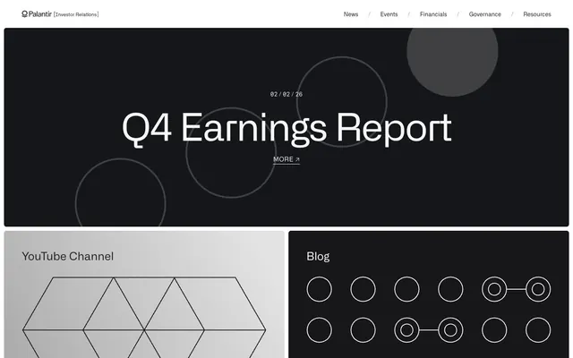
Large (96px) Ghost White text in Alliance No.2, weight 400, with tight letter-spacing (-0.03em) presented on a Storm Gray background with geometric overlays. Provides immediate visual impact.
Ghost White text (size 14px or 16px, weight 400) in Alliance No.2, separated by a light slash divider. No background, minimal padding, direct and functional. Border-bottom appears on hover in Storm Gray.
Ghost White text (14px or 16px) using Alliance No.2, weight 400, on a transparent background. Features an underline effect on hover/active states formed by Storm Gray border-bottom.
Uses Midnight Ink (#15161a) as background, with 6px border-radius. No internal padding, relying on external spacing. Can contain headings and body text in Ghost White, occasionally integrating subtle gradients for visual interest.
Uses Storm Gray (#1f2426) as background, with 6px border-radius. No internal padding. Presents content in Ghost White.
Guidelines
- Use Midnight Ink (#15161a) for primary background surfaces and Storm Gray (#1f2426) for secondary UI elements to establish clear visual hierarchy.
- Apply Alliance No.2 font consistently across all text elements; utilize its specific letter-spacing values: -0.03em for display sizes (96px) and 0.03em for smaller text (10px-12px).
- Maintain a monochrome palette with Ghost White (#f6f6f6) for all primary text and interaction states.
- Employ 6px `radius` for all cards and panel-like containers, avoiding sharper or more rounded corners.
- Structure layouts with a `sectionGap` of 55px and an `elementGap` of 10px to create spacious, organized content blocks.
- Utilize a 1px Storm Gray (`#1f2426`) border for interactive elements and subtle content dividers, as seen in navigation links and card outlines.
- Incorporate subtle geometric overlays or abstract gradients, such as the Subtle Gray Gradient, as decorative elements within dark backgrounds, rather than colorful imagery.
- Avoid introducing additional vivid or saturated colors outside of the established monochrome palette and subtle accent gradients.
- Do not use heavy shadows or strong elevation effects; rely on subtle background variations and borders for depth.
- Refrain from using bold type weights; Alliance No.2 weight 400 is the standard for all text, conveying authority through clarity, not volume.
- Do not use generic button styles; interactive elements should be minimal, often text-based with subtle underlines or thin borders.
- Avoid decorative imagery with lifestyle photography or human elements; focus on abstract, geometric, or product-screenshot-like visuals.
- Do not vary border-radius significantly; stick to 6px for all rounded elements.
- Avoid dense, information-packed sections with minimal whitespace; maintain generous `sectionGap` and `elementGap` for readability.
About this system
ShowHide
Palantir Investor Relations embodies a 'data-driven dark academia' aesthetic, presenting information within a clean, monochromatic environment. The design prioritizes content with high contrast typography against dark surfaces, using subtle geometric patterns and delicate borders instead of bold colors or heavy embellishments. Interaction is minimal, with an emphasis on direct navigation and clear data presentation, maintaining a serious and authoritative tone.
The page primarily uses a full-bleed dark background for its canvas. The hero section is full-bleed, showcasing a centered headline with large typography over a dark background enriched with subtle geometric patterns. Content sections often alternate between different shades of dark gray backgrounds, with consistent vertical spacing (55px `sectionGap`). Content is frequently arranged in multi-column grids (like the two-column card layout), with an emphasis on centered textual content or text-adjacent visual blocks. The navigation is a minimalist sticky top bar with text links and a subtle separator.
Imagery is minimal and abstract, prioritizing geometric patterns (circles, hexagons) and subtly faded gradients over photography or illustrations. Illustrations are linear, outlined, and monochromatic, used sparsely to enrich background areas or complement text. Icons are outlined, simple, and white, matching the overall stark, technical aesthetic. The few visuals serve an atmospheric or explanatory role, never dominating the content and always maintaining a low-key presence.
Reminiscent of Stripe, Vercel, Linear, Dark-mode dashboards.
# Palantir IR — Style Reference
> Midnight data console

**Theme:** dark

**Site:** https://investors.palantir.com

Palantir Investor Relations embodies a 'data-driven dark academia' aesthetic, presenting information within a clean, monochromatic environment. The design prioritizes content with high contrast typography against dark surfaces, using subtle geometric patterns and delicate borders instead of bold colors or heavy embellishments. Interaction is minimal, with an emphasis on direct navigation and clear data presentation, maintaining a serious and authoritative tone.

## Tokens — Colors

| Name | Value | Token | Role |
|------|------|------|------|
| Subtle Gray Gradient | `#e3e3e3` | `--color-subtle-gray-gradient` | Decorative background for visual elements, adding a touch of dimensional texture without introducing strong color |
| Midnight Ink | `#15161a` | `--color-midnight-ink` | Primary background color for cards and other primary surfaces, providing a deep, consistent dark base |
| Storm Gray | `#1f2426` | `--color-storm-gray` | Background for secondary surfaces, headers, and subtle borders, slightly lighter than Midnight Ink to create minimal depth |
| Ghost White | `#f6f6f6` | `--color-ghost-white` | Primary text color for maximum readability against dark backgrounds, also used for outlines and inactive indicators |

## Tokens — Typography

### Alliance No.2
- **Substitute:** Arial
- **Weights:** 400
- **Sizes:** 10px, 12px, 14px, 16px, 28px, 96px
- **Line height:** 1.12, 1.15, 1.19, 1.2, 1.22
- **Letter spacing:** -0.03em for display text like 96px, 0.03em for smaller text like 10px-12px
- **Role:** All textual content, from large headings to body text and navigation. Its precise letter-spacing and feature sets ('lnum', 'ss04', 'tnum') create a crisp, engineered feel crucial for a data-focused brand.

## Tokens — Type Scale

| Role | Size | Line height | Letter spacing |
|------|------|------|------|
| caption | 10px | 1.12 | 0.3px |
| body | 14px | 1.19 | — |
| heading | 28px | 1.22 | — |
| display | 96px | 1.22 | -0.96px |

## Tokens — Spacing

- **Section gap:** 55px
- **Card padding:** 0px
- **Element gap:** 10px

## Tokens — Radius

- **Cards:** 6px
- **panels:** 6px

## Layout

The page primarily uses a full-bleed dark background for its canvas. The hero section is full-bleed, showcasing a centered headline with large typography over a dark background enriched with subtle geometric patterns. Content sections often alternate between different shades of dark gray backgrounds, with consistent vertical spacing (55px `sectionGap`). Content is frequently arranged in multi-column grids (like the two-column card layout), with an emphasis on centered textual content or text-adjacent visual blocks. The navigation is a minimalist sticky top bar with text links and a subtle separator.

## Imagery

Imagery is minimal and abstract, prioritizing geometric patterns (circles, hexagons) and subtly faded gradients over photography or illustrations. Illustrations are linear, outlined, and monochromatic, used sparsely to enrich background areas or complement text. Icons are outlined, simple, and white, matching the overall stark, technical aesthetic. The few visuals serve an atmospheric or explanatory role, never dominating the content and always maintaining a low-key presence.

## Components

### Hero Headline
*Primary page title*

Large (96px) Ghost White text in Alliance No.2, weight 400, with tight letter-spacing (-0.03em) presented on a Storm Gray background with geometric overlays. Provides immediate visual impact.

### Navigation Link
*Top-level site navigation*

Ghost White text (size 14px or 16px, weight 400) in Alliance No.2, separated by a light slash divider. No background, minimal padding, direct and functional. Border-bottom appears on hover in Storm Gray.

### Ghost Button
*Navigation and secondary calls to action*

Ghost White text (14px or 16px) using Alliance No.2, weight 400, on a transparent background. Features an underline effect on hover/active states formed by Storm Gray border-bottom.

### Information Card
*Content segmentation and presentation*

Uses Midnight Ink (#15161a) as background, with 6px border-radius. No internal padding, relying on external spacing. Can contain headings and body text in Ghost White, occasionally integrating subtle gradients for visual interest.

### Minimal Card
*Secondary content cards*

Uses Storm Gray (#1f2426) as background, with 6px border-radius. No internal padding. Presents content in Ghost White.

## Guidelines

### Do

- Use Midnight Ink (#15161a) for primary background surfaces and Storm Gray (#1f2426) for secondary UI elements to establish clear visual hierarchy.
- Apply Alliance No.2 font consistently across all text elements; utilize its specific letter-spacing values: -0.03em for display sizes (96px) and 0.03em for smaller text (10px-12px).
- Maintain a monochrome palette with Ghost White (#f6f6f6) for all primary text and interaction states.
- Employ 6px `radius` for all cards and panel-like containers, avoiding sharper or more rounded corners.
- Structure layouts with a `sectionGap` of 55px and an `elementGap` of 10px to create spacious, organized content blocks.
- Utilize a 1px Storm Gray (`#1f2426`) border for interactive elements and subtle content dividers, as seen in navigation links and card outlines.
- Incorporate subtle geometric overlays or abstract gradients, such as the Subtle Gray Gradient, as decorative elements within dark backgrounds, rather than colorful imagery.

### Don't

- Avoid introducing additional vivid or saturated colors outside of the established monochrome palette and subtle accent gradients.
- Do not use heavy shadows or strong elevation effects; rely on subtle background variations and borders for depth.
- Refrain from using bold type weights; Alliance No.2 weight 400 is the standard for all text, conveying authority through clarity, not volume.
- Do not use generic button styles; interactive elements should be minimal, often text-based with subtle underlines or thin borders.
- Avoid decorative imagery with lifestyle photography or human elements; focus on abstract, geometric, or product-screenshot-like visuals.
- Do not vary border-radius significantly; stick to 6px for all rounded elements.
- Avoid dense, information-packed sections with minimal whitespace; maintain generous `sectionGap` and `elementGap` for readability.

## Agent Prompt Guide

Quick Color Reference:
text: #f6f6f6
background: #15161a
border: #1f2426
accent: #e3e3e3
primary action: no distinct CTA color

Example Component Prompts:
1. Create a Hero section for 'Q4 Earnings Report': Storm Gray background (#1f2426). Headline 'Q4 Earnings Report' in Ghost White (#f6f6f6), Alliance No.2, size 96px, weight 400, letter-spacing -0.03em. Subtext '02 / 02 / 26' below it in Ghost White, Alliance No.2, size 16px, weight 400. Include a 'MORE ↗' link in Ghost White, size 14px, weight 400, with a 1px Storm Gray (#1f2426) border-bottom on hover.
2. Design an 'Information Card' for 'YouTube Channel': Midnight Ink (#15161a) background, 6px border-radius, with no internal padding. Title 'YouTube Channel' in Ghost White (#f6f6f6), Alliance No.2, size 28px, weight 400. Content below is a geometric line illustration in Ghost White.
3. Implement a 'Navigation Link' for 'Financials': Ghost White (#f6f6f6), Alliance No.2, size 14px, weight 400, on a transparent background. On hover, apply a 1px (#1f2426) border-bottom.
More like this









Keep what you find
A free account saves references to boards and can send you a weekly email of picks based on what you save.
To see every result, go Pro.