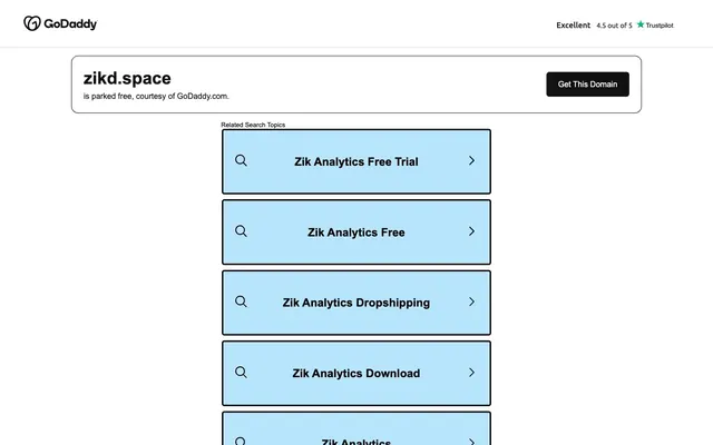
Preview image. Unlock full-res
High-contrast digital ledger.
Color palette
Blue wash for highlight backgrounds, decorative bands, and soft emphasis behind content. Do not promote it to the primary CTA color
Dark borders and separators for elevated surfaces and inverted UI. Do not promote it to the primary CTA color
Content backgrounds, button text, secondary borders
Component backgrounds, muted text, filled button backgrounds
Typography
- Weights
- 400, 600, 700
- Sizes
- 13px, 16px, 23px, 35px
- Line height
- 1.2, 1.85
- Letter spacing
- normal
- Fallback
- Inter
Primary brand typeface for all content and UI elements; its varied weights establish clear hierarchy.
- Weights
- 400
- Sizes
- 16px
- Line height
- 1.2
- Letter spacing
- normal
- Fallback
- sans-serif
System fallback font, used for auxiliary information.
Spacing & shape
Components
Background: Deep Graphite (#111111), Text: Canvas White (#ffffff), Border: Canvas White (#ffffff) 1px solid, Padding: 0px vertical, 24px horizontal, Radius: 6px.
Background: Sky Dust (#b8e4fc), Border: Midnight Ink (#000000) 3px solid, Padding: 20px vertical, 20px horizontal (with 8px bottom margin), Radius: 5px.
Background: rgba(0,0,0,0) (transparent), Border: Midnight Ink (#000000) 3px solid, Padding: 24px, Radius: 14px.
Guidelines
- Prioritize Deep Graphite (#111111) as baseline for component backgrounds and Midnight Ink (#000000) for primary text and significant borders.
- Use Sky Dust (#b8e4fc) exclusively for interactive surface backgrounds like list items or search results, never for primary text or borders.
- Apply a 3px solid Midnight Ink (#000000) border to cards and interactive elements for a crisp, defined outline.
- Maintain a default padding of 24px for card content using `cardPadding`.
- Utilize GD Sherpa at 700 weight for primary actions and key interface elements to maximize impact.
- Ensure all buttons have a 5px border-radius unless specified, and cards use 14px for a distinct visual separation.
- Use 16px as the primary `elementGap` for horizontal and vertical spacing between related items.
- Do not introduce additional saturated colors; maintain the strictly neutral palette with Sky Dust as the sole accent.
- Avoid using soft shadows or elevation effects; elements are defined by borders and background changes.
- Do not use Canvas White (#ffffff) for large background areas except for specific content zones or header.
- Do not deviate from the specified GD Sherpa font family for any textual content within the main interface.
- Do not combine multiple text sizes within a single sentence or functional element; adhere to the type scale for clear hierarchy.
- Avoid decorative imagery or complex graphics; the interface should rely on strong typography and clear UI elements.
- Do not use `elementGap` greater than 16px for elements within a component; reserve larger gaps for section separation.
About this system
ShowHide
Zikd employs a high-contrast theme defined by its stark black and white palette, punctuated by a soft, muted blue for interactive elements. Typography is bold and direct, ensuring clarity against dark backgrounds. Component surfaces feature sharp corners, with softer rounding reserved for interactive elements, contributing to a sense of precision and responsiveness.
The page uses a contained layout model, with content centered within a maximum width that dictates the flow. The hero section is characterized by a prominent input field with a clear call-to-action button, vertically stacked and centered. Subsequent sections, such as 'Related Search Topics', utilize multiple vertically stacked cards with consistent padding. Sections are primarily separated by consistent vertical spacing, and strong 3px borders provide clear visual boundaries around components. The page maintains a comfortable density with ample breathing room between elements, rather than dense information blocks. A minimal sticky header with the brand logo is present at the top.
This site features a minimalist approach to imagery, primarily relying on small, simple icons. The GoDaddy logo is the dominant visual graphic. Icons are presented in a monochrome, outlined style (Midnight Ink #000000) with a standard stroke weight, serving purely functional and decorative purposes without additional color or dimension. There are no photographs, complex illustrations, or 3D renders; the visual emphasis is entirely on UI elements and typography.
# Zikd — Style Reference
> High-contrast digital ledger.

**Theme:** dark

**Site:** https://www.zikd.space/en

Zikd employs a high-contrast theme defined by its stark black and white palette, punctuated by a soft, muted blue for interactive elements. Typography is bold and direct, ensuring clarity against dark backgrounds. Component surfaces feature sharp corners, with softer rounding reserved for interactive elements, contributing to a sense of precision and responsiveness.

## Tokens — Colors

| Name | Value | Token | Role |
|------|------|------|------|
| Sky Dust | `#b8e4fc` | `--color-sky-dust` | Blue wash for highlight backgrounds, decorative bands, and soft emphasis behind content. Do not promote it to the primary CTA color |
| Midnight Ink | `#000000` | `--color-midnight-ink` | Dark borders and separators for elevated surfaces and inverted UI. Do not promote it to the primary CTA color |
| Canvas White | `#ffffff` | `--color-canvas-white` | Content backgrounds, button text, secondary borders |
| Deep Graphite | `#111111` | `--color-deep-graphite` | Component backgrounds, muted text, filled button backgrounds |

## Tokens — Typography

### GD Sherpa
- **Substitute:** Inter
- **Weights:** 400, 600, 700
- **Sizes:** 13px, 16px, 23px, 35px
- **Line height:** 1.2, 1.85
- **Letter spacing:** normal
- **Role:** Primary brand typeface for all content and UI elements; its varied weights establish clear hierarchy.

### Arial
- **Substitute:** sans-serif
- **Weights:** 400
- **Sizes:** 16px
- **Line height:** 1.2
- **Letter spacing:** normal
- **Role:** System fallback font, used for auxiliary information.

## Tokens — Type Scale

Augmented Fourth (1.414) from 23px base.

| Role | Size | Line height | Letter spacing |
|------|------|------|------|
| caption | 13px | 1.85 | — |
| body-sm | 16px | 1.85 | — |
| body | 23px | 1.85 | — |
| body-lg | 35px | 1.3 | — |

## Tokens — Spacing

- **Section gap:** 54px
- **Card padding:** 24px
- **Element gap:** 16px

## Tokens — Radius

- **Buttons:** 5px
- **Cards:** 14px
- **lists:** 5px

## Layout

The page uses a contained layout model, with content centered within a maximum width that dictates the flow. The hero section is characterized by a prominent input field with a clear call-to-action button, vertically stacked and centered. Subsequent sections, such as 'Related Search Topics', utilize multiple vertically stacked cards with consistent padding. Sections are primarily separated by consistent vertical spacing, and strong 3px borders provide clear visual boundaries around components. The page maintains a comfortable density with ample breathing room between elements, rather than dense information blocks. A minimal sticky header with the brand logo is present at the top.

## Imagery

This site features a minimalist approach to imagery, primarily relying on small, simple icons. The GoDaddy logo is the dominant visual graphic. Icons are presented in a monochrome, outlined style (Midnight Ink #000000) with a standard stroke weight, serving purely functional and decorative purposes without additional color or dimension. There are no photographs, complex illustrations, or 3D renders; the visual emphasis is entirely on UI elements and typography.

## Components

### Primary Action Button
*Filled button for main calls to action.*

Background: Deep Graphite (#111111), Text: Canvas White (#ffffff), Border: Canvas White (#ffffff) 1px solid, Padding: 0px vertical, 24px horizontal, Radius: 6px.

### Search Result Card
*Container for related search topics.*

Background: Sky Dust (#b8e4fc), Border: Midnight Ink (#000000) 3px solid, Padding: 20px vertical, 20px horizontal (with 8px bottom margin), Radius: 5px.

### Domain Lookup Card
*Container for the domain search input and action.*

Background: rgba(0,0,0,0) (transparent), Border: Midnight Ink (#000000) 3px solid, Padding: 24px, Radius: 14px.

## Guidelines

### Do

- Prioritize Deep Graphite (#111111) as baseline for component backgrounds and Midnight Ink (#000000) for primary text and significant borders.
- Use Sky Dust (#b8e4fc) exclusively for interactive surface backgrounds like list items or search results, never for primary text or borders.
- Apply a 3px solid Midnight Ink (#000000) border to cards and interactive elements for a crisp, defined outline.
- Maintain a default padding of 24px for card content using `cardPadding`.
- Utilize GD Sherpa at 700 weight for primary actions and key interface elements to maximize impact.
- Ensure all buttons have a 5px border-radius unless specified, and cards use 14px for a distinct visual separation.
- Use 16px as the primary `elementGap` for horizontal and vertical spacing between related items.

### Don't

- Do not introduce additional saturated colors; maintain the strictly neutral palette with Sky Dust as the sole accent.
- Avoid using soft shadows or elevation effects; elements are defined by borders and background changes.
- Do not use Canvas White (#ffffff) for large background areas except for specific content zones or header.
- Do not deviate from the specified GD Sherpa font family for any textual content within the main interface.
- Do not combine multiple text sizes within a single sentence or functional element; adhere to the type scale for clear hierarchy.
- Avoid decorative imagery or complex graphics; the interface should rely on strong typography and clear UI elements.
- Do not use `elementGap` greater than 16px for elements within a component; reserve larger gaps for section separation.

## Agent Prompt Guide

primary action: no distinct CTA color
More like this









Keep what you find
A free account saves references to boards and can send you a weekly email of picks based on what you save.
To see every result, go Pro.