Preview image. Unlock full-res
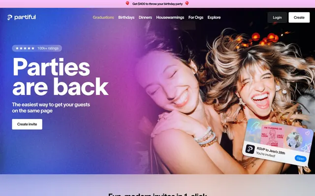
confetti landing on white marble — the page stays quiet and light while the content explodes with color and celebration.
Color palette
Primary text, filled CTA buttons, icon fills, card borders — black on white is the entire contrast system; no blue or colored accent dilutes it
Active nav item highlight text — the single warm accent in an otherwise achromatic nav bar
Hero gradient start — soft pink-violet wash over photography
Section gradient accent — soft blue tint fading to white for feature-section backgrounds
Decorative surface gradient — teal-to-pale wash used in invitation card previews
Deep brand accent in invitation templates and decorative event card designs
Page background, card surfaces, button text on dark backgrounds, nav surfaces
Secondary body text, footer links, supporting labels
Tertiary body copy, descriptive paragraphs, helper text in feature sections
Muted captions, attribution text, ratings sub-labels
Footer section headings, disabled labels
Hairline borders, disabled button backgrounds
Typography
- Weights
- 400
- Sizes
- 12px
- Line height
- 1.2
sans-serif — detected in extracted data but not described by AI
- Weights
- 400, 500
- Sizes
- 26px, 40px, 42px, 48px
- Line height
- 1
- Letter spacing
- -0.02em across all sizes
- Fallback
- Cabinet Grotesk, Satoshi
Hero headlines and section display titles only — this custom face is the brand's signature; its slightly rounded geometric letterforms at weight 500 read as celebratory without being childish. Used exclusively for the largest type on any screen.
- Weights
- 400, 500, 550, 600, 650, 700, 825
- Sizes
- 12px, 14px, 16px, 18px, 20px, 22px, 24px, 36px, 112px
- Line height
- 1.2
- Letter spacing
- -0.02em at regular weights (400–600), -0.04em at heavy weights (650–825), -0.03em at 112px display size
- Fallback
- Neue Haas Grotesk, Inter
Everything else: nav links, body copy, card labels, buttons, captions, and the massive 112px decorative numeral at weight 825. The variable weight axis means the entire type system runs through one family — 400 for prose, 550-650 for UI emphasis, 700 for section headings, 825 only for oversized display numerals. The tight -0.04em tracking at bold weights and -0.02em at regular weights gives text a snug, editorial density uncommon in event apps.
- Weights
- 400, 600
- Sizes
- 11px, 12px
- Line height
- 1
- Letter spacing
- -0.0200em
- Fallback
- SF Pro, system-ui
System UI fallback appearing in app-like micro-UI contexts (notification previews, in-app RSVP widget). Renders as San Francisco on Apple devices — not a brand choice but a functional system font for OS-native feeling components.
- Weights
- 400, 550
- Sizes
- 16px, 20px, 24px
- Line height
- 1.4
- Letter spacing
- -0.02
TWK Lausanne Pan 550 — detected in extracted data but not described by AI
- Weights
- 400
- Sizes
- 14px, 18px
- Line height
- 1.4
- Letter spacing
- -0.02
TWK Lausanne Pan 400 — detected in extracted data but not described by AI
- Weights
- 400, 700
- Sizes
- 12px, 14px, 18px, 24px, 36px
- Line height
- 1.2
- Letter spacing
- -0.04
TWK Lausanne Pan 700 — detected in extracted data but not described by AI
- Weights
- 400
- Sizes
- 11px
- Line height
- 1.4
- Letter spacing
- -0.02
.SFNSText — detected in extracted data but not described by AI
- Weights
- 600
- Sizes
- 12px
- Line height
- 1
- Letter spacing
- -0.02
.SFNSDisplay-Semibold — detected in extracted data but not described by AI
- Weights
- 600
- Sizes
- 14px
- Line height
- 1.4
- Letter spacing
- -0.02
TWK Lausanne Pan 600 — detected in extracted data but not described by AI
- Weights
- 400
- Sizes
- 22px
- Line height
- 1.4
- Letter spacing
- -0.04
TWK Lausanne Pan 650 — detected in extracted data but not described by AI
- Weights
- 500
- Sizes
- 14px
- Line height
- 1.4
- Letter spacing
- -0.02
TWK Lausanne Pan 500 — detected in extracted data but not described by AI
- Weights
- 825
- Sizes
- 112px
- Line height
- 0.8
- Letter spacing
- -0.03
TWK Lausanne Pan 850 — detected in extracted data but not described by AI
Spacing & shape
Elevation
Components
Background #000000, text #ffffff, border-radius 8px, padding 10px 24px. Font: TWK Lausanne Pan 700 at 14px, -0.04em letter-spacing. On dark/photo hero sections appears as white-filled with black text. No shadow in default state.
Background transparent, border 1px solid #000000, text #000000, border-radius 4px, padding 10px 24px. Sits in the navigation bar beside the filled Create button. Font: TWK Lausanne Pan 550 at 16px.
Background rgba(0,0,0,0.05) or rgba(0,0,0,0.2), border-radius 960px (full pill), padding 6px 12px. Text #000000 at 12px TWK Lausanne Pan 700. Semantic variants: Leaf #31c431 background for Going, Amber #ffae00 for Maybe, Ember red for Can't go.
Text color #d9c58b (Warm Sand), border-bottom or border-color #d9c58b, border-radius 4px. Contrasts against the dark hero background to signal selection. All other nav links render in #ffffff on dark sections.
Background #ffffff, border-radius 12px, box-shadow rgba(0,0,0,0.1) 0px 0px 6px 0px, padding 12px 16px 16px 16px. Headline in TWK Lausanne Pan 700 at 18px, body text #666666 at 14px TWK Lausanne Pan 400.
Background #ffffff, border-radius 12px, multi-layer shadow (rgba(0,0,0,0.05) stack from 0.8px to 60px spread). Contains event title in Partiful Display Medium 40px, date/time in TWK Lausanne Pan 400 at 18px #333333, and a guest avatar row with a +N overflow indicator.
Aspect ratio roughly 3:4 portrait. Border-radius 12px. Each tile is a full-bleed image — photography, illustration, or typographic design — with no overlaid text labels. Displayed in horizontal scrolling rows or scattered at ±15° rotation in feature sections.
Background rgba(0,0,0,0.05) pill container with active tab having #ffffff background and box-shadow rgba(0,0,0,0.1) 0px 0px 6px 0px. Border-radius 960px for container and individual tab items. Font: TWK Lausanne Pan 550 at 14px. Padding 8px 16px per tab.
Circular shape (border-radius 960px), size ~56px, background #ffffff with box-shadow rgba(0,0,0,0.1) 0px 0px 6px 0px. Contains a single emoji. Label text in TWK Lausanne Pan 400 at 12px #333333 centered below the circle.
Full viewport width, ~420px tall. Background: full-bleed editorial photography with a linear-gradient overlay (Party Pink #f8c4ff to mauve at 0.4 opacity) layered over the image from left-to-right. White headline text at Partiful Display Medium 48px, subtext TWK Lausanne Pan 400 18px #ffffff, white ghost Create invite button. Backdrop blur 2px on text containers for legibility.
Full width, ~32px tall, background: soft pink-to-mauve gradient (Party Pink gradient). Text #000000 TWK Lausanne Pan 550 at 14px, centered. Flanked by emoji decorators. No close button visible in default state.
Background #ffffff, border-radius 16px, box-shadow rgba(0,0,0,0.1) 0px 0px 20px 0px. Width ~240px. Contains app icon (32px, radius 8px), headline in .SFNSDisplay-Semibold 12px, subtext .SFNSText 11px #666666. Action button in #000000 background #ffffff text, border-radius 40px, padding 6px 16px.
Guidelines
- Use #000000 filled buttons with #ffffff text and 8px radius for all primary CTAs — no colored accent replaces this.
- Apply TWK Lausanne Pan at -0.04em letter-spacing for all headings at 24px and above; drop to -0.02em for body text at 14-18px.
- Use 960px border-radius for pill badges, RSVP status tags, and tab selectors — never a small radius on these elements.
- Wrap feature sections in periwinkle-to-white gradients (rgba(150,196,255,0.1) → #ffffff) to create visual rhythm alternating with pure white sections.
- Scatter invitation card tiles at ±10-15° rotation in showcase sections — the tilted stack of cards communicates creative variety and physical party energy.
- Reserve Partiful Display Medium exclusively for hero headlines and the largest section display titles; use TWK Lausanne Pan 700 for all other headings.
- Use #31c431, #ffae00, and red exclusively for RSVP semantic states (Going/Maybe/Can't go) — never use these as decorative or brand colors elsewhere in the UI.
- Never use a colored accent (purple, blue, pink) as the primary button fill — the entire action hierarchy runs on black and white only.
- Don't apply box-shadow to the hero or full-bleed sections — elevation is only used on cards and floating widgets, never on full-width surfaces.
- Don't use Partiful Display Medium below 26px — at small sizes it loses its identity; use TWK Lausanne Pan 700 instead.
- Never use #d9c58b (Warm Sand) for anything other than the active nav link state — it reads as a selected-state indicator, not a general accent.
- Don't center-align body copy paragraphs in feature sections — body text stays left-aligned even when the section layout is centered.
- Don't use more than 2 type sizes in a single card component — the hierarchy is title + body, not a cascade of 3+ sizes.
- Never apply the pink-to-mauve gradient to interactive UI components (buttons, inputs, badges) — it is a background/surface treatment only.
About this system
ShowHide
Partiful runs on celebration energy: a white canvas that gives way to full-bleed photographic heroes washed in purple-to-pink gradients, then returns to white for feature sections with soft periwinkle-to-white gradient backgrounds. The type system pairs a custom display face (Partiful Display Medium) for statement headlines — used at sizes up to 112px with tight -0.03em tracking — with TWK Lausanne Pan across all weights for UI text, giving the whole interface a confident, slightly editorial quality. Black is the primary action color: filled black buttons, black borders, black headings — no blue accent, just pure contrast. Decorative depth comes from invitation card imagery, scattered at tilted angles against gradient washes, making the UI feel like a physical party surface rather than a software dashboard.
Max-width approximately 1200px, centered. Hero is full-bleed viewport-width photography (~420px tall) with left-aligned headline and centered gradient overlay, navigation sits in a dark-background top bar above it. Below the hero, sections alternate between white canvas (feature demos with tab selectors and event card mockups) and soft gradient washes (periwinkle-to-white or pink-to-white) for 'For every occasion' type sections. Feature sections use a two-column layout: text-left with a large product card mockup or scattered invitation tiles on the right. Invitation gallery carousels are full-width horizontal scroll rows with visible overflow. A 3-4 column card grid appears in testimonial/press sections. Section vertical rhythm is consistent at ~80px gaps. Navigation is a sticky top bar with horizontal category links (Graduations, Birthdays, Dinners, etc.) plus Login/Create button pair in the top right — no mega-menu, no sidebar.
Partiful mixes three distinct visual registers: (1) editorial lifestyle photography — tight, high-energy shots of people laughing and dancing, shot in warm mixed lighting with intentional grain; used full-bleed in the hero with a pink-violet gradient overlay that tints the photograph without obscuring it. (2) Invitation card templates — the dominant imagery type across the page, shown as portrait-format tiles in carousels and scattered at ±10-15° rotation in feature sections; these range from flat color blocks with display typography to painterly watercolors to retro album-art pastiche, each wildly different in visual style. (3) Product UI screenshots — clean white event pages shown in card mockups with realistic shadow, used to demonstrate feature functionality. Icons throughout the UI are filled mono-weight shapes at 16-20px, appearing exclusively in #000000 or #ffffff. The overall image density is medium-high — photography and invitation tiles occupy the majority of above-fold screen real estate, with text-dominant sections only appearing in alternating feature bands below. No abstract geometric illustration or decorative SVG patterns are used.
Reminiscent of Eventbrite, Luma (lu.ma), Canva, Hotmart, Paperless Post.
# Partiful — Style Reference
> confetti landing on white marble — the page stays quiet and light while the content explodes with color and celebration.

**Theme:** light

**Site:** https://partiful.com

Partiful runs on celebration energy: a white canvas that gives way to full-bleed photographic heroes washed in purple-to-pink gradients, then returns to white for feature sections with soft periwinkle-to-white gradient backgrounds. The type system pairs a custom display face (Partiful Display Medium) for statement headlines — used at sizes up to 112px with tight -0.03em tracking — with TWK Lausanne Pan across all weights for UI text, giving the whole interface a confident, slightly editorial quality. Black is the primary action color: filled black buttons, black borders, black headings — no blue accent, just pure contrast. Decorative depth comes from invitation card imagery, scattered at tilted angles against gradient washes, making the UI feel like a physical party surface rather than a software dashboard.

## Tokens — Colors

| Name | Value | Token | Role |
|------|------|------|------|
| Midnight Ink | `#000000` | `--color-midnight-ink` | Primary text, filled CTA buttons, icon fills, card borders — black on white is the entire contrast system; no blue or colored accent dilutes it |
| Warm Sand | `#d9c58b` | `--color-warm-sand` | Active nav item highlight text — the single warm accent in an otherwise achromatic nav bar |
| Party Pink | `#f8c4ff` | `--color-party-pink` | Hero gradient start — soft pink-violet wash over photography |
| Sky Periwinkle | `#96c4ff` | `--color-sky-periwinkle` | Section gradient accent — soft blue tint fading to white for feature-section backgrounds |
| Spearmint | `#85dadc` | `--color-spearmint` | Decorative surface gradient — teal-to-pale wash used in invitation card previews |
| Midnight Blue | `#001666` | `--color-midnight-blue` | Deep brand accent in invitation templates and decorative event card designs |
| Pure Canvas | `#ffffff` | `--color-pure-canvas` | Page background, card surfaces, button text on dark backgrounds, nav surfaces |
| Graphite | `#333333` | `--color-graphite` | Secondary body text, footer links, supporting labels |
| Slate | `#666666` | `--color-slate` | Tertiary body copy, descriptive paragraphs, helper text in feature sections |
| Ash | `#999999` | `--color-ash` | Muted captions, attribution text, ratings sub-labels |
| Fog | `#b3b3b3` | `--color-fog` | Footer section headings, disabled labels |
| Silver | `#cccccc` | `--color-silver` | Hairline borders, disabled button backgrounds |

## Tokens — Typography

### sans-serif
- **Weights:** 400
- **Sizes:** 12px
- **Line height:** 1.2
- **Role:** sans-serif — detected in extracted data but not described by AI

### Partiful Display Medium
- **Substitute:** Cabinet Grotesk, Satoshi
- **Weights:** 400, 500
- **Sizes:** 26px, 40px, 42px, 48px
- **Line height:** 1
- **Letter spacing:** -0.02em across all sizes
- **Role:** Hero headlines and section display titles only — this custom face is the brand's signature; its slightly rounded geometric letterforms at weight 500 read as celebratory without being childish. Used exclusively for the largest type on any screen.

### TWK Lausanne Pan
- **Substitute:** Neue Haas Grotesk, Inter
- **Weights:** 400, 500, 550, 600, 650, 700, 825
- **Sizes:** 12px, 14px, 16px, 18px, 20px, 22px, 24px, 36px, 112px
- **Line height:** 1.2
- **Letter spacing:** -0.02em at regular weights (400–600), -0.04em at heavy weights (650–825), -0.03em at 112px display size
- **Role:** Everything else: nav links, body copy, card labels, buttons, captions, and the massive 112px decorative numeral at weight 825. The variable weight axis means the entire type system runs through one family — 400 for prose, 550-650 for UI emphasis, 700 for section headings, 825 only for oversized display numerals. The tight -0.04em tracking at bold weights and -0.02em at regular weights gives text a snug, editorial density uncommon in event apps.

### .SFNSDisplay / .SFNSText
- **Substitute:** SF Pro, system-ui
- **Weights:** 400, 600
- **Sizes:** 11px, 12px
- **Line height:** 1
- **Letter spacing:** -0.0200em
- **Role:** System UI fallback appearing in app-like micro-UI contexts (notification previews, in-app RSVP widget). Renders as San Francisco on Apple devices — not a brand choice but a functional system font for OS-native feeling components.

### TWK Lausanne Pan 550
- **Weights:** 400, 550
- **Sizes:** 16px, 20px, 24px
- **Line height:** 1.4
- **Letter spacing:** -0.02
- **Role:** TWK Lausanne Pan 550 — detected in extracted data but not described by AI

### TWK Lausanne Pan 400
- **Weights:** 400
- **Sizes:** 14px, 18px
- **Line height:** 1.4
- **Letter spacing:** -0.02
- **Role:** TWK Lausanne Pan 400 — detected in extracted data but not described by AI

### TWK Lausanne Pan 700
- **Weights:** 400, 700
- **Sizes:** 12px, 14px, 18px, 24px, 36px
- **Line height:** 1.2
- **Letter spacing:** -0.04
- **Role:** TWK Lausanne Pan 700 — detected in extracted data but not described by AI

### .SFNSText
- **Weights:** 400
- **Sizes:** 11px
- **Line height:** 1.4
- **Letter spacing:** -0.02
- **Role:** .SFNSText — detected in extracted data but not described by AI

### .SFNSDisplay-Semibold
- **Weights:** 600
- **Sizes:** 12px
- **Line height:** 1
- **Letter spacing:** -0.02
- **Role:** .SFNSDisplay-Semibold — detected in extracted data but not described by AI

### TWK Lausanne Pan 600
- **Weights:** 600
- **Sizes:** 14px
- **Line height:** 1.4
- **Letter spacing:** -0.02
- **Role:** TWK Lausanne Pan 600 — detected in extracted data but not described by AI

### TWK Lausanne Pan 650
- **Weights:** 400
- **Sizes:** 22px
- **Line height:** 1.4
- **Letter spacing:** -0.04
- **Role:** TWK Lausanne Pan 650 — detected in extracted data but not described by AI

### TWK Lausanne Pan 500
- **Weights:** 500
- **Sizes:** 14px
- **Line height:** 1.4
- **Letter spacing:** -0.02
- **Role:** TWK Lausanne Pan 500 — detected in extracted data but not described by AI

### TWK Lausanne Pan 850
- **Weights:** 825
- **Sizes:** 112px
- **Line height:** 0.8
- **Letter spacing:** -0.03
- **Role:** TWK Lausanne Pan 850 — detected in extracted data but not described by AI

## Tokens — Type Scale

Perfect Fourth (1.333) from 14px base.

| Role | Size | Line height | Letter spacing |
|------|------|------|------|
| caption | 11px | 1.2 | -0.22px |
| body | 14px | 1.4 | -0.28px |
| heading-sm | 18px | 1.4 | -0.36px |
| heading | 24px | 1.2 | -0.96px |
| heading-lg | 36px | 1.2 | -1.44px |
| display | 48px | 1 | -0.96px |

## Tokens — Spacing

- **Max width:** 1200px
- **Section gap:** 80px
- **Element gap:** 10px

## Tokens — Radius

- **Buttons:** 8px
- **Inputs:** 8px
- **Cards:** 12px
- **Images:** 12px
- **badges:** 960px
- **modals:** 16px
- **navPills:** 4px

## Tokens — Elevation

- **Standard Card:** `rgba(0, 0, 0, 0.1) 0px 0px 6px 0px`
- **Event Preview Card (elevated):** `rgba(0, 0, 0, 0.05) 0px 0.8px 2.4px -0.6px, rgba(0, 0, 0, 0.05) 0px 2.4px 7.2px -1.25px, rgba(0, 0, 0, 0.05) 0px 6.4px 19.1px -1.875px, rgba(0, 0, 0, 0.05) 0px 20px 60px -2.5px`
- **Floating Button:** `rgba(0, 0, 0, 0.1) 0px 0px 20px 0px`

## Layout

Max-width approximately 1200px, centered. Hero is full-bleed viewport-width photography (~420px tall) with left-aligned headline and centered gradient overlay, navigation sits in a dark-background top bar above it. Below the hero, sections alternate between white canvas (feature demos with tab selectors and event card mockups) and soft gradient washes (periwinkle-to-white or pink-to-white) for 'For every occasion' type sections. Feature sections use a two-column layout: text-left with a large product card mockup or scattered invitation tiles on the right. Invitation gallery carousels are full-width horizontal scroll rows with visible overflow. A 3-4 column card grid appears in testimonial/press sections. Section vertical rhythm is consistent at ~80px gaps. Navigation is a sticky top bar with horizontal category links (Graduations, Birthdays, Dinners, etc.) plus Login/Create button pair in the top right — no mega-menu, no sidebar.

## Imagery

Partiful mixes three distinct visual registers: (1) editorial lifestyle photography — tight, high-energy shots of people laughing and dancing, shot in warm mixed lighting with intentional grain; used full-bleed in the hero with a pink-violet gradient overlay that tints the photograph without obscuring it. (2) Invitation card templates — the dominant imagery type across the page, shown as portrait-format tiles in carousels and scattered at ±10-15° rotation in feature sections; these range from flat color blocks with display typography to painterly watercolors to retro album-art pastiche, each wildly different in visual style. (3) Product UI screenshots — clean white event pages shown in card mockups with realistic shadow, used to demonstrate feature functionality. Icons throughout the UI are filled mono-weight shapes at 16-20px, appearing exclusively in #000000 or #ffffff. The overall image density is medium-high — photography and invitation tiles occupy the majority of above-fold screen real estate, with text-dominant sections only appearing in alternating feature bands below. No abstract geometric illustration or decorative SVG patterns are used.

## Components

### Announcement Banner

### Feature Tab Selector

### RSVP Response Buttons

### Primary Filled Button
*Main page CTAs — Create invite, Create event*

Background #000000, text #ffffff, border-radius 8px, padding 10px 24px. Font: TWK Lausanne Pan 700 at 14px, -0.04em letter-spacing. On dark/photo hero sections appears as white-filled with black text. No shadow in default state.

### Ghost Nav Button
*Login / secondary header action*

Background transparent, border 1px solid #000000, text #000000, border-radius 4px, padding 10px 24px. Sits in the navigation bar beside the filled Create button. Font: TWK Lausanne Pan 550 at 16px.

### Pill Badge / Rating Tag
*Star rating display, count labels, RSVP status*

Background rgba(0,0,0,0.05) or rgba(0,0,0,0.2), border-radius 960px (full pill), padding 6px 12px. Text #000000 at 12px TWK Lausanne Pan 700. Semantic variants: Leaf #31c431 background for Going, Amber #ffae00 for Maybe, Ember red for Can't go.

### Active Nav Link
*Currently selected category in horizontal navigation*

Text color #d9c58b (Warm Sand), border-bottom or border-color #d9c58b, border-radius 4px. Contrasts against the dark hero background to signal selection. All other nav links render in #ffffff on dark sections.

### Standard Content Card
*Feature cards, testimonial cards, invite preview tiles*

Background #ffffff, border-radius 12px, box-shadow rgba(0,0,0,0.1) 0px 0px 6px 0px, padding 12px 16px 16px 16px. Headline in TWK Lausanne Pan 700 at 18px, body text #666666 at 14px TWK Lausanne Pan 400.

### Event Preview Card
*Live event page mockup shown in feature demos*

Background #ffffff, border-radius 12px, multi-layer shadow (rgba(0,0,0,0.05) stack from 0.8px to 60px spread). Contains event title in Partiful Display Medium 40px, date/time in TWK Lausanne Pan 400 at 18px #333333, and a guest avatar row with a +N overflow indicator.

### Invitation Template Tile
*Gallery of invitation design options in carousels*

Aspect ratio roughly 3:4 portrait. Border-radius 12px. Each tile is a full-bleed image — photography, illustration, or typographic design — with no overlaid text labels. Displayed in horizontal scrolling rows or scattered at ±15° rotation in feature sections.

### Feature Tab Selector
*Tabbed navigation for Backgrounds / Fonts / Animations / Posters*

Background rgba(0,0,0,0.05) pill container with active tab having #ffffff background and box-shadow rgba(0,0,0,0.1) 0px 0px 6px 0px. Border-radius 960px for container and individual tab items. Font: TWK Lausanne Pan 550 at 14px. Padding 8px 16px per tab.

### RSVP Response Button
*Going / Maybe / Can't go response options on event pages*

Circular shape (border-radius 960px), size ~56px, background #ffffff with box-shadow rgba(0,0,0,0.1) 0px 0px 6px 0px. Contains a single emoji. Label text in TWK Lausanne Pan 400 at 12px #333333 centered below the circle.

### Hero Section
*Full-bleed page header with photography and gradient overlay*

Full viewport width, ~420px tall. Background: full-bleed editorial photography with a linear-gradient overlay (Party Pink #f8c4ff to mauve at 0.4 opacity) layered over the image from left-to-right. White headline text at Partiful Display Medium 48px, subtext TWK Lausanne Pan 400 18px #ffffff, white ghost Create invite button. Backdrop blur 2px on text containers for legibility.

### Announcement Banner
*Top-of-page promotional strip*

Full width, ~32px tall, background: soft pink-to-mauve gradient (Party Pink gradient). Text #000000 TWK Lausanne Pan 550 at 14px, centered. Flanked by emoji decorators. No close button visible in default state.

### App Notification Preview
*Mobile push notification widget shown floating over hero*

Background #ffffff, border-radius 16px, box-shadow rgba(0,0,0,0.1) 0px 0px 20px 0px. Width ~240px. Contains app icon (32px, radius 8px), headline in .SFNSDisplay-Semibold 12px, subtext .SFNSText 11px #666666. Action button in #000000 background #ffffff text, border-radius 40px, padding 6px 16px.

## Guidelines

### Do

- Use #000000 filled buttons with #ffffff text and 8px radius for all primary CTAs — no colored accent replaces this.
- Apply TWK Lausanne Pan at -0.04em letter-spacing for all headings at 24px and above; drop to -0.02em for body text at 14-18px.
- Use 960px border-radius for pill badges, RSVP status tags, and tab selectors — never a small radius on these elements.
- Wrap feature sections in periwinkle-to-white gradients (rgba(150,196,255,0.1) → #ffffff) to create visual rhythm alternating with pure white sections.
- Scatter invitation card tiles at ±10-15° rotation in showcase sections — the tilted stack of cards communicates creative variety and physical party energy.
- Reserve Partiful Display Medium exclusively for hero headlines and the largest section display titles; use TWK Lausanne Pan 700 for all other headings.
- Use #31c431, #ffae00, and red exclusively for RSVP semantic states (Going/Maybe/Can't go) — never use these as decorative or brand colors elsewhere in the UI.

### Don't

- Never use a colored accent (purple, blue, pink) as the primary button fill — the entire action hierarchy runs on black and white only.
- Don't apply box-shadow to the hero or full-bleed sections — elevation is only used on cards and floating widgets, never on full-width surfaces.
- Don't use Partiful Display Medium below 26px — at small sizes it loses its identity; use TWK Lausanne Pan 700 instead.
- Never use #d9c58b (Warm Sand) for anything other than the active nav link state — it reads as a selected-state indicator, not a general accent.
- Don't center-align body copy paragraphs in feature sections — body text stays left-aligned even when the section layout is centered.
- Don't use more than 2 type sizes in a single card component — the hierarchy is title + body, not a cascade of 3+ sizes.
- Never apply the pink-to-mauve gradient to interactive UI components (buttons, inputs, badges) — it is a background/surface treatment only.

## Agent Prompt Guide

**Quick Color Reference**
- text: #000000
- secondary text: #666666
- background: #ffffff
- border: #000000 (1px solid, hairline use #cccccc)
- accent gradient (sections): rgba(150,196,255,0.1) → #ffffff
- primary action: #000000 (filled action)

**Example Component Prompts**

1. **Primary CTA Button**: Black filled button. Background #000000, text #ffffff, border-radius 8px, padding 10px 24px. Font: TWK Lausanne Pan 700 at 14px, letter-spacing -0.04em. Hover: slight opacity reduction to 0.85.

2. **Event Preview Card**: White card, border-radius 12px, shadow rgba(0,0,0,0.05) 0px 0.8px 2.4px, …up to 0px 20px 60px -2.5px. Event title in Partiful Display Medium weight 500 at 40px, letter-spacing -0.02em, color #000000. Date/time in TWK Lausanne Pan 400 at 18px, color #333333, line-height 1.4. Guest avatar row (32px circles, overlapping by 8px) with +N pill in background rgba(0,0,0,0.1), border-radius 960px, text #000000 12px.

3. Create a Primary Action Button: #000000 background, #ffffff text, 9999px radius, compact pill padding. Use this filled treatment for the main CTA.

4. **RSVP Status Pill**: Border-radius 960px pill. Going: background #31c431, text #ffffff. Maybe: background #ffae00, text #000000. Can't go: background #ff0000, text #ffffff. All at TWK Lausanne Pan 700 12px, padding 4px 10px.

5. **Feature Section with Gradient Background**: Section background linear-gradient(rgba(150,196,255,0.1) 0%, #ffffff 100%). Section padding 80px 40px. Left column: section heading TWK Lausanne Pan 700 36px #000000 letter-spacing -0.04em, body copy TWK Lausanne Pan 400 16px #666666 line-height 1.4. Right column: invitation tile stack, 3 tiles at -10°, 0°, +12° rotation, each border-radius 12px, box-shadow rgba(0,0,0,0.1) 0px 0px 6px 0px.

## Gradient System

Partiful uses four gradient registers:
1. **Hero Photography Overlay**: Party Pink (rgba(248,196,255,0.4)–rgba(240,182,224,0.4)) layered over full-bleed photography from left edge, fading right. Creates the signature purple-pink festival wash over dark photography.
2. **Feature Section Wash**: Sky Periwinkle fade (rgba(150,196,255,0.1) → #ffffff). Applied as full-section backgrounds for alternating feature bands — the gradient runs top-to-bottom, starting with a very faint blue tint and dissolving to white so sections appear to 'lift' from the page.
3. **Announcement Banner**: Party Pink to mauve (rgb(248,196,255) → rgb(240,182,224)) horizontal — the only place a saturated pink appears in interface chrome rather than imagery.
4. **Invitation Template Gradients**: Spearmint teal (rgb(133,218,220) → rgb(192,226,226)) and semi-transparent blue/white overlays appear inside invitation card designs — these are content-level, not UI-level gradients.
Never use a gradient on a button or text element. Gradients are surfaces and overlays only.
More like this









Keep what you find
A free account saves references to boards and can send you a weekly email of picks based on what you save.
To see every result, go Pro.