Preview image. Unlock full-res
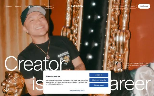
Authentic creator stories on a clean stage.
Color palette
Decorative highlights, accent icons, informational states – a light, active blue
Secondary brand accent, decorative elements — a bright, playful pink
Primary text, critical buttons, primary navigation elements, footer background — creates strong contrast and a confident presence
Page backgrounds, card surfaces, ghost button text and borders — provides a clean, bright foundation
Neutral form states, badge text, and quiet UI feedback where color should stay understated. Do not promote it to the primary CTA color
Muted helper text, disabled states, subtle indications — a soft gray that recedes visually
Typography
- Weights
- 250, 300, 350, 400, 500
- Sizes
- 8px, 14px, 15px, 22px, 26px, 27px, 39px, 54px, 128px, 188px
- Line height
- 0.87, 0.98, 1, 1.1, 1.2, 1.5
- Letter spacing
- -0.0600em, -0.0550em, -0.0400em, -0.0230em, -0.0200em, -0.0180em, 0.0200em
- Fallback
- Inter
Primary typeface for all headings, body text, and UI elements. Its custom nature and extensive weights create a distinct brand voice.
Spacing & shape
Components
Background: Ink (#000000), text: Canvas (#ffffff); 30px border-radius; padding: 15px vertical, 21px horizontal.
Background: transparent (rgba(0,0,0,0)), text: Canvas (#ffffff), border: 1px solid Iron (#1a1a1a); 30px border-radius; padding: 11.25px vertical, 18px horizontal.
Background: Ink (#000000), text: Canvas (#ffffff); 50% border-radius (perfect circle); padding: 14.25px all around.
Background: rgba(255, 255, 255, 0.16) (translucent white), text: Canvas (#ffffff); 37.5px border-radius; padding: 10.5px vertical, 21px horizontal.
Background: Canvas (#ffffff), no shadow; 30px border-radius; padding: 52.5px top, 75px bottom, 30px horizontal.
Background: transparent (rgba(0, 0, 0, 0)), text color: Canvas (#ffffff), border: 1px solid Iron (#1a1a1a); 45px border-radius; no internal padding.
Guidelines
- Use Oracle font family for all text elements, leveraging its custom weights for visual hierarchy.
- Apply Ink (#000000) for primary text and critical interactive button backgrounds.
- Ensure all buttons and cards have a minimum border-radius of 30px to maintain a soft, friendly aesthetic.
- Utilize Canvas (#ffffff) for page backgrounds and primary content surfaces to provide a crisp, clean base.
- Maintain comfortable spacing with a base unit of 4px; use 7px for element-level gaps and 14px for internal card padding.
- Emphasize the Sky Blue (#5fc1f1) accent color for functional indicators and non-critical highlights only.
- Integrate high-quality, authentic photography of creators as key visual elements where appropriate.
- Avoid using multiple colors for text; primary text should be Ink (#000000) and secondary text Iron (#1a1a1a) or Silver Thread (#959595).
- Do not introduce square or sharp-cornered elements; all interactive and content containers should adhere to the established radii.
- Refrain from using strong shadows or gradients on primary UI elements, favoring flat and clean surfaces.
- Do not use accent colors as background for large sections or text blocks unless explicitly defined as a semantic state.
- Do not clutter layouts with too many disparate elements; prioritize clear hierarchy and ample whitespace.
- Avoid generic stock photography; all imagery should feel genuine and creator-focused.
- Do not use font weights below 300 for body text to maintain readability.
About this system
ShowHide
Patreon leverages a canvas of real-world photography and a muted palette to ground its brand in authentic creator stories, overlaid with a clean, functional UI. Strong, confident typography paired with rounded components creates a friendly yet authoritative tone. The design prioritizes clear content presentation, with color used sparingly to highlight interactive elements and brand identity, rather than for decorative excess. It balances a feeling of welcoming accessibility with structural clarity.
The page model is a full-bleed layout, particularly for hero sections, which often feature large, compelling creator photography that extends to the viewport edges. Content is generally organized into digestible blocks with consistent vertical spacing, often alternating between visual styles. Hero sections utilize centered headlines over background imagery or video. Subsequent sections typically employ a responsive grid, with alternating text-left/image-right compositions often observed. Navigation is a flexible top bar that can adapt to light or dark contexts, featuring ghost buttons and a prominent filled action button.
The visual language is dominated by authentic photography of diverse creators, not stock imagery. Photos are typically high-quality and often feature subjects engaged in their craft, establishing a connection with the audience. Images are generally featured full-bleed or contained in soft-edged frames. Iconography is minimalist, often monochrome (Ink or Canvas), using thin strokes. There's a high density of imagery, with photos often acting as primary visual anchors rather than mere decoration or product showcases.
Reminiscent of Substack, Gumroad, Linktree, Medium.
# Patreon — Style Reference
> Authentic creator stories on a clean stage.

**Theme:** light

**Site:** https://www.patreon.com

Patreon leverages a canvas of real-world photography and a muted palette to ground its brand in authentic creator stories, overlaid with a clean, functional UI. Strong, confident typography paired with rounded components creates a friendly yet authoritative tone. The design prioritizes clear content presentation, with color used sparingly to highlight interactive elements and brand identity, rather than for decorative excess. It balances a feeling of welcoming accessibility with structural clarity.

## Tokens — Colors

| Name | Value | Token | Role |
|------|------|------|------|
| Sky Blue | `#5fc1f1` | `--color-sky-blue` | Decorative highlights, accent icons, informational states – a light, active blue |
| Vivid Pink | `#f15ff1` | `--color-vivid-pink` | Secondary brand accent, decorative elements — a bright, playful pink |
| Ink | `#000000` | `--color-ink` | Primary text, critical buttons, primary navigation elements, footer background — creates strong contrast and a confident presence |
| Canvas | `#ffffff` | `--color-canvas` | Page backgrounds, card surfaces, ghost button text and borders — provides a clean, bright foundation |
| Iron | `#1a1a1a` | `--color-iron` | Neutral form states, badge text, and quiet UI feedback where color should stay understated. Do not promote it to the primary CTA color |
| Silver Thread | `#959595` | `--color-silver-thread` | Muted helper text, disabled states, subtle indications — a soft gray that recedes visually |

## Tokens — Typography

### Oracle
- **Substitute:** Inter
- **Weights:** 250, 300, 350, 400, 500
- **Sizes:** 8px, 14px, 15px, 22px, 26px, 27px, 39px, 54px, 128px, 188px
- **Line height:** 0.87, 0.98, 1, 1.1, 1.2, 1.5
- **Letter spacing:** -0.0600em, -0.0550em, -0.0400em, -0.0230em, -0.0200em, -0.0180em, 0.0200em
- **Role:** Primary typeface for all headings, body text, and UI elements. Its custom nature and extensive weights create a distinct brand voice.

## Tokens — Type Scale

| Role | Size | Line height | Letter spacing |
|------|------|------|------|
| body-sm | 14px | 1.5 | -0.28px |
| subheading | 22px | 1.2 | -0.48px |
| heading-sm | 26px | 1.2 | -0.52px |
| heading | 39px | 1.1 | -0.78px |
| heading-lg | 54px | 1.1 | -0.97px |
| display | 128px | 0.98 | -2.3px |
| display-lg | 188px | 0.87 | -3.38px |

## Tokens — Spacing

- **Section gap:** 38px
- **Card padding:** 14px
- **Element gap:** 7px

## Tokens — Radius

- **Buttons:** 30px
- **Inputs:** 45px
- **Cards:** 30px
- **tags:** 37.5px

## Layout

The page model is a full-bleed layout, particularly for hero sections, which often feature large, compelling creator photography that extends to the viewport edges. Content is generally organized into digestible blocks with consistent vertical spacing, often alternating between visual styles. Hero sections utilize centered headlines over background imagery or video. Subsequent sections typically employ a responsive grid, with alternating text-left/image-right compositions often observed. Navigation is a flexible top bar that can adapt to light or dark contexts, featuring ghost buttons and a prominent filled action button.

## Imagery

The visual language is dominated by authentic photography of diverse creators, not stock imagery. Photos are typically high-quality and often feature subjects engaged in their craft, establishing a connection with the audience. Images are generally featured full-bleed or contained in soft-edged frames. Iconography is minimalist, often monochrome (Ink or Canvas), using thin strokes. There's a high density of imagery, with photos often acting as primary visual anchors rather than mere decoration or product showcases.

## Components

### Primary Filled Button
*Main call-to-action button, conveying confidence and directness.*

Background: Ink (#000000), text: Canvas (#ffffff); 30px border-radius; padding: 15px vertical, 21px horizontal.

### Ghost Button
*Secondary action or navigational link within a content block, visually recessive.*

Background: transparent (rgba(0,0,0,0)), text: Canvas (#ffffff), border: 1px solid Iron (#1a1a1a); 30px border-radius; padding: 11.25px vertical, 18px horizontal.

### Mini Circular Button
*Icon-only or small, self-contained actions, often navigational or functional.*

Background: Ink (#000000), text: Canvas (#ffffff); 50% border-radius (perfect circle); padding: 14.25px all around.

### Tag Button
*Categorization, filtering, or minor interactive elements.*

Background: rgba(255, 255, 255, 0.16) (translucent white), text: Canvas (#ffffff); 37.5px border-radius; padding: 10.5px vertical, 21px horizontal.

### Feature Card
*Content container for features or testimonials, elevated on the Canvas background.*

Background: Canvas (#ffffff), no shadow; 30px border-radius; padding: 52.5px top, 75px bottom, 30px horizontal.

### Search Input
*Allows users to query content without distracting visual weight.*

Background: transparent (rgba(0, 0, 0, 0)), text color: Canvas (#ffffff), border: 1px solid Iron (#1a1a1a); 45px border-radius; no internal padding.

## Guidelines

### Do

- Use Oracle font family for all text elements, leveraging its custom weights for visual hierarchy.
- Apply Ink (#000000) for primary text and critical interactive button backgrounds.
- Ensure all buttons and cards have a minimum border-radius of 30px to maintain a soft, friendly aesthetic.
- Utilize Canvas (#ffffff) for page backgrounds and primary content surfaces to provide a crisp, clean base.
- Maintain comfortable spacing with a base unit of 4px; use 7px for element-level gaps and 14px for internal card padding.
- Emphasize the Sky Blue (#5fc1f1) accent color for functional indicators and non-critical highlights only.
- Integrate high-quality, authentic photography of creators as key visual elements where appropriate.

### Don't

- Avoid using multiple colors for text; primary text should be Ink (#000000) and secondary text Iron (#1a1a1a) or Silver Thread (#959595).
- Do not introduce square or sharp-cornered elements; all interactive and content containers should adhere to the established radii.
- Refrain from using strong shadows or gradients on primary UI elements, favoring flat and clean surfaces.
- Do not use accent colors as background for large sections or text blocks unless explicitly defined as a semantic state.
- Do not clutter layouts with too many disparate elements; prioritize clear hierarchy and ample whitespace.
- Avoid generic stock photography; all imagery should feel genuine and creator-focused.
- Do not use font weights below 300 for body text to maintain readability.

## Agent Prompt Guide

primary action: #000000 (filled action)
Create a Primary Action Button: #000000 background, #ffffff text, 9999px radius, compact pill padding. Use this filled treatment for the main CTA.

Example Component Prompts:
1. Create a Hero Section: full-bleed background image with a centered headline 'Creativity Powered by Fandom' using Oracle font, size 128px, weight 250, letter-spacing -2.3px, color Canvas (#ffffff). Below it, a ghost button 'Get Started' with text Canvas (#ffffff), transparent background, 1px solid Iron (#1a1a1a) border, 30px radius, 11.25px vertical padding, 18px horizontal padding.
3. Create a Sub-Navigation Bar: Ghost Button elements; text Canvas (#ffffff), transparent background, 1px solid Iron (#1a1a1a) border, 30px radius, 11.25px vertical padding, 18px horizontal padding. Include an active 'Updates' button with a Tag Button style: rgba(255, 255, 255, 0.16) background, Canvas (#ffffff) text, 37.5px radius, 10.5px vertical padding, 21px horizontal padding.
More like this









Keep what you find
A free account saves references to boards and can send you a weekly email of picks based on what you save.
To see every result, go Pro.