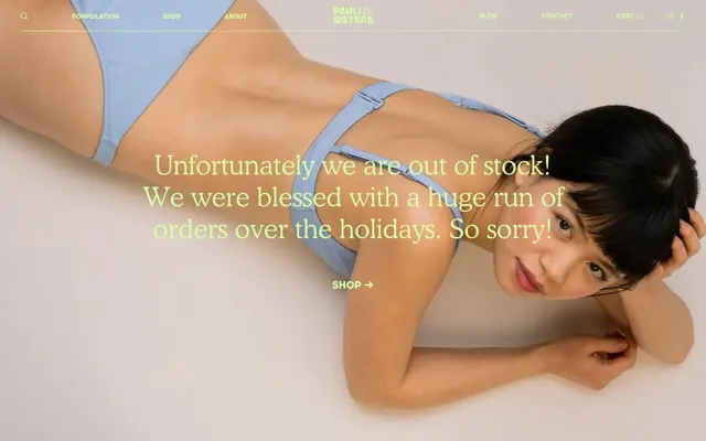
Preview image. Unlock full-res
Organic botanical serenity
Color palette
Primary text, outlined button borders, key interactive elements, subtle accent details for navigation and headings
Primary background for sections and cards, accent for outlined headings, and subtle interactive states
Input borders and placeholder text — a soft, almost imperceptible boundary
Background for secondary content blocks and design elements, providing a cool contrast to the dominant green palette
Background for informational panels and subtle surface changes, sitting between Sky Pale and Spring Meadow
Background for elevated content or distinctive sections, a slightly deeper cool tone
Typography
- Weights
- 300, 400
- Sizes
- 14px, 20px, 28px, 48px, 54px
- Line height
- 1.1, 1.2, 1.3
- Letter spacing
- normal
- Fallback
- Lora
Primary headings and display text, its light weight and classic serif form create an air of understated elegance and authority, almost like letterpress.
- Weights
- 400, 800
- Sizes
- 13px, 18px, 21px
- Line height
- 1.3
- Letter spacing
- normal
- Fallback
- Montserrat
Body copy, link text, and component labels. Its geometric sans-serif nature provides clarity and a modern, approachable counterbalance to the serif headings.
- Weights
- 400
- Sizes
- 45px
- Line height
- 1.1
- Letter spacing
- normal
- Fallback
- Playfair Display
Specific display headings and decorative text elements, bringing a unique, distinctive character to focal points.
Spacing & shape
Components
Appears as a transparent rectangle with a 'Forest Canopy' (#152800) border, 'Forest Canopy' text, 0px border-radius, and generous 30px vertical and 54px horizontal padding. The text should use Sharp Sans at 14px 400 weight.
Features a 'Limestone' (#8b9682) border, same color placeholder text, no background fill (transparent), and 0px border-radius. Padding is 22px vertical and 24px horizontal. Text input uses Cooper Lt BT Light at 14px 400 weight.
Transparent background with 'Forest Canopy' (#152800) text. Features large vertical padding of 44px with no horizontal padding, and 0px border-radius. Text uses Sharp Sans at 13px 400 weight.
Guidelines
- Always use 'Forest Canopy' (#152800) for primary text and key interactive elements.
- Prioritize 'Spring Meadow' (#d8ffa4) and 'Sky Pale' (#d0e3ff) for background sections to maintain brand neutrality.
- Employ generous vertical spacing, primarily using `sectionGap` of 70px between major content blocks.
- Set borders to 0px radius across all components for a sharp, deliberate aesthetic.
- Use Cooper Lt BT Light for all main headings and Sharp Sans for body copy and navigation links.
- Implement the 'Outline Ghost Button' for primary calls to action to reinforce the subtle interaction style.
- Ensure all input fields utilize a 'Limestone' (#8b9682) outline for consistent form styling.
- Avoid solid, filled buttons; all primary actions should be ghosted or outlined.
- Do not introduce strong accent colors outside the defined palette of greens and cool neutrals.
- Refrain from using any border-radius greater than 0px on UI elements.
- Avoid dense layouts; always maintain the generous 70px `sectionGap` between primary content blocks.
- Do not apply shadow to any component, maintaining a flat and clean visual style.
- Never use a different font family for headings or body text than Cooper Lt BT Light and Sharp Sans, respectively.
- Do not use inline padding for elements within components where specific `elementGap` of 6px or `cardPadding` of 24px should apply.
About this system
ShowHide
The Pauli & Sisters visual system evokes a natural and understated aesthetic, built upon a palette of organic greens and soft neutrals. Typography balances elegant, structured serifs with clean, approachable sans-serifs, creating a grounded yet refined feel. Spacing is generous, allowing elements to breathe and emphasizing content clarity over density. Components prioritize utility and a sense of craft, often appearing as subtle outlines or ghost elements rather than bold, filled forms.
The page uses a maximum width of 1341px, centered, creating a contained content experience. The hero section often features a full-width image with text overlaid, sometimes with a split layout incorporating a solid color panel. Section rhythm is managed through consistent vertical spacing of 70px and alternating background colors (Spring Meadow, Sky Pale, Faded Denim). Content is arranged in alternating text-left/image-right patterns, centered stacks for headlines, and occasional 2-column breakdowns for detailed information. Navigation is a sticky top bar with centrally aligned brand logo and dispersed links.
The visual language for imagery is a mix of product photography and stylized abstract graphics. Photography consists of authentic, unedited shots of models in natural poses, often with a subtle light blue or green tint. Product elements are minimal, tightly cropped, and presented directly. Illustrations are flat, organic shapes, relying on the brand's green palette. Icons are minimal, outlined, and monochromatic, maintaining a light stroke weight.
Reminiscent of Glossier, Seedlip, Byredo.
# Pauliandsisters — Style Reference
> Organic botanical serenity

**Theme:** light

**Site:** https://pauliandsisters.com

The Pauli & Sisters visual system evokes a natural and understated aesthetic, built upon a palette of organic greens and soft neutrals. Typography balances elegant, structured serifs with clean, approachable sans-serifs, creating a grounded yet refined feel. Spacing is generous, allowing elements to breathe and emphasizing content clarity over density. Components prioritize utility and a sense of craft, often appearing as subtle outlines or ghost elements rather than bold, filled forms.

## Tokens — Colors

| Name | Value | Token | Role |
|------|------|------|------|
| Forest Canopy | `#152800` | `--color-forest-canopy` | Primary text, outlined button borders, key interactive elements, subtle accent details for navigation and headings |
| Spring Meadow | `#d8ffa4` | `--color-spring-meadow` | Primary background for sections and cards, accent for outlined headings, and subtle interactive states |
| Limestone | `#8b9682` | `--color-limestone` | Input borders and placeholder text — a soft, almost imperceptible boundary |
| Sky Pale | `#d0e3ff` | `--color-sky-pale` | Background for secondary content blocks and design elements, providing a cool contrast to the dominant green palette |
| Faded Denim | `#bdd2dc` | `--color-faded-denim` | Background for informational panels and subtle surface changes, sitting between Sky Pale and Spring Meadow |
| Azure Haze | `#a0c8ff` | `--color-azure-haze` | Background for elevated content or distinctive sections, a slightly deeper cool tone |

## Tokens — Typography

### Cooper Lt BT Light
- **Substitute:** Lora
- **Weights:** 300, 400
- **Sizes:** 14px, 20px, 28px, 48px, 54px
- **Line height:** 1.1, 1.2, 1.3
- **Letter spacing:** normal
- **Role:** Primary headings and display text, its light weight and classic serif form create an air of understated elegance and authority, almost like letterpress.

### Sharp Sans
- **Substitute:** Montserrat
- **Weights:** 400, 800
- **Sizes:** 13px, 18px, 21px
- **Line height:** 1.3
- **Letter spacing:** normal
- **Role:** Body copy, link text, and component labels. Its geometric sans-serif nature provides clarity and a modern, approachable counterbalance to the serif headings.

### Beatrice
- **Substitute:** Playfair Display
- **Weights:** 400
- **Sizes:** 45px
- **Line height:** 1.1
- **Letter spacing:** normal
- **Role:** Specific display headings and decorative text elements, bringing a unique, distinctive character to focal points.

## Tokens — Type Scale

Augmented Fourth (1.414) from 13px base.

| Role | Size | Line height | Letter spacing |
|------|------|------|------|
| caption | 13px | 1.3 | — |
| subheading | 18px | 1.3 | — |
| heading-sm | 20px | 1.3 | — |
| heading-lg | 28px | 1.2 | — |
| display | 48px | 1.1 | — |

## Tokens — Spacing

- **Max width:** 1341px
- **Section gap:** 70px
- **Card padding:** 24px
- **Element gap:** 6px

## Tokens — Radius

- **none:** 0px

## Layout

The page uses a maximum width of 1341px, centered, creating a contained content experience. The hero section often features a full-width image with text overlaid, sometimes with a split layout incorporating a solid color panel. Section rhythm is managed through consistent vertical spacing of 70px and alternating background colors (Spring Meadow, Sky Pale, Faded Denim). Content is arranged in alternating text-left/image-right patterns, centered stacks for headlines, and occasional 2-column breakdowns for detailed information. Navigation is a sticky top bar with centrally aligned brand logo and dispersed links.

## Imagery

The visual language for imagery is a mix of product photography and stylized abstract graphics. Photography consists of authentic, unedited shots of models in natural poses, often with a subtle light blue or green tint. Product elements are minimal, tightly cropped, and presented directly. Illustrations are flat, organic shapes, relying on the brand's green palette. Icons are minimal, outlined, and monochromatic, maintaining a light stroke weight.

## Components

### Outline Ghost Button
*Primary call to action.*

Appears as a transparent rectangle with a 'Forest Canopy' (#152800) border, 'Forest Canopy' text, 0px border-radius, and generous 30px vertical and 54px horizontal padding. The text should use Sharp Sans at 14px 400 weight.

### Outline Text Input
*User input fields.*

Features a 'Limestone' (#8b9682) border, same color placeholder text, no background fill (transparent), and 0px border-radius. Padding is 22px vertical and 24px horizontal. Text input uses Cooper Lt BT Light at 14px 400 weight.

### Badge with Padding
*Informational labels or tags.*

Transparent background with 'Forest Canopy' (#152800) text. Features large vertical padding of 44px with no horizontal padding, and 0px border-radius. Text uses Sharp Sans at 13px 400 weight.

## Guidelines

### Do

- Always use 'Forest Canopy' (#152800) for primary text and key interactive elements.
- Prioritize 'Spring Meadow' (#d8ffa4) and 'Sky Pale' (#d0e3ff) for background sections to maintain brand neutrality.
- Employ generous vertical spacing, primarily using `sectionGap` of 70px between major content blocks.
- Set borders to 0px radius across all components for a sharp, deliberate aesthetic.
- Use Cooper Lt BT Light for all main headings and Sharp Sans for body copy and navigation links.
- Implement the 'Outline Ghost Button' for primary calls to action to reinforce the subtle interaction style.
- Ensure all input fields utilize a 'Limestone' (#8b9682) outline for consistent form styling.

### Don't

- Avoid solid, filled buttons; all primary actions should be ghosted or outlined.
- Do not introduce strong accent colors outside the defined palette of greens and cool neutrals.
- Refrain from using any border-radius greater than 0px on UI elements.
- Avoid dense layouts; always maintain the generous 70px `sectionGap` between primary content blocks.
- Do not apply shadow to any component, maintaining a flat and clean visual style.
- Never use a different font family for headings or body text than Cooper Lt BT Light and Sharp Sans, respectively.
- Do not use inline padding for elements within components where specific `elementGap` of 6px or `cardPadding` of 24px should apply.

## Agent Prompt Guide

Quick Color Reference:
text: #152800
background: #d8ffa4
border: #152800
accent: #d8ffa4
primary action: #152800 (outlined action border)

Example Component Prompts:
1. Create a primary call-to-action button: 'Outline Ghost Button' using 'Forest Canopy' (#152800) for text and border, 0px radius, 30px vertical and 54px horizontal padding. Text is Sharp Sans 400 at 14px.
2. Design an input field: 'Outline Text Input' with 'Limestone' (#8b9682) border, transparent background, 0px radius, 22px vertical and 24px horizontal padding. Placeholder text is 'Limestone' (#8b9682) using Cooper Lt BT Light 400 at 14px.
3. Build a prominent heading section: Background 'Spring Meadow' (#d8ffa4), headline 'Unfortunately we are out of stock!' using Cooper Lt BT Light 300 at 54px, 'Forest Canopy' (#152800) text color, with 70px spacing below. A subtle outlined accent below the heading should use 'Forest Canopy' (#152800) border.
More like this









Keep what you find
A free account saves references to boards and can send you a weekly email of picks based on what you save.
To see every result, go Pro.