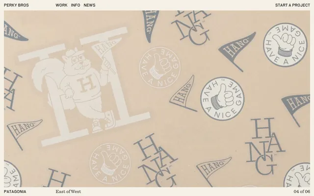
Preview image. Unlock full-res
Warm parchment atelier
Color palette
Decorative accents, perhaps hover states or subtle highlights – suggested by CSS tokens but not heavily used, indicating a reserved use of bold color
Subtle color accents, hints towards a natural, earthy secondary palette — also from CSS tokens for potential future use
Page backgrounds, card surfaces, primary content areas — a warm, creamy base echoing natural paper
Dark borders and separators for elevated surfaces and inverted UI. Do not promote it to the primary CTA color
Typography
- Weights
- 400
- Sizes
- 16px, 18px
- Line height
- 1.2
- Fallback
- Inter
Navigation links, body text, image captions, footer text — a concise, modern sans-serif that ensures clarity and efficiency in UI elements and supporting content. Its compact form contributes to the site's overall refined feel.
- Weights
- 400
- Sizes
- 19px, 60px
- Line height
- 1.13, 1.3
- Letter spacing
- -0.0120em
- Fallback
- Lora
Main headings, introductory body text — a distinctive serif with subtle negative letter-spacing that grants a sophisticated, almost custom-typeset feel to prominent textual blocks. It provides a warm, classic counterpoint to the sans-serif for impact.
Spacing & shape
Components
Text link using Dada-Grotesk-Medium, 16px, Charcoal Ink (#1e1f20), with a 1px solid Charcoal Ink (#1e1f20) border on hover or active.
Large text using QuadrantText-Regular, 60px, Charcoal Ink (#1e1f20), with -0.0120em letter-spacing. Line height 1.13 for visual density.
Text using QuadrantText-Regular, 19px, Charcoal Ink (#1e1f20), with -0.0120em letter-spacing. Line height 1.30 for comfortable reading.
Text link using Dada-Grotesk-Medium, 18px, Charcoal Ink (#1e1f20), typically appearing as part of a list or informational footer item.
Guidelines
- Use Ecru Canvas (#f5f1e7) as the dominant background color for all main content areas.
- Apply Charcoal Ink (#1e1f20) for all primary text, headings, and UI borders to create a stark, legible contrast.
- Set navigation links and UI labels in Dada-Grotesk-Medium (400) at 16px to 18px.
- Headings and prominent text blocks must use QuadrantText-Regular (400) with -0.0120em letter-spacing for a tailored, unique appearance.
- Maintain a comfortable density with 20px element gaps and 40px vertical section gaps.
- Use 1px solid borders in Charcoal Ink (#1e1f20) for interactive elements, reinforcing a crisp, defined structure.
- Avoid using bright or vivid colors for large backgrounds or primary UI elements; reserve them strictly for subtle accents (Ocean Deep, Desert Tan).
- Do not deviate from the specified letter-spacing for QuadrantText; it is a signature characteristic of the typographic style.
- Do not apply rounded corners or significant border-radius to elements; the system prioritizes sharp, defined edges.
- Do not use generic system fonts; always utilize Dada-Grotesk and QuadrantText (or their designated substitutes).
- Avoid heavy shadows or gradients; the design relies on flat planes and high contrast for visual hierarchy.
- Do not introduce unnecessary visual flair; maintain the clean, content-focused presentation.
About this system
ShowHide
Perky Bros employs a sophisticated, craft-oriented visual language with a limited, high-contrast palette. The design feels grounded and textural, with a prominent off-white background and deep charcoal accents. Typography is refined and deliberate, balancing a modern, compact sans-serif with a warm humanist serif. The layout emphasizes thoughtful content presentation with ample comfortable spacing, reflecting a considered approach to design.
The page structure favors a max-width contained layout, though the exact width is not explicitly fixed but appears comfortably wide. The hero section uses a full-bleed background with a textured overlay and centered brand-related graphics, giving way to a more contained content area. Content is arranged in a fluid, single-column stack, occasionally featuring side-by-side (text-left/image-right) arrangements for featured work. Vertical rhythm is established through consistent 40px section gaps. Navigation is a simple, sticky top bar with minimal links and a 'Start a project' right-aligned accent.
The visual language for imagery is mixed, featuring both product-focused illustrations and photography. Illustrations are predominantly flat, outlined, and monochromatic, often using brand-colored (Charcoal Ink) motifs that give a handcrafted, badge-like quality. Photography appears to be more natural and candid, potentially capturing textures or close-ups without heavy styling. Imagery functions decoratively to reinforce brand identity in some areas, and curatorially in others (e.g., project case study thumbnails). The visual density is moderate; images are used to break up text-dominant sections, but the UI itself remains clear and uncluttered.
Reminiscent of Focus Lab, Pentagram, Collins.
# Perky Bros — Style Reference
> Warm parchment atelier

**Theme:** light

**Site:** https://perkybros.com

Perky Bros employs a sophisticated, craft-oriented visual language with a limited, high-contrast palette. The design feels grounded and textural, with a prominent off-white background and deep charcoal accents. Typography is refined and deliberate, balancing a modern, compact sans-serif with a warm humanist serif. The layout emphasizes thoughtful content presentation with ample comfortable spacing, reflecting a considered approach to design.

## Tokens — Colors

| Name | Value | Token | Role |
|------|------|------|------|
| Ocean Deep | `#195df4` | `--color-ocean-deep` | Decorative accents, perhaps hover states or subtle highlights – suggested by CSS tokens but not heavily used, indicating a reserved use of bold color |
| Desert Tan | `#d4ae8b` | `--color-desert-tan` | Subtle color accents, hints towards a natural, earthy secondary palette — also from CSS tokens for potential future use |
| Ecru Canvas | `#f5f1e7` | `--color-ecru-canvas` | Page backgrounds, card surfaces, primary content areas — a warm, creamy base echoing natural paper |
| Charcoal Ink | `#1e1f20` | `--color-charcoal-ink` | Dark borders and separators for elevated surfaces and inverted UI. Do not promote it to the primary CTA color |

## Tokens — Typography

### Dada-Grotesk
- **Substitute:** Inter
- **Weights:** 400
- **Sizes:** 16px, 18px
- **Line height:** 1.2
- **Role:** Navigation links, body text, image captions, footer text — a concise, modern sans-serif that ensures clarity and efficiency in UI elements and supporting content. Its compact form contributes to the site's overall refined feel.

### QuadrantText
- **Substitute:** Lora
- **Weights:** 400
- **Sizes:** 19px, 60px
- **Line height:** 1.13, 1.3
- **Letter spacing:** -0.0120em
- **Role:** Main headings, introductory body text — a distinctive serif with subtle negative letter-spacing that grants a sophisticated, almost custom-typeset feel to prominent textual blocks. It provides a warm, classic counterpoint to the sans-serif for impact.

## Tokens — Spacing

- **Section gap:** 40px
- **Element gap:** 20px

## Tokens — Radius

- **Default:** 0px

## Layout

The page structure favors a max-width contained layout, though the exact width is not explicitly fixed but appears comfortably wide. The hero section uses a full-bleed background with a textured overlay and centered brand-related graphics, giving way to a more contained content area. Content is arranged in a fluid, single-column stack, occasionally featuring side-by-side (text-left/image-right) arrangements for featured work. Vertical rhythm is established through consistent 40px section gaps. Navigation is a simple, sticky top bar with minimal links and a 'Start a project' right-aligned accent.

## Imagery

The visual language for imagery is mixed, featuring both product-focused illustrations and photography. Illustrations are predominantly flat, outlined, and monochromatic, often using brand-colored (Charcoal Ink) motifs that give a handcrafted, badge-like quality. Photography appears to be more natural and candid, potentially capturing textures or close-ups without heavy styling. Imagery functions decoratively to reinforce brand identity in some areas, and curatorially in others (e.g., project case study thumbnails). The visual density is moderate; images are used to break up text-dominant sections, but the UI itself remains clear and uncluttered.

## Components

### Primary Navigation Link
*Top navigation items*

Text link using Dada-Grotesk-Medium, 16px, Charcoal Ink (#1e1f20), with a 1px solid Charcoal Ink (#1e1f20) border on hover or active.

### Feature Heading
*Section titles*

Large text using QuadrantText-Regular, 60px, Charcoal Ink (#1e1f20), with -0.0120em letter-spacing. Line height 1.13 for visual density.

### Body Text Block
*Main content paragraphs*

Text using QuadrantText-Regular, 19px, Charcoal Ink (#1e1f20), with -0.0120em letter-spacing. Line height 1.30 for comfortable reading.

### Information Link
*Contextual links in body/footer*

Text link using Dada-Grotesk-Medium, 18px, Charcoal Ink (#1e1f20), typically appearing as part of a list or informational footer item.

## Guidelines

### Do

- Use Ecru Canvas (#f5f1e7) as the dominant background color for all main content areas.
- Apply Charcoal Ink (#1e1f20) for all primary text, headings, and UI borders to create a stark, legible contrast.
- Set navigation links and UI labels in Dada-Grotesk-Medium (400) at 16px to 18px.
- Headings and prominent text blocks must use QuadrantText-Regular (400) with -0.0120em letter-spacing for a tailored, unique appearance.
- Maintain a comfortable density with 20px element gaps and 40px vertical section gaps.
- Use 1px solid borders in Charcoal Ink (#1e1f20) for interactive elements, reinforcing a crisp, defined structure.

### Don't

- Avoid using bright or vivid colors for large backgrounds or primary UI elements; reserve them strictly for subtle accents (Ocean Deep, Desert Tan).
- Do not deviate from the specified letter-spacing for QuadrantText; it is a signature characteristic of the typographic style.
- Do not apply rounded corners or significant border-radius to elements; the system prioritizes sharp, defined edges.
- Do not use generic system fonts; always utilize Dada-Grotesk and QuadrantText (or their designated substitutes).
- Avoid heavy shadows or gradients; the design relies on flat planes and high contrast for visual hierarchy.
- Do not introduce unnecessary visual flair; maintain the clean, content-focused presentation.

## Agent Prompt Guide

**Quick Color Reference**
- text: #1e1f20
- background: #f5f1e7
- border: #1e1f20
- accent: #195df4
- primary action: no distinct CTA color

**3-5 Example Component Prompts**
- Create a section divider: 1px solid, #1e1f20, width 100%. Margin 40px top and bottom.
- Create a site heading: QuadrantText-Regular, 60px, #1e1f20, letter-spacing -0.012em, line-height 1.13, centered.
- Create a navigation link: Dada-Grotesk-Medium, 16px, #1e1f20, hover state with 1px solid #1e1f20 border below text, 10px padding left/right.
- Create an introductory paragraph: QuadrantText-Regular, 19px, #1e1f20, letter-spacing -0.012em, line-height 1.30.
More like this









Keep what you find
A free account saves references to boards and can send you a weekly email of picks based on what you save.
To see every result, go Pro.