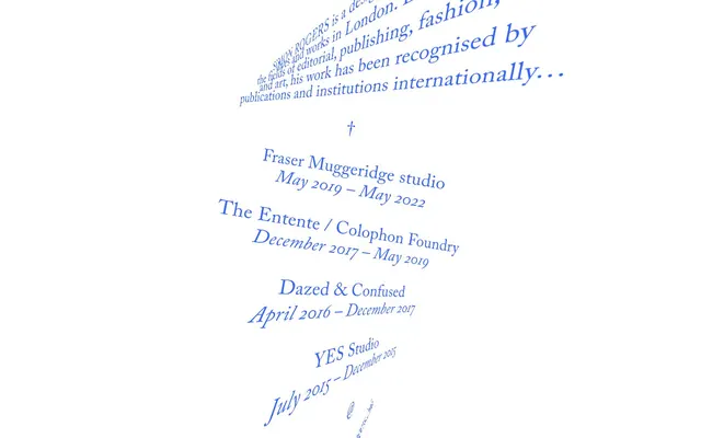
Preview image. Unlock full-res
typographic art installation
Color palette
Primary brand color for headings, links, active states, and decorative borders. Its vividness provides the main visual accent against the neutral background
Page backgrounds, primary surface for content
Secondary text, subtle details, borders in some contexts
Typography
- Weights
- 400
- Sizes
- 18px, 36px
- Line height
- 1.3
- Letter spacing
- -0.01em at 18px, -0.05em at 36px
- Fallback
- Georgia
Primary display and content text, embodying the distinctive slanted, art-focused style. Its custom nature is central to the visual identity.
- Weights
- 400
- Sizes
- 20px
- Line height
- 1.35
- Letter spacing
- -0.01em at 20px
- Fallback
- Playfair Display
An evocative secondary font for specific content blocks, offering a contrasting, perhaps more traditional textual texture.
Spacing & shape
Components
Uses 'Wazlon' at 36px, weight 400, in 'Designer Blue' (#3366ff), with precise letter-spacing to reinforce the brand's visual signature.
Text rendered in 'Designer Blue' (#3366ff), primarily using 'Wazlon' at 18px weight 400, indicating clickable elements without needing traditional button fills.
Appears in 'Ink Black' (#000000), using 'Wazlon' at 18px weight 400 for general information.
Uses 'Caslon Ionic' at 20px weight 400, in 'Ink Black' (#000000), providing a stylistic contrast for less prominent content.
Comprised of an unformatted text block, often with two lines, where the first is a 'Link Blue Text' and the second is 'Body Text Black', both from the 'Wazlon' family, defining a clear hierarchical pairing.
Guidelines
- Prioritize 'Designer Blue' (#3366ff) for all headings, links, and any element requiring visual prominence.
- Maintain a stark white background using 'Canvas White' (#ffffff) for all primary content areas.
- Utilize the custom font 'Wazlon' for all major text elements, leveraging its unique diagonal presentation seen in the screenshots.
- Implement 'Wazlon' at 36px, weight 400, with aggressive letter-spacing for main headings.
- Ensure 'Caslon Ionic' is used for secondary, contextual information at 20px weight 400 to introduce typographic variation.
- Use 'Ink Black' (#000000) sparingly for less prominent text elements or subtle borders, never as a primary brand color.
- Embrace the overall 'comfortable' density by ensuring ample white space around typographic elements rather than compact layouts.
- Avoid using any colors other than 'Designer Blue' or the neutrals (#ffffff, #000000) for UI elements.
- Do not use traditional button components; rely on 'Link Blue Text' for interactive elements.
- Refrain from introducing decorative gradients, shadows, or rounded corners; the aesthetic is flat and sharp.
- Do not break character from the custom fonts 'Wazlon' and 'Caslon Ionic'; this site's identity is deeply tied to its specific typography.
- Avoid generic imagery or illustrations; this site is text-dominant and graphically minimalist.
- Do not introduce complex grid systems or multi-column layouts; content should largely follow a linear, stacked progression modulated by text orientation.
About this system
ShowHide
Simon Rogers employs a minimalist, typographic-driven aesthetic, using a stark white canvas as a backdrop for highly expressive, diagonally-oriented text. The visual identity is built around a single vivid blue hue that establishes hierarchy and brand presence, contrasting sharply with the achromatic background. Typography takes center stage, with custom fonts and precise letter-spacing contributing to a distinctive, art-direction-focused feel. The system prioritizes visual impact and clarity through directness, eschewing complex componentry or superfluous ornamentation.
The page exhibits a full-bleed, vertically scrolled content model with highly dynamic, rotated text blocks. There is no traditional hero section; instead, the initial content presents key information in the brand's unique typographic style. Section rhythm is dictated by the strategic placement and rotation of text, with no explicit visual dividers or alternating color bands. Content arrangement is primarily centered and stacked, but heavily influenced by the diagonal orientation, creating an asymmetric flow. No discernible fixed grid for cards or features is present; the layout is fluid and driven by the textual art direction. The density is very spacious, emphasizing negative space around content. Navigation, if present, is implicit through clickable text links rather than distinct navigation bars.
The site is imagery-light, focusing almost exclusively on typography as its primary visual element. No photography, illustrations, or product screenshots are present. The 'imagery' is the highly stylized, diagonally-oriented typography itself. If any icons were to be introduced, they would likely be minimalist, line-based, and in 'Designer Blue' or 'Ink Black', serving purely functional roles rather than decorative ones. The visual density is extremely low, with text dominating the canvas.
Reminiscent of AIGA Eye on Design, Certain graphic design portfolios, Some conceptual art websites, Actual Source.
# Simon Rogers — Style Reference
> typographic art installation

**Theme:** light

**Site:** https://www.simonrogers.info

Simon Rogers employs a minimalist, typographic-driven aesthetic, using a stark white canvas as a backdrop for highly expressive, diagonally-oriented text. The visual identity is built around a single vivid blue hue that establishes hierarchy and brand presence, contrasting sharply with the achromatic background. Typography takes center stage, with custom fonts and precise letter-spacing contributing to a distinctive, art-direction-focused feel. The system prioritizes visual impact and clarity through directness, eschewing complex componentry or superfluous ornamentation.

## Tokens — Colors

| Name | Value | Token | Role |
|------|------|------|------|
| Designer Blue | `#3366ff` | `--color-designer-blue` | Primary brand color for headings, links, active states, and decorative borders. Its vividness provides the main visual accent against the neutral background |
| Canvas White | `#ffffff` | `--color-canvas-white` | Page backgrounds, primary surface for content |
| Ink Black | `#000000` | `--color-ink-black` | Secondary text, subtle details, borders in some contexts |

## Tokens — Typography

### Wazlon
- **Substitute:** Georgia
- **Weights:** 400
- **Sizes:** 18px, 36px
- **Line height:** 1.3
- **Letter spacing:** -0.01em at 18px, -0.05em at 36px
- **Role:** Primary display and content text, embodying the distinctive slanted, art-focused style. Its custom nature is central to the visual identity.

### Caslon Ionic
- **Substitute:** Playfair Display
- **Weights:** 400
- **Sizes:** 20px
- **Line height:** 1.35
- **Letter spacing:** -0.01em at 20px
- **Role:** An evocative secondary font for specific content blocks, offering a contrasting, perhaps more traditional textual texture.

## Tokens — Radius

- **Default:** 0px

## Layout

The page exhibits a full-bleed, vertically scrolled content model with highly dynamic, rotated text blocks. There is no traditional hero section; instead, the initial content presents key information in the brand's unique typographic style. Section rhythm is dictated by the strategic placement and rotation of text, with no explicit visual dividers or alternating color bands. Content arrangement is primarily centered and stacked, but heavily influenced by the diagonal orientation, creating an asymmetric flow. No discernible fixed grid for cards or features is present; the layout is fluid and driven by the textual art direction. The density is very spacious, emphasizing negative space around content. Navigation, if present, is implicit through clickable text links rather than distinct navigation bars.

## Imagery

The site is imagery-light, focusing almost exclusively on typography as its primary visual element. No photography, illustrations, or product screenshots are present. The 'imagery' is the highly stylized, diagonally-oriented typography itself. If any icons were to be introduced, they would likely be minimalist, line-based, and in 'Designer Blue' or 'Ink Black', serving purely functional roles rather than decorative ones. The visual density is extremely low, with text dominating the canvas.

## Components

### Headline Blue Text
*Primary section titles and key information*

Uses 'Wazlon' at 36px, weight 400, in 'Designer Blue' (#3366ff), with precise letter-spacing to reinforce the brand's visual signature.

### Link Blue Text
*Interactive elements and primary navigation items*

Text rendered in 'Designer Blue' (#3366ff), primarily using 'Wazlon' at 18px weight 400, indicating clickable elements without needing traditional button fills.

### Body Text Black
*Standard descriptive text and functional content*

Appears in 'Ink Black' (#000000), using 'Wazlon' at 18px weight 400 for general information.

### Subtle Contextual Text
*Secondary information, dates, or explanatory notes*

Uses 'Caslon Ionic' at 20px weight 400, in 'Ink Black' (#000000), providing a stylistic contrast for less prominent content.

### List Item
*Structured lists of content, such as experience entries*

Comprised of an unformatted text block, often with two lines, where the first is a 'Link Blue Text' and the second is 'Body Text Black', both from the 'Wazlon' family, defining a clear hierarchical pairing.

## Guidelines

### Do

- Prioritize 'Designer Blue' (#3366ff) for all headings, links, and any element requiring visual prominence.
- Maintain a stark white background using 'Canvas White' (#ffffff) for all primary content areas.
- Utilize the custom font 'Wazlon' for all major text elements, leveraging its unique diagonal presentation seen in the screenshots.
- Implement 'Wazlon' at 36px, weight 400, with aggressive letter-spacing for main headings.
- Ensure 'Caslon Ionic' is used for secondary, contextual information at 20px weight 400 to introduce typographic variation.
- Use 'Ink Black' (#000000) sparingly for less prominent text elements or subtle borders, never as a primary brand color.
- Embrace the overall 'comfortable' density by ensuring ample white space around typographic elements rather than compact layouts.

### Don't

- Avoid using any colors other than 'Designer Blue' or the neutrals (#ffffff, #000000) for UI elements.
- Do not use traditional button components; rely on 'Link Blue Text' for interactive elements.
- Refrain from introducing decorative gradients, shadows, or rounded corners; the aesthetic is flat and sharp.
- Do not break character from the custom fonts 'Wazlon' and 'Caslon Ionic'; this site's identity is deeply tied to its specific typography.
- Avoid generic imagery or illustrations; this site is text-dominant and graphically minimalist.
- Do not introduce complex grid systems or multi-column layouts; content should largely follow a linear, stacked progression modulated by text orientation.

## Agent Prompt Guide

Quick Color Reference:
text: #000000
background: #ffffff
border: #3366ff (decorative)
accent: #3366ff
primary action: #3366ff (outlined action border)

Example Component Prompts:
Create a primary headline: 'Wazlon' font, 36px, weight 400, 'Designer Blue' (#3366ff) color, with negative letter spacing, rotated to 15 degrees.
Create a link: 'Wazlon' font, 18px, weight 400, 'Designer Blue' (#3366ff) color, no underline by default, with slight negative letter spacing.
Create a body text paragraph: 'Wazlon' font, 18px, weight 400, 'Ink Black' (#000000) color, with standard letter spacing and line height.
Create a contextual date tag: 'Caslon Ionic' font, 20px, weight 400, 'Ink Black' (#000000) color, with slight negative letter spacing, positioned near a link.
Create a decorative border: 1px solid stroke in 'Designer Blue' (#3366ff) that acts as a subtle separator or framing element.
More like this









Keep what you find
A free account saves references to boards and can send you a weekly email of picks based on what you save.
To see every result, go Pro.