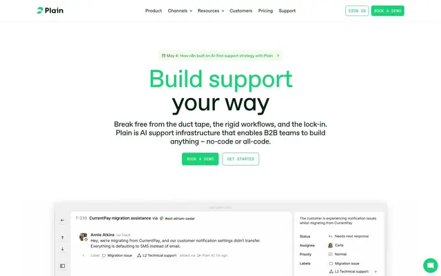
Preview image. Unlock full-res
Crisp digital workbench
Color palette
Primary brand accent. Used for filled call-to-action buttons, active states, key links, and decorative elements
A slightly darker, more subdued version of Plain Green, appearing in text links and as a border for ghost buttons, maintaining brand consistency with less visual intensity
Red wash for highlight backgrounds, decorative bands, and soft emphasis behind content. Use as a supporting accent, not as a status color
Accent for specific text highlights or border elements, providing a subtle, warm contrast
Primary page background, modal backgrounds, and pristine content areas. Serves as the base for all UI elements
Subtle background for informational sections and secondary content blocks, providing a soft lift from the pure white canvas. Also used for outlined button backgrounds
Background for cards and elevated components, offering a slightly warmer off-white tone than the main canvas
Primary text color for headings and body copy. Also used for borders around text elements and some icon fills
Background for specific card variants, providing a dark, grounded alternative to the lighter card surfaces
Muted text for secondary information, subheadings, and soft outlines, providing a hint of color while remaining neutral
Used for hard borders, lines, and some icon details to create sharp distinctions and visual structure
Typography
- Weights
- 400
- Sizes
- 12px
- Line height
- 1.2
sans-serif — detected in extracted data but not described by AI
- Weights
- 400, 500
- Sizes
- 13px, 15px, 18px, 24px, 48px, 80px
- Line height
- 0.95, 1, 1.17, 1.33, 1.46
- Letter spacing
- -0.0200em (at 80px, 48px), -0.0100em (at 24px, 18px), normal (at 15px, 13px)
- Fallback
- Inter
Primary brand typeface for headings, body text, and key UI elements. Its geometric sans-serif nature provides a modern, crisp, and highly readable foundation.
- Weights
- 500
- Sizes
- 13px
- Line height
- 1.46
- Letter spacing
- 0.0150em
- Fallback
- JetBrains Mono
Used for code snippets, timestamps, secondary navigation, and functional labels where precise character alignment and a technical feel are desired. The specific font features enhance its unique character.
- Line height
- 1.2
- Letter spacing
- normal
A fallback or utility font for small interface elements, ensuring broad compatibility and system-level performance. Often seen in metadata, tags, and incidental text.
Spacing & shape
Components
Solid filled button with Plain Green background (#1ad379) and Ash Graphite text (#0a2414). Border-radius of 6px, with 8px vertical and 10px horizontal padding. Prominently guides user action.
Outline button with Ghost Fog background (#f3fbe9), Plain Green text (#1ad379), and Plain Green border. Border-radius 6px, with 5px vertical and 10px (variable) horizontal padding. Offers a less dominant interactive element.
Card with Vanilla Cream background (#f9f6f1) and 9px border-radius. No box-shadow. Padding defaults to 24px internally. Used for grouping related content.
Card with Deep Forest background (#283a2e) and 9px border-radius. No box-shadow. Padding is generous at 40px, creating a rich content block.
Card with Alert Red background (#360003) and 9px border-radius. No box-shadow. Contains specific content that needs to stand out, with 24px padding.
Text in Plain Green Muted (#17b267) within body copy. Often used for navigation or inline references.
Text in Ash Graphite (#0a2414) on transparent background. Used in the header, indicating navigatable sections without strong visual emphasis until hovered/active.
Guidelines
- Use ABC Favorit for all primary text content. Opt for weight 400 for body and 500 for headlines to establish clear hierarchy.
- Apply Plain Green (#1ad379) strictly for primary calls to action, active states, and small, functional brand accents.
- Maintain a clear visual hierarchy using the surface progression: Canvas White (#ffffff) as base, Ghost Fog (#f3fbe9) for secondary blocks, and Vanilla Cream (#f9f6f1) for cards.
- Ensure all buttons and interactive elements utilize a 6px border-radius for a consistent, subtle rounding.
- Implement 24px as the standard element gap for moderate spacing between distinct UI components.
- Use Geist Mono (#13px, weight 500) for all code snippets, timestamps, and interface labels requiring a technical, structured feel, applying specialized font features 'ss02' and 'ss06'.
- Employ System Black (#000000) for hard lines and borders to create sharp, deliberate divisions and structure without relying on heavy shadows.
- Do not introduce new saturated accent colors outside of Plain Green; rely on the established brand green for all chromatic interactions.
- Avoid heavy box-shadows or complex elevation styles; prefer clean, flat surfaces or subtle background color changes for depth.
- Do not use generic system fonts for prominent headings or body copy; ABC Favorit and Geist Mono are essential to the brand's typographic identity.
- Do not deviate from the specified border-radii of 6px for interactive elements and 9px for cards; inconsistent rounding undermines the visual precision.
- Do not use color for purely decorative purposes, apply it functionally to highlight interactions, status, or brand identity.
- Avoid wide, full-bleed content sections; maintain a comfortable maximum content width and centered layout for readability.
- Do not overuse bold weights in text; the system relies on subtle weight shifts and specific font choices to convey hierarchy and distinction.
About this system
ShowHide
Plain's design system evokes a digital workbench aesthetic: a clean white canvas overlaid with distinct, slightly textured surfaces. The typography is precise and functional, favoring mono-spaced and geometric sans-serifs. A single vibrant green serves as the primary accent, activating interactive elements and key information against an otherwise subdued, near-monochromatic palette. Components are lightweight with subtle shadow work, emphasizing information over heavy ornamentation.
The page operates on a contained width model with no explicit maximum width detected, suggesting a fluid-responsive approach that favors readability within a comfortable range. The hero section prominently features a centered headline over a white background, immediately followed by the main call-to-action buttons. Content sections typically flow with consistent vertical spacing (defaulting to 40px), alternating between text-heavy blocks and product screenshots often presented as centered elements or within cards. Navigation is a sticky top bar with ghost buttons and distinct accent buttons for calls to action.
The site predominantly uses product screenshots and abstract, data-driven visualizations to explain concepts. Photography is minimal, appearing as contained, often masked elements that avoid full-bleed or overlapping treatments. Icons are outlined, lightweight, and mono-color, typically using Ash Graphite or Plain Green, serving as functional indicators rather than decorative elements. The overall density of imagery is balanced, visually supporting text-dominant sections without overwhelming them.
Reminiscent of Linear, Stripe, Vercel, Notion.
# Plain — Style Reference
> Crisp digital workbench

**Theme:** light

**Site:** https://plain.com

Plain's design system evokes a digital workbench aesthetic: a clean white canvas overlaid with distinct, slightly textured surfaces. The typography is precise and functional, favoring mono-spaced and geometric sans-serifs. A single vibrant green serves as the primary accent, activating interactive elements and key information against an otherwise subdued, near-monochromatic palette. Components are lightweight with subtle shadow work, emphasizing information over heavy ornamentation.

## Tokens — Colors

| Name | Value | Token | Role |
|------|------|------|------|
| Plain Green | `#1ad379` | `--color-plain-green` | Primary brand accent. Used for filled call-to-action buttons, active states, key links, and decorative elements |
| Plain Green Muted | `#17b267` | `--color-plain-green-muted` | A slightly darker, more subdued version of Plain Green, appearing in text links and as a border for ghost buttons, maintaining brand consistency with less visual intensity |
| Alert Red | `#360003` | `--color-alert-red` | Red wash for highlight backgrounds, decorative bands, and soft emphasis behind content. Use as a supporting accent, not as a status color |
| Warm Pink | `#ffbac3` | `--color-warm-pink` | Accent for specific text highlights or border elements, providing a subtle, warm contrast |
| Canvas White | `#ffffff` | `--color-canvas-white` | Primary page background, modal backgrounds, and pristine content areas. Serves as the base for all UI elements |
| Ghost Fog | `#f3fbe9` | `--color-ghost-fog` | Subtle background for informational sections and secondary content blocks, providing a soft lift from the pure white canvas. Also used for outlined button backgrounds |
| Vanilla Cream | `#f9f6f1` | `--color-vanilla-cream` | Background for cards and elevated components, offering a slightly warmer off-white tone than the main canvas |
| Ash Graphite | `#0a2414` | `--color-ash-graphite` | Primary text color for headings and body copy. Also used for borders around text elements and some icon fills |
| Deep Forest | `#283a2e` | `--color-deep-forest` | Background for specific card variants, providing a dark, grounded alternative to the lighter card surfaces |
| Sage Green | `#607166` | `--color-sage-green` | Muted text for secondary information, subheadings, and soft outlines, providing a hint of color while remaining neutral |
| System Black | `#000000` | `--color-system-black` | Used for hard borders, lines, and some icon details to create sharp distinctions and visual structure |

## Tokens — Typography

### sans-serif
- **Weights:** 400
- **Sizes:** 12px
- **Line height:** 1.2
- **Role:** sans-serif — detected in extracted data but not described by AI

### ABC Favorit
- **Substitute:** Inter
- **Weights:** 400, 500
- **Sizes:** 13px, 15px, 18px, 24px, 48px, 80px
- **Line height:** 0.95, 1, 1.17, 1.33, 1.46
- **Letter spacing:** -0.0200em (at 80px, 48px), -0.0100em (at 24px, 18px), normal (at 15px, 13px)
- **Role:** Primary brand typeface for headings, body text, and key UI elements. Its geometric sans-serif nature provides a modern, crisp, and highly readable foundation.

### Geist Mono
- **Substitute:** JetBrains Mono
- **Weights:** 500
- **Sizes:** 13px
- **Line height:** 1.46
- **Letter spacing:** 0.0150em
- **Role:** Used for code snippets, timestamps, secondary navigation, and functional labels where precise character alignment and a technical feel are desired. The specific font features enhance its unique character.

### system-ui
- **Line height:** 1.2
- **Letter spacing:** normal
- **Role:** A fallback or utility font for small interface elements, ensuring broad compatibility and system-level performance. Often seen in metadata, tags, and incidental text.

## Tokens — Type Scale

| Role | Size | Line height | Letter spacing |
|------|------|------|------|
| caption | 12px | 1.2 | — |
| body | 15px | 1.33 | — |
| subheading | 18px | 1.17 | -0.18px |
| heading | 24px | 1.17 | -0.24px |
| heading-lg | 48px | 1.04 | -0.96px |
| display | 80px | 0.95 | -1.6px |

## Tokens — Spacing

- **Section gap:** 40px
- **Card padding:** 24px
- **Element gap:** 24px

## Tokens — Radius

- **General:** 6px
- **Buttons:** 6px
- **Cards:** 9px

## Layout

The page operates on a contained width model with no explicit maximum width detected, suggesting a fluid-responsive approach that favors readability within a comfortable range. The hero section prominently features a centered headline over a white background, immediately followed by the main call-to-action buttons. Content sections typically flow with consistent vertical spacing (defaulting to 40px), alternating between text-heavy blocks and product screenshots often presented as centered elements or within cards. Navigation is a sticky top bar with ghost buttons and distinct accent buttons for calls to action.

## Imagery

The site predominantly uses product screenshots and abstract, data-driven visualizations to explain concepts. Photography is minimal, appearing as contained, often masked elements that avoid full-bleed or overlapping treatments. Icons are outlined, lightweight, and mono-color, typically using Ash Graphite or Plain Green, serving as functional indicators rather than decorative elements. The overall density of imagery is balanced, visually supporting text-dominant sections without overwhelming them.

## Components

### Primary Action Button
*Main call-to-action*

Solid filled button with Plain Green background (#1ad379) and Ash Graphite text (#0a2414). Border-radius of 6px, with 8px vertical and 10px horizontal padding. Prominently guides user action.

### Outlined Accent Button
*Secondary action button*

Outline button with Ghost Fog background (#f3fbe9), Plain Green text (#1ad379), and Plain Green border. Border-radius 6px, with 5px vertical and 10px (variable) horizontal padding. Offers a less dominant interactive element.

### Light Content Card
*Neutral information container*

Card with Vanilla Cream background (#f9f6f1) and 9px border-radius. No box-shadow. Padding defaults to 24px internally. Used for grouping related content.

### Dark Themed Card
*Emphasized or themed content container*

Card with Deep Forest background (#283a2e) and 9px border-radius. No box-shadow. Padding is generous at 40px, creating a rich content block.

### Alert Card
*Indicator for critical or urgent information*

Card with Alert Red background (#360003) and 9px border-radius. No box-shadow. Contains specific content that needs to stand out, with 24px padding.

### Text Link Active
*Interactive text link*

Text in Plain Green Muted (#17b267) within body copy. Often used for navigation or inline references.

### Ghost Navigation Button
*Top navigation item*

Text in Ash Graphite (#0a2414) on transparent background. Used in the header, indicating navigatable sections without strong visual emphasis until hovered/active.

## Guidelines

### Do

- Use ABC Favorit for all primary text content. Opt for weight 400 for body and 500 for headlines to establish clear hierarchy.
- Apply Plain Green (#1ad379) strictly for primary calls to action, active states, and small, functional brand accents.
- Maintain a clear visual hierarchy using the surface progression: Canvas White (#ffffff) as base, Ghost Fog (#f3fbe9) for secondary blocks, and Vanilla Cream (#f9f6f1) for cards.
- Ensure all buttons and interactive elements utilize a 6px border-radius for a consistent, subtle rounding.
- Implement 24px as the standard element gap for moderate spacing between distinct UI components.
- Use Geist Mono (#13px, weight 500) for all code snippets, timestamps, and interface labels requiring a technical, structured feel, applying specialized font features 'ss02' and 'ss06'.
- Employ System Black (#000000) for hard lines and borders to create sharp, deliberate divisions and structure without relying on heavy shadows.

### Don't

- Do not introduce new saturated accent colors outside of Plain Green; rely on the established brand green for all chromatic interactions.
- Avoid heavy box-shadows or complex elevation styles; prefer clean, flat surfaces or subtle background color changes for depth.
- Do not use generic system fonts for prominent headings or body copy; ABC Favorit and Geist Mono are essential to the brand's typographic identity.
- Do not deviate from the specified border-radii of 6px for interactive elements and 9px for cards; inconsistent rounding undermines the visual precision.
- Do not use color for purely decorative purposes, apply it functionally to highlight interactions, status, or brand identity.
- Avoid wide, full-bleed content sections; maintain a comfortable maximum content width and centered layout for readability.
- Do not overuse bold weights in text; the system relies on subtle weight shifts and specific font choices to convey hierarchy and distinction.

## Agent Prompt Guide

Quick Color Reference:
text: #0a2414
background: #ffffff
border: #000000
accent: #1ad379
primary action: #1ad379 (filled action)

Example Component Prompts:
1. Create a Primary Action Button: #1ad379 background, #000000 text, 9999px radius, compact pill padding. Use this filled treatment for the main CTA.
2. Create a Light Content Card: Vanilla Cream background (#f9f6f1), 9px border-radius, 24px internal padding. Inside, use a subheading 'Card Title' (ABC Favorit, weight 500, size 24px, #0a2414) and body text 'Card content goes here.' (ABC Favorit, weight 400, size 15px, #0a2414).
3. Create a Dark Themed Card: Deep Forest background (#283a2e), 9px border-radius, 40px internal padding. Inside, use a heading 'Feature Highlight' (ABC Favorit, weight 500, size 48px, #ffffff) and body text 'Detailed description of the feature.' (ABC Favorit, weight 400, size 18px, #f3fbe9).
More like this





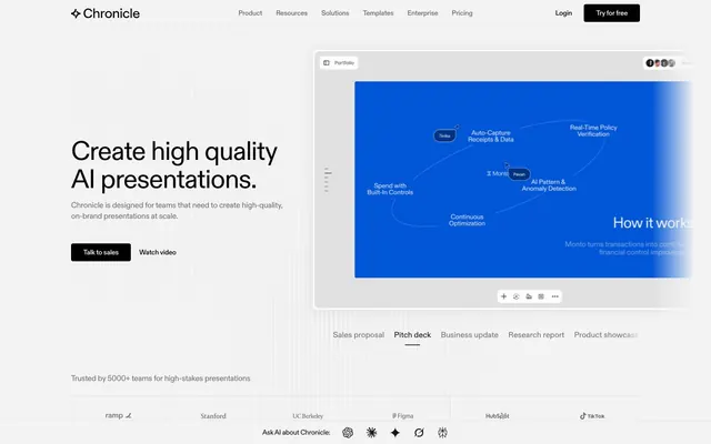




Keep what you find
A free account saves references to boards and can send you a weekly email of picks based on what you save.
To see every result, go Pro.