Preview image. Unlock full-res
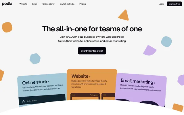
Playful market stall atop soft-glowing white
Color palette
Feature card backgrounds, secondary actionable contexts
Feature card backgrounds, decorative elements
Feature card accents, decorative background shapes
Feature card accents, decorative background shapes, subtle card borders
Feature card accents, decorative background shapes
Primary text, outline buttons, card borders, interactive elements
Secondary text, solid buttons, card background transitions
Page backgrounds, prominent card surfaces, primary button text
Light surface background, subtle button text, icon accents
Main page background, subtle elevated card backgrounds, link backgrounds
Text for buttons and body copy on dark backgrounds, icon accents
Typography
- Weights
- 400, 500, 700
- Sizes
- 11px, 12px, 16px, 18px, 20px, 22px, 24px, 36px, 40px, 60px
- Line height
- 1
- Letter spacing
- -1.8px, -1.2px, -1.08px, -0.72px, -0.66px, -0.6px, -0.54px, -0.48px, -0.36px, -0.33px
- Fallback
- Inter
All text elements: headlines, body copy, navigation, and buttons. Its varied weights and negative letter-spacing for larger sizes contribute to a cohesive yet dynamic feel, avoiding a rigid grid.
Spacing & shape
Components
Solid Ink Black (#06040e) background with Cloud Gray (#e1edf2) text. Features generous 16px vertical and 24px horizontal padding with a 14px border radius for a soft, inviting action. Used for 'Start your free trial' and 'Sign up free'.
Solid Deep Ocean (#10242f) background with Cloud Gray (#e1edf2) text. Has 10px vertical and 16px horizontal padding with an 8px border radius. Used for 'Learn more' actions.
Transparent background with Ink Black (#06040e) text and a 1px Ink Black (#06040e) border. Features 10px vertical and 16px horizontal padding with an 8px border radius.
Card with Sky Blue (#a5c8d8) background and Ink Black (#06040e) text content. Rounded corners at 56px radius to signify a soft, approachable container. No discernible padding beyond content flow.
Card with Sunset Orange (#e39a4d) background and Ink Black (#06040e) text content. Rounded corners at 56px radius. No discernible padding beyond content flow.
Card with Rich Plum (#1f1738) background and Light Peach (#f6ddc4) text content, with borders of Lavender Mist (#cbb0eb). Rounded corners at 56px radius. No discernible padding beyond content flow.
Guidelines
- Prioritize Ink Black (#06040e) for primary text and interactive outlines to maintain clarity and contrast.
- Use Crystal Canvas (#ffffff) or Warm Sand (#f5f5f5) as primary page and card backgrounds to establish a light, inviting base.
- Apply a 16px border radius to all interactive buttons for a consistent, soft touch.
- Employ the negative letter-spacing from StabilGrotesk for all headings and large text to achieve a modern, condensed appearance.
- Emphasize features using the distinct accent colors—Sky Blue (#a5c8d8), Sunset Orange (#e39a4d), and Lavender Mist (#cbb0eb)—for card backgrounds or decorative elements.
- Maintain an element gap of 16px and card padding of 16px to ensure comfortable information density.
- Utilize Ink Black (#06040e) as the background for primary call-to-action buttons, pairing it with Cloud Gray (#e1edf2) text for high contrast.
- Avoid arbitrary border radii; stick to 16px for buttons, 8px for links, and 56px for prominent cards.
- Do not introduce strong, saturated colors unless they are one of the defined accent colors for feature emphasis.
- Do not use generic system fonts; StabilGrotesk is essential for maintaining the brand's typographic personality.
- Avoid heavy shadows or gradients; rely on distinct background colors and rounded corners for visual separation and depth.
- Do not stray from the defined spacing values of 16px for elements and cards, or 40px for section gaps.
- Do not use highly chromatic colors for primary body text; keep body copy in Ink Black (#06040e) or Deep Ocean (#10242f).
- Avoid using Light Peach (#f6ddc4) for backgrounds; its primary role is text on dark surfaces or icon accents.
About this system
ShowHide
Podia presents a vibrant digital market stall. Its visual system layers playful, organic shapes over a soft, almost glowing white canvas. Information is presented in distinct, elevated cards with rounded corners that hint at approachability, while typography maintains a friendly confidence. A palette of muted pastels and warm earth tones, punctuated by deep near-black text and accents, creates a welcoming and engaging product-focused environment.
The page uses a maximum width containment for most content at the top, then transitions to a full-bleed layout for sections with larger cards and background elements, often with implicit centered content. The hero section features a prominent centered headline over a light background with floating, abstract shapes. Sections follow a rhythm of consistent vertical spacing, often with alternating light and slightly darker gray bands, utilizing card grids for feature showcases (typically three columns, but also two). Content often follows a text-left/image-right or image-left/text-right pattern. The primary navigation is a sticky top bar with minimal links and a clear 'Sign up free' button.
This site uses a mix of light, candid lifestyle photography, abstract geometric shapes, and stylized product illustrations. Photography focuses on diverse individuals with a slightly desaturated, natural tone, often cropped to a circular or organic shape. Illustrations are flat, two-dimensional, and utilize the brand's accent colors, serving as explanatory content or decorative atmosphere. Product screenshots are typically nested within abstract card designs. Icons are outlined, lightweight, and monochrome, often accompanying text for clarity. The overall density is balanced, with imagery often contained within specific card structures or as floating background graphics, complementing the UI rather than dominating it.
Reminiscent of ConvertKit, Teachable, Carrd, CreatorKit, Stripe.
# Podia — Style Reference
> Playful market stall atop soft-glowing white

**Theme:** light

**Site:** https://www.podia.com

Podia presents a vibrant digital market stall. Its visual system layers playful, organic shapes over a soft, almost glowing white canvas. Information is presented in distinct, elevated cards with rounded corners that hint at approachability, while typography maintains a friendly confidence. A palette of muted pastels and warm earth tones, punctuated by deep near-black text and accents, creates a welcoming and engaging product-focused environment.

## Tokens — Colors

| Name | Value | Token | Role |
|------|------|------|------|
| Rich Plum | `#1f1738` | `--color-rich-plum` | Feature card backgrounds, secondary actionable contexts |
| Earthy Umber | `#452623` | `--color-earthy-umber` | Feature card backgrounds, decorative elements |
| Sky Blue | `#a5c8d8` | `--color-sky-blue` | Feature card accents, decorative background shapes |
| Lavender Mist | `#cbb0eb` | `--color-lavender-mist` | Feature card accents, decorative background shapes, subtle card borders |
| Sunset Orange | `#e39a4d` | `--color-sunset-orange` | Feature card accents, decorative background shapes |
| Ink Black | `#06040e` | `--color-ink-black` | Primary text, outline buttons, card borders, interactive elements |
| Deep Ocean | `#10242f` | `--color-deep-ocean` | Secondary text, solid buttons, card background transitions |
| Crystal Canvas | `#ffffff` | `--color-crystal-canvas` | Page backgrounds, prominent card surfaces, primary button text |
| Cloud Gray | `#e1edf2` | `--color-cloud-gray` | Light surface background, subtle button text, icon accents |
| Warm Sand | `#f5f5f5` | `--color-warm-sand` | Main page background, subtle elevated card backgrounds, link backgrounds |
| Light Peach | `#f6ddc4` | `--color-light-peach` | Text for buttons and body copy on dark backgrounds, icon accents |

## Tokens — Typography

### StabilGrotesk
- **Substitute:** Inter
- **Weights:** 400, 500, 700
- **Sizes:** 11px, 12px, 16px, 18px, 20px, 22px, 24px, 36px, 40px, 60px
- **Line height:** 1
- **Letter spacing:** -1.8px, -1.2px, -1.08px, -0.72px, -0.66px, -0.6px, -0.54px, -0.48px, -0.36px, -0.33px
- **Role:** All text elements: headlines, body copy, navigation, and buttons. Its varied weights and negative letter-spacing for larger sizes contribute to a cohesive yet dynamic feel, avoiding a rigid grid.

## Tokens — Type Scale

Augmented Fourth (1.414) from 16px base.

| Role | Size | Line height | Letter spacing |
|------|------|------|------|
| caption | 11px | 1.5 | -0.33px |
| body | 16px | 1.5 | -0.48px |
| subheading | 18px | 1.4 | -0.54px |
| heading-sm | 22px | 1.4 | -0.66px |
| heading | 36px | 1.09 | -1.08px |
| display | 60px | 1 | -1.8px |

## Tokens — Spacing

- **Section gap:** 40px
- **Card padding:** 16px
- **Element gap:** 16px

## Tokens — Radius

- **Buttons:** 16px
- **Cards:** 56px
- **links:** 8px
- **misc:** 24px

## Layout

The page uses a maximum width containment for most content at the top, then transitions to a full-bleed layout for sections with larger cards and background elements, often with implicit centered content. The hero section features a prominent centered headline over a light background with floating, abstract shapes. Sections follow a rhythm of consistent vertical spacing, often with alternating light and slightly darker gray bands, utilizing card grids for feature showcases (typically three columns, but also two). Content often follows a text-left/image-right or image-left/text-right pattern. The primary navigation is a sticky top bar with minimal links and a clear 'Sign up free' button.

## Imagery

This site uses a mix of light, candid lifestyle photography, abstract geometric shapes, and stylized product illustrations. Photography focuses on diverse individuals with a slightly desaturated, natural tone, often cropped to a circular or organic shape. Illustrations are flat, two-dimensional, and utilize the brand's accent colors, serving as explanatory content or decorative atmosphere. Product screenshots are typically nested within abstract card designs. Icons are outlined, lightweight, and monochrome, often accompanying text for clarity. The overall density is balanced, with imagery often contained within specific card structures or as floating background graphics, complementing the UI rather than dominating it.

## Components

### Primary Filled Button
*Primary Call to Action*

Solid Ink Black (#06040e) background with Cloud Gray (#e1edf2) text. Features generous 16px vertical and 24px horizontal padding with a 14px border radius for a soft, inviting action. Used for 'Start your free trial' and 'Sign up free'.

### Secondary Filled Button
*Secondary Call to Action*

Solid Deep Ocean (#10242f) background with Cloud Gray (#e1edf2) text. Has 10px vertical and 16px horizontal padding with an 8px border radius. Used for 'Learn more' actions.

### Outlined Button
*Tertiary action or alternative navigation emphasis*

Transparent background with Ink Black (#06040e) text and a 1px Ink Black (#06040e) border. Features 10px vertical and 16px horizontal padding with an 8px border radius.

### Hero Feature Card - Sky Blue
*Primary feature showcase with distinct visual identity*

Card with Sky Blue (#a5c8d8) background and Ink Black (#06040e) text content. Rounded corners at 56px radius to signify a soft, approachable container. No discernible padding beyond content flow.

### Hero Feature Card - Sunset Orange
*Primary feature showcase with distinct visual identity*

Card with Sunset Orange (#e39a4d) background and Ink Black (#06040e) text content. Rounded corners at 56px radius. No discernible padding beyond content flow.

### Hero Feature Card - Lavender Mist
*Primary feature showcase with distinct visual identity*

Card with Rich Plum (#1f1738) background and Light Peach (#f6ddc4) text content, with borders of Lavender Mist (#cbb0eb). Rounded corners at 56px radius. No discernible padding beyond content flow.

## Guidelines

### Do

- Prioritize Ink Black (#06040e) for primary text and interactive outlines to maintain clarity and contrast.
- Use Crystal Canvas (#ffffff) or Warm Sand (#f5f5f5) as primary page and card backgrounds to establish a light, inviting base.
- Apply a 16px border radius to all interactive buttons for a consistent, soft touch.
- Employ the negative letter-spacing from StabilGrotesk for all headings and large text to achieve a modern, condensed appearance.
- Emphasize features using the distinct accent colors—Sky Blue (#a5c8d8), Sunset Orange (#e39a4d), and Lavender Mist (#cbb0eb)—for card backgrounds or decorative elements.
- Maintain an element gap of 16px and card padding of 16px to ensure comfortable information density.
- Utilize Ink Black (#06040e) as the background for primary call-to-action buttons, pairing it with Cloud Gray (#e1edf2) text for high contrast.

### Don't

- Avoid arbitrary border radii; stick to 16px for buttons, 8px for links, and 56px for prominent cards.
- Do not introduce strong, saturated colors unless they are one of the defined accent colors for feature emphasis.
- Do not use generic system fonts; StabilGrotesk is essential for maintaining the brand's typographic personality.
- Avoid heavy shadows or gradients; rely on distinct background colors and rounded corners for visual separation and depth.
- Do not stray from the defined spacing values of 16px for elements and cards, or 40px for section gaps.
- Do not use highly chromatic colors for primary body text; keep body copy in Ink Black (#06040e) or Deep Ocean (#10242f).
- Avoid using Light Peach (#f6ddc4) for backgrounds; its primary role is text on dark surfaces or icon accents.

## Agent Prompt Guide

Quick Color Reference:
text: #06040e
background: #f5f5f5
border: #06040e
accent: #a5c8d8
primary action: #10242f (filled action)

Example Component Prompts:
1. Create a hero section with a large headline: use 'StabilGrotesk' weight 700 at 60px, Ink Black (#06040e), letter-spacing -1.8px. Place it above a Deep Ocean (#10242f) filled button with Cloud Gray (#e1edf2) text, 14px radius, 16px vertical padding, 24px horizontal padding.
2. Design a feature card with a Sky Blue (#a5c8d8) background: use 'StabilGrotesk' weight 500 at 22px, Ink Black (#06040e), letter-spacing -0.66px for the title. Ensure a 56px border radius.
3. Build a navigation link: 'StabilGrotesk' weight 400 at 16px, Ink Black (#06040e), with an 8px border radius, and 10px vertical and 16px horizontal padding. The link should transition opacity on hover.
4. Produce a secondary action button: Deep Ocean (#10242f) background, Cloud Gray (#e1edf2) text, 8px border radius, 10px vertical and 16px horizontal padding. Text 'StabilGrotesk' weight 400 at 16px, letter-spacing -0.48px.
More like this










Keep what you find
A free account saves references to boards and can send you a weekly email of picks based on what you save.
To see every result, go Pro.