Preview image. Unlock full-res
Monochrome canvas, silent authority
Color palette
Background illustrations, subtle decorative elements suggesting depth and iridescence. Represents the cool-toned starting point of a complex conic gradient
Subtle background gradients for atmospheric effects, suggesting depth and height
Primary text, headline text, dark surface backgrounds for contrast, navigation links, primary icon color; Overlays or background fills for sections that require heavy contrast, used sparingly for strong visual separation
Dominant page background, soft button backgrounds, subtle surface details, light badge backgrounds
Card backgrounds, elevated UI elements, navigation backgrounds
Secondary text, muted helper text, inactive navigation items, subtle border colors
Subtle alternative card background for visual separation, delicate UI accents
Typography
- Weights
- 400, 600, 700
- Sizes
- 11px, 13px, 14px, 16px, 18px, 19px, 64px, 88px
- Line height
- 1, 1.2, 1.4, 1.5
- Letter spacing
- -0.0300em (at 88px, 64px), -0.0200em (at 19px, 18px), normal (at 16px, 14px)
- Fallback
- Inter
Primary UI font for body text, button labels, navigation, and smaller headings. The range of weights and granular sizes supports a precise textual hierarchy across the interface.
- Weights
- 400
- Sizes
- 20px, 22px, 24px, 30px, 40px, 58px, 84px
- Line height
- 1, 1.2
- Letter spacing
- -0.0300em (at 84px, 58px), -0.0250em (at 40px)
- Fallback
- Freight Text Pro
Dedicated serif font for large, impactful headlines, subheadings, and decorative text. Its single weight and careful tracking give it a refined presence.
Spacing & shape
Elevation
Components
Background: rgba(247, 247, 247, 0.6), Text color: #393737, Border Top: rgba(255, 255, 255, 0.6), Border Radius: 100px, Padding: 13px vertical, 18px horizontal. Uses Messina Sans 16px.
Background: #ffffff, Border Radius: 12px, Box Shadow: rgba(0, 0, 0, 0.05) 0px 4px 20px 0px, Padding: 18px on all sides. Content spacing of 16px.
Background: #ffffff, Border Radius: 15px, No shadow, Padding: 34px top, 0px horizontal, 0px bottom.
Background: #f7f7f7, Text color: #393737, Border Radius: 100px, Padding: 10px vertical, 14px horizontal internally, 10px leading graphic padding. Uses Messina Sans 14px.
Background: rgba(0, 0, 0, 0), Text color: #393737, Border Radius: 100px, Padding: 7px vertical, 16px horizontal leading, 7px right. Uses Messina Sans 14px.
Text color: #393737, Messina Sans 16px, 10px horizontal padding, 12px vertical padding. Active state indicated by an underline.
Guidelines
- Use Midnight Graphite (#393737) for all primary text and main headlines.
- Apply Canvas White (#f7f7f7) for the main page background and soft button fills.
- Ensure all primary interactive elements like buttons and badges use a 100px border radius for a continuous pill shape.
- Implement the soft shadow rgba(0, 0, 0, 0.05) 0px 4px 20px 0px for all elevated cards to maintain a light visual weight.
- Reserve Untitled Serif for headlines and subheadings at larger sizes (40px and above) to distinguish them from UI text.
- Maintain a comfortable vertical rhythm with a default element gap of 16px and section gap of 64px.
- Avoid using highly saturated, vivid colors; the palette is intentionally subtle and achromatic.
- Do not introduce sharp corners or small radii; the system favors soft, rounded edges at 12px for cards and 100px for buttons.
- Do not use heavy, opaque drop shadows; stick to the light, ethereal shadow for elevation.
- Do not use generic system fonts; always specify Messina Sans for UI and body text, and Untitled Serif for display headings.
- Avoid tightly packed content; maintain ample spacing and allow sufficient whitespace around elements.
About this system
ShowHide
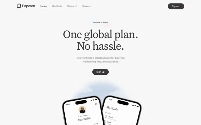
Popcorn employs a modern, calm, and spacious aesthetic built on a largely monochrome palette. Light, soft surfaces and ample white space define the visual canvas. Typography is characteristically bold yet airy for headlines, conveying information with subtle authority, while body text remains minimal and legible. Small, rounded components with soft shadows and transparent accents give an impression of lightness and approachability.
The page uses a maximum width of 1200px, centered on the screen, creating a contained and focused experience. The hero section features a large, centered headline over a subtle gradient background, setting a calm, spacious tone. Content sections generally follow a pattern of generous vertical spacing, with testimonials in a 3-column card grid and feature lists presented as centered blocks. Navigation is a sticky top bar with left-aligned branding and right-aligned links and a sign-up button. The overall density is spacious, ensuring ample breathing room between elements and sections.
The visual language for imagery is minimal and functional, primarily consisting of product showcases and abstract atmospheric elements. Product screenshots of mobile devices are shown with realistic interfaces, rendered on white backgrounds with soft shadows for elevation. Icons are outlined, lightweight, and mono-color, serving as subtle decorative or explanatory elements. Backgrounds feature large, abstract, multi-color conic gradients, providing a soft, almost ethereal atmosphere without disrupting the clean UI. Imagery serves a decorative and illustrative role rather than being critical content.
Reminiscent of Linear, Framer, Stripe, Revolut.
# Popcorn — Style Reference
> Monochrome canvas, silent authority

**Theme:** light

**Site:** https://popcorn.space

Popcorn employs a modern, calm, and spacious aesthetic built on a largely monochrome palette. Light, soft surfaces and ample white space define the visual canvas. Typography is characteristically bold yet airy for headlines, conveying information with subtle authority, while body text remains minimal and legible. Small, rounded components with soft shadows and transparent accents give an impression of lightness and approachability.

## Tokens — Colors

| Name | Value | Token | Role |
|------|------|------|------|
| Gradient Aura | `#e7f3ee` | `--color-gradient-aura` | Background illustrations, subtle decorative elements suggesting depth and iridescence. Represents the cool-toned starting point of a complex conic gradient |
| Skylight Fade | `#dae8f5` | `--color-skylight-fade` | Subtle background gradients for atmospheric effects, suggesting depth and height |
| Midnight Graphite | `#393737` | `--color-midnight-graphite` | Primary text, headline text, dark surface backgrounds for contrast, navigation links, primary icon color; Overlays or background fills for sections that require heavy contrast, used sparingly for strong visual separation |
| Canvas White | `#f7f7f7` | `--color-canvas-white` | Dominant page background, soft button backgrounds, subtle surface details, light badge backgrounds |
| Snow Drift | `#ffffff` | `--color-snow-drift` | Card backgrounds, elevated UI elements, navigation backgrounds |
| Slate Mist | `#888787` | `--color-slate-mist` | Secondary text, muted helper text, inactive navigation items, subtle border colors |
| Pale Cloud | `#e9eff6` | `--color-pale-cloud` | Subtle alternative card background for visual separation, delicate UI accents |

## Tokens — Typography

### Messina Sans
- **Substitute:** Inter
- **Weights:** 400, 600, 700
- **Sizes:** 11px, 13px, 14px, 16px, 18px, 19px, 64px, 88px
- **Line height:** 1, 1.2, 1.4, 1.5
- **Letter spacing:** -0.0300em (at 88px, 64px), -0.0200em (at 19px, 18px), normal (at 16px, 14px)
- **Role:** Primary UI font for body text, button labels, navigation, and smaller headings. The range of weights and granular sizes supports a precise textual hierarchy across the interface.

### Untitled Serif
- **Substitute:** Freight Text Pro
- **Weights:** 400
- **Sizes:** 20px, 22px, 24px, 30px, 40px, 58px, 84px
- **Line height:** 1, 1.2
- **Letter spacing:** -0.0300em (at 84px, 58px), -0.0250em (at 40px)
- **Role:** Dedicated serif font for large, impactful headlines, subheadings, and decorative text. Its single weight and careful tracking give it a refined presence.

## Tokens — Type Scale

Perfect Fifth (1.5) from 19px base.

| Role | Size | Line height | Letter spacing |
|------|------|------|------|
| subheading | 19px | 1.4 | -0.38px |
| heading-sm | 24px | 1.2 | — |
| heading | 40px | 1.2 | -1px |
| heading-lg | 58px | 1.2 | -1.74px |
| display | 88px | 1.2 | -2.64px |

## Tokens — Spacing

- **Max width:** 1200px
- **Section gap:** 64px
- **Card padding:** 18px
- **Element gap:** 16px

## Tokens — Radius

- **Buttons:** 100px
- **Cards:** 12px
- **badges:** 100px
- **largeElements:** 64px

## Tokens — Elevation

- **Elevated Feature Card:** `rgba(0, 0, 0, 0.05) 0px 4px 20px 0px`

## Layout

The page uses a maximum width of 1200px, centered on the screen, creating a contained and focused experience. The hero section features a large, centered headline over a subtle gradient background, setting a calm, spacious tone. Content sections generally follow a pattern of generous vertical spacing, with testimonials in a 3-column card grid and feature lists presented as centered blocks. Navigation is a sticky top bar with left-aligned branding and right-aligned links and a sign-up button. The overall density is spacious, ensuring ample breathing room between elements and sections.

## Imagery

The visual language for imagery is minimal and functional, primarily consisting of product showcases and abstract atmospheric elements. Product screenshots of mobile devices are shown with realistic interfaces, rendered on white backgrounds with soft shadows for elevation. Icons are outlined, lightweight, and mono-color, serving as subtle decorative or explanatory elements. Backgrounds feature large, abstract, multi-color conic gradients, providing a soft, almost ethereal atmosphere without disrupting the clean UI. Imagery serves a decorative and illustrative role rather than being critical content.

## Components

### Primary Ghost Button
*Action button for primary calls to action, maintaining lightness and integrating into the design.*

Background: rgba(247, 247, 247, 0.6), Text color: #393737, Border Top: rgba(255, 255, 255, 0.6), Border Radius: 100px, Padding: 13px vertical, 18px horizontal. Uses Messina Sans 16px.

### Elevated Feature Card
*Highlights key features or testimonials, using soft elevation to draw attention.*

Background: #ffffff, Border Radius: 12px, Box Shadow: rgba(0, 0, 0, 0.05) 0px 4px 20px 0px, Padding: 18px on all sides. Content spacing of 16px.

### Base Feature Card
*Standard card for displaying information without strong visual hierarchy.*

Background: #ffffff, Border Radius: 15px, No shadow, Padding: 34px top, 0px horizontal, 0px bottom.

### Badge Pill
*Categorization or status indicator.*

Background: #f7f7f7, Text color: #393737, Border Radius: 100px, Padding: 10px vertical, 14px horizontal internally, 10px leading graphic padding. Uses Messina Sans 14px.

### Hero Pill Badge
*Prominent status indicator within hero sections.*

Background: rgba(0, 0, 0, 0), Text color: #393737, Border Radius: 100px, Padding: 7px vertical, 16px horizontal leading, 7px right. Uses Messina Sans 14px.

### Navigation Link
*Primary navigation elements.*

Text color: #393737, Messina Sans 16px, 10px horizontal padding, 12px vertical padding. Active state indicated by an underline.

## Guidelines

### Do

- Use Midnight Graphite (#393737) for all primary text and main headlines.
- Apply Canvas White (#f7f7f7) for the main page background and soft button fills.
- Ensure all primary interactive elements like buttons and badges use a 100px border radius for a continuous pill shape.
- Implement the soft shadow rgba(0, 0, 0, 0.05) 0px 4px 20px 0px for all elevated cards to maintain a light visual weight.
- Reserve Untitled Serif for headlines and subheadings at larger sizes (40px and above) to distinguish them from UI text.
- Maintain a comfortable vertical rhythm with a default element gap of 16px and section gap of 64px.

### Don't

- Avoid using highly saturated, vivid colors; the palette is intentionally subtle and achromatic.
- Do not introduce sharp corners or small radii; the system favors soft, rounded edges at 12px for cards and 100px for buttons.
- Do not use heavy, opaque drop shadows; stick to the light, ethereal shadow for elevation.
- Do not use generic system fonts; always specify Messina Sans for UI and body text, and Untitled Serif for display headings.
- Avoid tightly packed content; maintain ample spacing and allow sufficient whitespace around elements.

## Agent Prompt Guide

Quick Color Reference:
text: #393737
background: #f7f7f7
border: #f7f7f7
accent: #e7f3ee
primary action: no distinct CTA color

Example Component Prompts:
1. Create a Hero Section with a main headline: 'Seamless Connectivity.', Messina Sans 88px, weight 400, color #393737, letter-spacing -2.64px. Below it, a subtle ghost button: 'Learn More', background rgba(247, 247, 247, 0.6), text color #393737, border top rgba(255, 255, 255, 0.6), 100px radius, 13px vertical padding, 18px horizontal padding.
2. Design an Elevated Feature Card: Background #ffffff, border radius 12px, shadow rgba(0, 0, 0, 0.05) 0px 4px 20px 0px, 18px padding. Inside, place a caption 'Global' in Messina Sans 13px, color #393737, followed by a headline 'Unlimited Data' in Untitled Serif 40px, color #393737, letter-spacing -1.0px.
3. Create a Badge Pill: 'Live in Alpha' with background #f7f7f7, text color #393737, border radius 100px, 10px vertical and 14px horizontal padding (internal text padding), Messina Sans 14px.
4. Compose a Footer Navigation Link: 'Privacy Policy', text color #393737, Messina Sans 16px, 10px horizontal padding, 12px vertical padding. No underline by default.
More like this









Keep what you find
A free account saves references to boards and can send you a weekly email of picks based on what you save.
To see every result, go Pro.