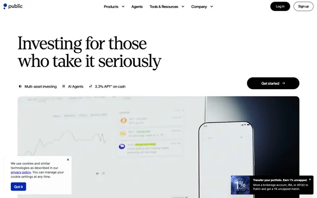
Preview image. Unlock full-res
Crisp Editorial Clarity: a high-contrast financial journal on a pristine, structured page.
Color palette
Active link text, interactive element borders, functional highlights
Decorative icons, light accent fills, subtle hover states
Light supporting surface for subtle backgrounds and section separation. Do not promote it to the primary CTA color
Gray supporting accent for decorative details and low-frequency emphasis. Do not promote it to the primary CTA color
Subtle icon fills, deeper blue decorative elements
Navigation active states, subtle header text
Primary text, darkest backgrounds, prominent borders
Page backgrounds, card surfaces, UI elements requiring high contrast
Subtle borders, dividers, card outlines, background separation
Dark card backgrounds, secondary dark text, subtle dark interface elements
Muted borders and text, outlines for secondary elements
Dark navigation text, dark UI element borders, secondary dark backgrounds
Secondary text, muted links, subtle informational accents
Subtle border accents, light informational text, placeholder content
Typography
- Weights
- 300
- Sizes
- 48px, 52px, 80px
- Line height
- 1, 1.11, 1.12, 1.13
- Fallback
- Playfair Display
Display and primary headings – its light weight at large sizes conveys authority through understatement, setting an intellectual tone.
- Weights
- 400, 500
- Sizes
- 12px, 14px, 16px, 20px, 24px, 32px
- Line height
- 1, 1.13, 1.14, 1.15, 1.17, 1.2, 1.28, 1.29, 1.31, 1.37, 1.38, 1.5
- Fallback
- IBM Plex Serif
Secondary headings, subheadings, and emphasized text segments – providing a structured, confident contrast to Inter for key informational blocks.
- Weights
- 400, 500
- Sizes
- 12px, 14px, 16px, 20px, 24px, 32px
- Line height
- 1, 1.13, 1.14, 1.15, 1.17, 1.2, 1.28, 1.29, 1.31, 1.37, 1.38, 1.5
- Fallback
- IBM Plex Serif
More emphatic secondary headings and callouts, providing a slightly bolder touch while retaining the core character of Invest Pro.
- Weights
- 400, 600
- Sizes
- 10px, 11px, 12px, 14px, 16px
- Line height
- 1, 1.15, 1.42, 1.43, 1.5, 1.54, 1.6, 2
- Letter spacing
- normal
- Fallback
- Inter
Body copy, navigation, and detailed information – its neutral, legible form supports dense data and long-form content.
- Weights
- 400, 600
- Sizes
- 10px, 11px, 12px, 14px, 16px
- Line height
- 1, 1.15, 1.42, 1.43, 1.5, 1.54, 1.6, 2
- Letter spacing
- normal
- Fallback
- Inter
Strong emphasis within body text, labels, and small headings, maintaining high readability at smaller sizes.
Spacing & shape
Elevation
Components
An outlined button with transparent background, white text (#ffffff), and a subtle border of Ultramarine (#0027b3) or rgba(255, 255, 255, 0.1). Rounded with 100px radius and 40px horizontal padding. Features a dual colored shadow to hint at interactivity: rgba(255, 196, 250, 0.25) 8px -8px 20px 0px, rgba(56, 205, 255, 0.25) -8px 8px 30px 0px.
A solid black button (#000000) with white text (#ffffff). Rounded corners set at 100px, with 40px horizontal padding. Used for primary actions like 'Get started'.
A light gray background card (#fafa_fafa) with 16px border-radius. No shadow, flush padding for internal content. Used to group related features or information.
A dark gray background card (#262626) with a subtle shadow (rgba(0, 0, 0, 0.08) 0px 1px 10px 0px). Has 6px border-radius and 16px padding on all sides. Used for focused content blocks, such as AI agent details or market briefs.
Transparent background badge with black text (#000000) and no border radius. Used for small, contextual labels like '3.30% APY*'.
Transparent background with no border-radius or shadow, 22px left padding. Utilized for introductory feature links like 'Stocks Build your portfolio'.
Guidelines
- Prioritize Ink (#000000) for all primary text and critical headlines to maintain high contrast and legibility.
- Use Ultramarine (#0027b3) exclusively for interactive elements like links and button borders, ensuring functional color remains a distinct accent.
- Apply Denton at Weight 300 for all large headings (48px and above) to convey a sense of understated authority.
- Maintain a default border-radius of 4px for most UI elements, reserving 100px for buttons and 16px for prominent cards.
- Employ Smoke (#e9edf3) for hairline borders and subtle dividers to structure content without heavy visual lines.
- Ensure generous spacing with an 8px element gap and 16px card padding to maintain a spacious, uncluttered layout.
- Use Invest Pro for secondary titles and emphasized text, ensuring it complements Denton without competing for attention.
- Leverage the dual-tinted shadow (rgba(255, 196, 250, 0.25) 8px -8px 20px 0px, rgba(56, 205, 255, 0.25) -8px 8px 30px 0px) for highly interactive ghost buttons to add distinct visual depth.
- Avoid using highly saturated colors outside of the defined Ultramarine (#0027b3) and Azure Glow (#95d0ff) accents.
- Do not introduce heavy drop shadows or decorative gradients on surfaces, as the design maintains minimal elevation.
- Refrain from mixing font families randomly; adhere strictly to Inter for body text, Invest Pro for structured text, and Denton for display headings.
- Do not use border-radius values other than 1px, 4px, 8px, 12px, 16px, 100px, or 999px.
- Do not use #0000ee (browser default link blue) for any link states; use Ultramarine (#0027b3) instead.
- Do not use an element gap smaller than 8px for vertical or horizontal spacing between related items.
- Avoid excessive use of uppercase text; reserve it only for specific, highly constrained labels or navigation items where it's explicitly observed.
About this system
ShowHide
Public's design system evokes a confident, editorial demeanor, balancing sharp, sophisticated typography with subtle, functional use of color. The primary palette is a clean, high-contrast monochrome, serving as a neutral canvas for data and product interfaces. Visual accents are delivered through a singular, vivid violet for interactive elements and an electric blue for subtle highlights, creating focal points without visual clutter. Surfaces are predominantly light and spacious, grounded by slim borders and minimal shadow, suggesting precision and clarity in financial tooling.
The page primarily uses a contained layout with elements centered within a maximum width, though the hero section can be full-bleed. The hero features a large, light-weighted headline centered over a background that integrates product imagery. Sections exhibit a consistent vertical rhythm, often alternating between centered stacks of text, or two-column layouts pairing text with a visual. Content is arranged with a sense of order and precision, frequently utilizing visual separations for clarity. Navigation is a sticky top bar with clearly delineated links and distinct login/signup buttons.
The visual language for imagery is primarily product-focused and functional. It features clean product screenshots of UI interfaces, often displayed within device mockups. These are presented without heavy filters or dramatic lighting, maintaining a sense of realism and direct utility. Imagery primarily serves an explanatory role, showcasing the product's functionality rather than purely decorative atmosphere. The density is moderate; images are used to break up text-heavy sections and illustrate concepts, but the layout remains text-dominant.
Reminiscent of Linear, Rippling, Stripe, Wealthfront.
# Public — Style Reference
> Crisp Editorial Clarity: a high-contrast financial journal on a pristine, structured page.

**Theme:** light

**Site:** https://public.com

Public's design system evokes a confident, editorial demeanor, balancing sharp, sophisticated typography with subtle, functional use of color. The primary palette is a clean, high-contrast monochrome, serving as a neutral canvas for data and product interfaces. Visual accents are delivered through a singular, vivid violet for interactive elements and an electric blue for subtle highlights, creating focal points without visual clutter. Surfaces are predominantly light and spacious, grounded by slim borders and minimal shadow, suggesting precision and clarity in financial tooling.

## Tokens — Colors

| Name | Value | Token | Role |
|------|------|------|------|
| Ultramarine | `#0027b3` | `--color-ultramarine` | Active link text, interactive element borders, functional highlights |
| Azure Glow | `#95d0ff` | `--color-azure-glow` | Decorative icons, light accent fills, subtle hover states |
| Lilac Mist | `#fff0fe` | `--color-lilac-mist` | Light supporting surface for subtle backgrounds and section separation. Do not promote it to the primary CTA color |
| Sky Veil | `#cdf3ff` | `--color-sky-veil` | Gray supporting accent for decorative details and low-frequency emphasis. Do not promote it to the primary CTA color |
| Ocean Deep | `#00379a` | `--color-ocean-deep` | Subtle icon fills, deeper blue decorative elements |
| Nav Blue | `#566e8c` | `--color-nav-blue` | Navigation active states, subtle header text |
| Ink | `#000000` | `--color-ink` | Primary text, darkest backgrounds, prominent borders |
| Canvas | `#ffffff` | `--color-canvas` | Page backgrounds, card surfaces, UI elements requiring high contrast |
| Smoke | `#e9edf3` | `--color-smoke` | Subtle borders, dividers, card outlines, background separation |
| Graphite | `#262626` | `--color-graphite` | Dark card backgrounds, secondary dark text, subtle dark interface elements |
| Ash | `#dce2ea` | `--color-ash` | Muted borders and text, outlines for secondary elements |
| Jet | `#1b2128` | `--color-jet` | Dark navigation text, dark UI element borders, secondary dark backgrounds |
| Slate | `#516880` | `--color-slate` | Secondary text, muted links, subtle informational accents |
| Cloud | `#a8b4bf` | `--color-cloud` | Subtle border accents, light informational text, placeholder content |

## Tokens — Typography

### Denton
- **Substitute:** Playfair Display
- **Weights:** 300
- **Sizes:** 48px, 52px, 80px
- **Line height:** 1, 1.11, 1.12, 1.13
- **Role:** Display and primary headings – its light weight at large sizes conveys authority through understatement, setting an intellectual tone.

### Invest Pro
- **Substitute:** IBM Plex Serif
- **Weights:** 400, 500
- **Sizes:** 12px, 14px, 16px, 20px, 24px, 32px
- **Line height:** 1, 1.13, 1.14, 1.15, 1.17, 1.2, 1.28, 1.29, 1.31, 1.37, 1.38, 1.5
- **Role:** Secondary headings, subheadings, and emphasized text segments – providing a structured, confident contrast to Inter for key informational blocks.

### Invest Pro
- **Substitute:** IBM Plex Serif
- **Weights:** 400, 500
- **Sizes:** 12px, 14px, 16px, 20px, 24px, 32px
- **Line height:** 1, 1.13, 1.14, 1.15, 1.17, 1.2, 1.28, 1.29, 1.31, 1.37, 1.38, 1.5
- **Role:** More emphatic secondary headings and callouts, providing a slightly bolder touch while retaining the core character of Invest Pro.

### Inter
- **Substitute:** Inter
- **Weights:** 400, 600
- **Sizes:** 10px, 11px, 12px, 14px, 16px
- **Line height:** 1, 1.15, 1.42, 1.43, 1.5, 1.54, 1.6, 2
- **Letter spacing:** normal
- **Role:** Body copy, navigation, and detailed information – its neutral, legible form supports dense data and long-form content.

### Inter
- **Substitute:** Inter
- **Weights:** 400, 600
- **Sizes:** 10px, 11px, 12px, 14px, 16px
- **Line height:** 1, 1.15, 1.42, 1.43, 1.5, 1.54, 1.6, 2
- **Letter spacing:** normal
- **Role:** Strong emphasis within body text, labels, and small headings, maintaining high readability at smaller sizes.

## Tokens — Type Scale

Augmented Fourth (1.414) from 10px base.

| Role | Size | Line height | Letter spacing |
|------|------|------|------|
| caption | 10px | 1.5 | — |
| body-lg | 14px | 1.43 | — |
| heading-sm | 20px | 1.2 | — |
| heading | 24px | 1.17 | — |
| heading-lg | 32px | 1.28 | — |
| display | 48px | 1.11 | — |
| display-lg | 80px | 1.13 | — |

## Tokens — Spacing

- **Section gap:** 24px
- **Card padding:** 16px
- **Element gap:** 8px

## Tokens — Radius

- **Default:** 4px
- **Buttons:** 100px
- **Cards:** 16px
- **minimal:** 1px
- **partial:** 12px
- **smallInteractive:** 8px
- **tags:** 999px

## Tokens — Elevation

- **Monochrome Elevated Card:** `rgba(0, 0, 0, 0.08) 0px 1px 10px 0px`
- **Primary Ghost Button:** `rgba(255, 196, 250, 0.25) 8px -8px 20px 0px, rgba(56, 205, 255, 0.25) -8px 8px 30px 0px`

## Layout

The page primarily uses a contained layout with elements centered within a maximum width, though the hero section can be full-bleed. The hero features a large, light-weighted headline centered over a background that integrates product imagery. Sections exhibit a consistent vertical rhythm, often alternating between centered stacks of text, or two-column layouts pairing text with a visual. Content is arranged with a sense of order and precision, frequently utilizing visual separations for clarity. Navigation is a sticky top bar with clearly delineated links and distinct login/signup buttons.

## Imagery

The visual language for imagery is primarily product-focused and functional. It features clean product screenshots of UI interfaces, often displayed within device mockups. These are presented without heavy filters or dramatic lighting, maintaining a sense of realism and direct utility. Imagery primarily serves an explanatory role, showcasing the product's functionality rather than purely decorative atmosphere. The density is moderate; images are used to break up text-heavy sections and illustrate concepts, but the layout remains text-dominant.

## Components

### Primary Ghost Button
*Call to action*

An outlined button with transparent background, white text (#ffffff), and a subtle border of Ultramarine (#0027b3) or rgba(255, 255, 255, 0.1). Rounded with 100px radius and 40px horizontal padding. Features a dual colored shadow to hint at interactivity: rgba(255, 196, 250, 0.25) 8px -8px 20px 0px, rgba(56, 205, 255, 0.25) -8px 8px 30px 0px.

### Filled Action Button
*Call to action*

A solid black button (#000000) with white text (#ffffff). Rounded corners set at 100px, with 40px horizontal padding. Used for primary actions like 'Get started'.

### Section Card
*Content container*

A light gray background card (#fafa_fafa) with 16px border-radius. No shadow, flush padding for internal content. Used to group related features or information.

### Monochrome Elevated Card
*Accent / Elevated content.*

A dark gray background card (#262626) with a subtle shadow (rgba(0, 0, 0, 0.08) 0px 1px 10px 0px). Has 6px border-radius and 16px padding on all sides. Used for focused content blocks, such as AI agent details or market briefs.

### Informational Badge
*Metadata / Status*

Transparent background badge with black text (#000000) and no border radius. Used for small, contextual labels like '3.30% APY*'.

### Feature Link Card
*Navigation / Feature overview*

Transparent background with no border-radius or shadow, 22px left padding. Utilized for introductory feature links like 'Stocks Build your portfolio'.

## Guidelines

### Do

- Prioritize Ink (#000000) for all primary text and critical headlines to maintain high contrast and legibility.
- Use Ultramarine (#0027b3) exclusively for interactive elements like links and button borders, ensuring functional color remains a distinct accent.
- Apply Denton at Weight 300 for all large headings (48px and above) to convey a sense of understated authority.
- Maintain a default border-radius of 4px for most UI elements, reserving 100px for buttons and 16px for prominent cards.
- Employ Smoke (#e9edf3) for hairline borders and subtle dividers to structure content without heavy visual lines.
- Ensure generous spacing with an 8px element gap and 16px card padding to maintain a spacious, uncluttered layout.
- Use Invest Pro for secondary titles and emphasized text, ensuring it complements Denton without competing for attention.
- Leverage the dual-tinted shadow (rgba(255, 196, 250, 0.25) 8px -8px 20px 0px, rgba(56, 205, 255, 0.25) -8px 8px 30px 0px) for highly interactive ghost buttons to add distinct visual depth.

### Don't

- Avoid using highly saturated colors outside of the defined Ultramarine (#0027b3) and Azure Glow (#95d0ff) accents.
- Do not introduce heavy drop shadows or decorative gradients on surfaces, as the design maintains minimal elevation.
- Refrain from mixing font families randomly; adhere strictly to Inter for body text, Invest Pro for structured text, and Denton for display headings.
- Do not use border-radius values other than 1px, 4px, 8px, 12px, 16px, 100px, or 999px.
- Do not use #0000ee (browser default link blue) for any link states; use Ultramarine (#0027b3) instead.
- Do not use an element gap smaller than 8px for vertical or horizontal spacing between related items.
- Avoid excessive use of uppercase text; reserve it only for specific, highly constrained labels or navigation items where it's explicitly observed.

## Agent Prompt Guide

### Quick Color Reference
text: #000000
background: #ffffff
border: #e9edf3
accent: #0027b3
primary action: #0027b3 (outlined action border)

### 3-5 Example Component Prompts
1. Create an Outlined Primary Action: Transparent background, #0027b3 border and text, 9999px radius, compact pill padding. Use it for the main CTA instead of a filled button.
2. Design a feature card for 'Bonds': Section Card (#fafa_fafa) background, 16px radius. Title 'Bonds' Invest Pro weight 400, 32px, Ink (#000000). Body text 'Fractionalized access to corporate bonds.' Inter weight 400, 16px, Slate (#516880).
3. Build a navigation menu item for 'Products': Inter weight 400, 16px, Ink (#000000) text. On hover, Ultramarine (#0027b3) text color. Use an 8px element gap between items.
4. Create a 'Market Briefing' block: Monochrome Elevated Card (#262626) background, 6px radius, 16px padding. Headline 'Market Briefing' Invest Pro weight 500, 20px, white text (#ffffff). Body text 'what’s moving the markets each day.' Inter weight 400, 14px, Cloud (#a8b4bf).
5. Construct a cookie consent banner: Canvas (#ffffff) background, 8px radius. Text 'We use cookies...' Inter weight 400, 12px, Slate (#516880). A 'Got it' button using a Filled Action Button style (#000000 background, #ffffff text, 100px radius).
More like this

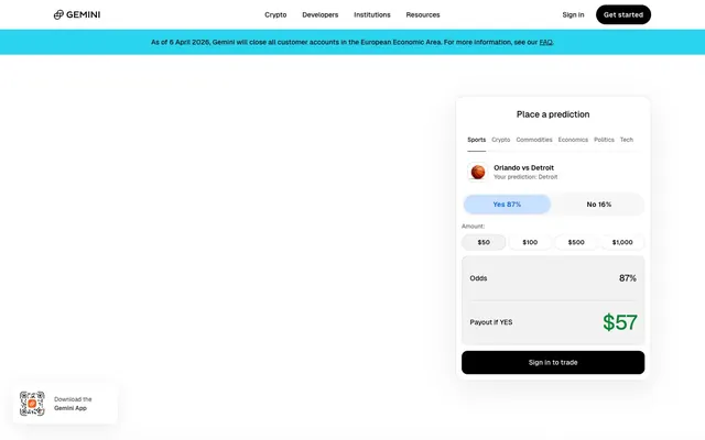








Keep what you find
A free account saves references to boards and can send you a weekly email of picks based on what you save.
To see every result, go Pro.