Preview image. Unlock full-res
Crisp Monochrome Control Panel
Color palette
Decorative accents, UI highlights – a deep, almost muted purple for a sophisticated touch
Interactive link underlines, bordered buttons, emphasis on a few key UI elements – a vibrant pop of color for action
Decorative background overlay for imagery, creating a dynamic, tech-forward atmosphere
Page backgrounds, elevated card surfaces, primary text on dark elements
Dark borders and separators for elevated surfaces and inverted UI. Do not promote it to the primary CTA color
Headlines, dominant button fills, critical text elements – slightly softer than pure black to prevent starkness; Background for product screenshots or dark UI sections, providing a smooth transition from dark to slightly lighter neutral
Secondary text, borders, subtle UI elements – a dark, desaturated background for content sections
Muted helper text, navigation items, secondary link borders – provides visual separation without disappearing
Lightest gray for borders, inactive states, placeholder text – provides subtle definition
Subtle background for navigation elements and ghost buttons, hinting at interactivity
Fine borders and decorative fills, providing minimal contrast
Typography
- Weights
- 400, 650, 700
- Sizes
- 16px, 34px, 40px, 48px, 60px
- Line height
- 1.1, 1.15, 1.2, 1.5
- Letter spacing
- -0.0470em, -0.0400em, -0.0350em
- Fallback
- system-ui
Primary headings and select prominent UI text. Its distinct letter spacing at larger sizes creates a signature tight, modern feel, while lighter weights retain approachability. Usage at 16px provides a clear, compact label.
- Weights
- 400, 500, 600, 650
- Sizes
- 8px, 12px, 14px, 16px, 18px
- Line height
- 1, 1.14, 1.33, 1.38, 1.43, 1.5
- Letter spacing
- -0.0200em, -0.0180em, -0.0140em, -0.0110em, -0.0100em
- Fallback
- sans-serif
Body copy, secondary navigation, and smaller UI text. Its versatility across weights and small sizes ensures readability and clarity in dense information areas.
- Weights
- 500
- Sizes
- 14px, 16px
- Line height
- 1.25, 1.29
- Letter spacing
- normal
- Fallback
- monospace
Used sparingly for code snippets, badges, or specific technical labels where a fixed-width, distinct character is desired. Its presence distinguishes content from standard UI text.
Spacing & shape
Components
Ghost button with no background or border, `Graphite Black` text, 5px bottom padding to create a subtle underline effect on hover, 0px radius.
Transparent background, 8px radius, `Graphite Black` text, 4px top/bottom padding, 10px left/right padding. The `Graphite Black` border activates on hover.
Transparent background, 8px radius, `Subtle Gray` text and border (when present), 8px top/bottom padding, 10px left/right padding.
Solid `Ink Black` background, `Canvas White` text, 8px radius, 8px top/bottom padding, 12px left/right padding. Signals high interaction priority.
`Whisper White` background, `Graphite Black` text, 8px radius, 8px top/bottom padding, 10px left/right padding.
Displays a vibrant `Electric Violet` border for emphasized links or buttons, with transparent background and `Electric Violet` text. Radius is 8px.
Cards use a `Canvas White` with 50% opacity background, a distinct 18px border radius, and 10px internal padding. They communicate a light, elevated presence without strong shadows.
Cards with a solid `Graphite Black` background, 18px border radius, and 0px padding, often used for embedding visuals or interactive elements.
Transparent background with `Ash Gray` text, 0px radius, and standard text padding. Used for unobtrusive categorization.
Guidelines
- Use `Canvas White` (#ffffff) as the primary page background for all content outside of dedicated dark sections.
- Apply `Ink Black` (#202020) for all primary headings (display-lg, display, heading-lg, heading) to ensure visual impact.
- Ensure interactive links and bordered buttons use `Electric Violet` (#7b68ee) for their text or border color, never for backgrounds.
- Maintain a tight visual rhythm for headings by consistently applying letter spacing: -1.4px at 40px, -1.44px at 48px, and -2.12px at 60px (`Plus Jakarta Sans`).
- Employ a 9px border radius (`spacing.radius.buttons` or `spacing.radius.general`) for all functional UI elements like buttons, nav links, and tags.
- Utilize 10px (`spacing.cardPadding`) as the primary internal padding for card components and similar container elements.
- For primary call-to-action buttons, use the `Ink Black` (#202020) fill with `Canvas White` (#ffffff) text and an 8px border radius.
- Do not use `Electric Violet` (#7b68ee) as a background fill for any button or primary UI element; reserve it for borders, text, and interactive highlights.
- Avoid applying heavy drop shadows; cards should use `Canvas White` at 50% opacity or be solid `Graphite Black` with no shadow.
- Do not introduce new typefaces; rely solely on `Plus Jakarta Sans`, `Inter`, and `Sometype Mono` for all typographic needs.
- Never use full-bleed imagery without a subtle overlay, especially when paired with the `Rainbow Gradient Overlay`.
- Do not use arbitrary spacing values; always refer to the defined `spacing` tokens like 4px, 5px, 8px, 10px, 12px, for consistent rhythm.
- Avoid deep, dark backgrounds on content cards unless it's a specific 'Dark Content Card' component using `Graphite Black` (#000000).
- Do not use highly saturated colors for body text; `Slate Gray` (#292d34) or `Subtle Gray` (#646464) are preferred for readability and brand adherence.
About this system
ShowHide
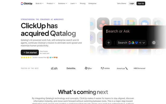
ClickUp's design system, as seen on the Qatalog acquisition page, emphasizes a bold yet understated aesthetic. High-contrast typography in deep, near-black neutrals anchors the content on a pristine white canvas. A single vivid violet serves as a functional accent, drawing the eye to interactive elements and brand highlights. The visual language balances sharp, confident headlines with approachable body text, creating a system that feels modern and efficient without visual clutter.
Reminiscent of Linear, Stripe, Notion, Figma, Vercel.
# Qatalog — Style Reference
> Crisp Monochrome Control Panel

**Theme:** light

**Site:** https://qatalog.com

ClickUp's design system, as seen on the Qatalog acquisition page, emphasizes a bold yet understated aesthetic. High-contrast typography in deep, near-black neutrals anchors the content on a pristine white canvas. A single vivid violet serves as a functional accent, drawing the eye to interactive elements and brand highlights. The visual language balances sharp, confident headlines with approachable body text, creating a system that feels modern and efficient without visual clutter.

## Tokens — Colors

| Name | Value | Token | Role |
|------|------|------|------|
| Deep Violet | `#514b81` | `--color-deep-violet` | Decorative accents, UI highlights – a deep, almost muted purple for a sophisticated touch |
| Electric Violet | `#7b68ee` | `--color-electric-violet` | Interactive link underlines, bordered buttons, emphasis on a few key UI elements – a vibrant pop of color for action |
| Rainbow Gradient Overlay | `#0091ff` | `--color-rainbow-gradient-overlay` | Decorative background overlay for imagery, creating a dynamic, tech-forward atmosphere |
| Canvas White | `#ffffff` | `--color-canvas-white` | Page backgrounds, elevated card surfaces, primary text on dark elements |
| Graphite Black | `#000000` | `--color-graphite-black` | Dark borders and separators for elevated surfaces and inverted UI. Do not promote it to the primary CTA color |
| Ink Black | `#202020` | `--color-ink-black` | Headlines, dominant button fills, critical text elements – slightly softer than pure black to prevent starkness; Background for product screenshots or dark UI sections, providing a smooth transition from dark to slightly lighter neutral |
| Slate Gray | `#292d34` | `--color-slate-gray` | Secondary text, borders, subtle UI elements – a dark, desaturated background for content sections |
| Subtle Gray | `#646464` | `--color-subtle-gray` | Muted helper text, navigation items, secondary link borders – provides visual separation without disappearing |
| Ash Gray | `#838383` | `--color-ash-gray` | Lightest gray for borders, inactive states, placeholder text – provides subtle definition |
| Whisper White | `#f0f0f0` | `--color-whisper-white` | Subtle background for navigation elements and ghost buttons, hinting at interactivity |
| Cloud Gray | `#e8e8e8` | `--color-cloud-gray` | Fine borders and decorative fills, providing minimal contrast |

## Tokens — Typography

### Plus Jakarta Sans
- **Substitute:** system-ui
- **Weights:** 400, 650, 700
- **Sizes:** 16px, 34px, 40px, 48px, 60px
- **Line height:** 1.1, 1.15, 1.2, 1.5
- **Letter spacing:** -0.0470em, -0.0400em, -0.0350em
- **Role:** Primary headings and select prominent UI text. Its distinct letter spacing at larger sizes creates a signature tight, modern feel, while lighter weights retain approachability. Usage at 16px provides a clear, compact label.

### Inter
- **Substitute:** sans-serif
- **Weights:** 400, 500, 600, 650
- **Sizes:** 8px, 12px, 14px, 16px, 18px
- **Line height:** 1, 1.14, 1.33, 1.38, 1.43, 1.5
- **Letter spacing:** -0.0200em, -0.0180em, -0.0140em, -0.0110em, -0.0100em
- **Role:** Body copy, secondary navigation, and smaller UI text. Its versatility across weights and small sizes ensures readability and clarity in dense information areas.

### Sometype Mono
- **Substitute:** monospace
- **Weights:** 500
- **Sizes:** 14px, 16px
- **Line height:** 1.25, 1.29
- **Letter spacing:** normal
- **Role:** Used sparingly for code snippets, badges, or specific technical labels where a fixed-width, distinct character is desired. Its presence distinguishes content from standard UI text.

## Tokens — Type Scale

Major Third (1.25) from 14px base.

| Role | Size | Line height | Letter spacing |
|------|------|------|------|
| body | 14px | 1.5 | -0.14px |
| body-lg | 16px | 1.5 | -0.16px |
| subheading | 18px | 1.43 | -0.21px |
| heading | 34px | 1.15 | -1.36px |
| heading-lg | 40px | 1.1 | -1.4px |
| display | 48px | 1.1 | -1.44px |
| display-lg | 60px | 1.1 | -2.12px |

## Tokens — Spacing

- **Section gap:** 133px
- **Card padding:** 10px
- **Element gap:** 5px

## Tokens — Radius

- **General:** 9px
- **Buttons:** 9px
- **Cards:** 18px
- **tags:** 9px

## Components

### Text Link Button
*Navigation, secondary actions*

Ghost button with no background or border, `Graphite Black` text, 5px bottom padding to create a subtle underline effect on hover, 0px radius.

### Outlined Neutral Button
*Secondary calls to action, filtering*

Transparent background, 8px radius, `Graphite Black` text, 4px top/bottom padding, 10px left/right padding. The `Graphite Black` border activates on hover.

### Muted Outlined Button
*Tertiary actions, less prominent links*

Transparent background, 8px radius, `Subtle Gray` text and border (when present), 8px top/bottom padding, 10px left/right padding.

### Filled Primary Button
*Main call to action*

Solid `Ink Black` background, `Canvas White` text, 8px radius, 8px top/bottom padding, 12px left/right padding. Signals high interaction priority.

### Light Header Button
*Navigation login actions*

`Whisper White` background, `Graphite Black` text, 8px radius, 8px top/bottom padding, 10px left/right padding.

### Gradient Border Button
*Specialized or featured actions*

Displays a vibrant `Electric Violet` border for emphasized links or buttons, with transparent background and `Electric Violet` text. Radius is 8px.

### Feature Card
*Showcasing product features or benefits*

Cards use a `Canvas White` with 50% opacity background, a distinct 18px border radius, and 10px internal padding. They communicate a light, elevated presence without strong shadows.

### Dark Content Card
*Containing rich media or contextual information*

Cards with a solid `Graphite Black` background, 18px border radius, and 0px padding, often used for embedding visuals or interactive elements.

### Muted Badge
*Informational labels, status indicators*

Transparent background with `Ash Gray` text, 0px radius, and standard text padding. Used for unobtrusive categorization.

## Guidelines

### Do

- Use `Canvas White` (#ffffff) as the primary page background for all content outside of dedicated dark sections.
- Apply `Ink Black` (#202020) for all primary headings (display-lg, display, heading-lg, heading) to ensure visual impact.
- Ensure interactive links and bordered buttons use `Electric Violet` (#7b68ee) for their text or border color, never for backgrounds.
- Maintain a tight visual rhythm for headings by consistently applying letter spacing: -1.4px at 40px, -1.44px at 48px, and -2.12px at 60px (`Plus Jakarta Sans`).
- Employ a 9px border radius (`spacing.radius.buttons` or `spacing.radius.general`) for all functional UI elements like buttons, nav links, and tags.
- Utilize 10px (`spacing.cardPadding`) as the primary internal padding for card components and similar container elements.
- For primary call-to-action buttons, use the `Ink Black` (#202020) fill with `Canvas White` (#ffffff) text and an 8px border radius.

### Don't

- Do not use `Electric Violet` (#7b68ee) as a background fill for any button or primary UI element; reserve it for borders, text, and interactive highlights.
- Avoid applying heavy drop shadows; cards should use `Canvas White` at 50% opacity or be solid `Graphite Black` with no shadow.
- Do not introduce new typefaces; rely solely on `Plus Jakarta Sans`, `Inter`, and `Sometype Mono` for all typographic needs.
- Never use full-bleed imagery without a subtle overlay, especially when paired with the `Rainbow Gradient Overlay`.
- Do not use arbitrary spacing values; always refer to the defined `spacing` tokens like 4px, 5px, 8px, 10px, 12px, for consistent rhythm.
- Avoid deep, dark backgrounds on content cards unless it's a specific 'Dark Content Card' component using `Graphite Black` (#000000).
- Do not use highly saturated colors for body text; `Slate Gray` (#292d34) or `Subtle Gray` (#646464) are preferred for readability and brand adherence.

## Agent Prompt Guide

**Quick Color Reference:**
text: #202020
background: #ffffff
border: #292d34
accent: #7b68ee
primary action: #202020 (filled action)

**3-5 Example Component Prompts:**
1. Create a hero section with a headline "ClickUp has acquired Qatalog" using Plus Jakarta Sans, 48px, weight 650, #202020, letter-spacing -1.44px. Include a primary button: filled `Ink Black` (#202020) background, `Canvas White` (#ffffff) text, 8px radius, 8px 12px padding, text "Get started".
2. Design a navigation item: Inter font, 16px, weight 500, `Slate Gray` (#292d34). On hover, add a 1px `Electric Violet` (#7b68ee) bottom border with 4px padding-bottom.
3. Build a feature card: `Canvas White` (#ffffff) background at 50% opacity, 18px border radius, 10px internal padding. Caption text in Inter, 12px, weight 400, `Slate Gray` (#292d34).
4. Create a callout box: `Dark Gradient` background, 18px border radius, with `Canvas White` (#ffffff) descriptive text in Inter, 16px, weight 400. The text should be accompanied by a small graphic that utilizes the `Rainbow Gradient Overlay`.
5. Implement a badge: `Muted Badge` style with `Ash Gray` (#838383) text, Inter font, 14px, weight 500, with no background or border.
More like this










Keep what you find
A free account saves references to boards and can send you a weekly email of picks based on what you save.
To see every result, go Pro.