Preview image. Unlock full-res
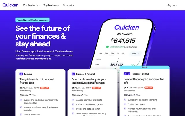
Electric violet data stream
Color palette
Hero background, prominent text, icon outlines, active state borders — forms the dark canvas for data visualization
Primary action buttons, interactive links, brand accents, icon fills — a vivid, energetic accent color that commands attention
Card borders, decorative accents, subtle dividers — hints at the brand violet in a soft, subdued manner
Subtle card borders, background gradients in data visualizations — a cool, muted blue-violet that complements the brand
Red action color for filled buttons, selected navigation states, and focused conversion moments. Use as a supporting accent, not as a status color
Informational badges, highlight elements in data visualizations — a bright, clear blue for positive emphasis
Page background, card surfaces, primary text on dark backgrounds, active button text — provides a clean canvas and high contrast
Primary body text, bold headings, descriptive labels — ensures strong readability against light surfaces
Secondary text, muted links, descriptive body copy — provides a softer contrast for less critical information
Subtle background for UI elements, card backgrounds on secondary surfaces — a softer variant of white
Promotional badge backgrounds, discount labels — a softer, warm red for secondary highlights
Typography
- Weights
- 400, 600
- Sizes
- 12px, 13px, 14px, 16px, 17px, 18px, 19px, 20px, 22px, 26px, 30px, 48px, 60px
- Line height
- 1, 1.16, 1.2, 1.24, 1.31, 1.32, 1.35, 1.4, 1.5, 2
- Letter spacing
- -0.0450em, -0.0330em, -0.0300em
- Fallback
- system-ui
All text elements use Haffer, ensuring a consistent, contemporary, and highly legible visual rhythm. Its character widths are optimized for both compact readability in data tables and impactful headlines. The subtle negative letter-spacing for larger sizes prevents text from feeling loose, maintaining a sophisticated density.
Spacing & shape
Elevation
Components
Filled Electric Indigo (#471cff) background with Pure White (#ffffff) text, featuring a 'pill' shape (400px radius) and generous horizontal padding (24px). Text is Haffer, 16px, 400 weight.
Pure White (#ffffff) background with an Electric Indigo (#471cff) border and text, retaining the 'pill' shape (400px radius) and 24px horizontal padding. Text is Haffer, 16px, 400 weight.
Transparent background with Electric Indigo (#471cff) text, no border, and no radius (0px). Its minimal styling allows it to blend into content while remaining interactive. Text is Haffer, 16px, 400 weight.
Transparent background with no box shadow or border radius (0px). Primarily used for full-width content blocks or as a semantic wrapper for sections.
Pure White (#ffffff) background with a large 16px border radius, and a subtle drop shadow (rgba(0, 0, 0, 0.15) 10px 20px 30px 0px). No internal padding specified, allowing flexible content layout. The shadow is a defining characteristic.
Pure White (#ffffff) background with a 16px border radius and no shadow. Features internal padding of 43px horizontal and 40px bottom, providing clear internal content margins.
Crimson Alert (#ff5a43) background with Pure White (#ffffff) text, a 20px border radius for a soft 'pill' shape, and 8px horizontal padding. Used for drawing attention to special offers.
Aqua Glow (#7ae7fb) background with Charcoal Black (#18181f) text, an 8px border radius, and 16px horizontal and 8px vertical padding. Used for supplementary information or categorization.
Guidelines
- Always use Haffer font family for all text elements to maintain typographic consistency.
- Prioritize Electric Indigo (#471cff) for all primary interactive elements like buttons and links.
- Utilize Pure White (#ffffff) as the dominant background for all content cards and the main page canvas.
- Apply Deep Violet (#0f0733) for hero sections and commanding headlines to define strong content blocks.
- Maintain a comfortable information density using 8px for `elementGap` between UI components and 16px padding within cards.
- Round corners on active elements: 400px for buttons to create 'pill' shapes, and 16px for cards for soft containment.
- Use rgba(0, 0, 0, 0.15) 10px 20px 30px 0px for `Elevated Feature Card` shadows to provide distinct visual hierarchy.
- Avoid using multiple font families; Haffer should be the sole typeface.
- Do not introduce new color hues; strictly adhere to the defined palette, especially the Electric Indigo (#471cff) and Deep Violet (#0f0733) accents.
- Refrain from heavy, overly complex shadows or gradients; keep elevation subtle as seen in the `Elevated Feature Card` or fully flat.
- Avoid arbitrary border radii; follow the established values of 400px for buttons, 16px for cards, and 20px for discount badges.
- Do not use generic gray values for borders; instead, use Pale Lavender (#dbd3ff) or Sky Mist (#bbc5fa) for subtle, on-brand borders.
- Do not deviate from the consistent line-heights and negative letter-spacing for Haffer, especially at larger sizes, as these are critical to the brand's typographic tone.
- Avoid full-bleed sections that extend beyond the `pageMaxWidth` of 1440px, except for hero backgrounds which may span full width but contain content within the max-width.
About this system
ShowHide
Quicken presents a robust, data-centric system with a cool, digital aesthetic. Deep violet and bright electric blue dominate, creating a distinct digital signature in a field often characterized by muted financial tones. Information is organized within clean, often shadowless cards, emphasizing clarity and efficient data presentation. Typography is confident and direct, avoiding decorative flourishes to deliver financial insights with precision. The overall impression is one of grounded digital authority, where color functions as high-contrast highlighting and action cues.
The page primarily uses a `max-width: 1440px` centered container, providing a structured, comfortable reading experience. The hero section is full-bleed with a Deep Violet background, featuring a prominent centered headline and descriptive text, often accompanied by a large 3D product mockup. Content below the hero alternates between full-width sections and contained blocks. Feature sections frequently employ two-column layouts pairing text with product visuals or data charts. Pricing information is presented in a card grid of three columns. Vertical rhythm is established through consistent section (`24px`) and element (`8px`) gaps, creating a sense of organized, approachable information flow. Navigation is a sticky top bar, providing persistent access to key sections.
The visual language focuses on 3D product renders and data visualizations. Product screenshots are typically presented within stylized device mockups, often floating or interacting with abstract, colored background elements, rather than flat UI. Data visualizations within these mockups are vibrant, using saturated blues, greens, and reds to communicate financial insights. Decorative imagery is minimal outside of these product-focused elements, emphasizing functionality over abstract art. Icons are simple, monochrome, and outlined, integrating seamlessly with text without distracting from the data.
Reminiscent of Mint, Credit Karma, Stripe.
# Quicken — Style Reference
> Electric violet data stream

**Theme:** light

**Site:** https://www.quicken.com

Quicken presents a robust, data-centric system with a cool, digital aesthetic. Deep violet and bright electric blue dominate, creating a distinct digital signature in a field often characterized by muted financial tones. Information is organized within clean, often shadowless cards, emphasizing clarity and efficient data presentation. Typography is confident and direct, avoiding decorative flourishes to deliver financial insights with precision. The overall impression is one of grounded digital authority, where color functions as high-contrast highlighting and action cues.

## Tokens — Colors

| Name | Value | Token | Role |
|------|------|------|------|
| Deep Violet | `#0f0733` | `--color-deep-violet` | Hero background, prominent text, icon outlines, active state borders — forms the dark canvas for data visualization |
| Electric Indigo | `#471cff` | `--color-electric-indigo` | Primary action buttons, interactive links, brand accents, icon fills — a vivid, energetic accent color that commands attention |
| Pale Lavender | `#dbd3ff` | `--color-pale-lavender` | Card borders, decorative accents, subtle dividers — hints at the brand violet in a soft, subdued manner |
| Sky Mist | `#bbc5fa` | `--color-sky-mist` | Subtle card borders, background gradients in data visualizations — a cool, muted blue-violet that complements the brand |
| Crimson Alert | `#eb0130` | `--color-crimson-alert` | Red action color for filled buttons, selected navigation states, and focused conversion moments. Use as a supporting accent, not as a status color |
| Aqua Glow | `#7ae7fb` | `--color-aqua-glow` | Informational badges, highlight elements in data visualizations — a bright, clear blue for positive emphasis |
| Pure White | `#ffffff` | `--color-pure-white` | Page background, card surfaces, primary text on dark backgrounds, active button text — provides a clean canvas and high contrast |
| Charcoal Black | `#18181f` | `--color-charcoal-black` | Primary body text, bold headings, descriptive labels — ensures strong readability against light surfaces |
| Graphite | `#494949` | `--color-graphite` | Secondary text, muted links, descriptive body copy — provides a softer contrast for less critical information |
| Snow Drift | `#f0f5fa` | `--color-snow-drift` | Subtle background for UI elements, card backgrounds on secondary surfaces — a softer variant of white |
| Sunny Orange | `#ff5a43` | `--color-sunny-orange` | Promotional badge backgrounds, discount labels — a softer, warm red for secondary highlights |

## Tokens — Typography

### Haffer
- **Substitute:** system-ui
- **Weights:** 400, 600
- **Sizes:** 12px, 13px, 14px, 16px, 17px, 18px, 19px, 20px, 22px, 26px, 30px, 48px, 60px
- **Line height:** 1, 1.16, 1.2, 1.24, 1.31, 1.32, 1.35, 1.4, 1.5, 2
- **Letter spacing:** -0.0450em, -0.0330em, -0.0300em
- **Role:** All text elements use Haffer, ensuring a consistent, contemporary, and highly legible visual rhythm. Its character widths are optimized for both compact readability in data tables and impactful headlines. The subtle negative letter-spacing for larger sizes prevents text from feeling loose, maintaining a sophisticated density.

## Tokens — Type Scale

Major Third (1.25) from 14px base.

| Role | Size | Line height | Letter spacing |
|------|------|------|------|
| caption | 12px | 1.5 | — |
| body | 14px | 1.4 | — |
| body-lg | 16px | 1.35 | — |
| subheading | 20px | 1.32 | — |
| heading | 26px | 1.24 | -0.3px |
| heading-lg | 30px | 1.2 | -0.33px |
| display | 48px | 1.16 | -0.45px |

## Tokens — Spacing

- **Max width:** 1440px
- **Section gap:** 24px
- **Card padding:** 16px
- **Element gap:** 8px

## Tokens — Radius

- **Buttons:** 400px
- **Cards:** 16px
- **badges:** 20px
- **elements-sm:** 8px

## Tokens — Elevation

- **Elevated Feature Card:** `rgba(0, 0, 0, 0.15) 10px 20px 30px 0px`

## Layout

The page primarily uses a `max-width: 1440px` centered container, providing a structured, comfortable reading experience. The hero section is full-bleed with a Deep Violet background, featuring a prominent centered headline and descriptive text, often accompanied by a large 3D product mockup. Content below the hero alternates between full-width sections and contained blocks. Feature sections frequently employ two-column layouts pairing text with product visuals or data charts. Pricing information is presented in a card grid of three columns. Vertical rhythm is established through consistent section (`24px`) and element (`8px`) gaps, creating a sense of organized, approachable information flow. Navigation is a sticky top bar, providing persistent access to key sections.

## Imagery

The visual language focuses on 3D product renders and data visualizations. Product screenshots are typically presented within stylized device mockups, often floating or interacting with abstract, colored background elements, rather than flat UI. Data visualizations within these mockups are vibrant, using saturated blues, greens, and reds to communicate financial insights. Decorative imagery is minimal outside of these product-focused elements, emphasizing functionality over abstract art. Icons are simple, monochrome, and outlined, integrating seamlessly with text without distracting from the data.

## Components

### Primary Action Button
*Call to action*

Filled Electric Indigo (#471cff) background with Pure White (#ffffff) text, featuring a 'pill' shape (400px radius) and generous horizontal padding (24px). Text is Haffer, 16px, 400 weight.

### Outline Ghost Button
*Secondary action*

Pure White (#ffffff) background with an Electric Indigo (#471cff) border and text, retaining the 'pill' shape (400px radius) and 24px horizontal padding. Text is Haffer, 16px, 400 weight.

### Text Link Button
*Navigation or tertiary action*

Transparent background with Electric Indigo (#471cff) text, no border, and no radius (0px). Its minimal styling allows it to blend into content while remaining interactive. Text is Haffer, 16px, 400 weight.

### Hero Background Card
*Information display*

Transparent background with no box shadow or border radius (0px). Primarily used for full-width content blocks or as a semantic wrapper for sections.

### Elevated Feature Card
*Product feature showcase*

Pure White (#ffffff) background with a large 16px border radius, and a subtle drop shadow (rgba(0, 0, 0, 0.15) 10px 20px 30px 0px). No internal padding specified, allowing flexible content layout. The shadow is a defining characteristic.

### Clean Content Card
*Standard content container*

Pure White (#ffffff) background with a 16px border radius and no shadow. Features internal padding of 43px horizontal and 40px bottom, providing clear internal content margins.

### Discount Badge
*Promotional highlight*

Crimson Alert (#ff5a43) background with Pure White (#ffffff) text, a 20px border radius for a soft 'pill' shape, and 8px horizontal padding. Used for drawing attention to special offers.

### Informational Badge
*Feature or status indicator*

Aqua Glow (#7ae7fb) background with Charcoal Black (#18181f) text, an 8px border radius, and 16px horizontal and 8px vertical padding. Used for supplementary information or categorization.

## Guidelines

### Do

- Always use Haffer font family for all text elements to maintain typographic consistency.
- Prioritize Electric Indigo (#471cff) for all primary interactive elements like buttons and links.
- Utilize Pure White (#ffffff) as the dominant background for all content cards and the main page canvas.
- Apply Deep Violet (#0f0733) for hero sections and commanding headlines to define strong content blocks.
- Maintain a comfortable information density using 8px for `elementGap` between UI components and 16px padding within cards.
- Round corners on active elements: 400px for buttons to create 'pill' shapes, and 16px for cards for soft containment.
- Use rgba(0, 0, 0, 0.15) 10px 20px 30px 0px for `Elevated Feature Card` shadows to provide distinct visual hierarchy.

### Don't

- Avoid using multiple font families; Haffer should be the sole typeface.
- Do not introduce new color hues; strictly adhere to the defined palette, especially the Electric Indigo (#471cff) and Deep Violet (#0f0733) accents.
- Refrain from heavy, overly complex shadows or gradients; keep elevation subtle as seen in the `Elevated Feature Card` or fully flat.
- Avoid arbitrary border radii; follow the established values of 400px for buttons, 16px for cards, and 20px for discount badges.
- Do not use generic gray values for borders; instead, use Pale Lavender (#dbd3ff) or Sky Mist (#bbc5fa) for subtle, on-brand borders.
- Do not deviate from the consistent line-heights and negative letter-spacing for Haffer, especially at larger sizes, as these are critical to the brand's typographic tone.
- Avoid full-bleed sections that extend beyond the `pageMaxWidth` of 1440px, except for hero backgrounds which may span full width but contain content within the max-width.

## Agent Prompt Guide

### Quick Color Reference
text: #18181f
background: #ffffff
border: #dbd3ff
accent: #471cff
primary action: #471cff (filled action)

### 3-5 Example Component Prompts
1.  **Create a hero section:** Full-width Deep Violet (#0f0733) background. Headline 'See the future of your finances & stay ahead' at 48px Haffer, 600 weight, Pure White (#ffffff) color, letter-spacing -0.45px. Subtext 'Most finance apps look backward...' at 18px Haffer, 400 weight, Pure White (#ffffff) color. Include a primary action button 'Get started' (Electric Indigo #471cff background, Pure White #ffffff text, 400px radius, 24px horizontal padding, 16px Haffer 400 weight). The entire content block should be centered within a 1440px maximum width.
2.  **Design a product feature card:** Pure White (#ffffff) background with a 16px radius and rgba(0, 0, 0, 0.15) 10px 20px 30px 0px shadow. Inside, place a 26px Haffer 600 weight headline 'Predictive budgeting at its best' in Charcoal Black (#18181f), above 14px Haffer 400 weight body text in Graphite (#494949). At the bottom, add a text link button 'Explore Spending Plan' (Electric Indigo #471cff text, no background/border).
3.  **Construct a pricing tier card:** Pure White (#ffffff) background with a 16px radius and no shadow. The title 'Personal' would be 20px Haffer 600 weight in Deep Violet (#0f0733). Below, use 14px Haffer 400 weight Charcoal Black (#18181f) for price details, featuring a Discount Badge (Sunny Orange #ff5a43 background, Pure White #ffffff text, 20px radius, 8px horizontal padding) for '50% off'. At the bottom, include an Outline Ghost Button 'Learn more' (Pure White #ffffff background, Electric Indigo #471cff text and border, 400px radius, 24px horizontal padding).
More like this









Keep what you find
A free account saves references to boards and can send you a weekly email of picks based on what you save.
To see every result, go Pro.